
Research data visualization
Scientific Data Visualization Tools
Upload data, choose a chart type, and create clean static scientific charts for manuscripts, posters, theses, and lab meetings.

Workflow
From spreadsheet to publication-ready chart
Use structured data first, then add optional instructions for labeling, colors, emphasis, and journal style.
Upload or paste data
Start from CSV, TSV, TXT, Excel, or pasted tables with clear headers.
Choose chart type
Generate the chart that fits your data, from box plots to volcano plots and heatmaps.
Refine with AI
Keep the chart accurate first, then optionally improve visual polish with AI instructions.
Chart generators
Dedicated tools for common research charts
Use a focused generator when you already know the chart type, or start from the full visualization workspace.

Bar Chart Generator
Create grouped or stacked bar charts with clean labels and research-safe colors.

Line Chart Generator
Plot trends, time courses, dose responses, and comparison lines.

Scatter Plot Generator
Show relationships, clusters, correlation, and annotated data points.
Box Plot Generator
Generate grouped box plots with medians, whiskers, outliers, and sample structure.

Violin Plot Generator
Visualize distributions and group comparisons with density shapes.

Volcano Plot Generator
Highlight significant genes, proteins, or features with threshold lines and labels.

Heatmap Generator
Create matrix heatmaps for expression, correlation, clustering, and omics summaries.

Forest Plot Generator
Display effect sizes, confidence intervals, and study-level meta-analysis summaries.

Regression Plot Generator
Fit and visualize trends with regression lines, confidence bands, and labels.
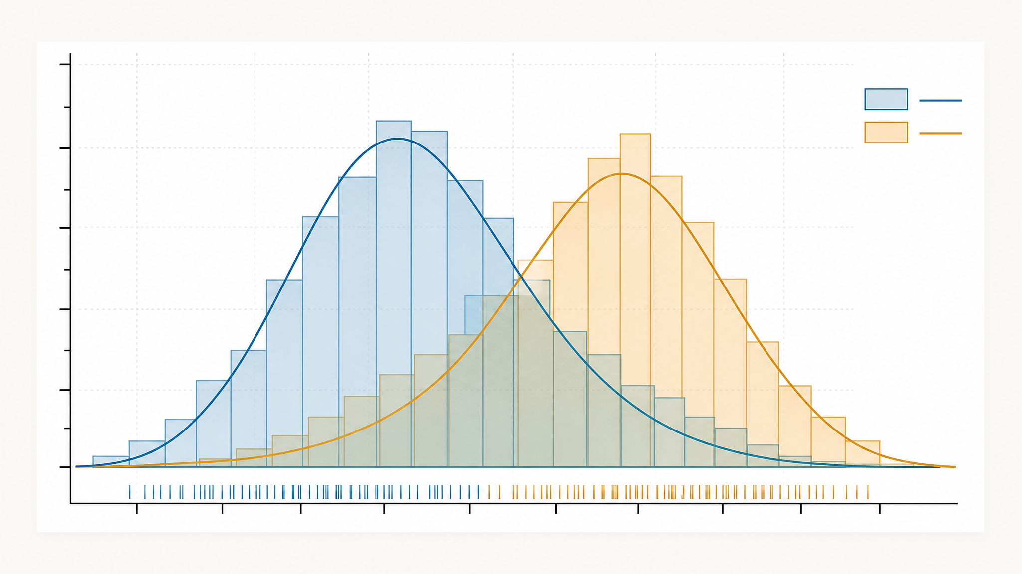
Histogram Generator
Show numeric distributions with clear bins and frequency labels.
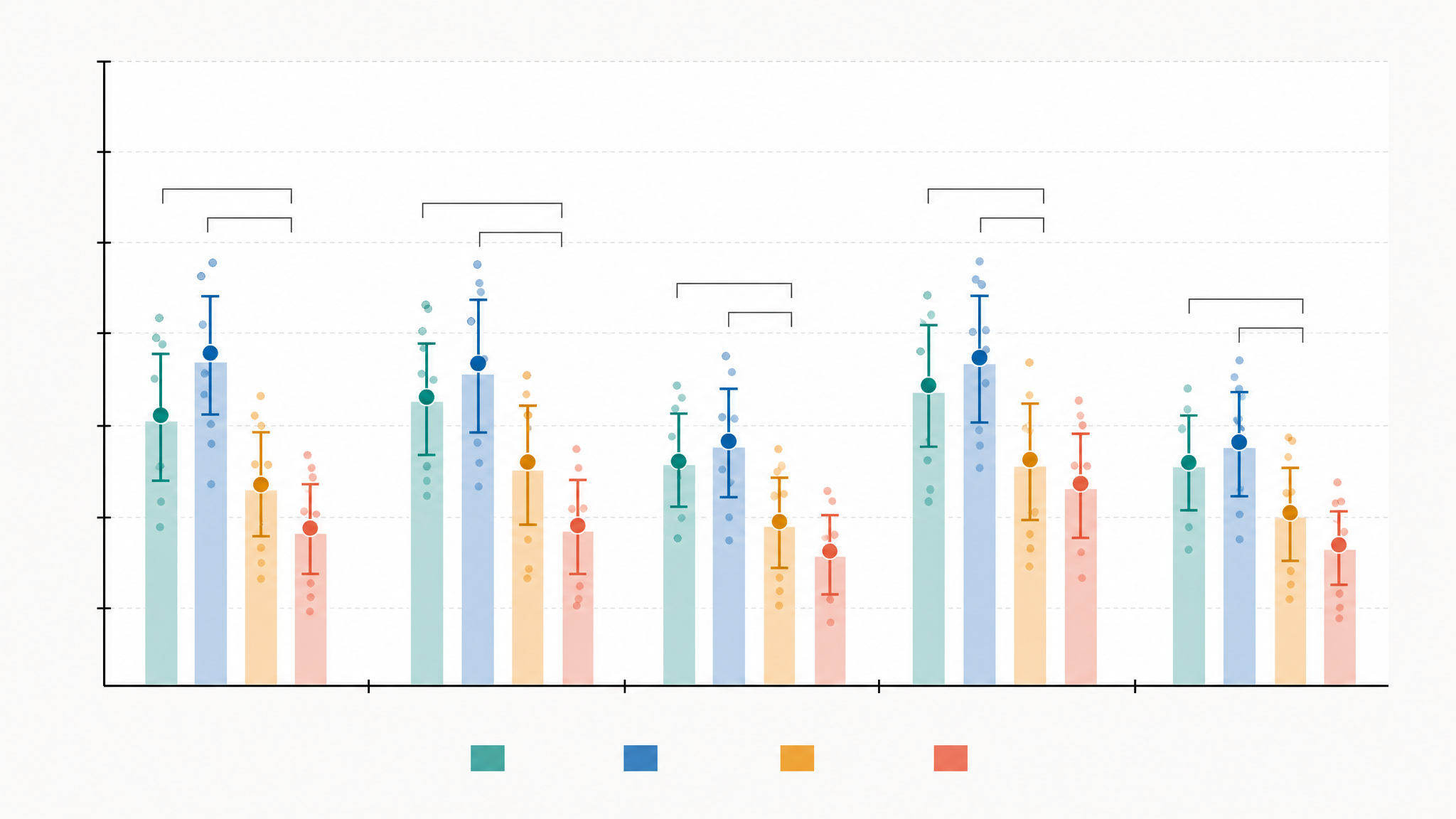
Error Bar Chart Generator
Compare group means with clear error ranges and labels.
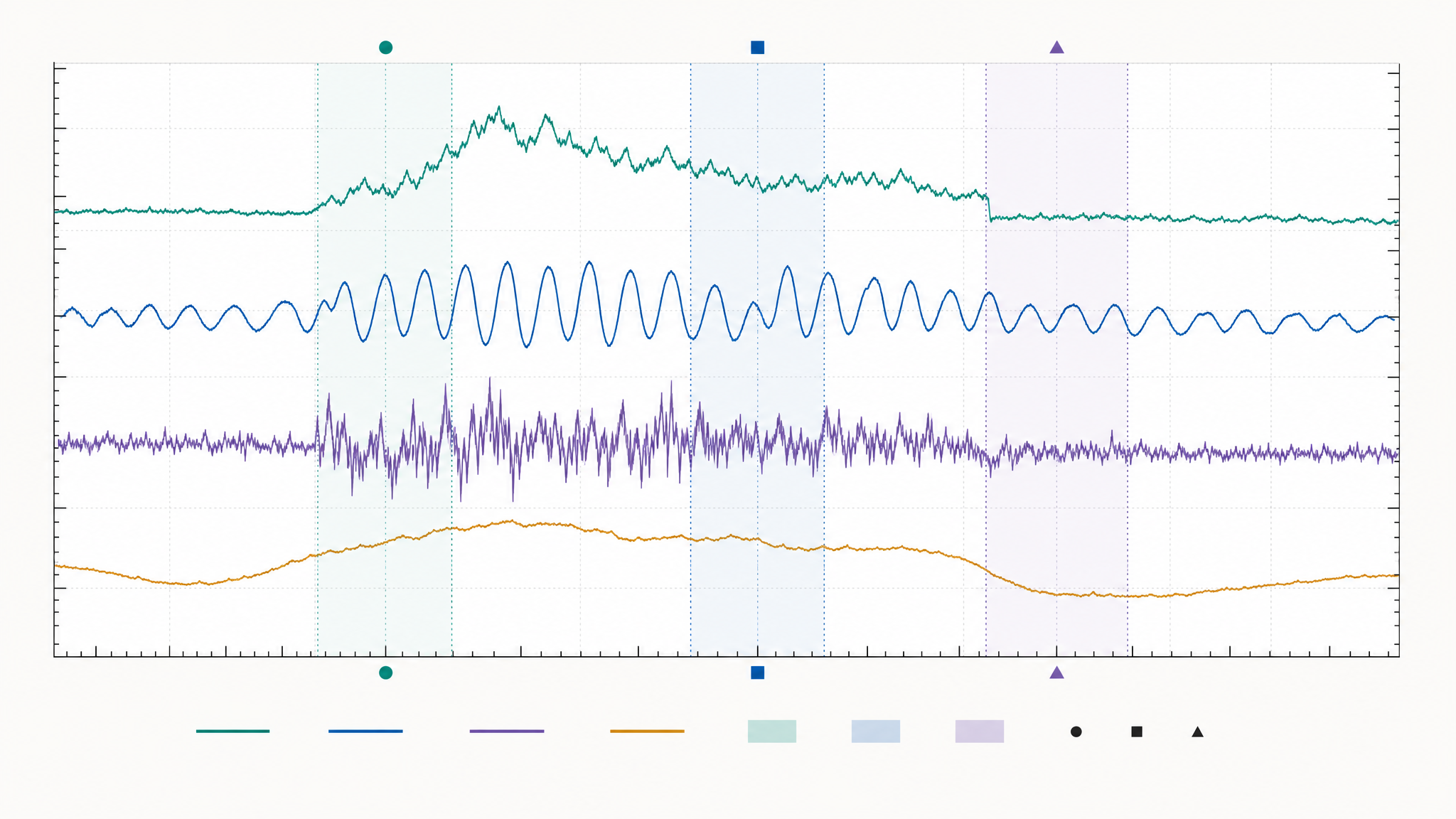
Time Series Plot Generator
Plot measurements over time with markers and event annotations.
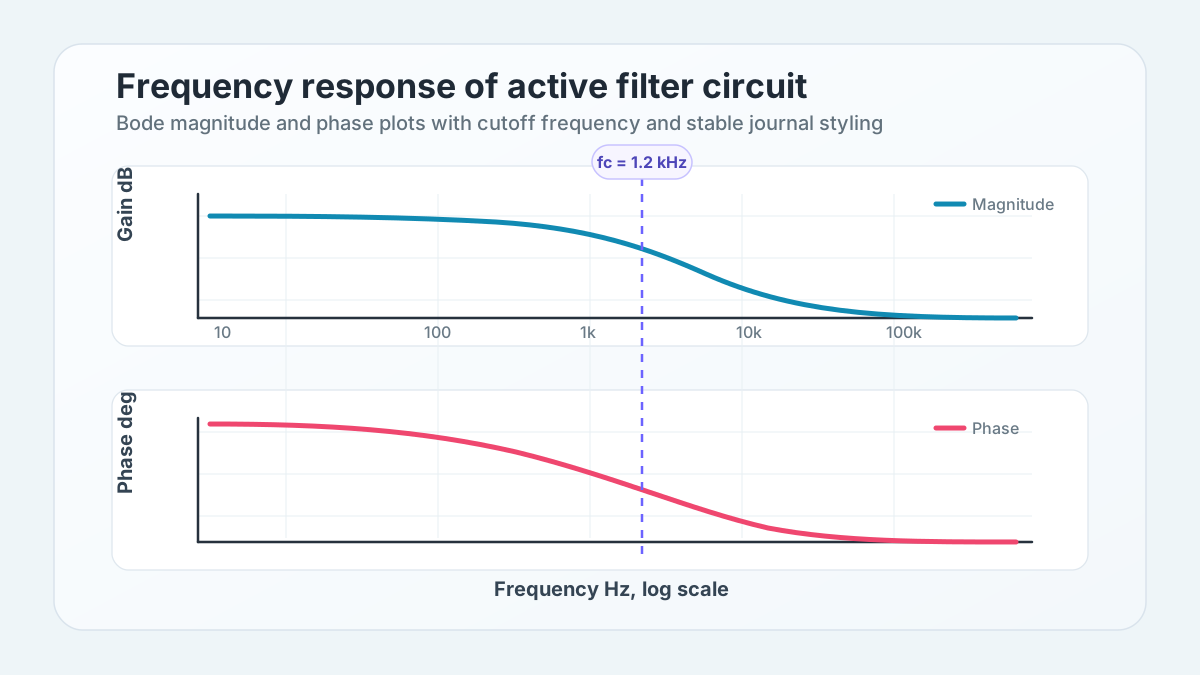
Bode Plot Generator
Plot frequency response with logarithmic magnitude and phase axes.
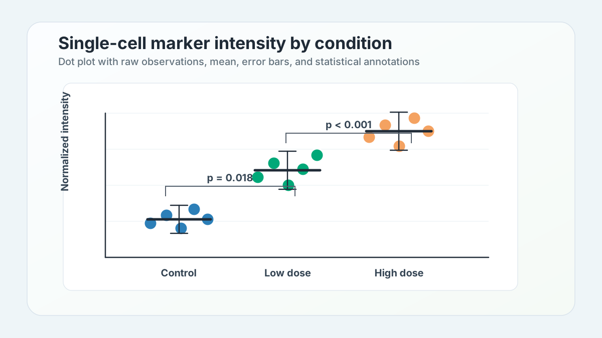
Dot Plot Generator
Compare ranked or grouped values with clean, readable markers.
Publishing checklist
Make charts easier to submit and explain
The best scientific chart is accurate first, then readable, labeled, and consistent with the rest of your figure.
Clear axis labels
Include units, group names, and enough context for a reader outside your lab.
Colorblind-safe palette
Use contrast and color choices that remain readable in print and presentations.
SVG-ready output
Start from clean chart output before combining panels in a figure or poster.
Optional AI polish
Use instructions to improve layout, emphasis, and manuscript-ready styling after the chart is accurate.
FAQ
Scientific data visualization questions
How SciFigure AI handles chart generation for research workflows.
Can I upload my own research data?
Yes. The visualization workspace accepts common spreadsheet-style files and pasted tables, then generates chart previews from the data.
Should I start from `/sci-vis` or a dedicated chart generator?
Use `/sci-vis` when you want to compare chart types. Use a dedicated generator when you already know you need a box plot, heatmap, volcano plot, or another specific chart.
Can these charts be used in papers?
The goal is to create clean, publication-ready static charts with readable labels, safe palettes, and optional AI refinement.