Correlation Matrix Generator for Research Data

Turn numeric variables into a publication-ready correlation heatmap.

Upload CSV or Excel data, pick Pearson or Spearman correlation, and SciFigure computes every pairwise coefficient before generating a clean, labeled matrix for your manuscript.

Pearson & SpearmanComputed r valuesPublication-ready PNG

AI Correlation Matrix Generator

Upload data and describe the matrix you need.

Aspect ratio
298 / 2000 characters

Costs 5 credits. Coefficients are computed from your uploaded data, then drawn as a PNG.

Preview

Correlation Matrix Examples

Aspect ratio: 16:9

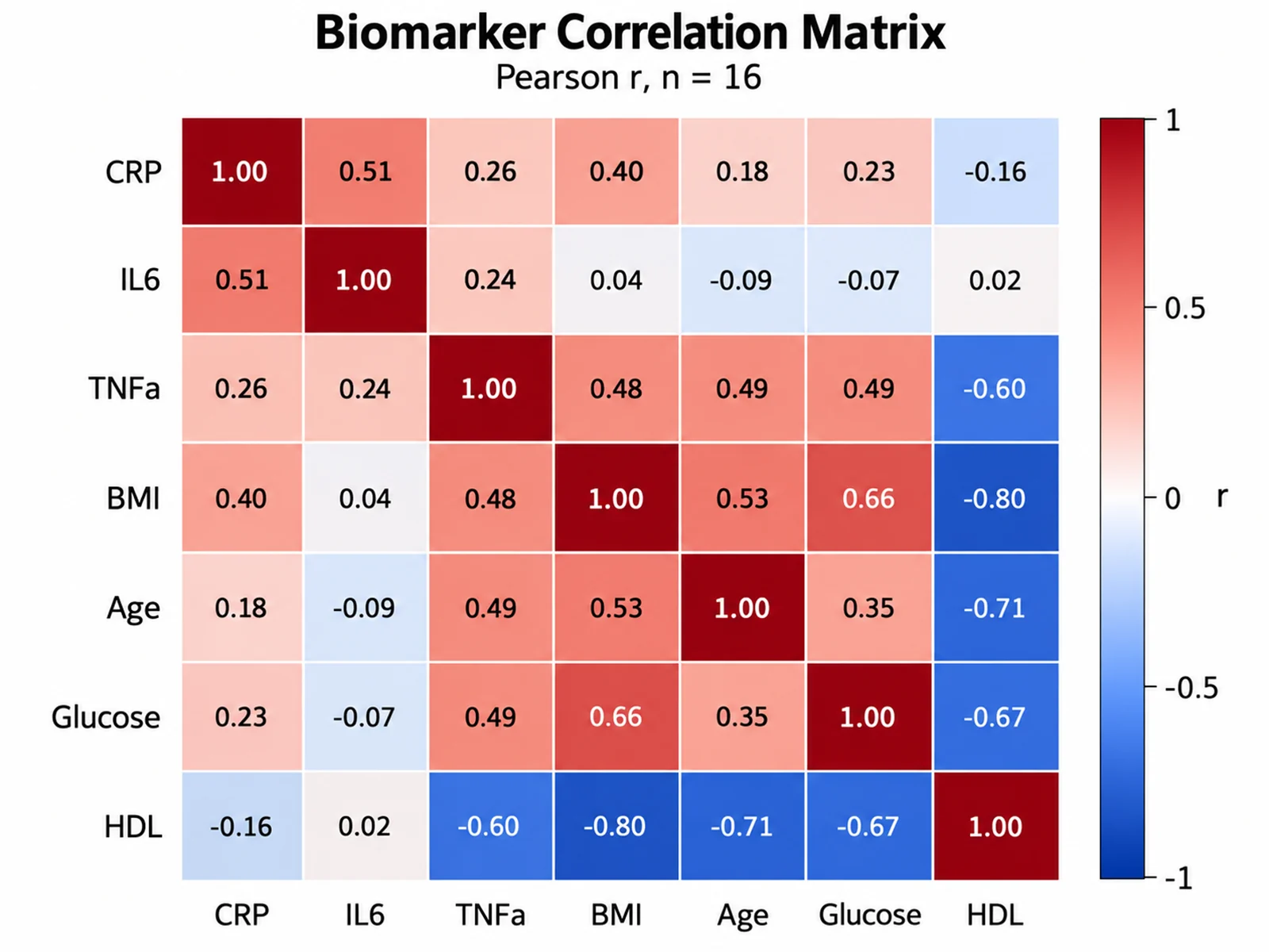
Biomarker Correlation Matrix correlation matrix example preview
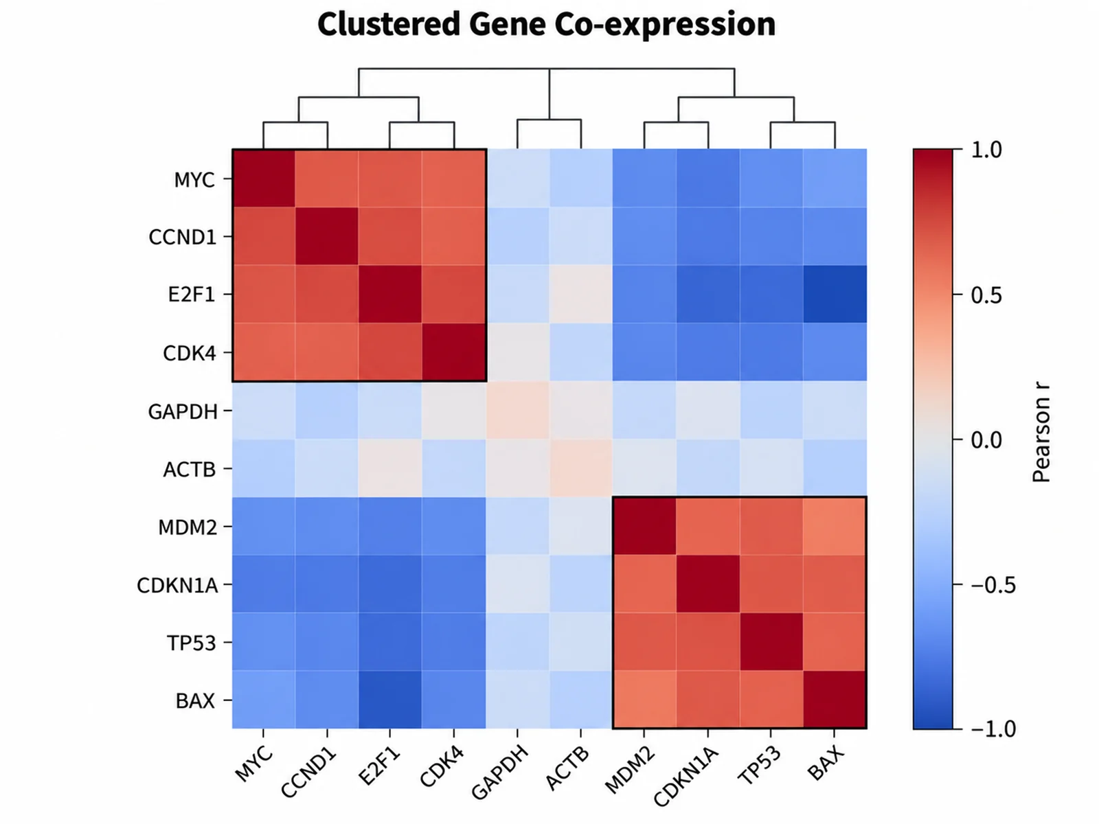
Clustered Gene Co-expression correlation matrix example preview
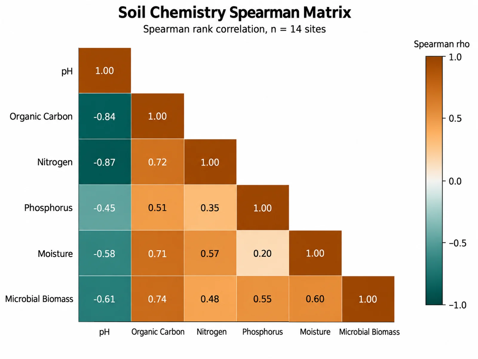
Soil Chemistry Spearman Matrix correlation matrix example preview

These are sample previews. Upload your dataset to generate your own correlation matrix.

Correlation matrix examples

Use these examples as starting points for biomarker panels, gene co-expression, environmental measurements, and clinical variable screens.

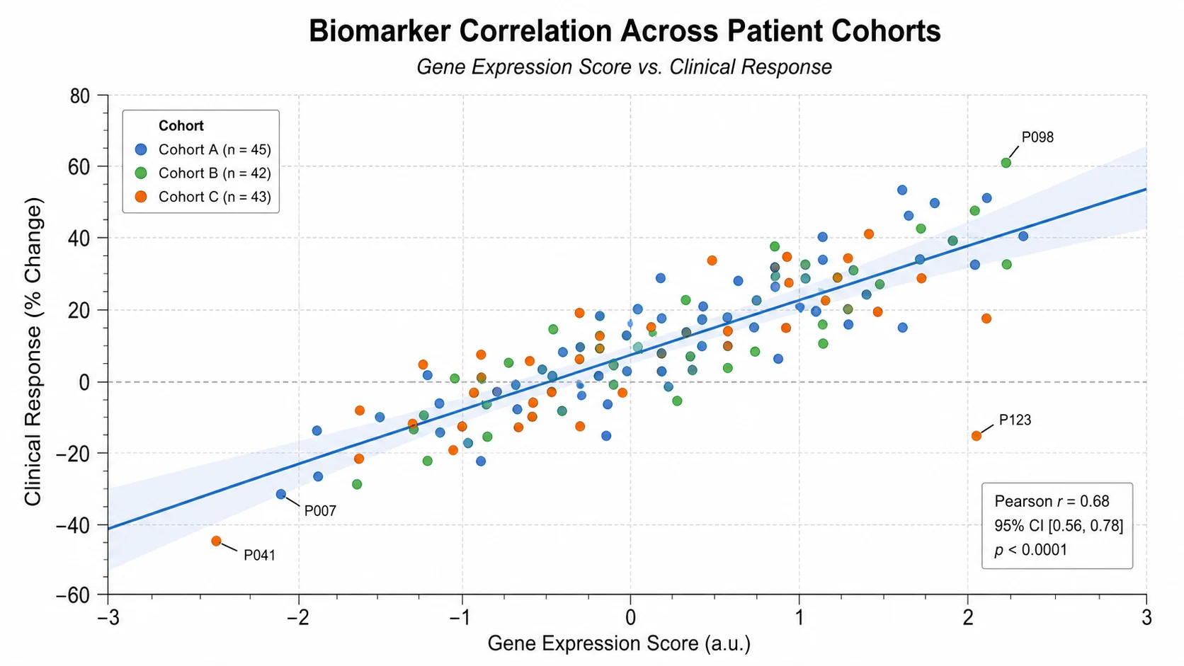
Correlation Matrix Generator: Biomarker Correlation Matrix scientific chart example

Prompt

Based on the uploaded biomarker_panel.csv file, create a Pearson correlation matrix for CRP, IL6, TNFa, BMI, Age, Glucose, and HDL. Use a diverging blue-white-red scale from -1 to +1, print r values with two decimals, add a labeled colorbar, and keep the full symmetric matrix.
Biomarker Correlation Matrix

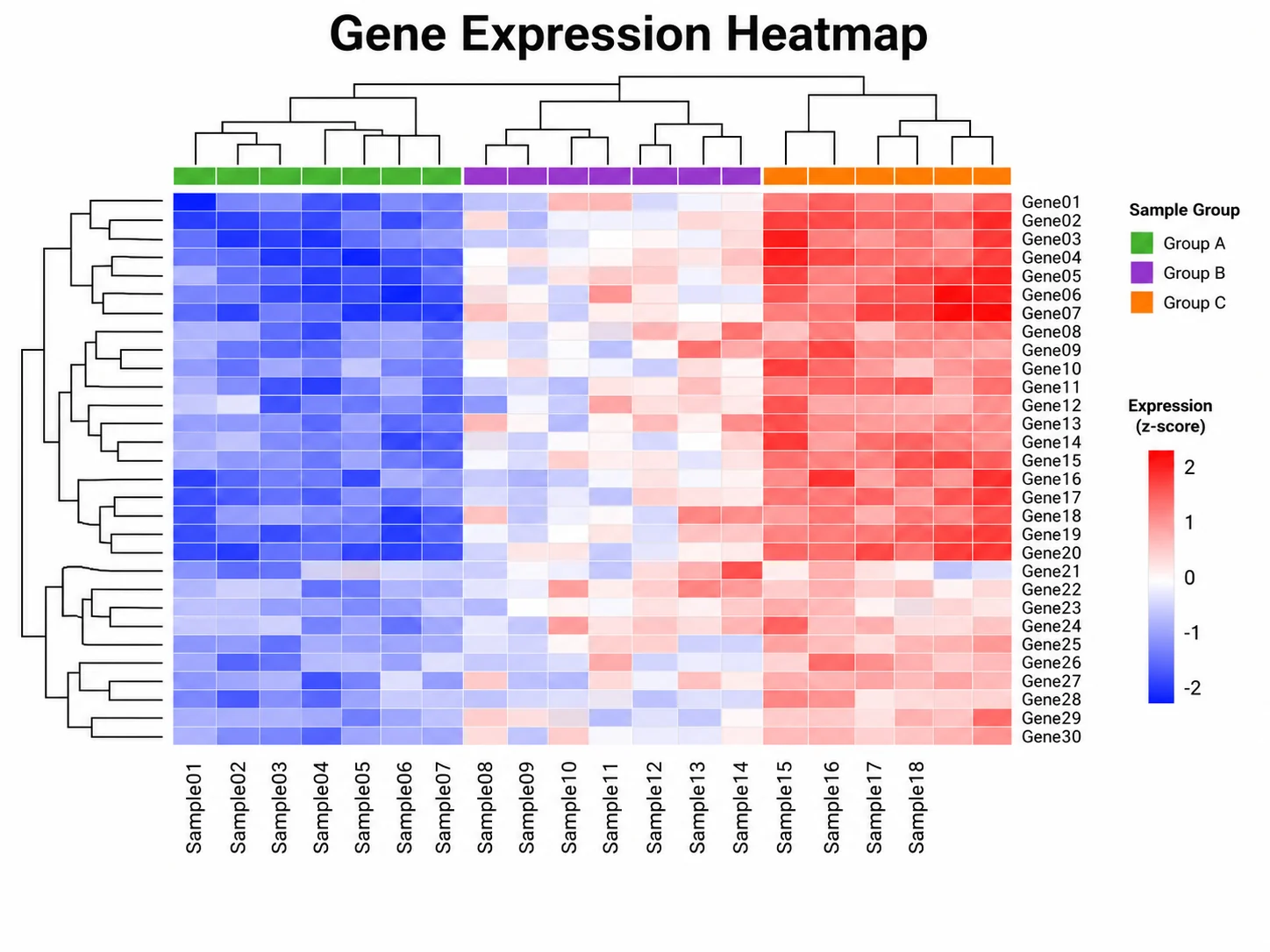
Correlation Matrix Generator: Clustered Gene Co-expression scientific chart example

Prompt

Based on the uploaded gene_coexpression.xlsx file, create a clustered Pearson correlation matrix for 10 genes. Order variables so strongly correlated genes sit together, outline the proliferation and p53-response blocks, omit numbers in cells, and use a compact colorbar.

Clustered Gene Co-expression

Correlation Matrix Generator: Soil Chemistry Spearman Matrix scientific chart example

Prompt

Based on the uploaded soil_chemistry.csv file, create a Spearman rank correlation matrix for pH, organic carbon, nitrogen, phosphorus, moisture, and microbial biomass. Show the lower triangle only, print rho values, and use an earthy but colorblind-safe diverging palette.

Soil Chemistry Spearman Matrix

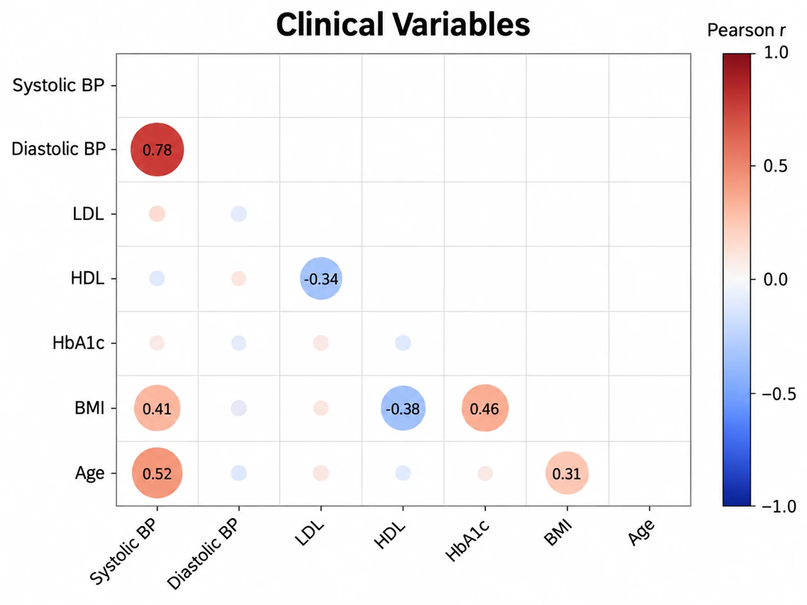
Correlation Matrix Generator: Clinical Variables Lower Triangle scientific chart example

Prompt

Based on the uploaded clinical_variables.tsv file, create a lower-triangle Pearson correlation matrix for systolic BP, diastolic BP, LDL, HDL, HbA1c, BMI, and age. Use circle size and color to encode r, print values above |0.3|, and keep labels angled for readability.

Clinical Variables Lower Triangle

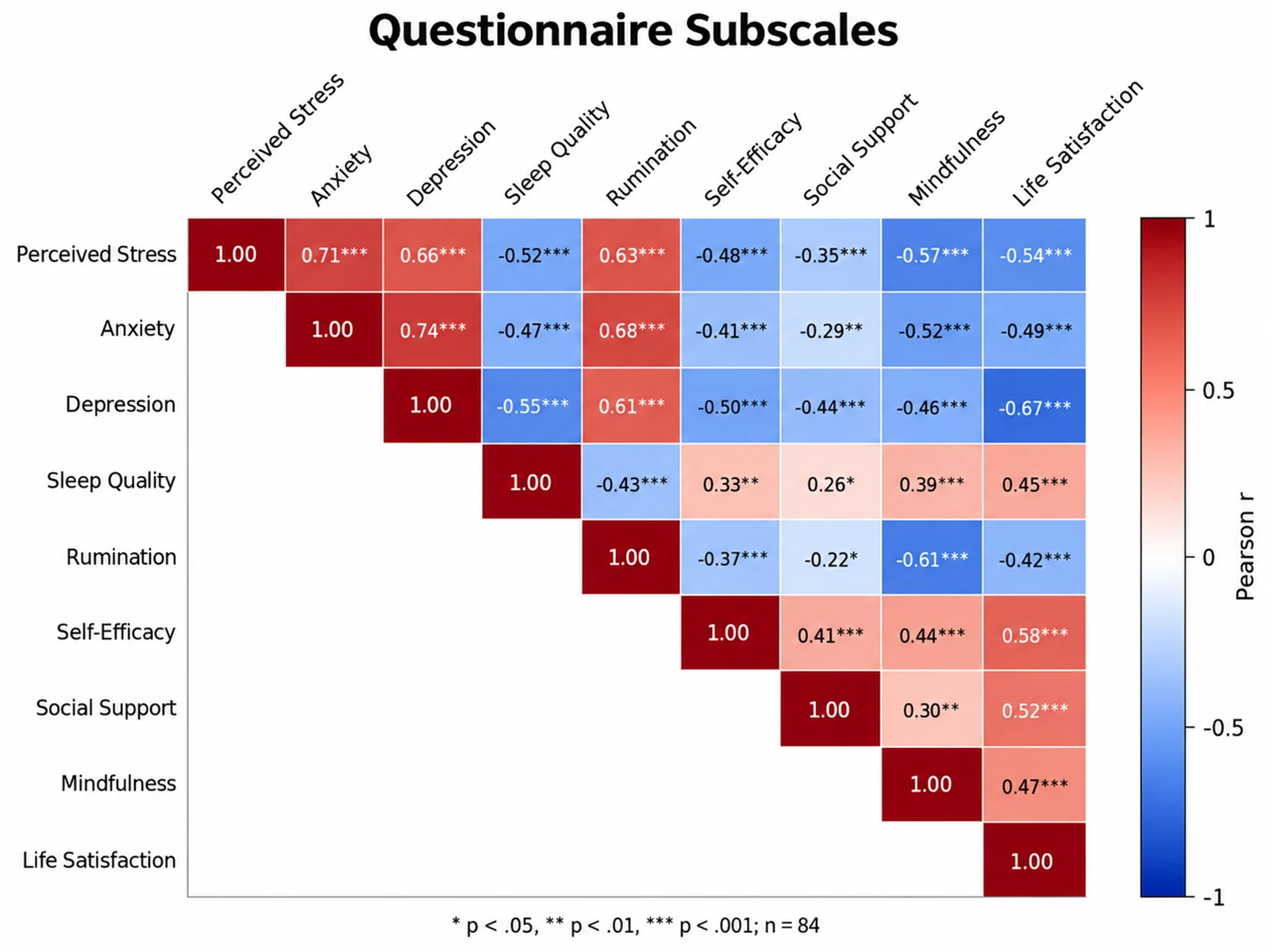
Correlation Matrix Generator: Questionnaire Subscales With Significance scientific chart example

Prompt

Based on the uploaded wellbeing_scales.csv file, create a Pearson correlation matrix for nine questionnaire subscales: perceived stress, anxiety, depression, sleep quality, rumination, self-efficacy, social support, mindfulness, and life satisfaction. Show the upper triangle only, print r with two decimals, and add significance asterisks with a footnote explaining them. Use a blue-white-red scale from -1 to +1 and rotate the column labels 45 degrees.

Questionnaire Subscales With Significance

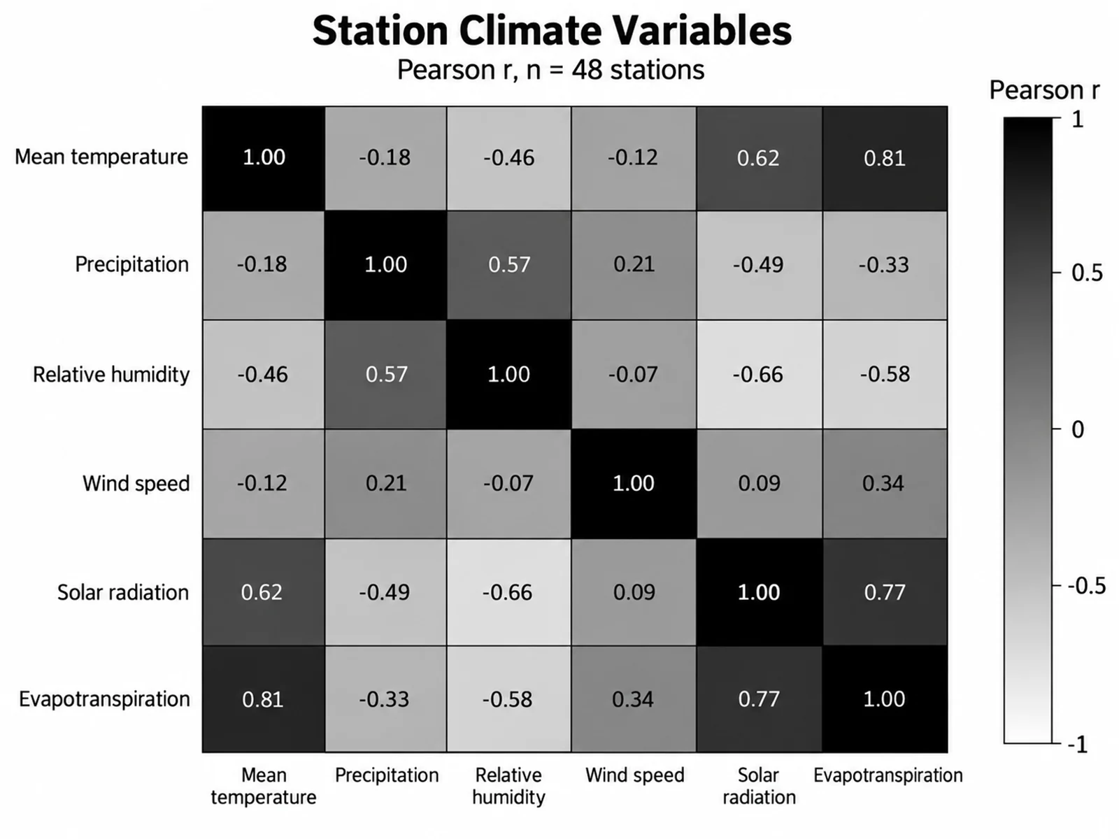
Correlation Matrix Generator: Grayscale Climate Variable Matrix scientific chart example

Prompt

Based on the uploaded station_climate.xlsx file, create a Pearson correlation matrix for mean temperature, precipitation, relative humidity, wind speed, solar radiation, and evapotranspiration measured at 48 weather stations. Render it in grayscale for a print-only journal, running from white at -1 through mid gray at 0 to near black at +1, print r in every cell, outline each cell in black, and keep the full symmetric matrix with horizontal labels.

Grayscale Climate Variable Matrix

How to make a correlation matrix

1

Upload your dataset

Add CSV, TSV, TXT, or Excel data with one row per sample and one numeric column per variable. ID columns are excluded automatically.

2

Describe the matrix

Choose Pearson or Spearman, full or lower triangle, clustered or original order, and whether r values appear in each cell.

3

Generate, review & download

SciFigure computes every coefficient, draws the heatmap, and lets you download a PNG ready for papers and slides.

What does this correlation matrix generator do?

It computes the correlation coefficient for every pair of numeric variables in your table and draws the results as a color-coded matrix. Positive relationships, negative relationships, and near-zero associations become visible at a glance, which makes the figure useful for exploratory analysis, multicollinearity checks, biomarker screening, and supplementary figures in research papers. Coefficients are calculated from your uploaded values before any drawing happens, so the colors and printed numbers reflect your data rather than an AI guess.

Pearson vs. Spearman correlation

  • Pearson r measures linear association between two continuous variables and is sensitive to outliers.
  • Spearman rho ranks each variable first, so it captures monotonic relationships and is more robust to skewed data and outliers.
  • Use Spearman for ordinal scales, heavily skewed measurements, or small samples with extreme values.
  • Mention "Spearman" in your instructions to switch methods; Pearson is the default.

How to read a correlation matrix

  • Each cell shows the coefficient between the row variable and the column variable, from -1 to +1.
  • The diagonal is always 1 because every variable correlates perfectly with itself.
  • The matrix is symmetric, so a lower-triangle layout shows the same information with less clutter.
  • Strong color does not imply causation, and a high r can be driven by a few extreme observations.

Tips for a clean, publication-ready matrix

  • Keep the matrix to about 20 variables; larger matrices are easier to read when clustered and shown without cell numbers.
  • Use a diverging palette centered on zero so positive and negative correlations are equally visible.
  • State the method, sample size, and any missing-data handling in the figure caption.
  • Order variables by domain or by hierarchical clustering so related blocks sit together.

Correlation Matrix Generator FAQ

What data format does the correlation matrix need?

Use a wide table: one row per sample, subject, or site, and one numeric column per variable. Text columns such as sample IDs or group labels are excluded from the calculation.

Does the tool calculate the coefficients or does AI estimate them?

The coefficients are calculated from your uploaded values using pairwise complete observations. The computed numbers are then passed to the image model, which only handles layout and styling.

Can I make a Spearman correlation matrix?

Yes. Include "Spearman" in your instructions and the tool ranks each variable before computing correlations. Pearson is used by default.

How are missing values handled?

Each pair of variables uses every row where both values are present, so one missing measurement does not remove the whole sample from the matrix.

Can I cluster variables or show only the lower triangle?

Yes. Ask for clustered ordering to group strongly related variables, and ask for a lower-triangle layout to remove the duplicated upper half.

Can I use the correlation matrix in a paper?

Yes, but verify the coefficients, method, sample size, and variable names before submission, and report whether p-values or multiple-testing corrections were applied in your own analysis.

Need a clearer view of variable relationships?

Generate correlation matrices, heatmaps, PCA plots, and other research-ready visualizations with SciFigure AI.