Dot Plot Generator for Scientific Data

Create publication-ready dot plots from grouped experimental data.

Upload raw observations, describe the comparison you need, then generate a clean AI-made PNG with individual points, group labels, summaries, and optional annotations.

Raw observationsGroup summariesPublication-ready PNG

AI Dot Plot Generator

Upload data and describe the AI chart you need.

Aspect ratio
256 / 2000 characters

Costs 5 credits. Uses your uploaded data and prompt to generate a publication-ready PNG.

Preview

Dot Plot Example Previews

Aspect ratio: 16:9

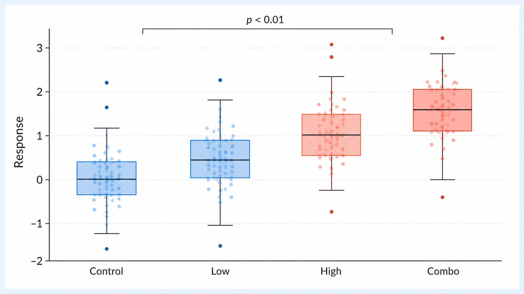
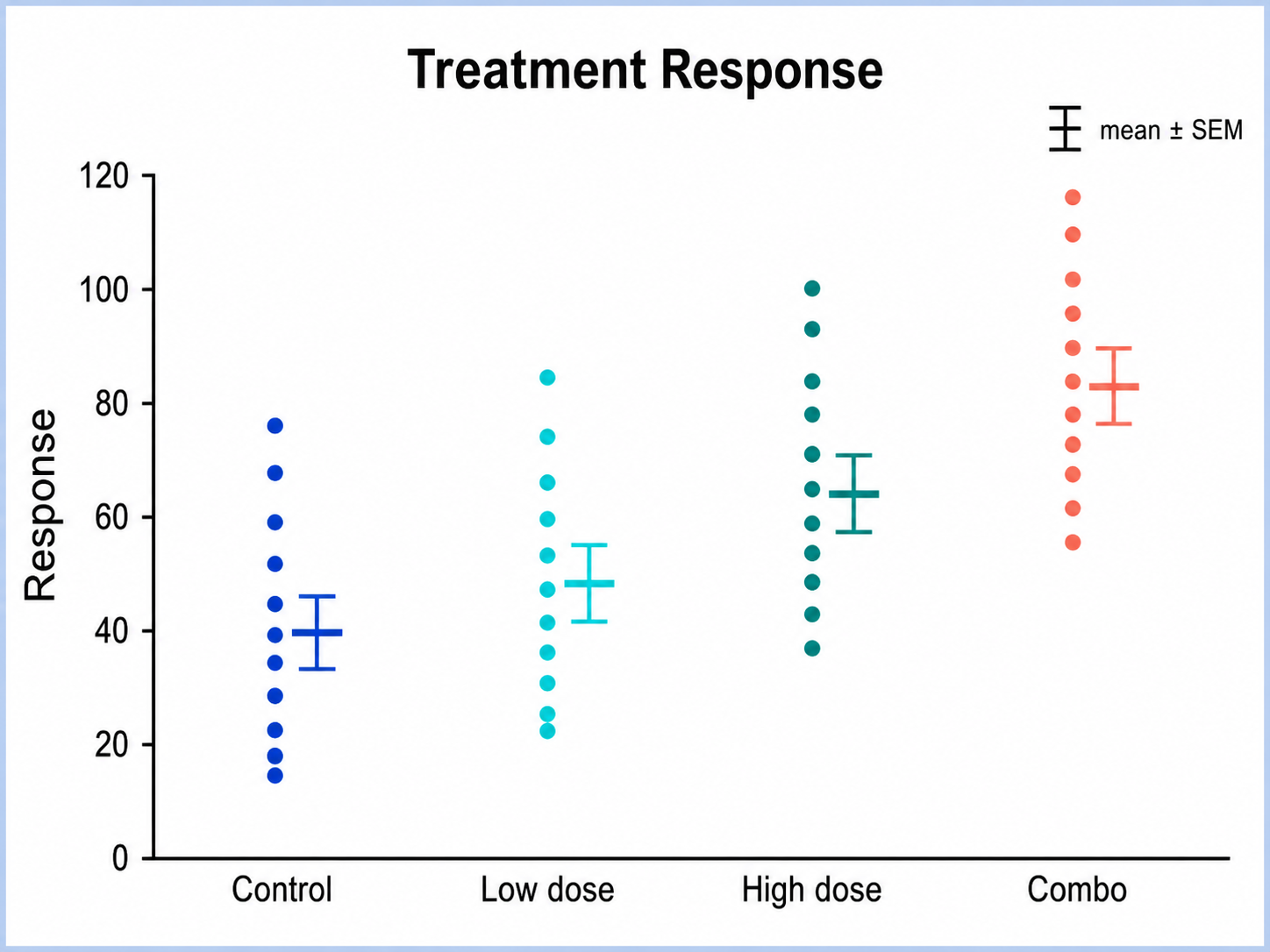
Treatment Response dot plot example preview
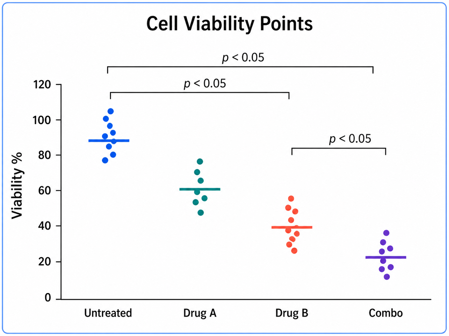
Cell Viability Points dot plot example preview
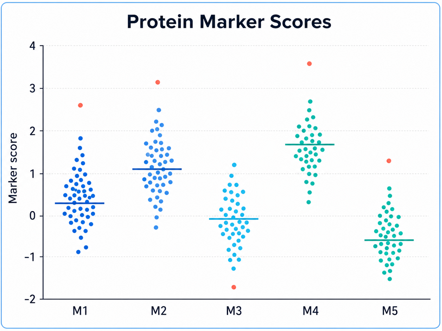
Protein Marker Scores dot plot example preview

These are sample previews. Upload your dataset to generate your own dot plot.

Dot plot examples

Use these examples as visual directions for raw observations, grouped comparisons, QC ranges, and manuscript-ready dot plots.

Dot Plot Generator for Scientific Data: Treatment Response scientific chart example

Prompt

Based on the uploaded treatment_response_points.csv file, create a publication-ready dot plot comparing individual response values across control, low-dose, high-dose, and combination groups. Use light jitter, median bars, readable group labels, and concise significance annotations.
Treatment Response

Dot Plot Generator for Scientific Data: Cell Viability Points scientific chart example

Prompt

Based on the uploaded cell_viability_replicates.xlsx file, create a dot plot showing replicate-level cell viability across untreated, drug A, drug B, and combination conditions. Include all observations, show mean with error bars, and use a clean scientific palette.

Cell Viability Points

Dot Plot Generator for Scientific Data: Protein Marker Scores scientific chart example

Prompt

Based on the uploaded protein_marker_scores.tsv file, create a grouped dot plot comparing marker scores across healthy, early-stage, and advanced disease cohorts. Show individual samples, sample sizes, median indicators, and clear y-axis units.

Protein Marker Scores

Dot Plot Generator for Scientific Data: Single-Cell Cluster Values scientific chart example

Prompt

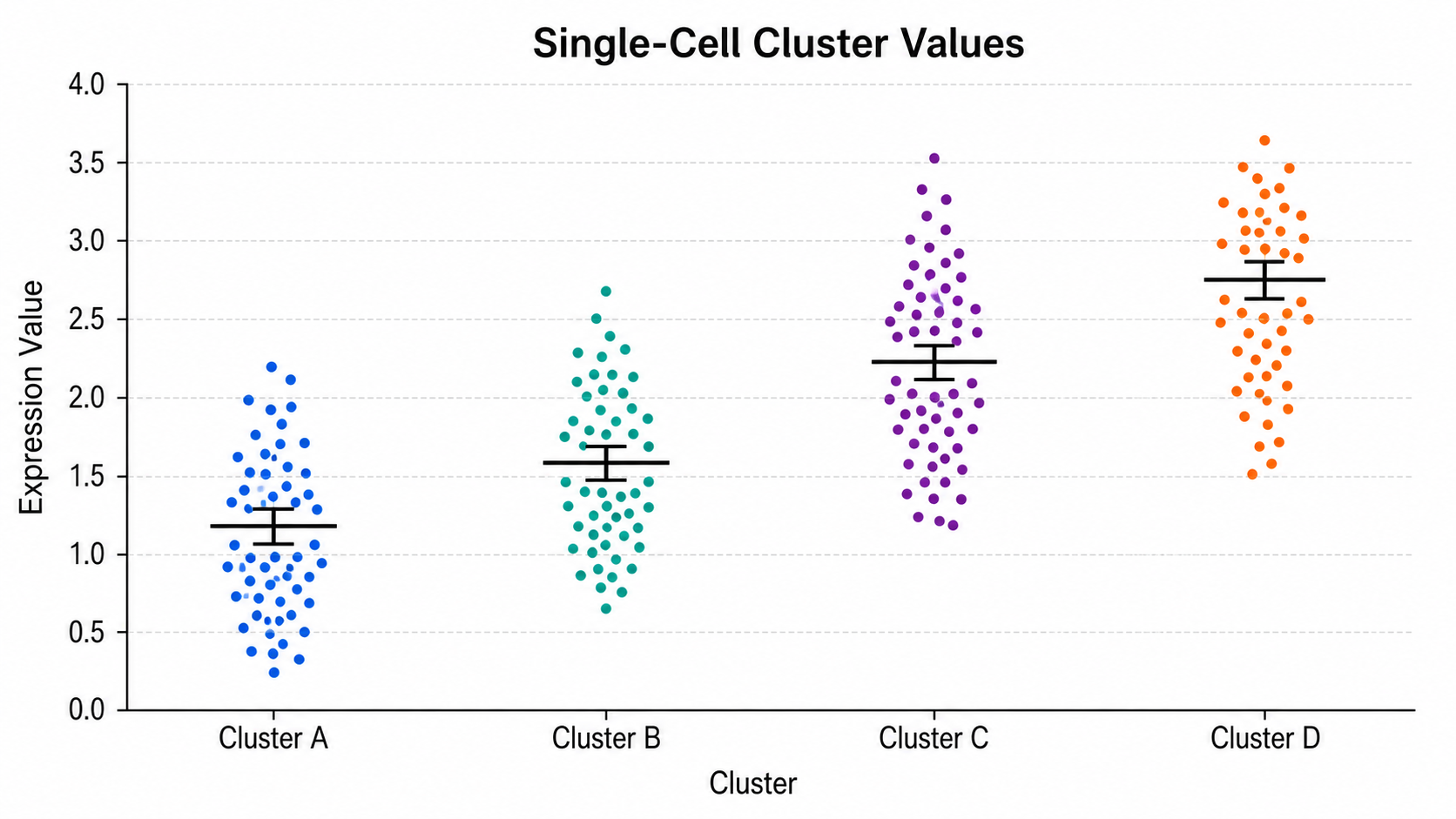
Based on the uploaded single_cell_cluster_values.csv file, create a dot plot summarizing marker intensity across cell clusters. Use compact jittered points, separate cluster labels, subtle color coding, and a clean legend for control versus treated samples.

Single-Cell Cluster Values

Dot Plot Generator for Scientific Data: Batch QC Measurements scientific chart example

Prompt

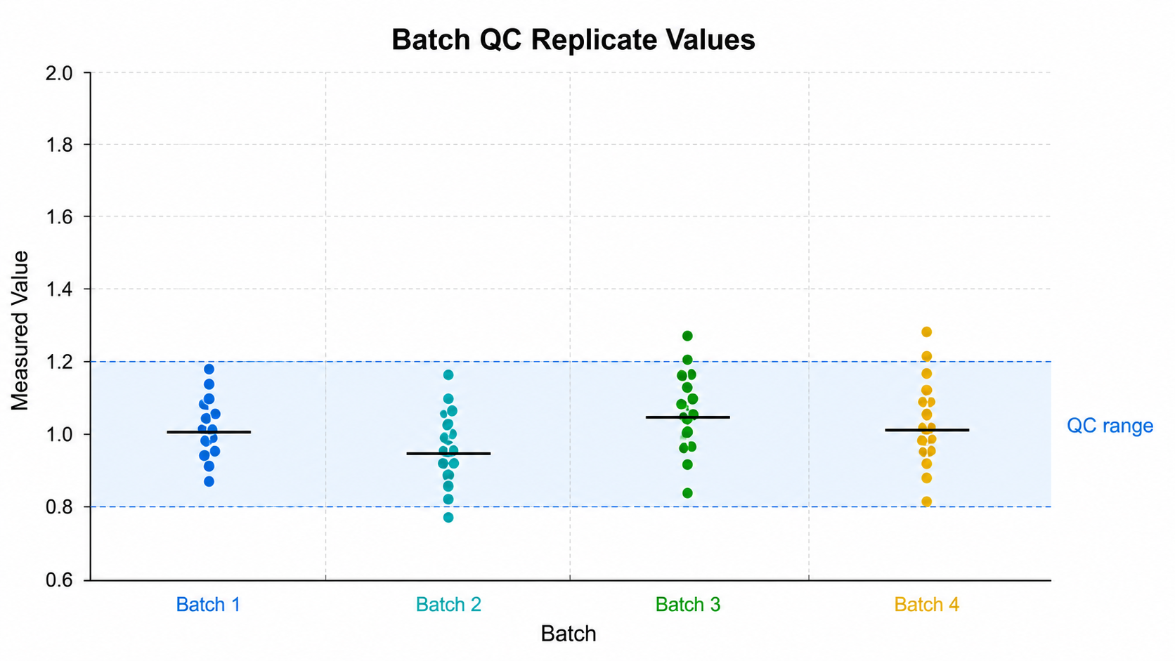
Based on the uploaded batch_qc_replicates.xlsx file, create a dot plot comparing replicate values across Batch 1, Batch 2, Batch 3, and Batch 4. Highlight the acceptable QC range, show outliers, and keep the figure suitable for a lab quality-control report.

Batch QC Measurements

Dot Plot Generator for Scientific Data: Time Point Measurements scientific chart example

Prompt

Based on the uploaded time_point_measurements.csv file, create a dot plot showing measurements across baseline, 24 hours, 48 hours, and 72 hours. Show individual observations, connect group medians with a subtle trend line, and label the time axis clearly.

Time Point Measurements

How to make a dot plot

1

Upload your dataset

Add CSV, TSV, TXT, or Excel observations with a numeric value column and optional group labels.

2

Describe the chart

Tell SciFigure AI the grouping, jitter, summaries, error bars, annotations, and palette you need.

3

Generate, review & download

Create a clean dot plot, review the result, then download PNG for papers and slides.

What does this dot plot generator do?

It turns individual observations into a clean dot plot that shows every data point while preserving group comparisons, summary cues, sample sizes, and readable labels.

Why use a dot plot generator

  • Show small or moderate sample sizes transparently without hiding raw observations.
  • Compare groups, treatments, cohorts, batches, or time points with direct visual evidence.
  • Add mean, median, error bars, QC ranges, or significance annotations without manual redrawing.
  • Create cleaner figures for papers, posters, lab reports, and teaching materials.

Types and parts of a dot plot

  • Each dot represents an observation, replicate, sample, or category estimate.
  • Jitter keeps overlapping points readable while preserving group structure.
  • Mean or median bars summarize the center without hiding raw values.
  • Sample sizes, paired lines, and statistical brackets can clarify the comparison.

Dot Plot Generator FAQ

What data does the dot plot need?

A numeric value column is required. Category, group, label, or series columns can organize the points.

When is a dot plot better than a box plot?

Use a dot plot when raw observations matter, especially for small or moderate sample sizes.

Can I show mean, median, or error bars?

Yes. Describe the summary marker you need, such as median bars, mean with SD, or mean with SEM.

Can I compare multiple treatment groups?

Yes. Use a group column for treatments, cohorts, batches, time points, or conditions.

Can I use the result in a paper?

Yes, but always verify data mapping, units, labels, statistics, and captions before submission.

Need clearer raw-value figures?

Generate dot plots, box plots, violin plots, and other research-ready visualizations with SciFigure AI.