Error Bar Chart Generator for Scientific Data

Create publication-ready error bar charts from estimates and uncertainty data.

Upload summary or replicate data, map estimates and uncertainty columns, then generate a clean AI chart with SD, SE, confidence intervals, or explicit bounds.

Summary data readySD, SE & CI intervalsPublication-ready PNG

AI Error Bar Chart Generator

Upload data and describe the AI chart you need.

Aspect ratio
290 / 2000 characters

Costs 5 credits. Uses your uploaded data and prompt to generate a publication-ready PNG.

Preview

Error Bar Chart Example Previews

Aspect ratio: 16:9

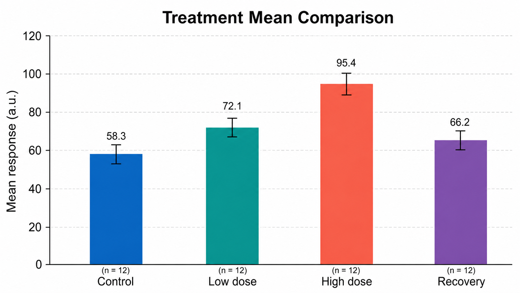
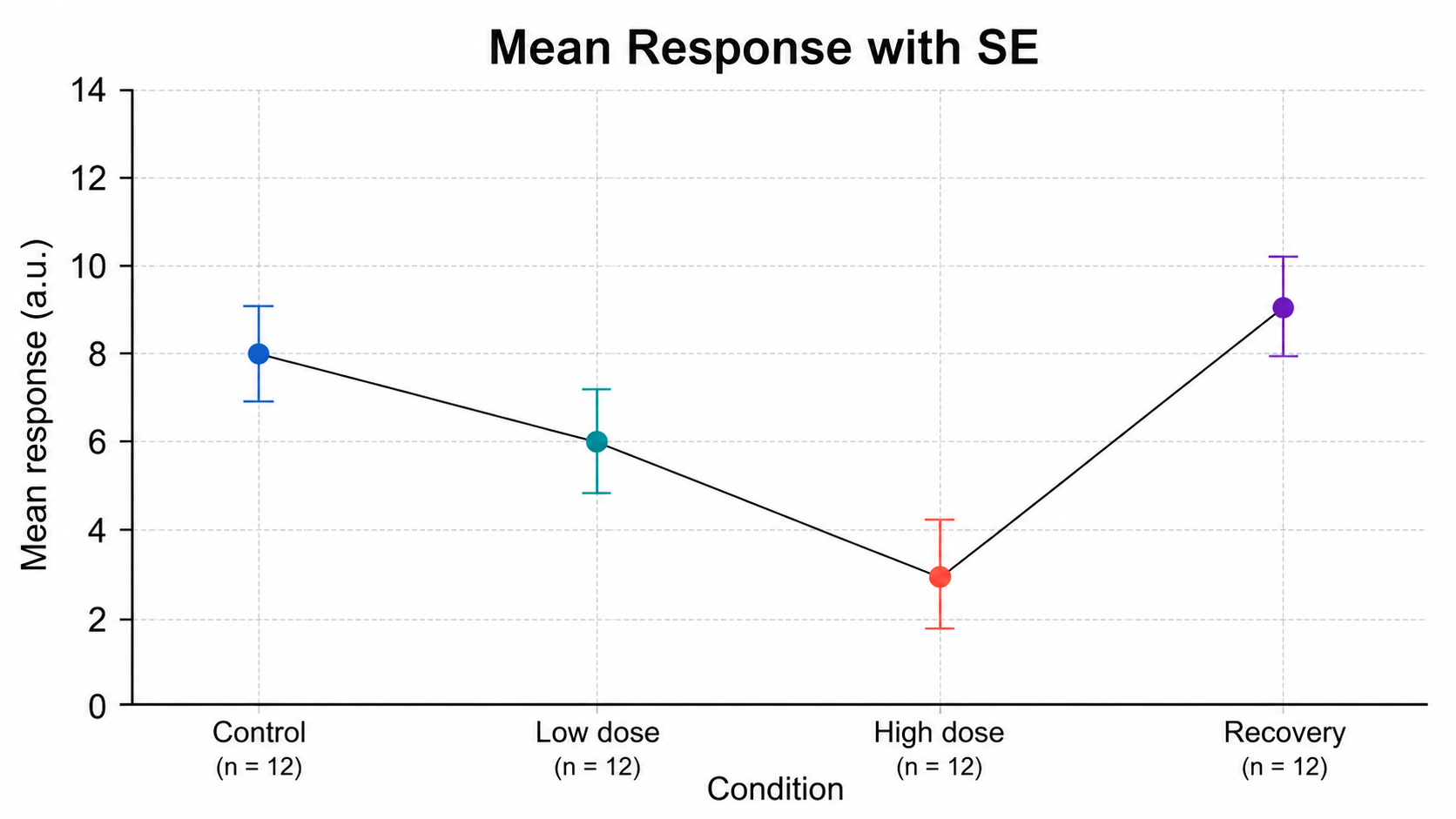
Mean Response with SE error bar chart example preview
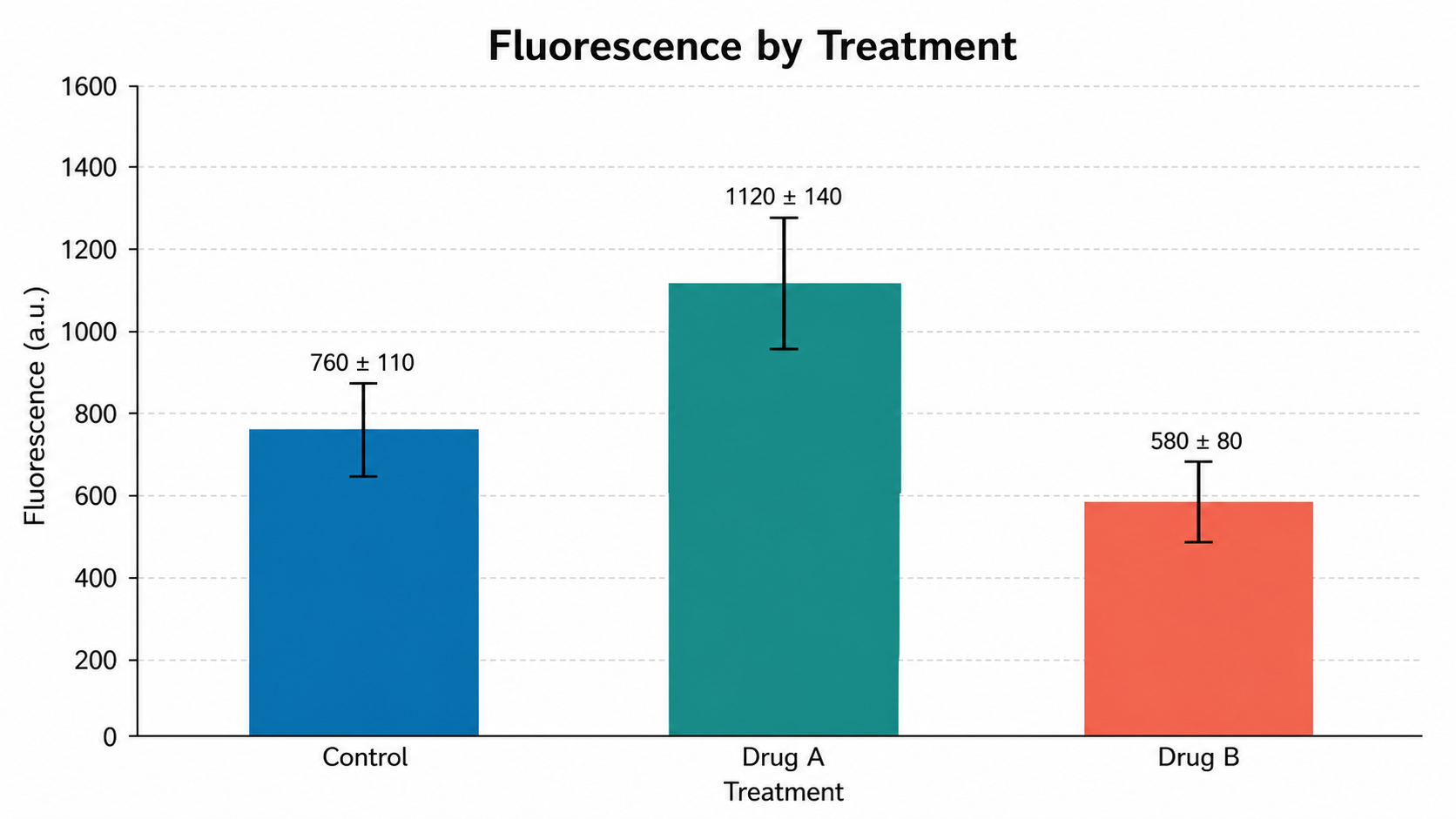
Fluorescence by Treatment error bar chart example preview
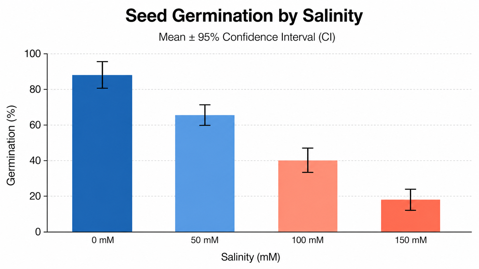
Seed Germination by Salinity error bar chart example preview

These are sample previews. Upload your dataset to generate your own error bar chart.

Error bar chart examples

Use these examples as visual directions for mean values, uncertainty intervals, confidence bounds, grouped estimates, and manuscript-ready summary figures.

Error Bar Chart Generator for Scientific Data: Mean Response with SE scientific chart example

Prompt

Based on the uploaded mean_response_se.csv file, create an error bar chart showing mean response with symmetric SE intervals across Control, Low dose, High dose, and Recovery groups. Use clear point markers, readable group labels, sample-size labels, a clean y-axis, and a restrained blue/teal/coral/purple palette.
Mean Response with SE

Error Bar Chart Generator for Scientific Data: Fluorescence by Treatment scientific chart example

Prompt

Based on the uploaded fluorescence_treatment_summary.xlsx file, create a bar-and-error chart comparing mean fluorescence for Control, Drug A, and Drug B. Use the uploaded SD column for error bars, show concise mean +/- SD labels, keep a zero-based y-axis, and use clean manuscript-ready styling.

Fluorescence by Treatment

Error Bar Chart Generator for Scientific Data: Seed Germination by Salinity scientific chart example

Prompt

Based on the uploaded seed_germination_ci.csv file, create an error bar chart showing mean germination percentage across 0 mM, 50 mM, 100 mM, and 150 mM salinity. Use the lower and upper 95% confidence interval columns, label the interval type, and keep the figure clean and publication-ready.

Seed Germination by Salinity

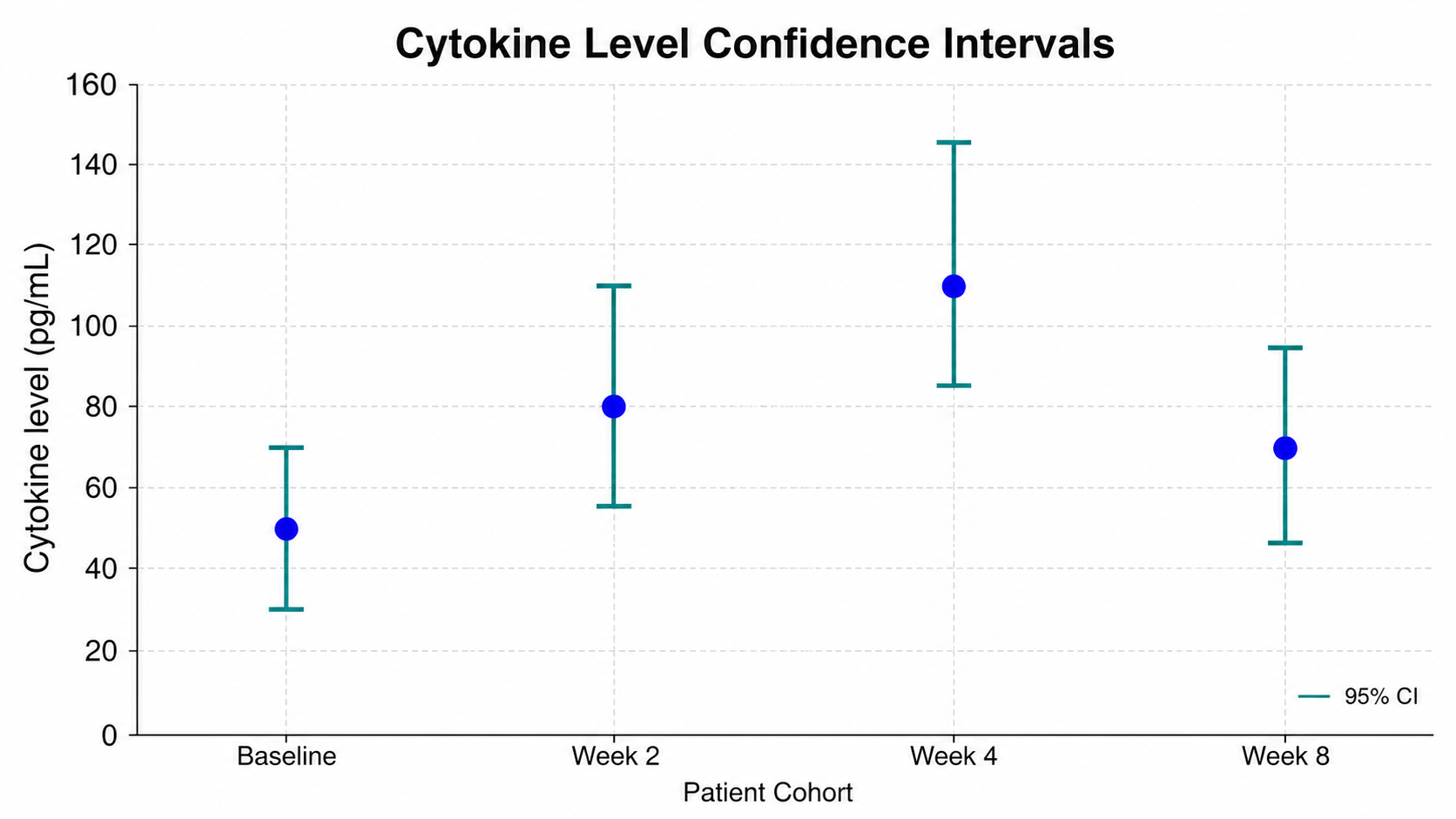
Error Bar Chart Generator for Scientific Data: Cytokine Level Confidence Intervals scientific chart example

Prompt

Based on the uploaded cytokine_levels_ci.tsv file, create a point-and-error-bar chart for Baseline, Week 2, Week 4, and Week 8 patient cohorts. Use asymmetric 95% confidence intervals from the lower and upper bound columns, direct labels, and a clean white scientific layout.

Cytokine Level Confidence Intervals

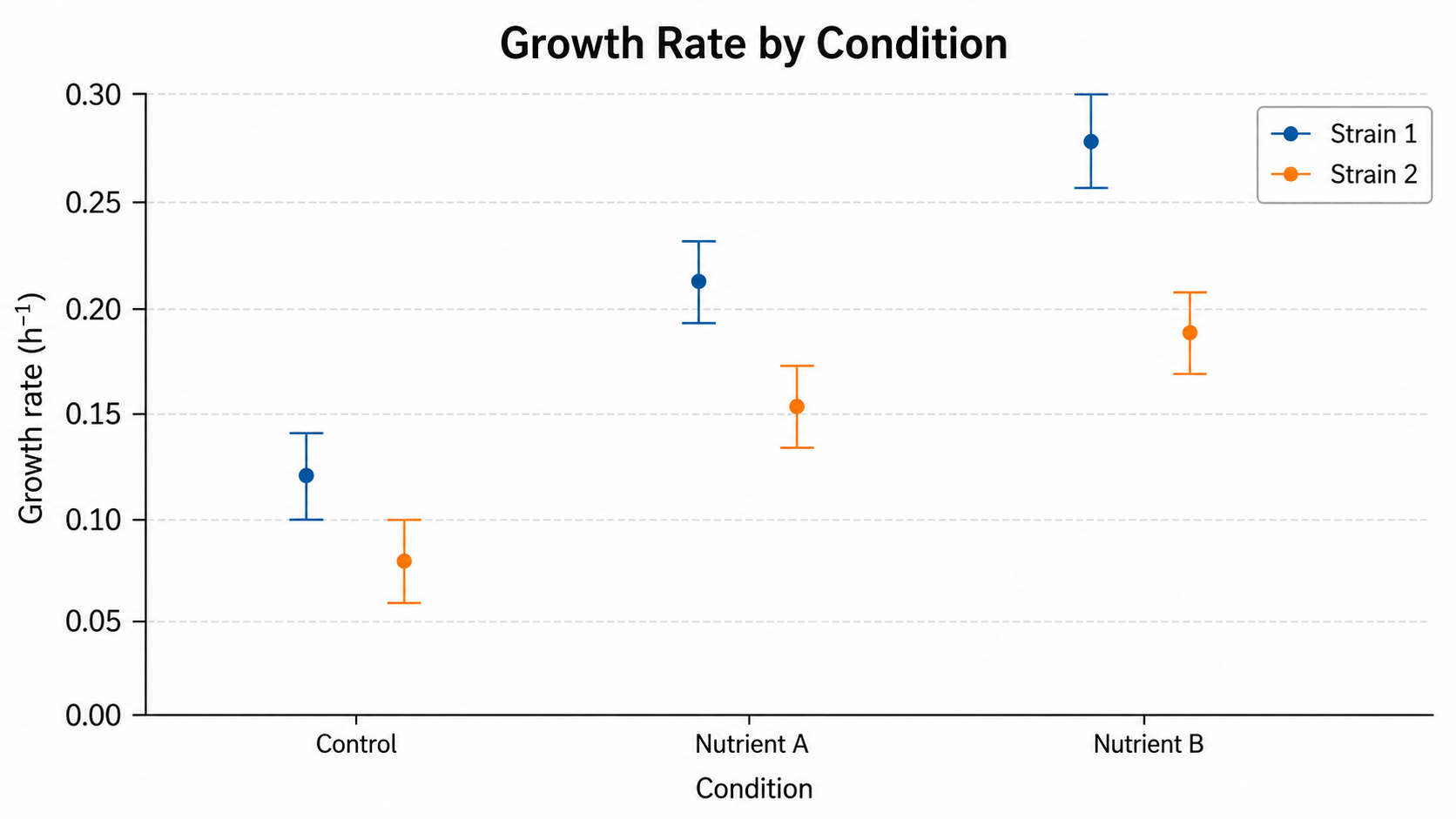
Error Bar Chart Generator for Scientific Data: Growth Rate by Condition scientific chart example

Prompt

Based on the uploaded growth_rate_conditions.xlsx file, create a grouped error bar chart comparing Strain 1 and Strain 2 across Control, Nutrient A, and Nutrient B. Use SEM intervals, grouped markers or slim bars, compact legend, clear units on the y-axis, and colorblind-safe blue/orange styling.

Growth Rate by Condition

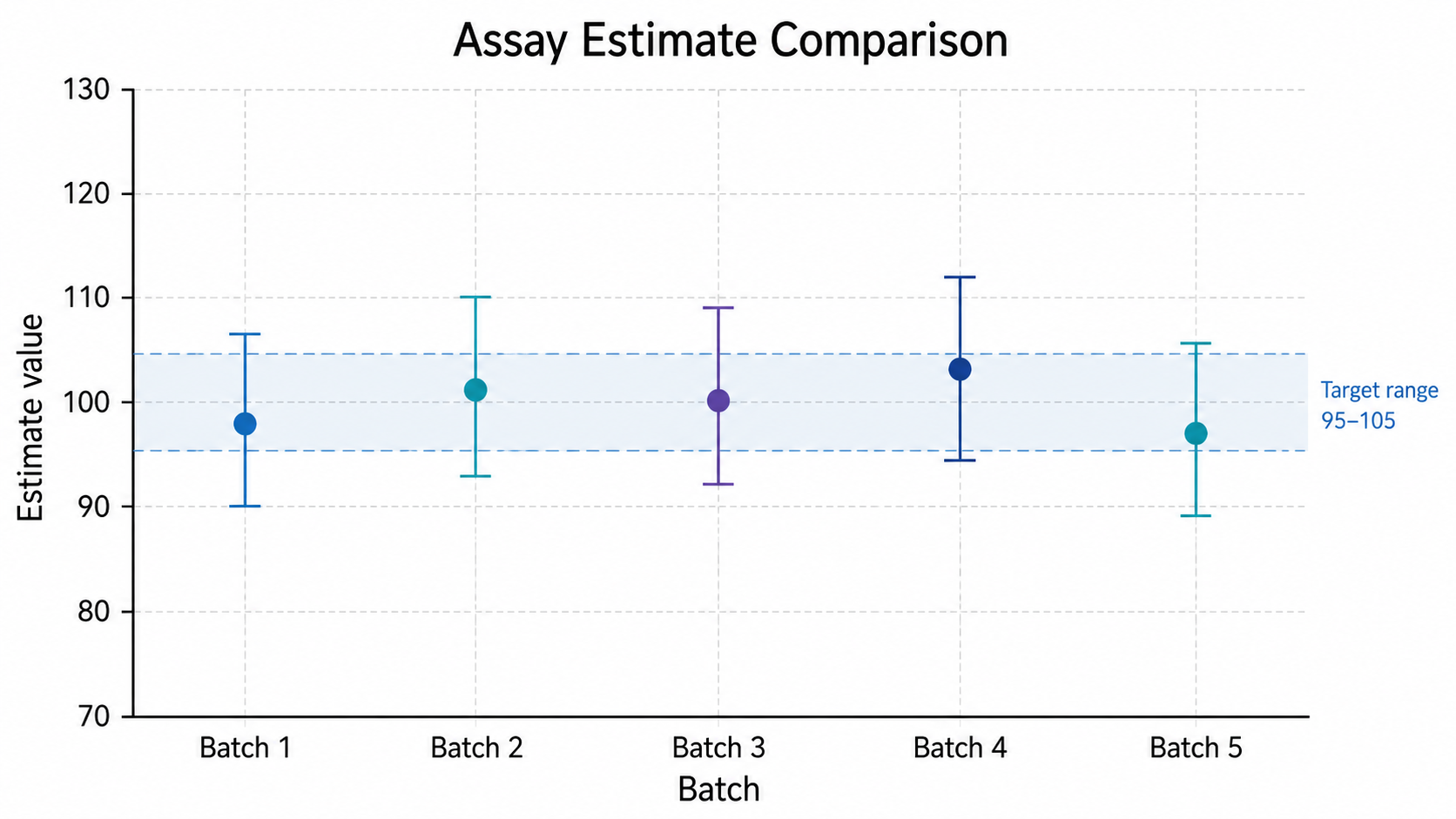
Error Bar Chart Generator for Scientific Data: Assay Estimate Comparison scientific chart example

Prompt

Based on the uploaded assay_estimate_batches.csv file, create an error bar chart comparing assay estimates across Batch 1 through Batch 5. Use SD error bars, add a subtle target reference band around the accepted range when provided, keep the labels readable, and avoid decorative clutter.

Assay Estimate Comparison

How to make an error bar chart

1

Upload your dataset

Add CSV, TSV, TXT, or Excel data with category, estimate, and uncertainty columns, or repeat measurement rows by group.

2

Describe the chart

Tell SciFigure AI whether the intervals are SD, SE, SEM, confidence intervals, or explicit lower and upper bounds.

3

Generate, review & export

Create a clean error bar chart, verify interval labels and values, then download PNG for papers and slides.

What does this error bar chart generator do?

It turns estimates and uncertainty columns into a clean error bar chart for comparing means, model estimates, confidence intervals, or assay summaries across groups, doses, cohorts, batches, and time points.

Why use an error bar chart generator

  • Show central estimates together with uncertainty instead of values alone.
  • Use SD, SE, SEM, confidence intervals, or explicit bounds when those columns are supplied.
  • Compare grouped estimates with clear labels, units, and legends.
  • Create consistent scientific summary figures from spreadsheet data faster.

Types and parts of an error bar chart

  • The center marker or bar shows the estimate.
  • The error bar width shows the stated uncertainty measure.
  • Asymmetric intervals need separate lower and upper bound columns.
  • Error-bar overlap alone is not a universal significance test.

Error Bar Chart Generator FAQ

What data does the error bar chart need?

Use a category or time-point column, an estimate column, and either an error-width column or lower and upper bound columns. Repeat measurements can also guide group summaries.

Can I use SD, SE, SEM, or confidence intervals?

Yes. Name the uncertainty column clearly and describe the interval type in the prompt so the figure can label it correctly.

Can I use asymmetric confidence intervals?

Yes. Map explicit lower and upper bound columns rather than forcing them into a symmetric error width.

Can I make grouped error bar charts?

Yes. Use a series column such as treatment, strain, cohort, or cell line, then request grouped markers or grouped bars.

Can I use the result in a paper?

Yes, but verify the estimate, interval definition, units, labels, statistics, and caption before submission.

Need clearer uncertainty figures?

Generate error bar charts, bar charts, forest plots, and other research-ready visualizations with SciFigure AI.