Regression Plot Generator for Scientific Data

Create publication-ready regression plots from uploaded research data.

Upload paired measurements, map predictors and responses, describe the regression figure you need, then generate a clean regression plot with fitted trends, confidence bands, group colors, labels, and manuscript-ready styling.

X-Y regression readyTrend lines & confidence bandsPublication-ready PNG

AI Regression Plot Generator

Upload data and describe the AI chart you need.

Aspect ratio
395 / 2000 characters

Costs 5 credits. Uses your uploaded data and prompt to generate a publication-ready PNG.

Preview

Regression Plot Example Previews

Aspect ratio: 16:9

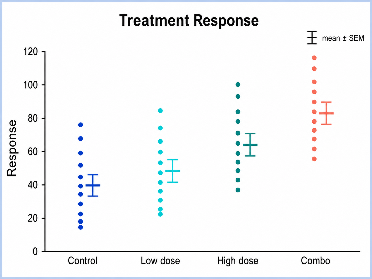
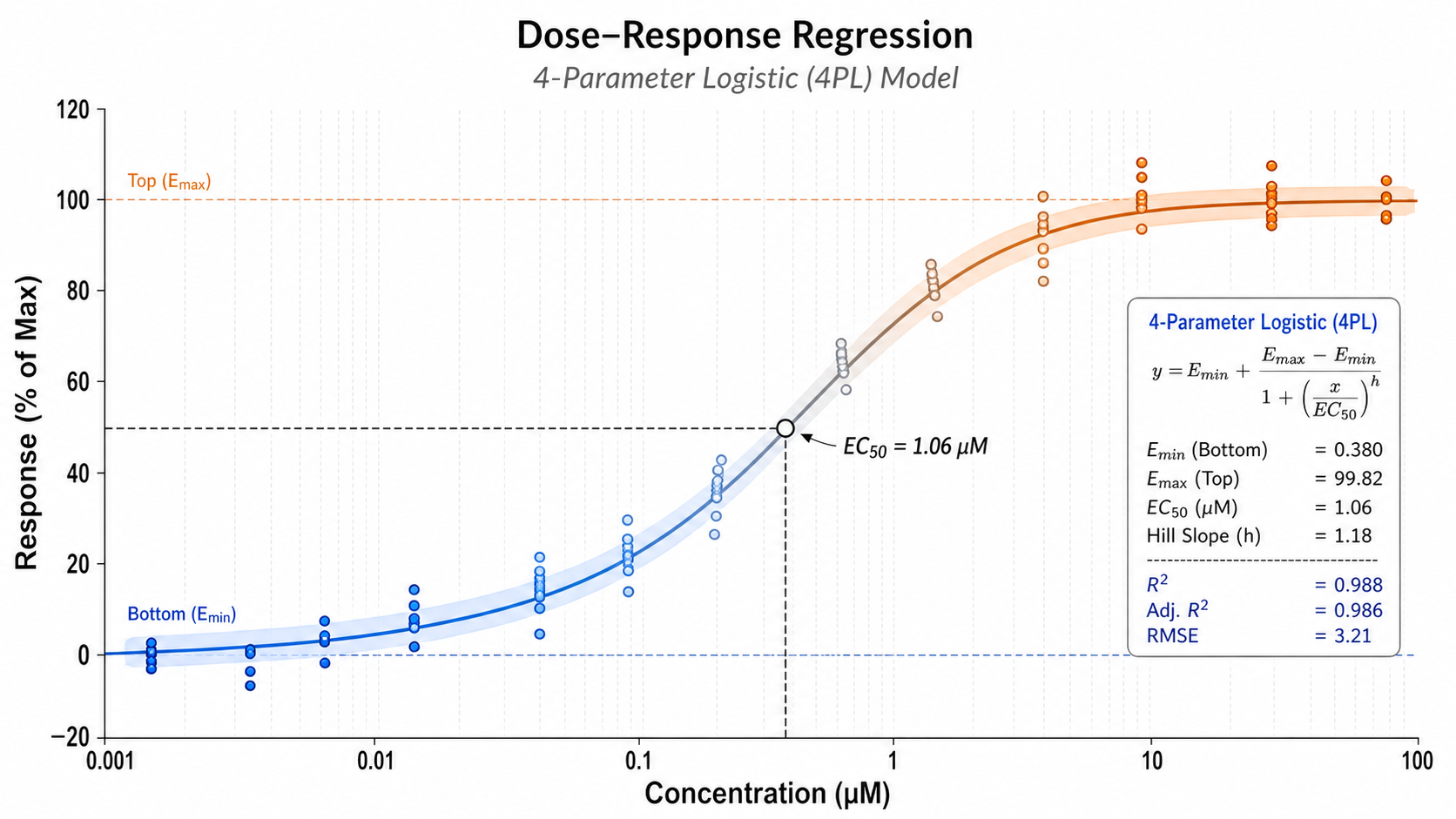
Dose-Response Regression regression plot example preview
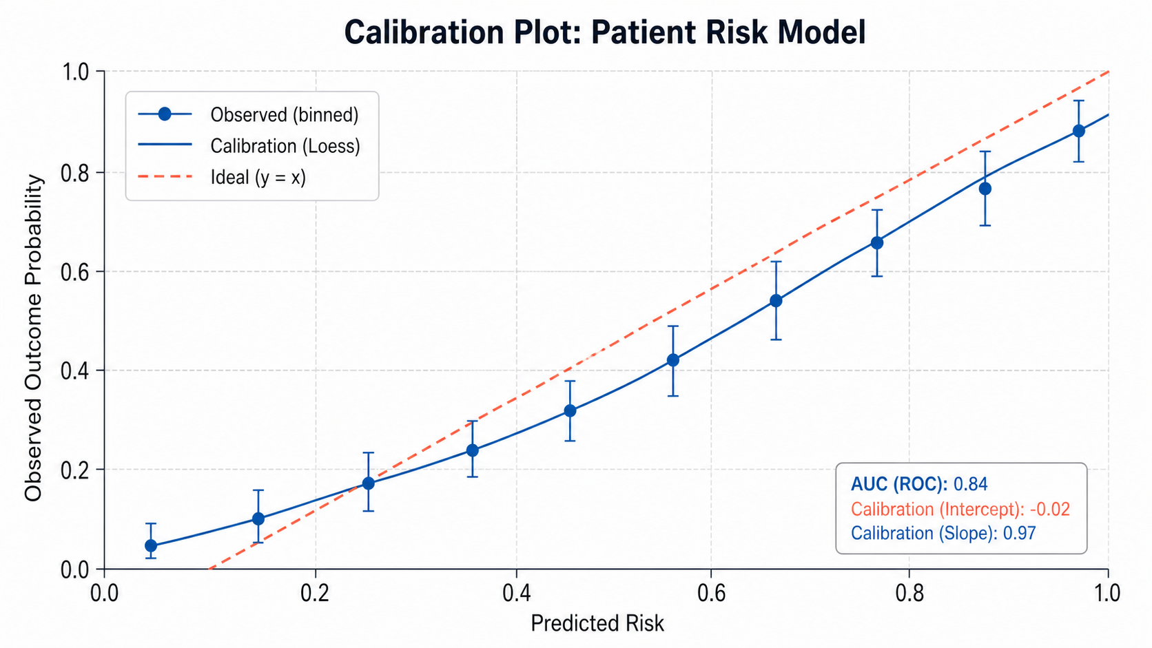
Assay Calibration Fit regression plot example preview
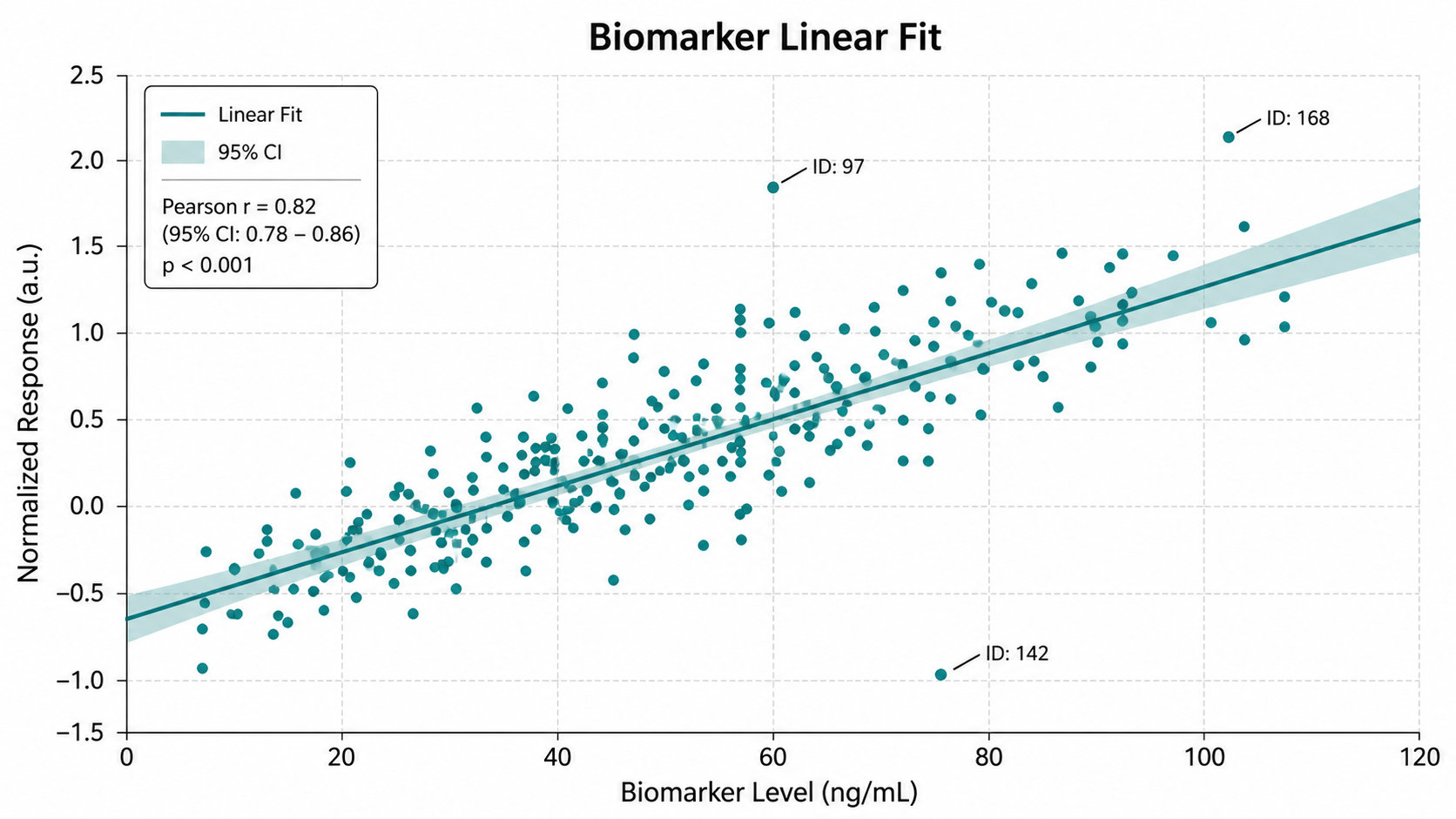
Biomarker Linear Fit regression plot example preview

These are sample previews. Upload your dataset to generate your own regression plot.

Regression plot examples

Use these examples as visual directions for fitted relationships, calibration curves, dose-response models, grouped trends, and regression diagnostics.

Regression Plot Generator for Scientific Data: Dose-Response Regression scientific chart example

Prompt

Based on the uploaded dose_response_curve.xlsx file, create a regression plot showing drug concentration on the x-axis and normalized response on the y-axis. Use individual replicate points, fit a smooth dose-response trend when appropriate, show treatment groups with subtle colors, add a light confidence band only if supported, and keep the layout publication-ready.
Dose-Response Regression

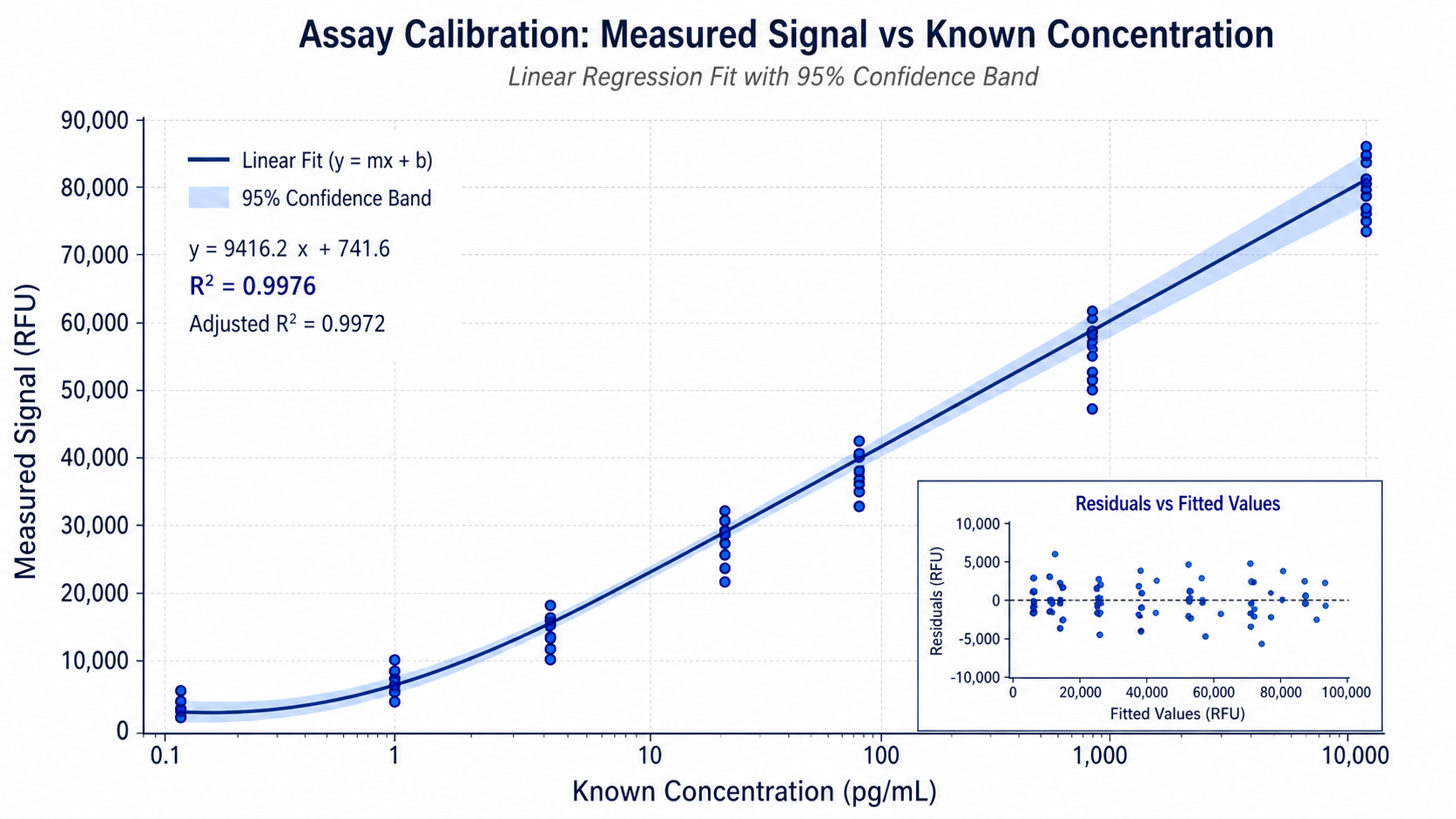
Regression Plot Generator for Scientific Data: Assay Calibration Fit scientific chart example

Prompt

Based on the uploaded assay_calibration_standards.tsv file, create a calibration regression plot with known concentration on the x-axis and signal intensity on the y-axis. Show replicate measurements as points, add a fitted regression line, include equation or R-squared only if available in the uploaded data, and style the chart for a methods or supplementary figure.

Assay Calibration Fit

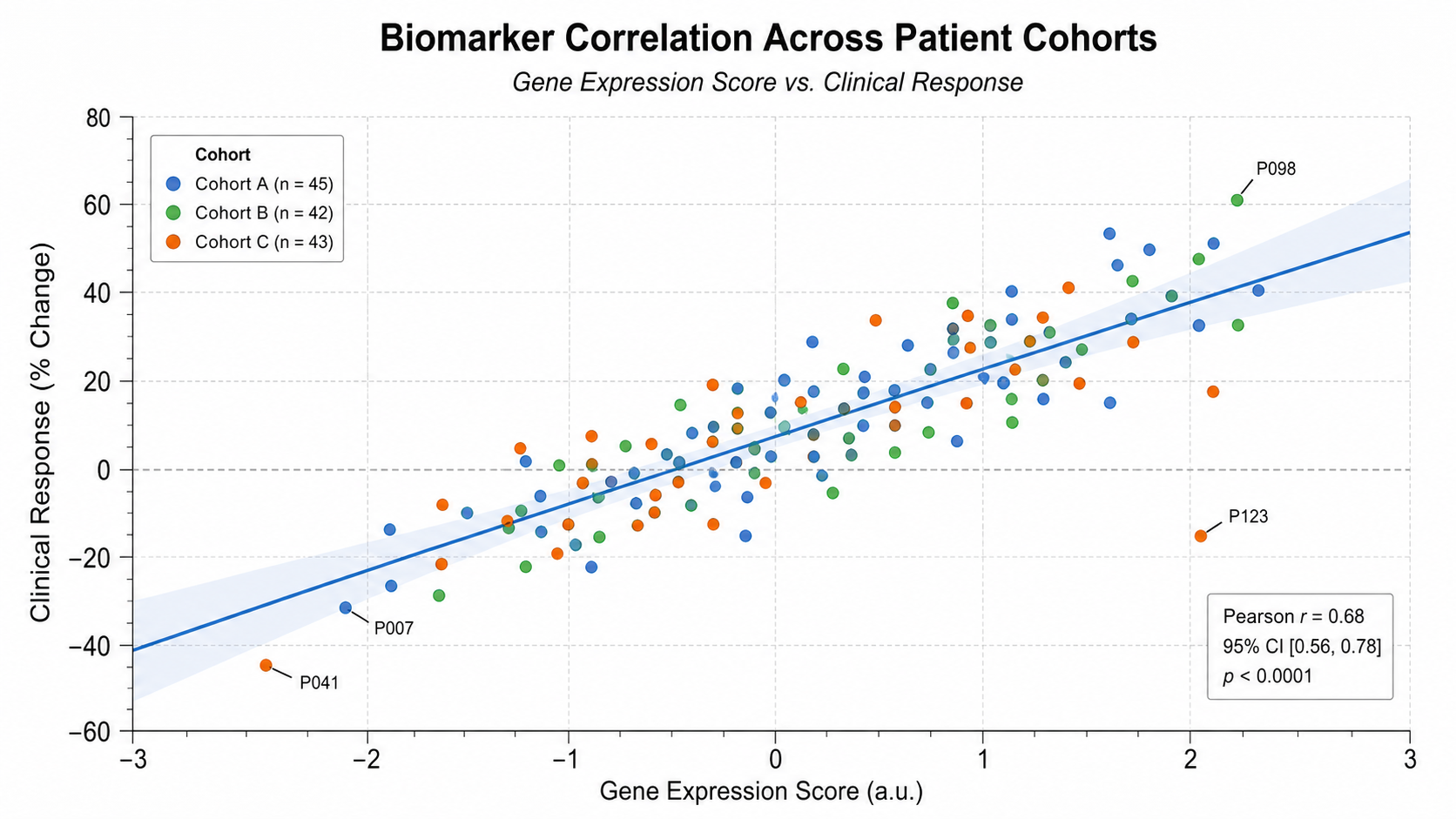
Regression Plot Generator for Scientific Data: Biomarker Linear Fit scientific chart example

Prompt

Based on the uploaded biomarker_regression.csv file, create a clean scientific regression plot showing biomarker score on the x-axis and clinical response on the y-axis. Add individual sample points, a fitted linear regression line, a light confidence band, and label only the most important influential observations.

Biomarker Linear Fit

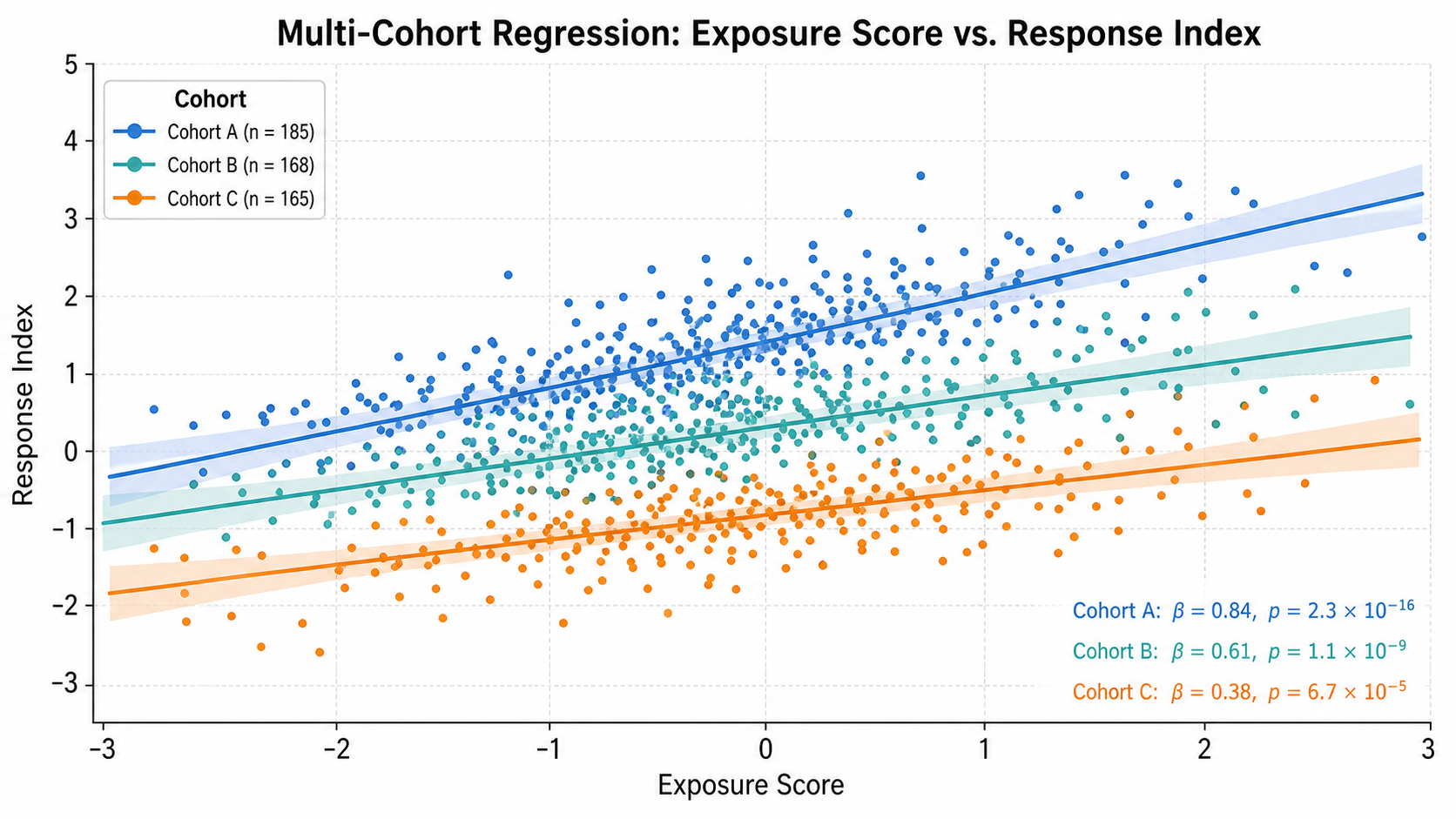
Regression Plot Generator for Scientific Data: Multi-Cohort Regression scientific chart example

Prompt

Based on the uploaded multi_cohort_regression.xlsx file, create a grouped regression plot showing the relationship between the selected predictor and response variables across multiple cohorts. Use separate point colors for each cohort, add either one overall fitted line or cohort-specific fitted lines based on the data structure, and keep legends and annotations compact.

Multi-Cohort Regression

Regression Plot Generator for Scientific Data: Patient Risk Model scientific chart example

Prompt

Based on the uploaded patient_risk_model.csv file, create a clinical regression plot comparing baseline risk score on the x-axis with follow-up outcome score on the y-axis. Color points by responder status, add a fitted trend line with a subtle confidence band when appropriate, highlight clear clusters without overcrowding the chart, and use a restrained clinical research style.

Patient Risk Model

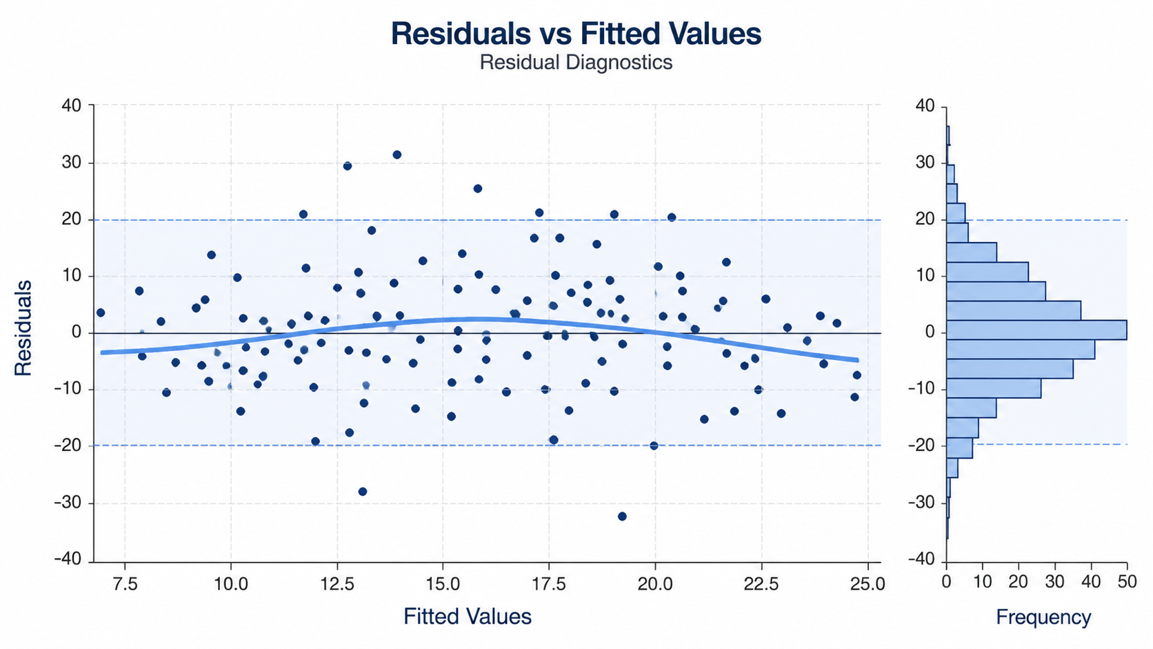
Regression Plot Generator for Scientific Data: Residual Diagnostics scientific chart example

Prompt

Based on the uploaded residual_diagnostic_data.csv file, create a regression diagnostics plot showing fitted values on the x-axis and residuals on the y-axis. Add a horizontal zero reference line, show residual points clearly, highlight potential outliers, and use a clean scientific layout that helps researchers evaluate model fit.

Residual Diagnostics

How to make a regression plot

1

Upload your dataset

Add CSV, TSV, TXT, or Excel data with at least two numeric columns for the predictor and response variables.

2

Describe the model view

Tell SciFigure AI whether you need a linear fit, dose-response curve, confidence band, group colors, labels, or diagnostics.

3

Generate, review & export

Create a clean regression plot, verify the fitted relationship and annotations, then download PNG for papers and slides.

What does this regression plot generator do?

It turns paired scientific measurements into a clean regression plot for showing modeled relationships between variables. Use it for calibration curves, dose-response data, biomarker associations, patient outcome models, QC trends, and other x-y datasets that need a fitted visual trend.

Why use a regression plot generator

  • Show observed data together with a fitted relationship.
  • Compare modeled trends across cohorts, treatments, or batches.
  • Add confidence bands, reference lines, and compact annotations when appropriate.
  • Move from spreadsheet data to a polished scientific figure faster.

Types and parts of a regression plot

  • Points show the original observations from the uploaded dataset.
  • The fitted line or curve summarizes the modeled relationship.
  • Confidence bands communicate uncertainty when the data and requested model support them.
  • Group colors, labels, and residual views help readers interpret model fit.

Regression Plot Generator FAQ

What data does the regression plot need?

A regression plot needs at least two numeric columns: one predictor for the x-axis and one response for the y-axis. Optional group and label columns can guide colors and annotations.

Can I make a dose-response or calibration curve?

Yes. Upload the measurements and describe the fitted curve or calibration view you need. Always verify model choice and reported statistics before publication.

Can I add confidence bands?

Yes, when the uploaded data and requested model support them. The generator should not invent statistical values that are not present or explicitly requested.

Can I compare groups?

Yes. Use a cohort, treatment, batch, or responder-status column to request grouped points and separate or shared fitted trends.

Can I use the result in a paper?

Yes, but verify source data, model assumptions, coefficients, intervals, labels, and captions before submission.

Need clearer model figures?

Create regression plots, scatter plots, calibration curves, and other research-ready visualizations from your uploaded data.