Line Chart Generator for Scientific Data

Create publication-ready line charts from uploaded research data.

Upload time-course, trend, or ordered measurement data, describe the figure you need, and generate a clean line chart with readable axes, grouped series, markers, labels, and manuscript-ready styling.

Ordered data readyGrouped trends & markersPublication-ready PNG

AI Line Chart Generator

Upload data and describe the AI chart you need.

Aspect ratio
309 / 2000 characters

Costs 5 credits. Uses your uploaded data and prompt to generate a publication-ready PNG.

Preview

Line Chart Example Previews

Aspect ratio: 16:9

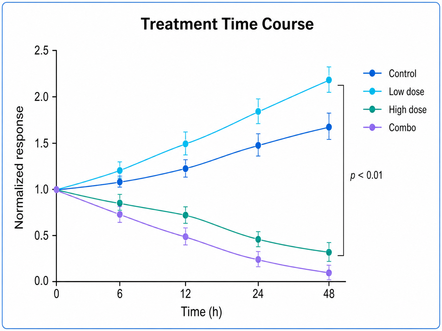
Treatment Time Course line chart example preview
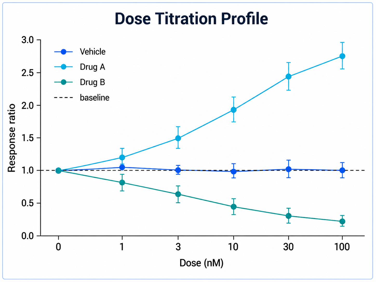
Dose Titration Profile line chart example preview
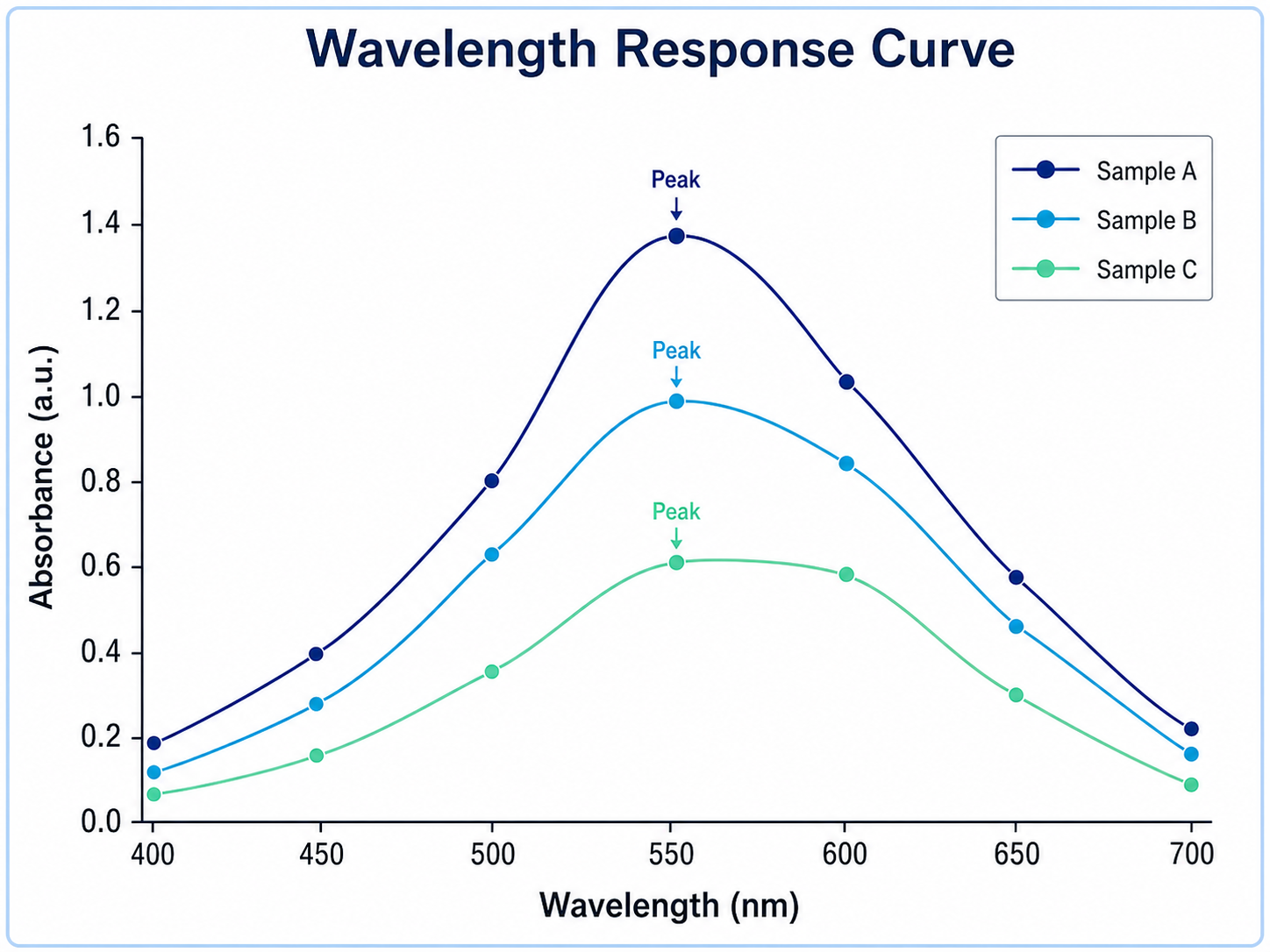
Wavelength Response Curve line chart example preview

These are sample previews. Upload your dataset to generate your own line chart.

Line chart examples

Use these examples as visual directions for time courses, dose profiles, growth curves, kinetics, and ordered experimental trends.

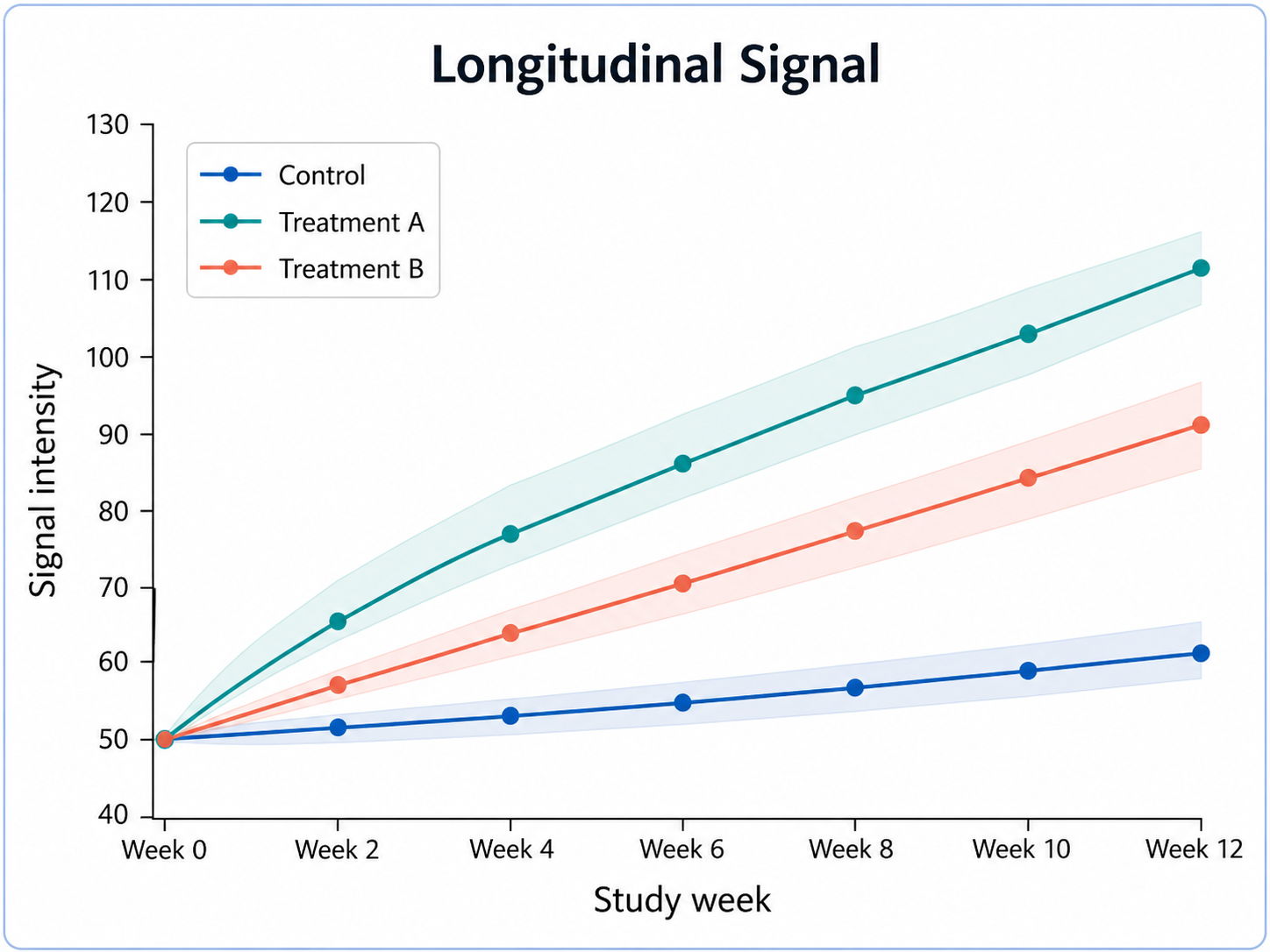
Line Chart Generator for Scientific Data: Treatment Time Course scientific chart example

Prompt

Based on the uploaded treatment_timecourse.csv file, create a publication-ready line chart showing response over time for each treatment group. Plot time on the x-axis and normalized response on the y-axis, use distinct group colors, add point markers, include uncertainty bands only if present in the data, and keep the legend compact.
Treatment Time Course

Line Chart Generator for Scientific Data: Dose Titration Profile scientific chart example

Prompt

Based on the uploaded dose_titration_profile.xlsx file, create a grouped line chart comparing signal across ordered dose levels. Use dose on the x-axis, response on the y-axis, one line per formulation or condition, readable markers, direct labels when helpful, and a clean manuscript-ready color palette.

Dose Titration Profile

Line Chart Generator for Scientific Data: Wavelength Response Curve scientific chart example

Prompt

Based on the uploaded wavelength_response_curve.tsv file, create a scientific line chart showing absorbance across ordered wavelength values. Use a single clean line with markers, label the peak response only if it is supported by the uploaded values, and keep axis units and spacing readable.

Wavelength Response Curve

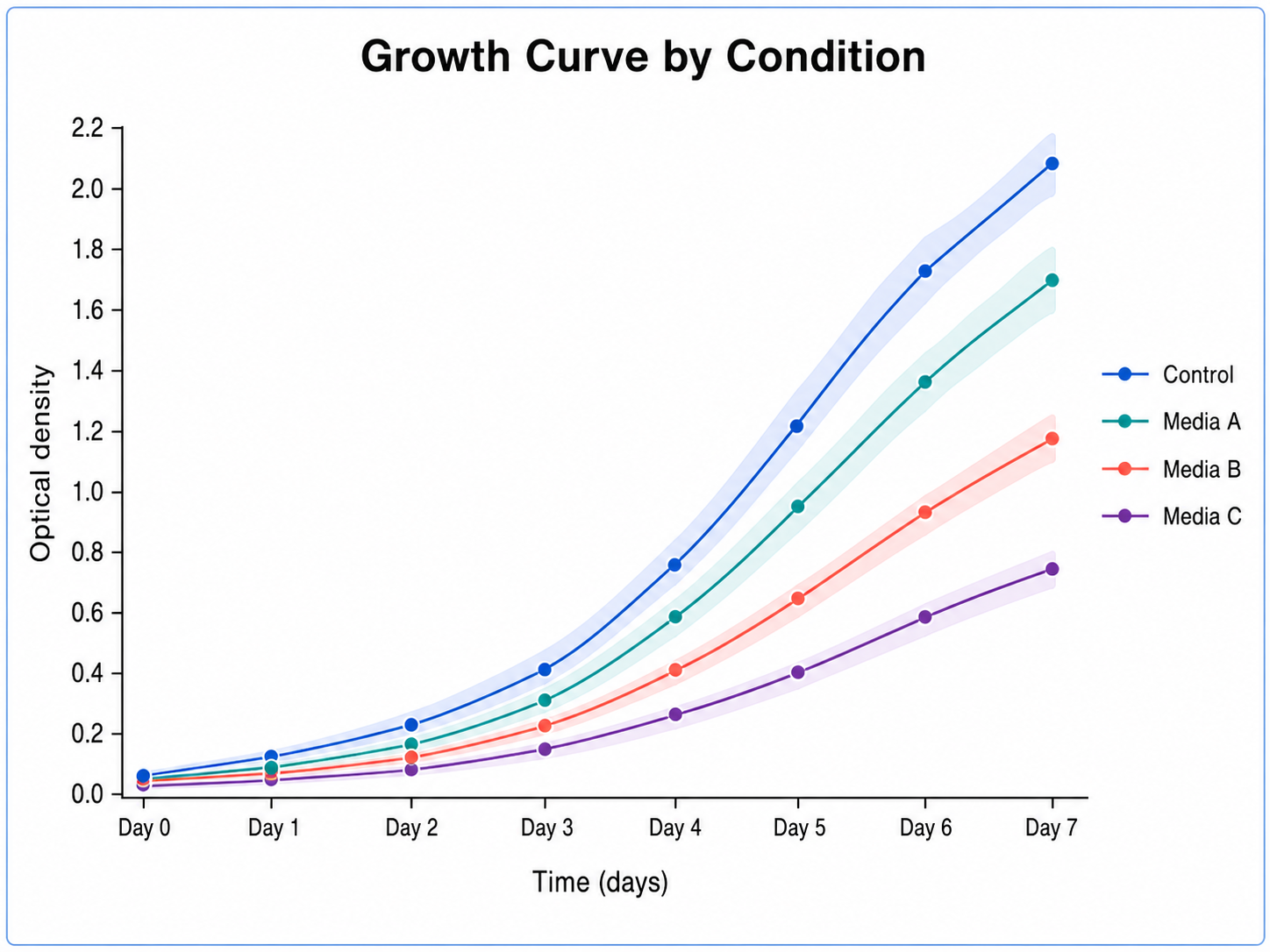
Line Chart Generator for Scientific Data: Growth Curve by Condition scientific chart example

Prompt

Based on the uploaded growth_curve_conditions.csv file, create a line chart showing growth index across study days for each condition. Use separate lines for nutrient or treatment groups, preserve observed measurement points, avoid inventing missing days, and keep the figure suitable for a results panel.

Growth Curve by Condition

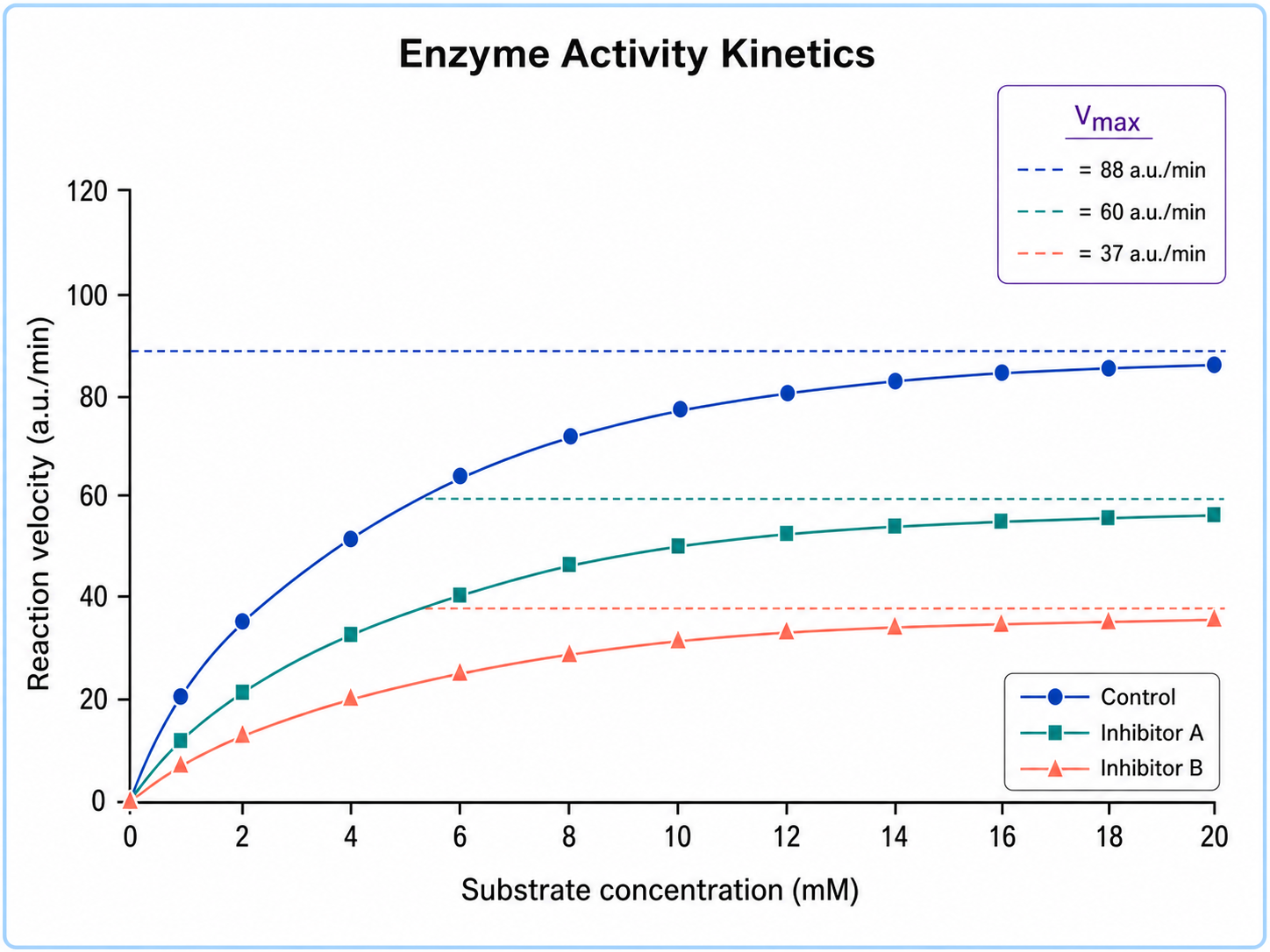
Line Chart Generator for Scientific Data: Enzyme Activity Kinetics scientific chart example

Prompt

Based on the uploaded enzyme_activity_kinetics.xlsx file, create a line chart showing reaction velocity across ordered substrate concentrations. Use clear markers, highlight the half-max region only if supported by the data, label the axes with units, and avoid decorative effects that reduce scientific clarity.

Enzyme Activity Kinetics

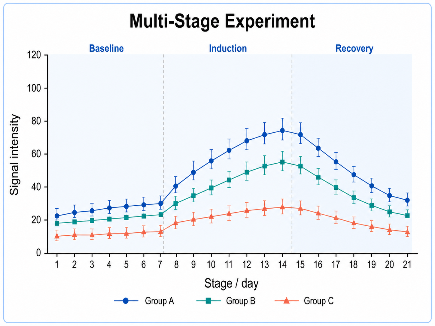
Line Chart Generator for Scientific Data: Multi-Stage Experiment scientific chart example

Prompt

Based on the uploaded multi_stage_experiment.csv file, create a multi-series line chart comparing measurements across ordered experimental stages. Use one line per batch or condition, compact legends, readable markers, and a journal-safe palette while preserving the original stage order.

Multi-Stage Experiment

How to make a line chart

1

Upload your dataset

Add CSV, TSV, TXT, or Excel data with an ordered x-axis column and at least one numeric measurement column.

2

Describe the chart

Tell SciFigure AI which trends, groups, markers, labels, and visual style you want for the final figure.

3

Generate, review & export

Create a clean line chart, check the series and labels, then download PNG for papers and slides.

What does this line chart generator do?

It turns uploaded ordered measurements into a clean line chart for showing changes across time, dose, wavelength, sample order, visits, or experimental stages. The result is designed for manuscripts, reports, posters, and presentations.

Why use a line chart generator

  • Show changes across time or ordered experimental conditions.
  • Compare multiple groups without rebuilding charts by hand.
  • Preserve observed data points while making trends easy to read.
  • Create consistent, publication-ready figures from spreadsheet data faster.

Types and parts of a line chart

  • The x-axis should represent time, dose, order, or another meaningful sequence.
  • The y-axis should represent a numeric measurement.
  • Multiple lines can compare treatments, cohorts, genes, batches, or conditions.
  • Markers, error bars, reference bands, and annotations should only appear when supported by the data.

Line Chart Generator FAQ

What data does the line chart need?

Use a dataset with one ordered x-axis column and at least one numeric measurement column. A group column can create multiple lines.

Can I make grouped line charts?

Yes. Upload a group, treatment, cohort, gene, or condition column and the generator can draw separate lines for each series.

Can the chart include error bars?

Yes, if the uploaded data includes replicate, standard deviation, standard error, confidence interval, or similar uncertainty values.

When should I not use a line chart?

Avoid line charts when the x-axis categories have no natural order. A bar chart, dot plot, or scatter plot may be clearer.

Can I use the result in a paper?

Yes, but verify the source data, labels, units, time/order, and statistical annotations before submission.

Need clearer trend figures?

Generate line charts, time courses, grouped trends, and other scientific figures with SciFigure AI.