Bar Chart Generator for Scientific Data

Create publication-ready bar charts from categorical research data.

Upload category and value columns, describe the comparison you need, then generate a clean AI chart with labels, optional error bars, and manuscript-ready PNG output.

Categorical data readyGrouped bars & labelsPublication-ready PNG

AI Bar Chart Generator

Upload data and describe the AI chart you need.

Aspect ratio
302 / 2000 characters

Costs 5 credits. Uses your uploaded data and prompt to generate a publication-ready PNG.

Preview

Bar Chart Example Previews

Aspect ratio: 16:9

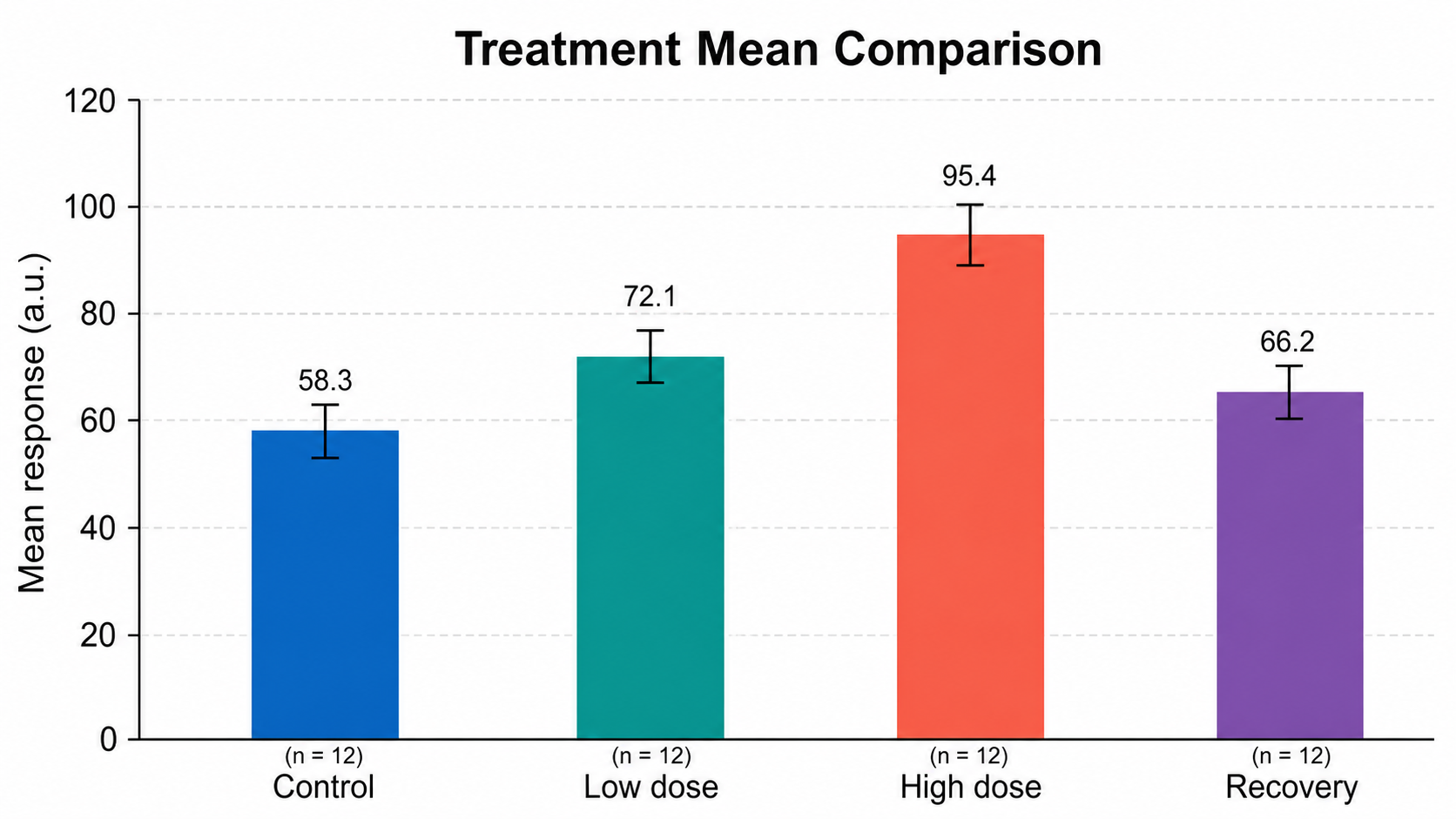
Treatment Mean Comparison bar chart example preview
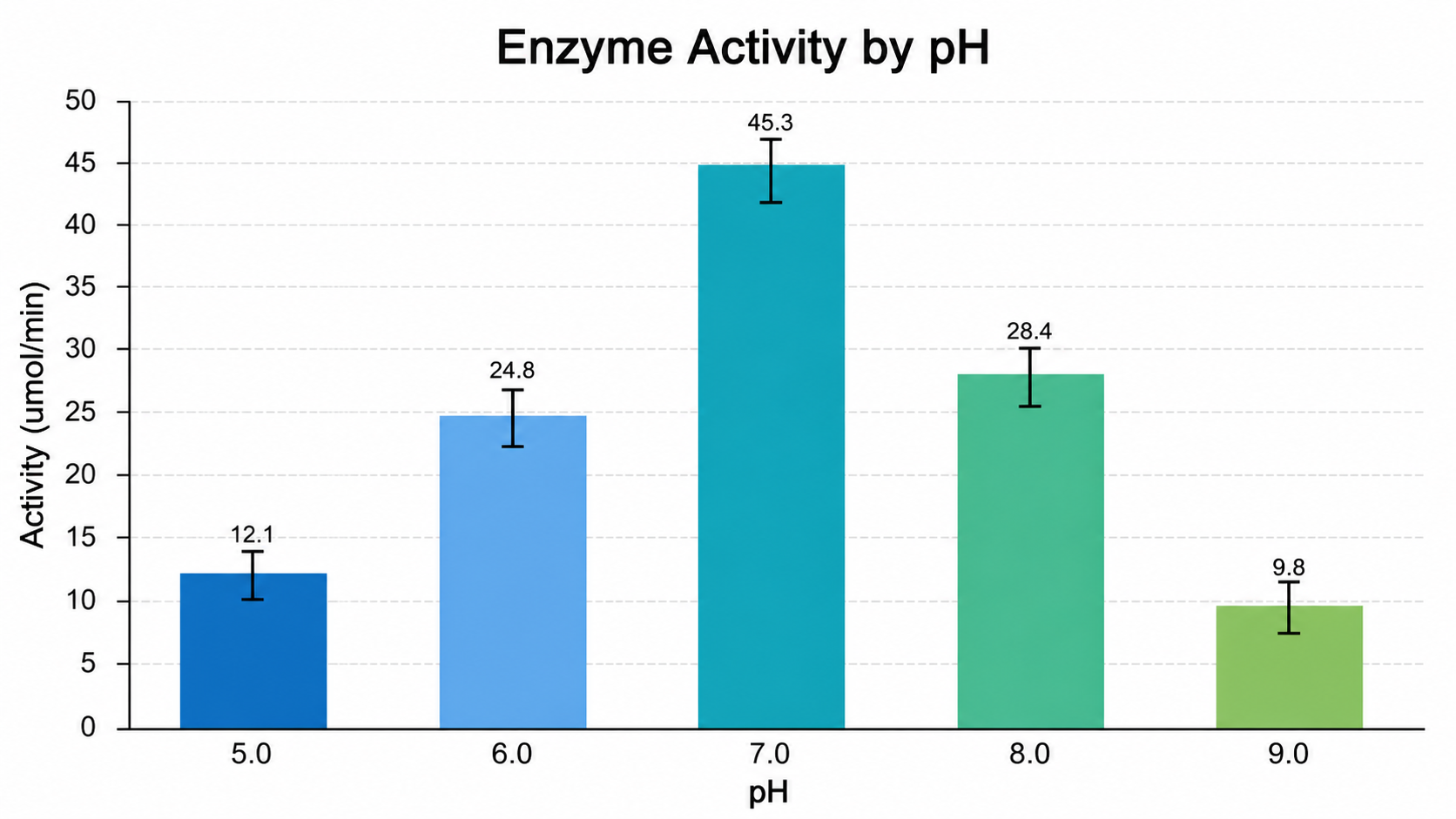
Enzyme Activity by pH bar chart example preview
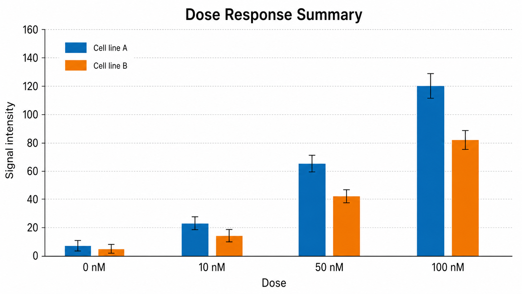
Dose Response Summary bar chart example preview

These are sample previews. Upload your dataset to generate your own bar chart.

Bar chart examples

Use these examples as visual directions for categorical comparisons, grouped bars, stacked bars, and manuscript-ready summary figures.

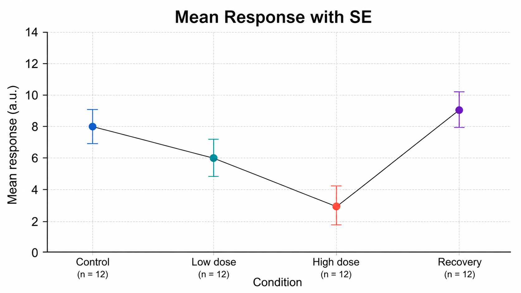
Bar Chart Generator for Scientific Data: Treatment Mean Comparison scientific chart example

Prompt

Based on the uploaded treatment_means.csv file, create a clean scientific bar chart comparing mean response across Control, Low dose, High dose, and Recovery groups. Use a zero-based y-axis, SD error bars, sample-size labels, direct value labels, clear group names, and a blue/teal/coral/purple publication palette.
Treatment Mean Comparison

Bar Chart Generator for Scientific Data: Enzyme Activity by pH scientific chart example

Prompt

Based on the uploaded enzyme_activity_ph.xlsx file, create a publication-ready bar chart showing enzyme activity across pH 5.0, 6.0, 7.0, 8.0, and 9.0. Keep pH on the category axis, activity on the y-axis, include supplied error bars, and highlight the peak near neutral pH with restrained scientific styling.

Enzyme Activity by pH

Bar Chart Generator for Scientific Data: Dose Response Summary scientific chart example

Prompt

Based on the uploaded dose_response_summary.csv file, create a grouped bar chart comparing Cell line A and Cell line B across 0 nM, 10 nM, 50 nM, and 100 nM doses. Use SEM error bars, a compact legend, readable dose labels, a zero-based y-axis, and a clean blue/orange manuscript style.

Dose Response Summary

Bar Chart Generator for Scientific Data: Gene Expression by Group scientific chart example

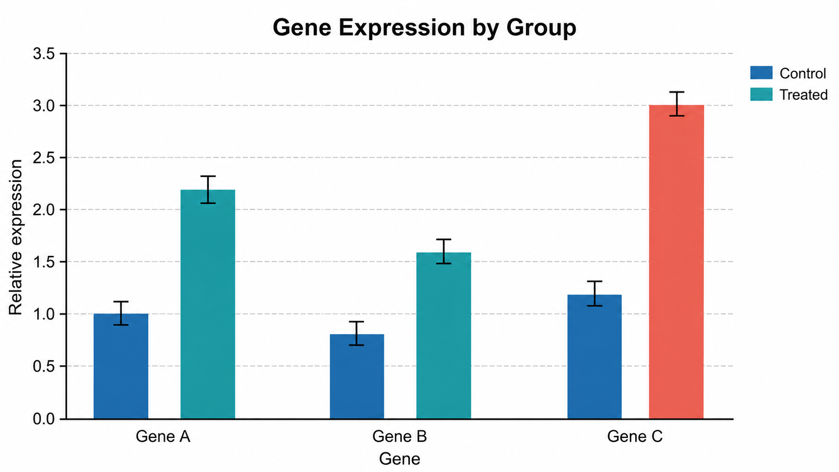
Prompt

Based on the uploaded gene_expression_groups.tsv file, create a grouped scientific bar chart comparing relative expression for Gene A, Gene B, and Gene C across Control and Treated conditions. Include SEM error bars, a compact legend, clear y-axis label, and a journal-safe blue/teal/coral palette.

Gene Expression by Group

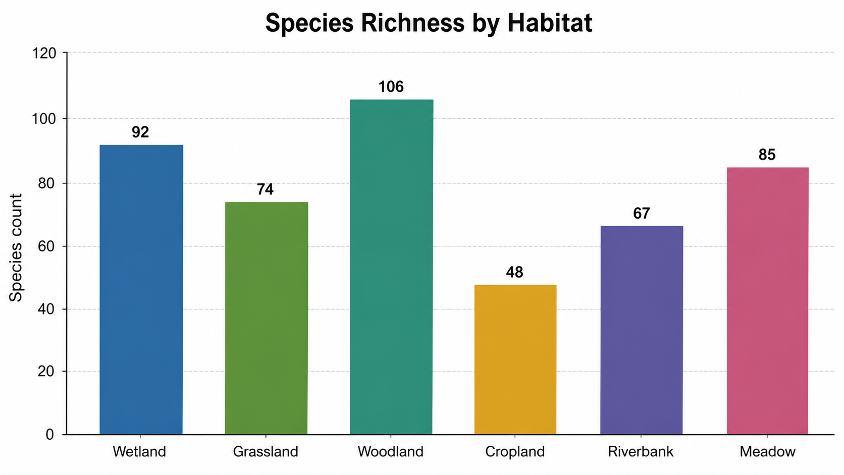
Bar Chart Generator for Scientific Data: Species Richness by Habitat scientific chart example

Prompt

Based on the uploaded habitat_species_richness.csv file, create a bar chart comparing observed species counts across Wetland, Grassland, Woodland, Cropland, Riverbank, and Meadow habitats. Use direct value labels, readable category labels, a zero-based y-axis, light gridlines, and restrained scientific colors.

Species Richness by Habitat

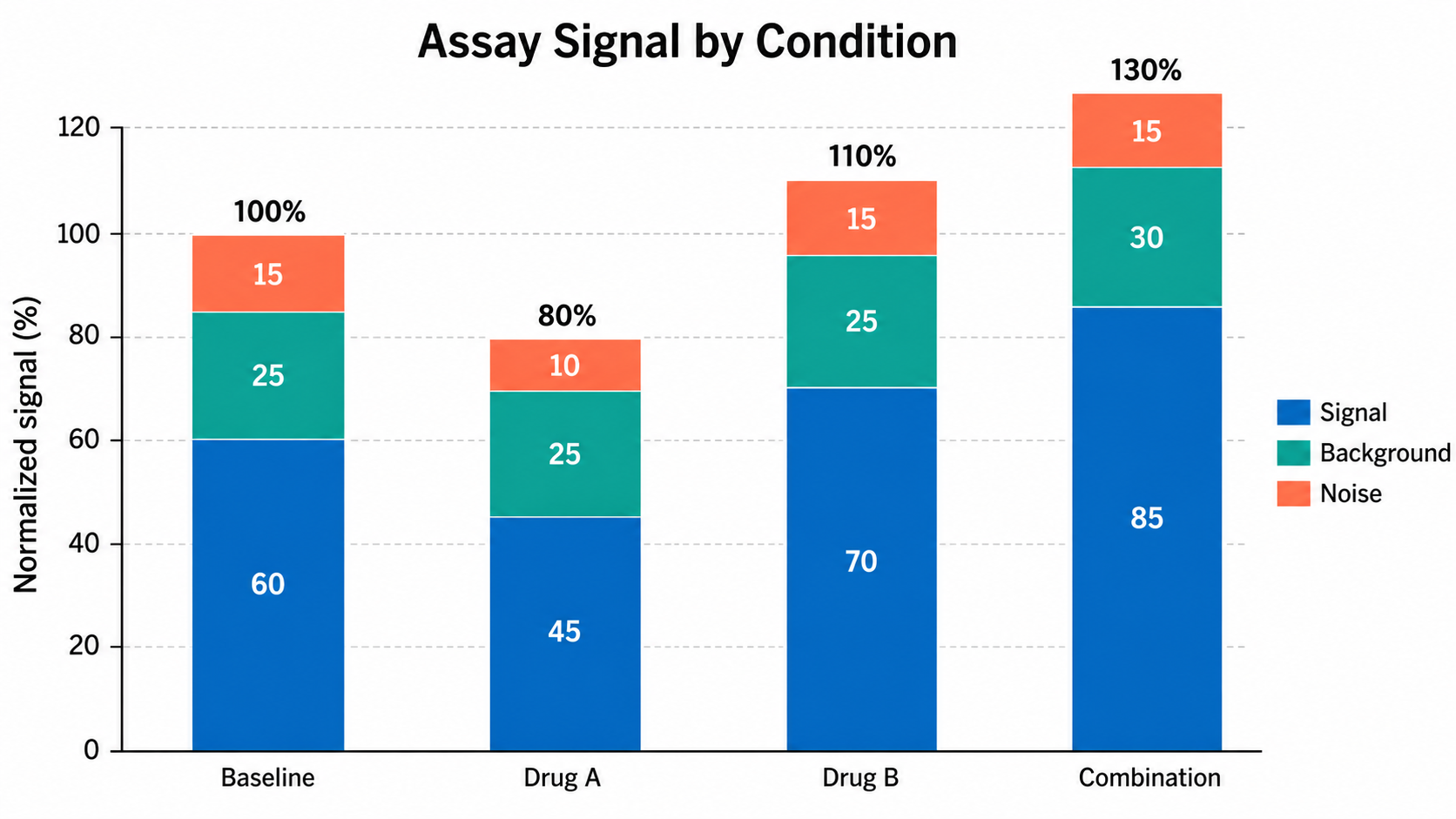
Bar Chart Generator for Scientific Data: Assay Signal by Condition scientific chart example

Prompt

Based on the uploaded assay_signal_components.xlsx file, create a stacked bar chart for Baseline, Drug A, Drug B, and Combination conditions. Stack Signal, Background, and Noise components, show total labels, include a compact legend, use a normalized signal y-axis, and keep the chart clean for a manuscript figure.

Assay Signal by Condition

How to make a bar chart

1

Upload your dataset

Add CSV, TSV, TXT, or Excel data with a category column and one or more numeric value columns.

2

Describe the chart

Tell SciFigure AI whether you need simple, grouped, stacked, ordered, or error-bar-supported bars.

3

Generate, review & export

Create a clean AI bar chart, check labels and values, then download PNG for papers and slides.

What does this bar chart generator do?

It turns categorical research data into a clean bar chart for comparing means, counts, totals, percentages, or grouped values across treatments, cohorts, genes, habitats, assays, and experimental conditions.

Why use a bar chart generator

  • Compare a small number of discrete categories against a common baseline.
  • Create grouped or stacked summaries without rebuilding the chart by hand.
  • Add labels, legends, units, and optional uncertainty cues from the uploaded data.
  • Move from spreadsheet summaries to a polished scientific figure faster.

Types and parts of a bar chart

  • Each bar encodes a category value, such as a mean, count, total, or percentage.
  • Grouped bars compare series within each category.
  • Stacked bars show component contributions to a total.
  • Error bars should only appear when the uploaded data includes SD, SE, CI, or another uncertainty column.

Bar Chart Generator FAQ

What data does the bar chart need?

Use one category column plus at least one numeric value column. Optional series, SD, SE, or CI columns can guide grouped bars and uncertainty.

Can I make grouped or stacked bar charts?

Yes. Upload a series or component column and describe whether the final figure should use grouped bars, stacked bars, or separate panels.

Should a bar chart start at zero?

For ordinary bar charts, a zero baseline is usually the clearest and least misleading choice.

When should I not use a bar chart?

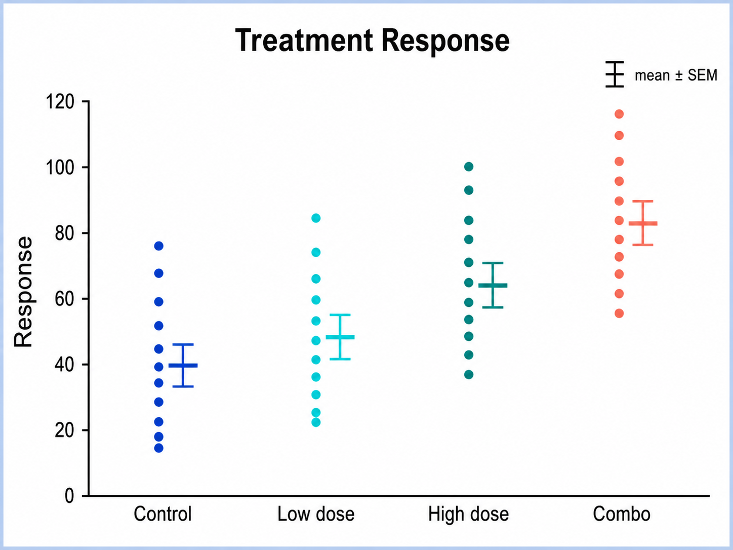
Use a dot plot, box plot, or violin plot when raw observations, sample size, or distribution shape matter more than summary values.

Can I use the result in a paper?

Yes, but verify the uploaded data, units, labels, uncertainty definition, and caption before submission.

Need clearer categorical figures?

Generate bar charts, error bar charts, dot plots, and other research-ready visualizations with SciFigure AI.