Prompt
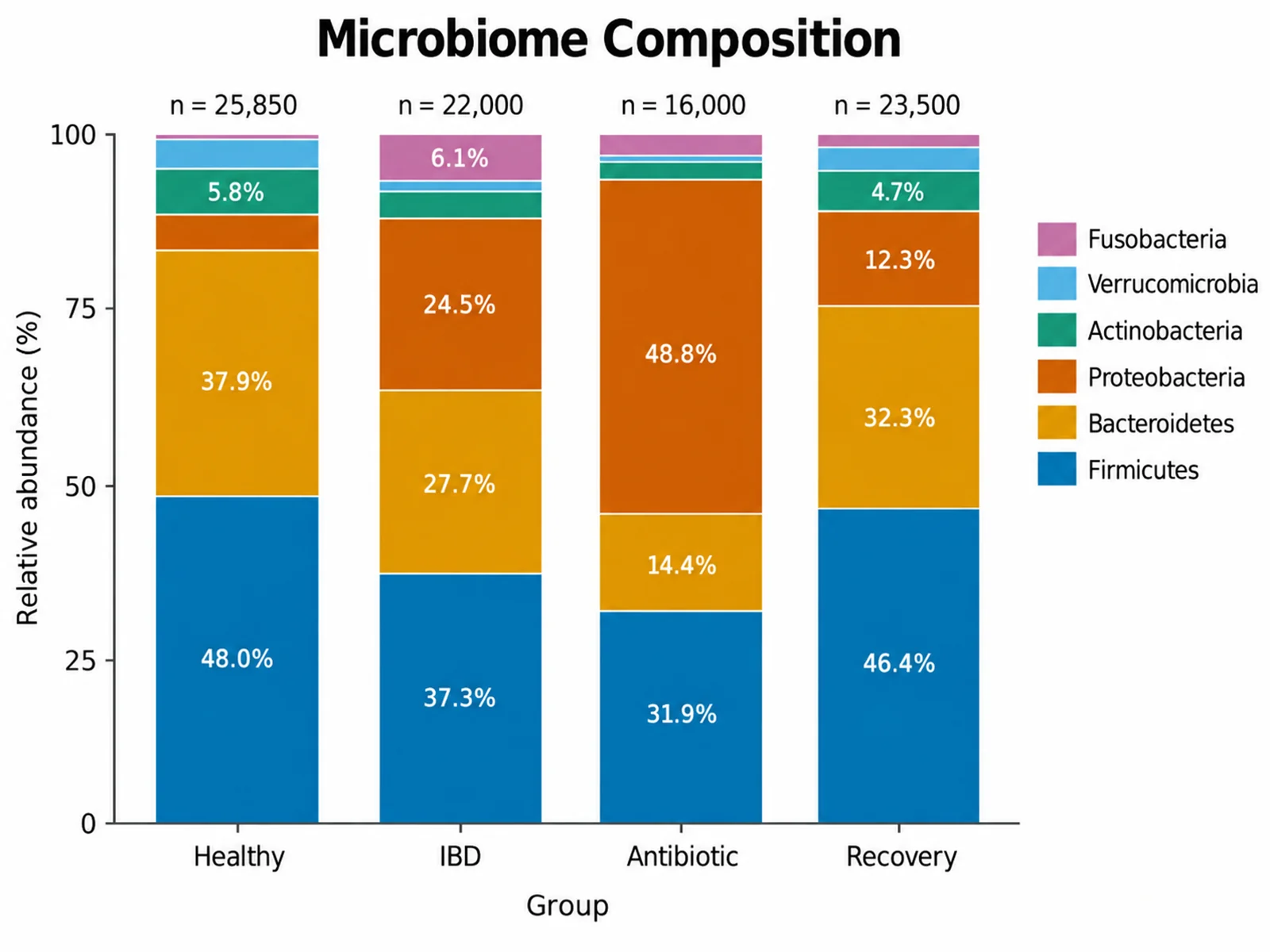
Based on the uploaded phylum_counts.csv file, create a 100% stacked bar chart of relative abundance by phylum for Healthy, IBD, Antibiotic, and Recovery groups, with percentages printed inside segments of at least 5%.
Show part-to-whole composition across groups with absolute or 100% stacked bars.
Upload CSV or Excel data in long or wide format, and SciFigure adds up every bar, computes each segment share, and draws a clean stacked bar chart you can use in a paper, lab report, poster, or class assignment.
Upload data and describe the stacked bars you need.
Costs 5 credits. Totals, segment values, and percentages are computed from your uploaded data, then drawn as a PNG.
Preview
Aspect ratio: 16:9
These are sample previews. Upload your dataset to generate your own stacked bar chart.
Use these examples as starting points for microbiome composition, survey results, energy or budget breakdowns, and cell-type proportions.
Prompt
Based on the uploaded phylum_counts.csv file, create a 100% stacked bar chart of relative abundance by phylum for Healthy, IBD, Antibiotic, and Recovery groups, with percentages printed inside segments of at least 5%.
Prompt
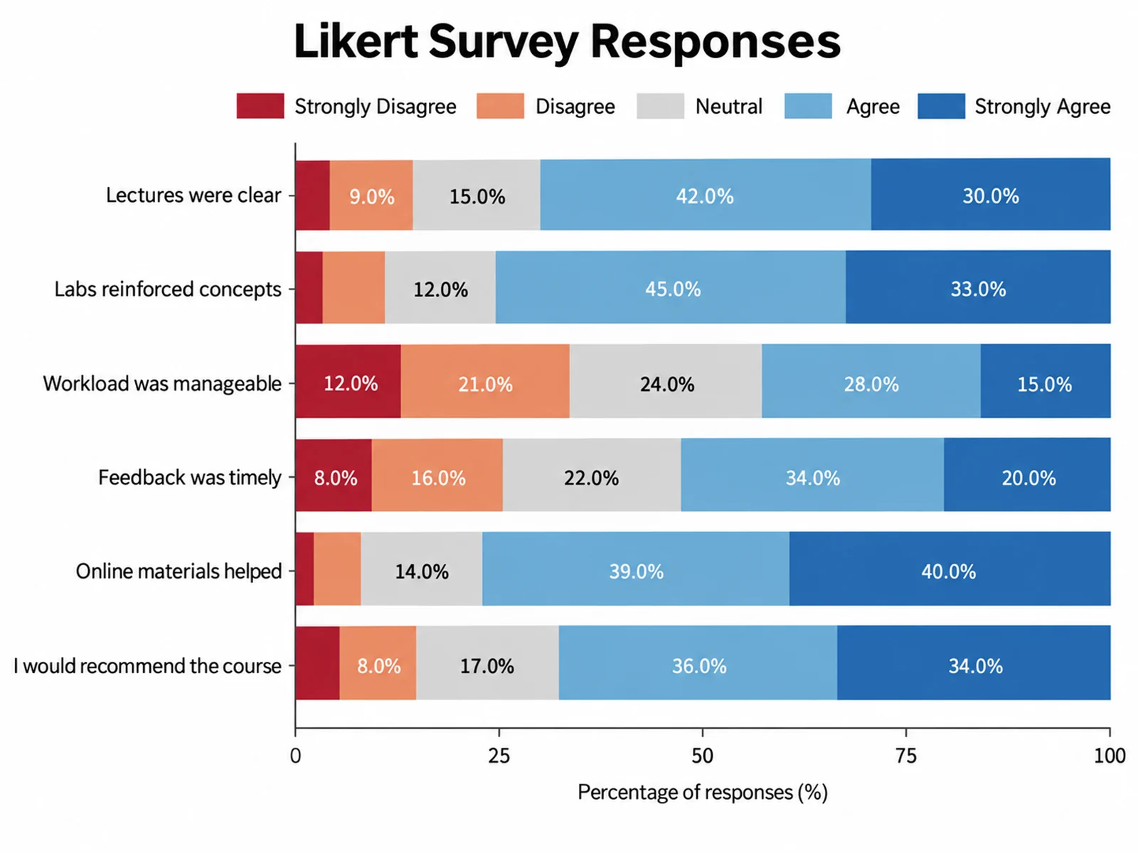
Based on the uploaded course_survey.xlsx file in wide format, create a horizontal 100% stacked bar chart with one bar per question and segments from Strongly Disagree to Strongly Agree, using a diverging red-to-blue palette.
Prompt
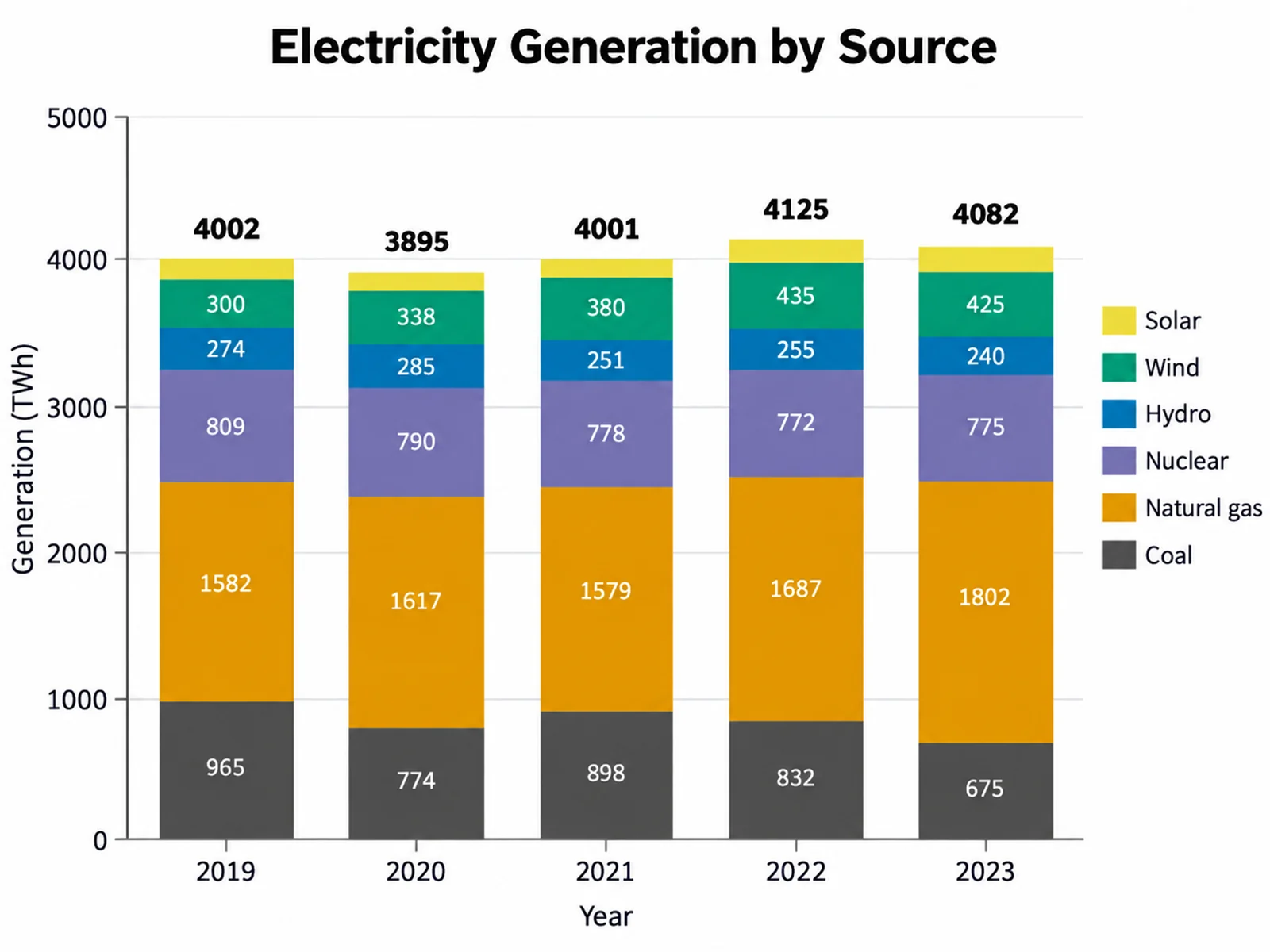
Based on the uploaded generation_by_year.csv file, create an absolute stacked column chart of electricity generation in TWh by source for each year, with totals printed above every column.
Prompt
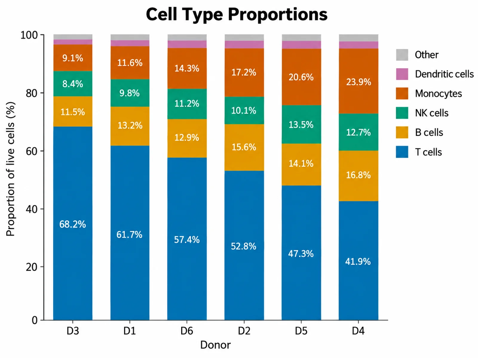
Based on the uploaded flow_cytometry_counts.csv file, create a 100% stacked bar chart of immune cell type proportions per donor, sorted by the T cell share, with a compact legend on the right.
Prompt
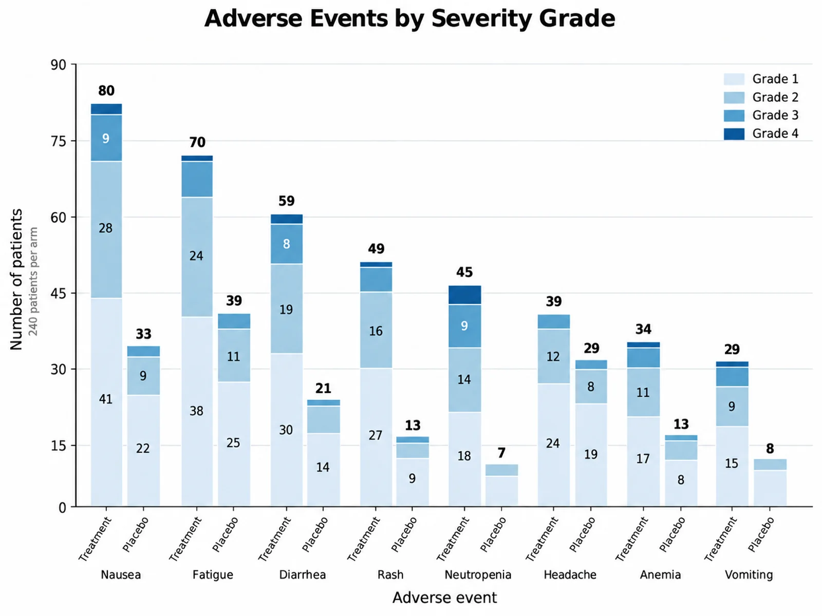
Based on the uploaded trial_adverse_events.csv file, create an absolute stacked bar chart of adverse event counts by CTCAE grade for the eight most common events, drawing a separate bar for the treatment arm and the placebo arm of each event. Stack grade 1 through grade 4 from light to dark in one sequential blue palette, sort the events by total count, print the total above every bar, and label the y-axis "Number of patients".
Prompt
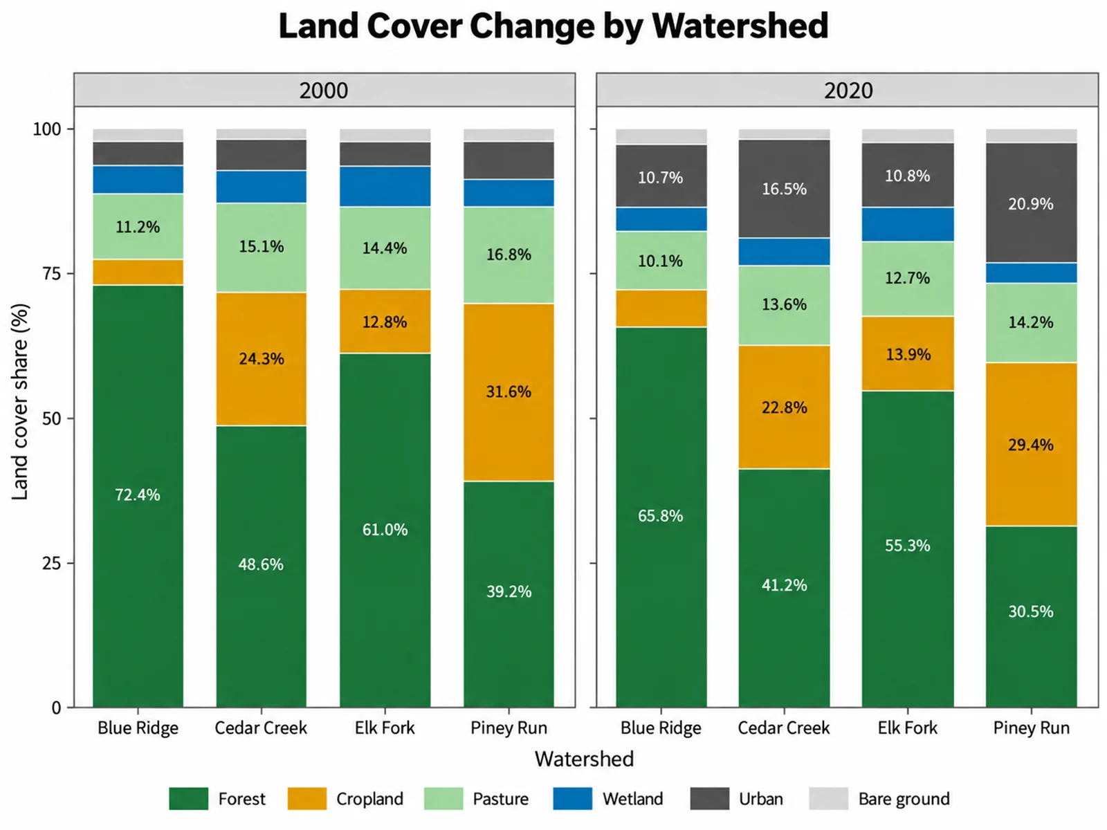
Based on the uploaded land_cover_shares.xlsx file, create a faceted 100% stacked bar chart of land cover share for four watersheds, with one panel for 2000 and one for 2020 sharing the same y-axis. Keep forest, cropland, pasture, wetland, urban, and bare ground in the same order and color in every bar, print percentages inside segments of at least 8%, and place one shared legend below the panels.
Add CSV, TSV, TXT, or Excel data. Use long format (group, segment, value) or wide format (one row per group and one numeric column per segment).
Pick the bar group column and, for long data, the segment and value columns. Then ask for absolute or 100% stacking, horizontal bars, sorting, and labels.
SciFigure computes totals and shares, draws the chart with those exact numbers, and lets you download a PNG.
It turns grouped numbers into a stacked bar chart, where each bar is a whole and each colored segment is one part of it. Before anything is drawn, the stacked bar chart maker adds duplicate rows together, totals each bar, and calculates the percentage each segment contributes. Those computed numbers are what the figure shows, so segment heights, percentage labels, and totals match your data. It works for research figures such as taxonomic composition or cell-type proportions, and for everyday coursework such as survey results or budget breakdowns.
Either long format with a bar group column, a segment column, and a numeric value column, or wide format with a bar group column and two or more numeric segment columns. The mapping panel detects which layout you uploaded.
The tool calculates them. Rows are aggregated, bar totals and segment shares are computed from your uploaded values, and the exact numbers are passed to the image model, which only handles layout and styling.
Include "100%", "percent", "proportion", or "relative" in your instructions. Each bar is then scaled to 100%, and the underlying totals are still reported so you can mention sample sizes.
Yes. Paste a small table such as survey counts or a monthly budget, describe the colors and labels you want, and download the PNG for a lab report, presentation, or poster.
The first 20 bars are shown, and when there are more than 12 segments the smallest ones by total are merged into a single "Other" segment. The chart notes what was combined or omitted.
Yes, but check that the segment order, colors, and totals are correct, state whether bars show counts or percentages, and report group sizes in the caption.
Generate stacked bar charts, bar charts, Sankey diagrams, and other research-ready visualizations with SciFigure AI.