Forest Plot Generator for Scientific Data

Create publication-ready forest plots from effect-size and confidence-interval data.

Upload study labels, effect estimates, and interval bounds, describe subgroups or summary rows, then generate a clean AI-made forest plot with manuscript-ready PNG output.

Effect-size data readyConfidence intervalsPublication-ready PNG

AI Forest Plot Generator

Upload data and describe the AI chart you need.

Aspect ratio
289 / 2000 characters

Costs 5 credits. Uses your uploaded data and prompt to generate a publication-ready PNG.

Preview

Forest Plot Example Previews

Aspect ratio: 16:9

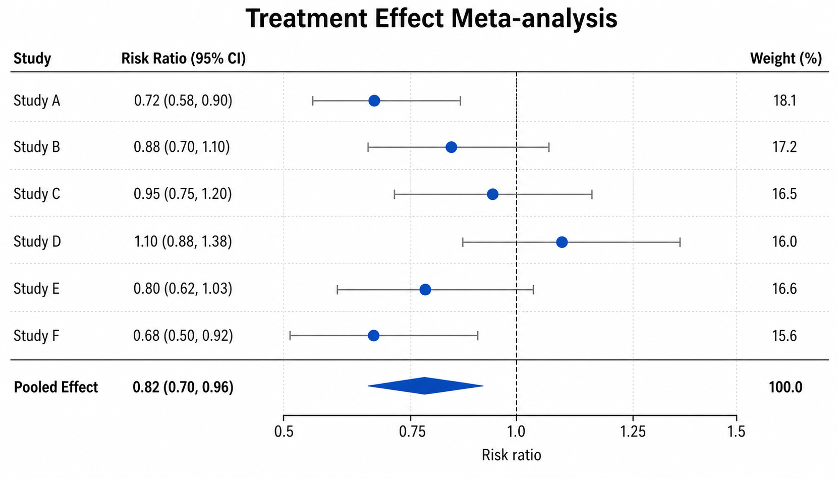
Treatment Effect Meta-analysis forest plot example preview
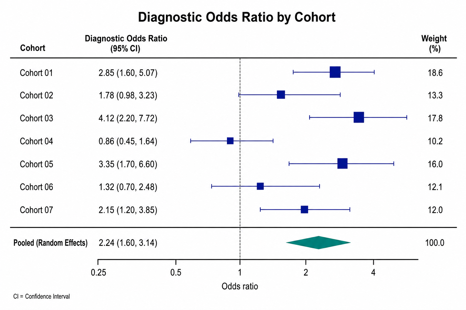
Diagnostic Odds Ratio forest plot example preview
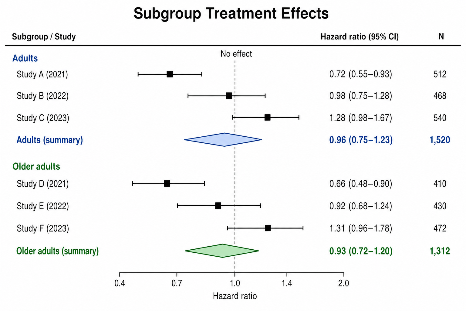
Subgroup Treatment Effects forest plot example preview

These are sample previews. Upload your dataset to generate your own forest plot.

Forest plot examples

Use these examples as visual directions for meta-analysis, subgroup effects, adjusted models, sensitivity checks, weighted studies, and manuscript-ready forest plots.

Forest Plot Generator: Treatment Effect Meta-analysis scientific chart example

Prompt

Based on the uploaded treatment_effect_meta_analysis.csv file, create a publication-ready forest plot comparing treatment effects across studies. Use the study label column, plot effect estimates with 95% confidence intervals, add a no-effect reference line at 1.0 for ratio measures, and include a pooled summary diamond only if the uploaded data contains an overall or pooled row.
Treatment Effect Meta-analysis

Forest Plot Generator: Diagnostic Odds Ratio scientific chart example

Prompt

Based on the uploaded diagnostic_odds_ratio_by_cohort.xlsx file, create a clean forest plot for diagnostic odds ratios. Use a logarithmic odds-ratio x-axis when appropriate, show horizontal 95% confidence intervals, size markers by weight if a weight column is supplied, and keep the right-side estimate and weight columns compact.

Diagnostic Odds Ratio

Forest Plot Generator: Subgroup Treatment Effects scientific chart example

Prompt

Based on the uploaded subgroup_treatment_effects.csv file, create a subgroup forest plot. Group rows by the uploaded subgroup column, show study estimates and confidence intervals within each subgroup, add subgroup summary rows only when provided, and use restrained blue and green accents with clear study labels.

Subgroup Treatment Effects

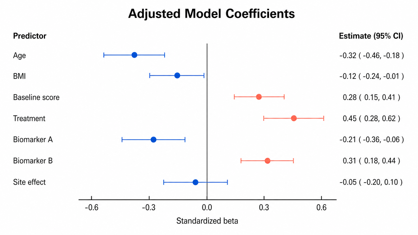
Forest Plot Generator: Adjusted Model Coefficients scientific chart example

Prompt

Based on the uploaded adjusted_model_coefficients.tsv file, create a forest plot for adjusted model coefficients. Use predictor names as row labels, plot standardized beta estimates with 95% confidence intervals, add a no-effect reference line at 0.0, color negative and positive effects subtly, and do not add a pooled effect diamond.

Adjusted Model Coefficients

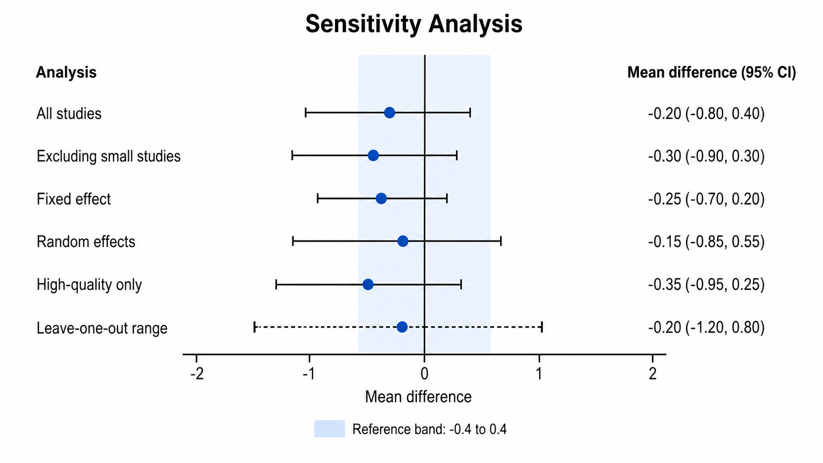
Forest Plot Generator: Sensitivity Analysis scientific chart example

Prompt

Based on the uploaded sensitivity_analysis_intervals.csv file, create a sensitivity-analysis forest plot. Show each analysis scenario as a row, plot mean differences with lower and upper confidence bounds, add a no-effect reference line at 0.0, include a subtle reference band only if requested or supplied, and keep the figure clean for a manuscript.

Sensitivity Analysis

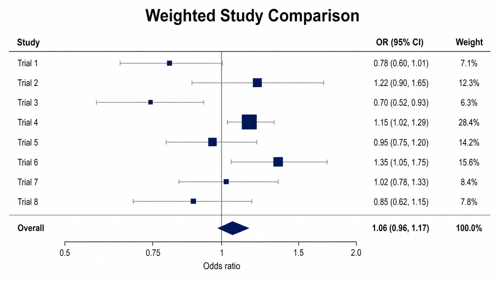
Forest Plot Generator: Weighted Study Comparison scientific chart example

Prompt

Based on the uploaded weighted_study_comparison.xlsx file, create a weighted study forest plot. Use study labels, odds ratio estimates, lower and upper confidence intervals, and weight values from the uploaded columns; vary marker size by weight, add a no-effect line at 1.0, and include an overall row only when it exists in the file.

Weighted Study Comparison

How to make a forest plot

1

Upload your dataset

Add CSV, TSV, TXT, or Excel data with row labels, effect estimates, lower bounds, and upper bounds.

2

Describe the plot

Tell SciFigure AI whether the measure is a ratio, difference, coefficient, subgroup analysis, or model-result figure.

3

Generate, review & download

Create a clean AI forest plot, verify intervals and reference lines, then download PNG for papers and slides.

What does this forest plot generator do?

It turns study-level estimates, model coefficients, odds ratios, risk ratios, hazard ratios, mean differences, or subgroup effects into a clean forest plot with row labels and confidence intervals. The result is designed for manuscripts, lab reports, systematic reviews, posters, and research presentations.

Why use a forest plot generator

  • Compare effect estimates across studies, cohorts, predictors, or subgroup rows.
  • Show lower and upper confidence intervals with a clear no-effect reference line.
  • Keep estimates, interval values, labels, weights, and optional subgroup structure readable in one compact figure.
  • Move from spreadsheet model output to a polished scientific figure faster.

Types and parts of a forest plot

  • Each row represents a study, cohort, predictor, sensitivity check, or subgroup result.
  • The marker shows the point estimate and the horizontal line shows the confidence interval.
  • Ratio measures such as OR, RR, and HR usually use a no-effect line at 1.0.
  • Difference or coefficient measures usually use a no-effect line at 0.0.

Forest Plot Generator FAQ

What data does the forest plot need?

Use one label column, one numeric effect estimate column, and numeric lower and upper confidence interval columns. Optional subgroup, weight, and sample-size columns can guide layout.

Can I make a subgroup forest plot?

Yes. Upload a subgroup column or describe the subgroup rows in your instructions, then verify the generated grouping before using the figure.

Can I use odds ratios, risk ratios, or hazard ratios?

Yes. Ratio measures usually use a reference line at 1.0, while mean differences, beta coefficients, and other signed estimates usually use 0.0.

Will it add a pooled effect diamond?

Only ask for a pooled or overall diamond when that row exists in the uploaded data or the prompt provides the summary estimate and interval.

Can I use the result in a paper?

Yes, but verify the uploaded estimates, interval bounds, scale, labels, weights, and statistical interpretation before submission.

Need clearer effect-size figures?

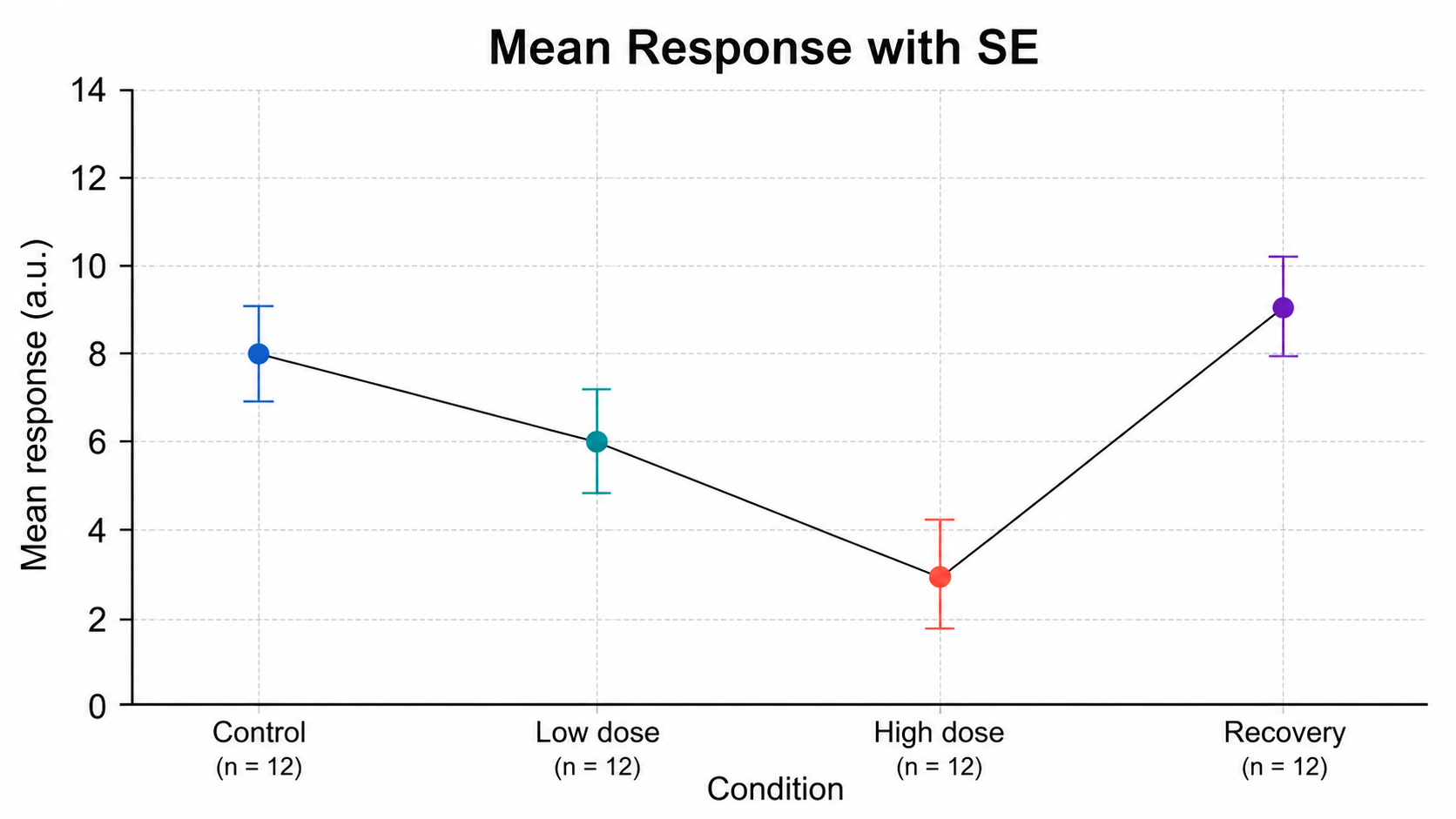
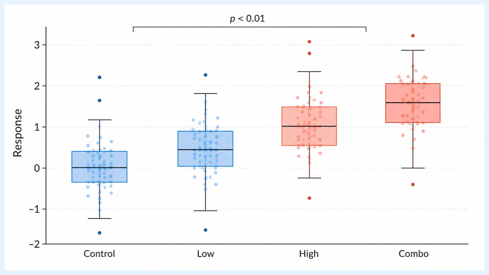
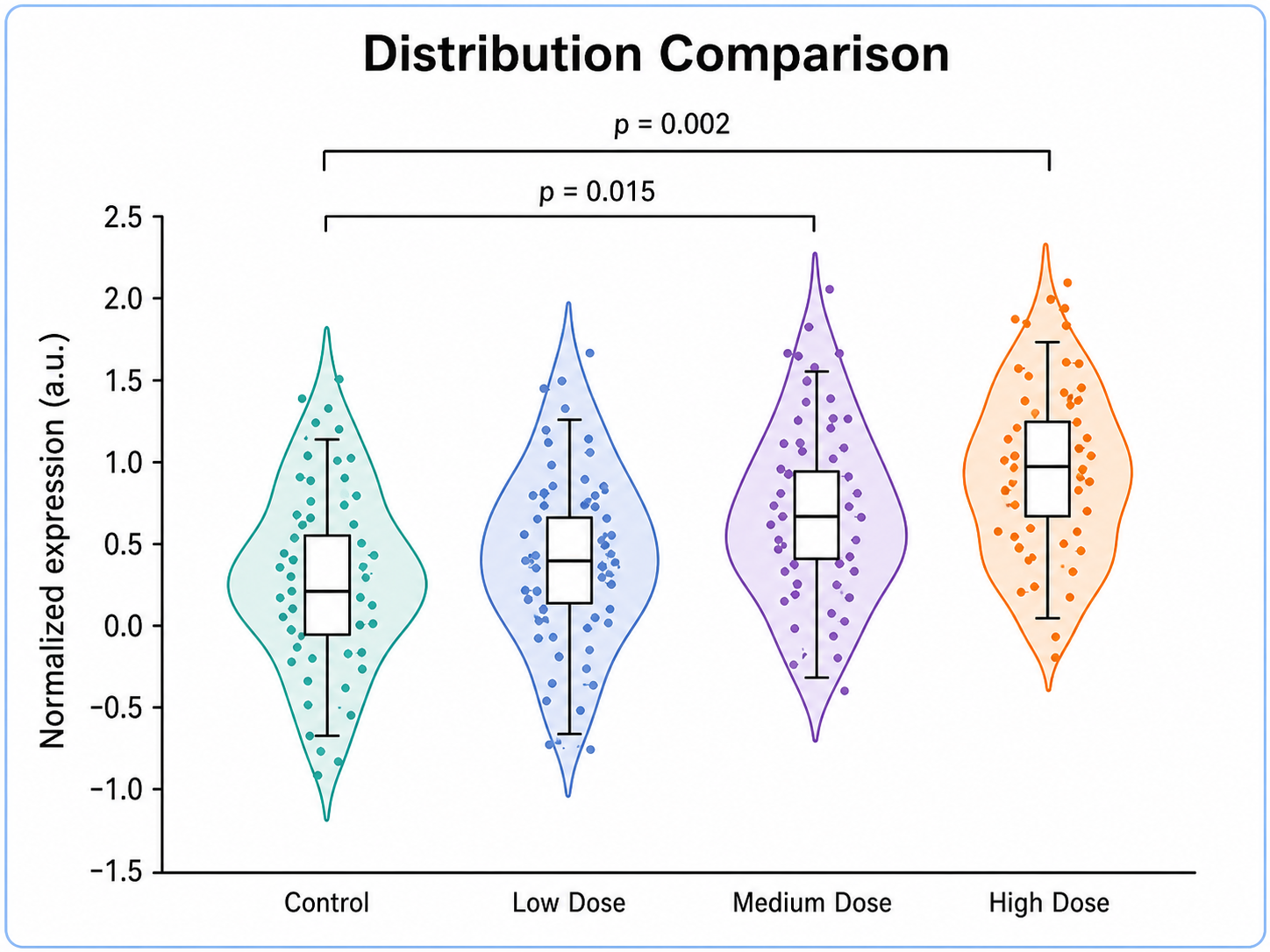
Generate forest plots, error bar charts, box plots, and other research-ready visualizations with SciFigure AI.