Violin Plot Generator for Scientific Data

Create publication-ready violin plots from grouped experimental data.

Upload raw measurements, describe the figure you need, then generate a clean density plot with summary overlays, sample points, and journal-ready labels.

Grouped data readyDensity + summary overlaysPublication-ready PNG

AI Violin Plot Generator

Upload data and describe the AI chart you need.

Aspect ratio
260 / 2000 characters

Costs 5 credits. Uses your uploaded data and prompt to generate a publication-ready PNG.

Preview

Violin Plot Example Previews

Aspect ratio: 16:9

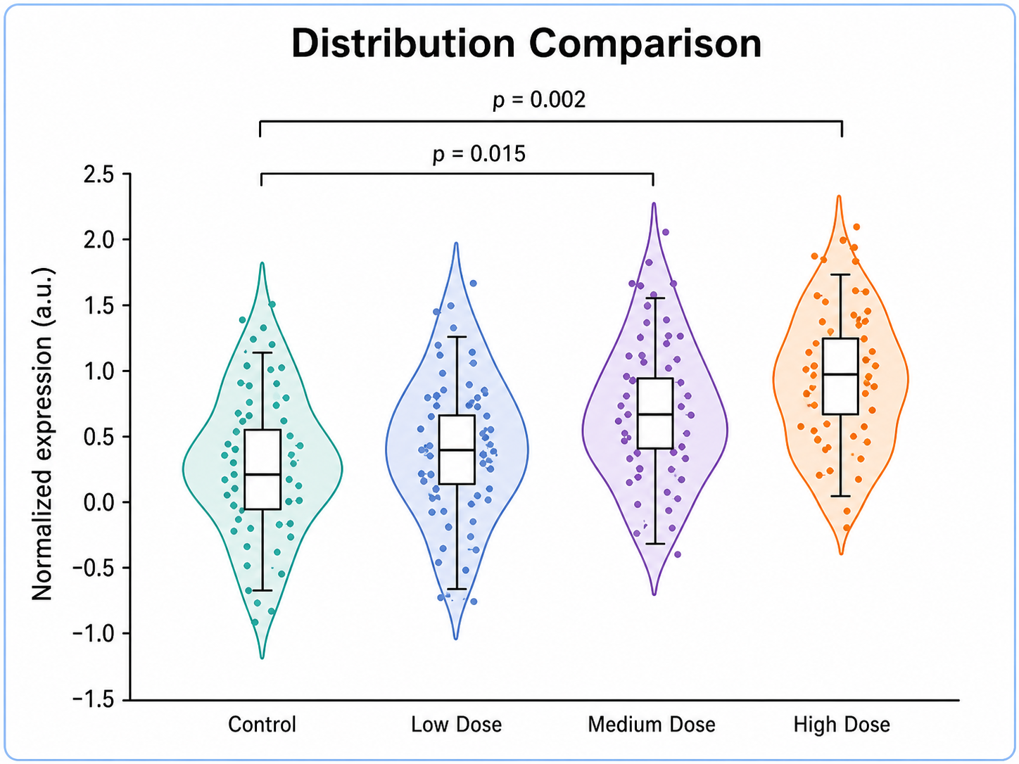
Distribution Comparison violin plot example preview
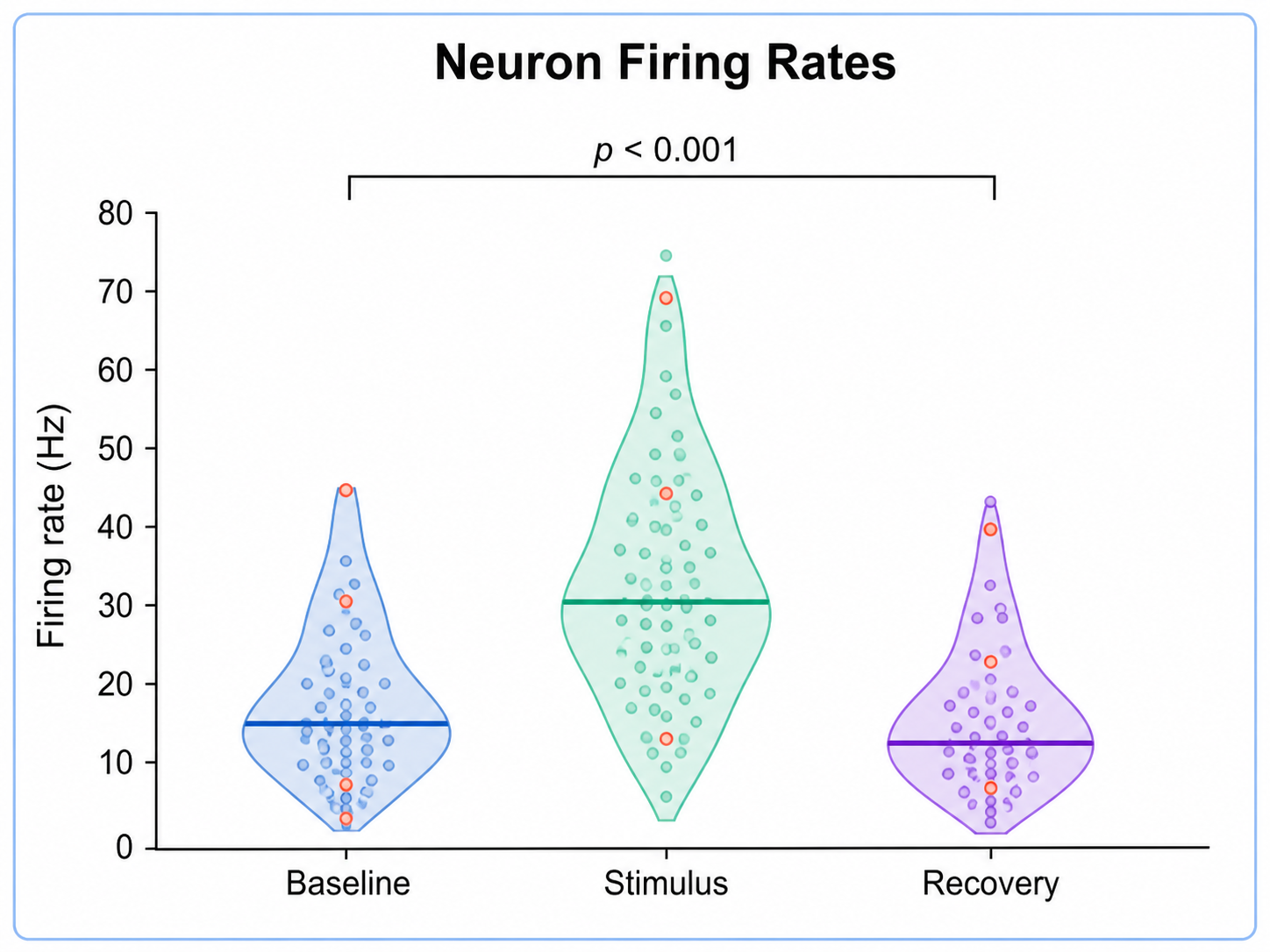
Neuron Firing Rates violin plot example preview
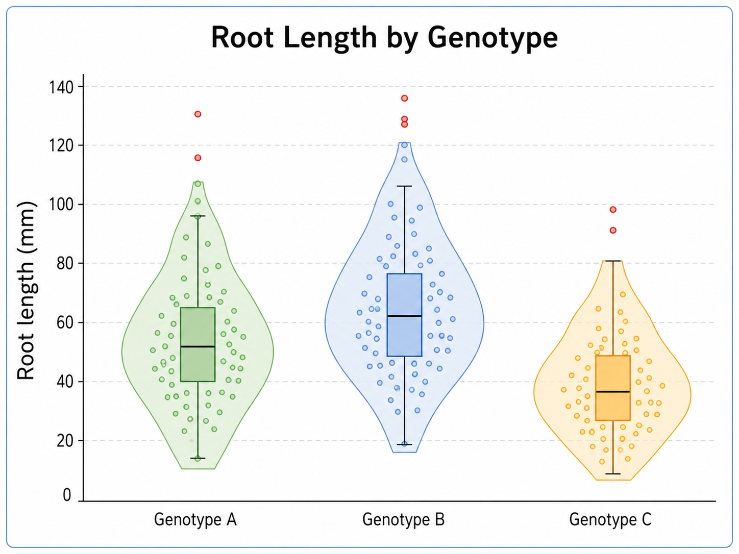
Root Length by Genotype violin plot example preview

These are sample previews. Upload your dataset to generate your own violin plot.

Violin plot examples

Use these examples as visual directions for grouped distributions, density shapes, and manuscript-ready statistical charts.

Violin Plot Generator: Distribution Comparison scientific chart example

Prompt

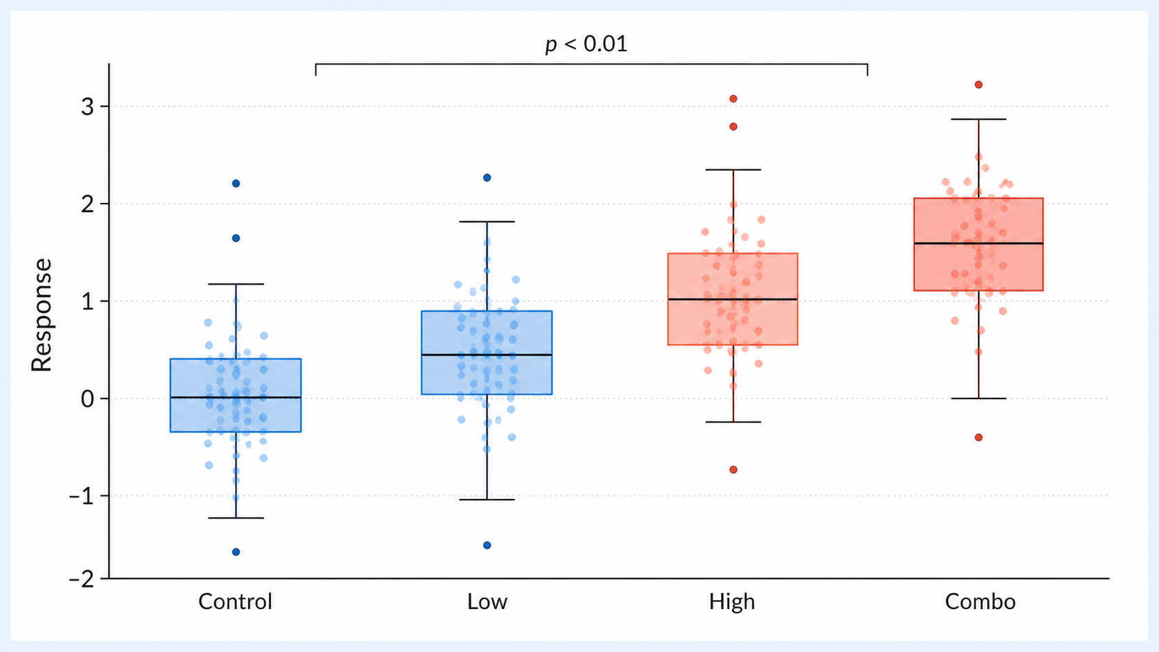
Based on the uploaded treatment_expression.csv file, create a publication-ready violin plot comparing Control, Low Dose, Medium Dose, and High Dose expression values. Draw smooth density shapes, overlay lightly jittered sample points, show median and IQR summaries, include sample-size labels, and use a clean blue/teal/purple/orange scientific palette.
Distribution Comparison

Violin Plot Generator: Neuron Firing Rates scientific chart example

Prompt

Based on the uploaded neuron_firing_rates.xlsx file, create a violin plot comparing firing-rate distributions across three stimulus groups. Show density width, individual observations, median lines, IQR overlays, compact p-value brackets when supplied, and clear axes for Firing rate (Hz).

Neuron Firing Rates

Violin Plot Generator: Root Length by Genotype scientific chart example

Prompt

Based on the uploaded root_length_genotypes.csv file, create a violin plot comparing root length distributions for WT, Mutant A, and Mutant B. Use smooth violins, transparent sample points, median and quartile overlays, readable genotype labels, and a clean white manuscript layout.

Root Length by Genotype

Violin Plot Generator: Protein Expression Spread scientific chart example

Prompt

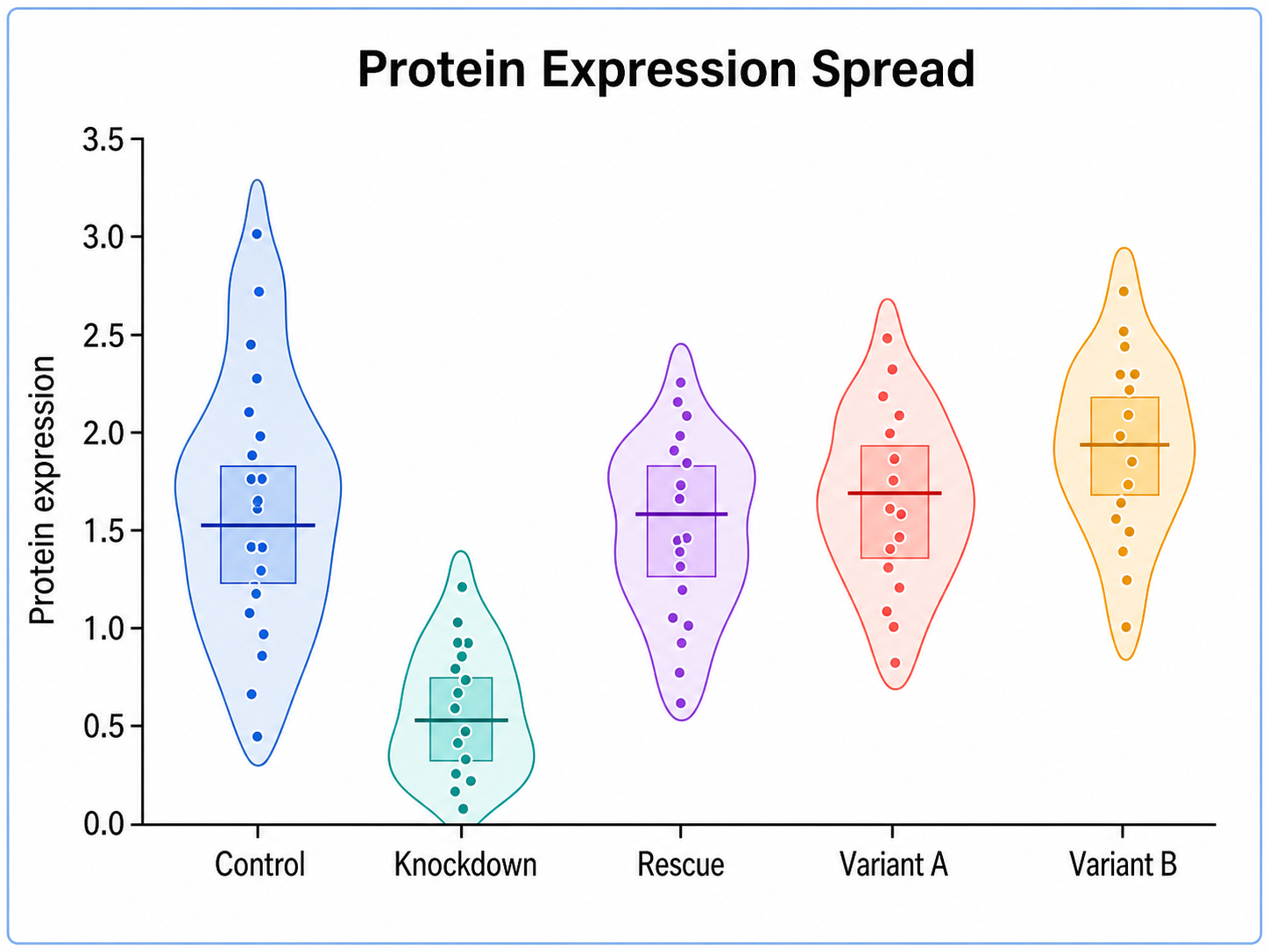
Based on the uploaded protein_expression_panel.xlsx file, create a faceted violin plot comparing protein expression for Gene A, Gene B, Gene C, and Gene D across experimental conditions. Include raw points, median/IQR summaries, readable labels, and manuscript-style spacing.

Protein Expression Spread

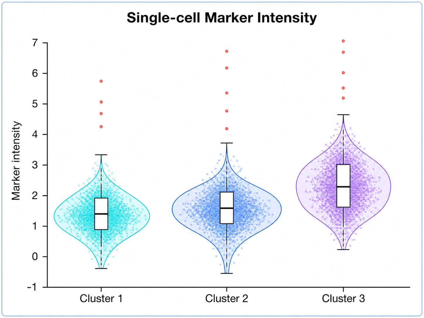
Violin Plot Generator: Single-cell Marker Intensity scientific chart example

Prompt

Based on the uploaded single_cell_marker_intensity.tsv file, create split violin plots showing marker intensity across cell clusters, separated by baseline and stimulated samples. Use distinct colors, lightly jittered cells, median markers, cluster labels, and a compact legend.

Single-cell Marker Intensity

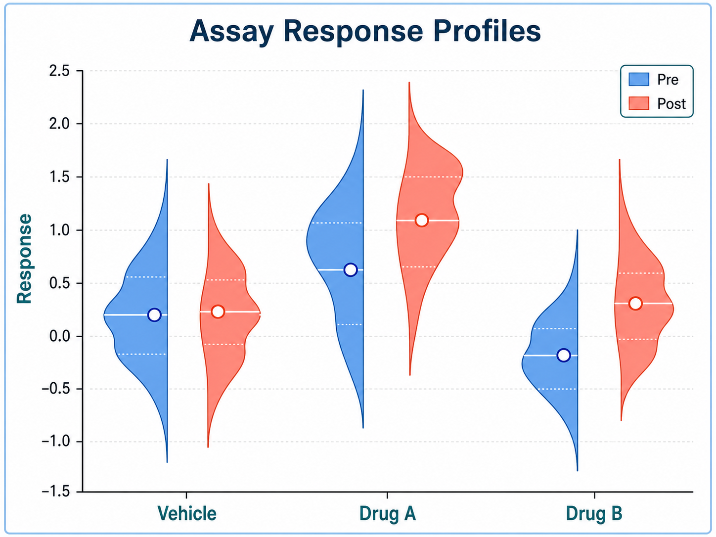
Violin Plot Generator: Assay Response Profiles scientific chart example

Prompt

Based on the uploaded assay_response_profiles.csv file, create a violin/raincloud plot comparing normalized response across dose groups. Show half-violin densities, replicate points, median/IQR marks, a clean dose axis, and a subtle trend annotation.

Assay Response Profiles

How to make a violin plot

1

Upload your dataset

Add CSV, TSV, TXT, or Excel measurements with one group column and one numeric value column.

2

Describe the chart

Tell SciFigure AI which density shape, overlays, labels, palette, and annotations you need.

3

Generate, review & download

Create a clean AI violin plot, review the result, then download PNG for papers and slides.

What does this violin plot generator do?

It turns grouped measurements into a clean violin plot that shows distribution shape, spread, asymmetry, sample points, and summary overlays. The result is designed for manuscripts, lab reports, posters, and research presentations.

Why use a violin plot generator

  • Compare full distribution shapes across treatments, cohorts, time points, or experimental conditions.
  • Show density, median, IQR, and sample observations without rebuilding the chart by hand.
  • Make skewed or multimodal data easier to interpret than a simple box plot.
  • Move from spreadsheet data to a polished scientific figure faster.

Types and parts of a violin plot

  • The width of each violin shows where values are more concentrated.
  • Median and IQR overlays summarize the central tendency and spread.
  • Jittered points can reveal sample size and individual observations.
  • Group labels, units, and optional p-value annotations make the figure manuscript-ready.

Violin Plot Generator FAQ

What data does the violin plot need?

Long-form grouped data works best: one group column and one numeric measurement column, with one row per observation.

When should I use a violin plot instead of a box plot?

Use a violin plot when distribution shape, skew, or multimodality matters. Use a box plot when you only need a compact summary.

Can a violin plot show individual observations?

Yes. Jittered sample points can be shown with transparency so the density shape and raw observations stay readable.

Can I create grouped violin plots?

Yes. Use group labels such as condition, genotype, cohort, dose, time point, or treatment arm to compare distributions.

Can I edit or export the result?

The generated result is a PNG image that you can download after generation. Review labels, statistics, and units before using it.

Need clearer distribution figures?

Generate violin plots, box plots, histograms, and other research-ready visualizations with SciFigure AI.