Radar Chart Maker for Multi-Metric Research Data

Compare multi-metric profiles across materials, athletes, models, or products in one figure.

Upload wide or long tables, and SciFigure computes per-axis ranges, decides whether axes need normalization, and generates a clean radar chart with the raw values kept on record.

Wide or long dataAuto axis normalizationPublication-ready PNG

AI Radar Chart Maker

Upload data and describe the radar chart you need.

Aspect ratio
295 / 2000 characters

Costs 5 credits. Axis ranges, scaling, and plotted positions are computed from your uploaded data, then drawn as a PNG.

Preview

Radar Chart Examples

Aspect ratio: 16:9

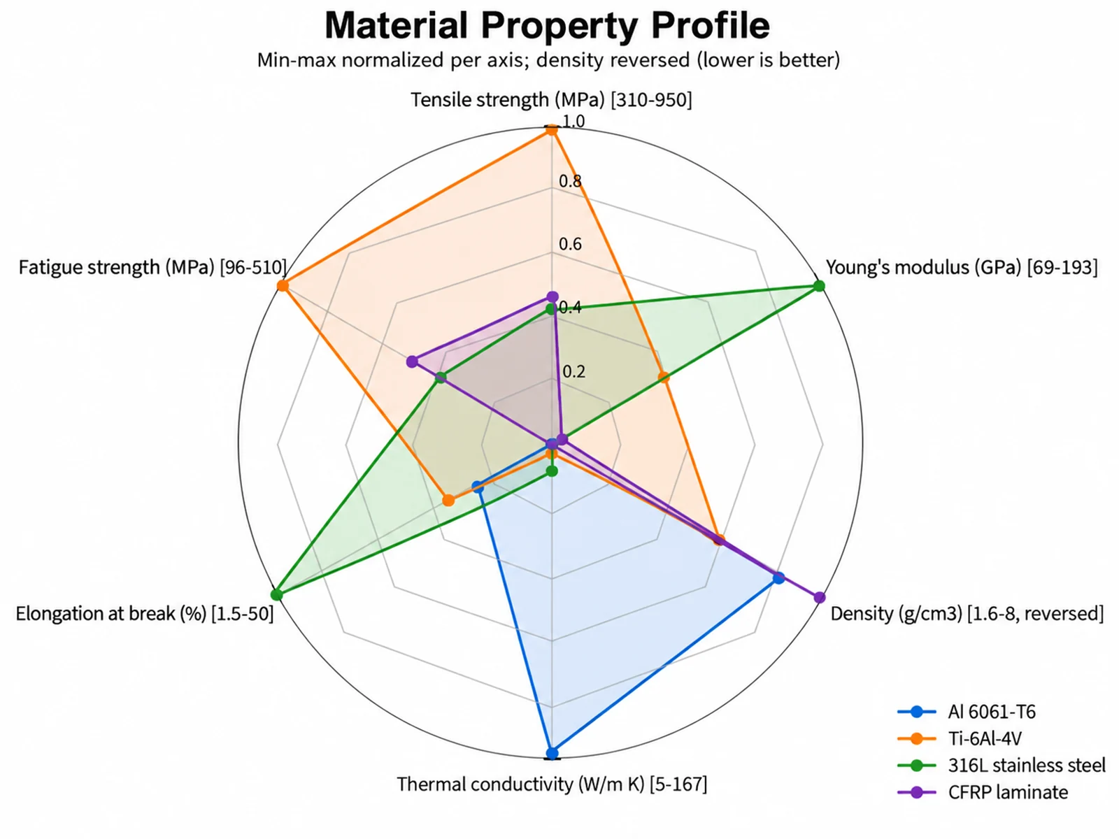
Material Property Profile radar chart example preview
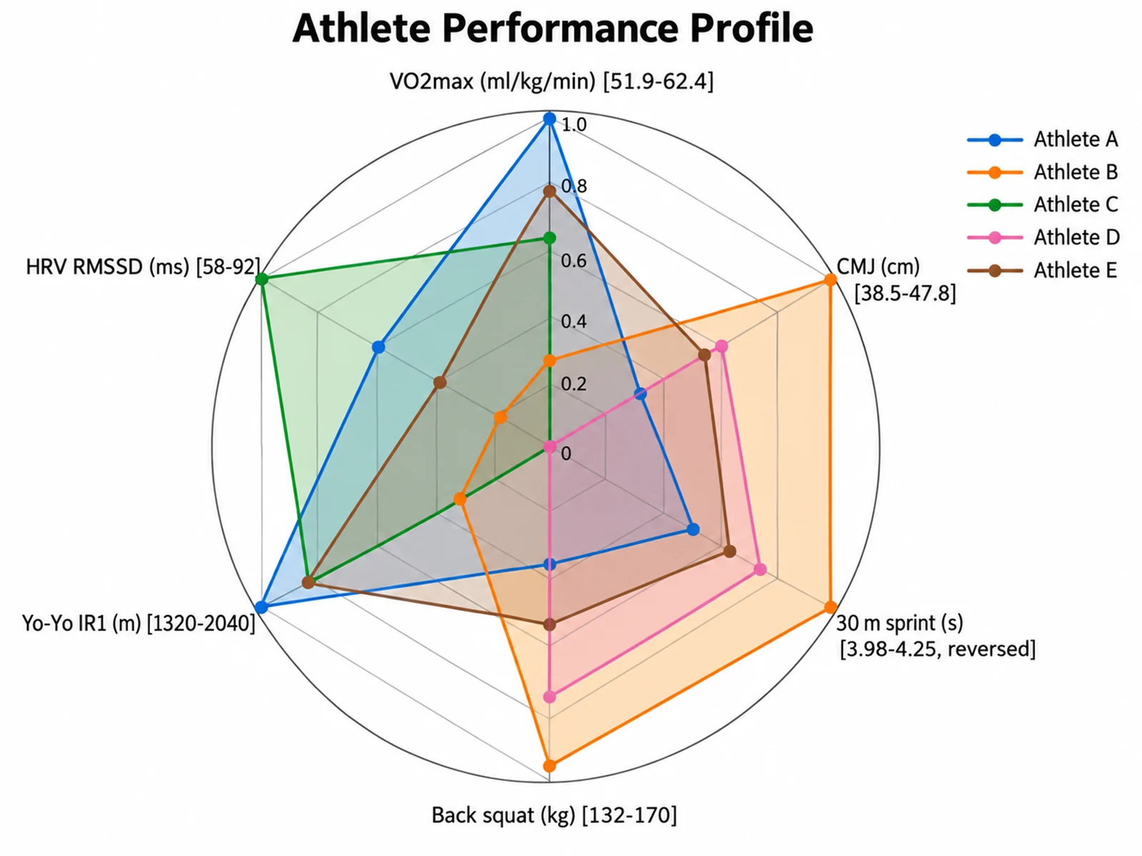
Athlete Performance Profile radar chart example preview
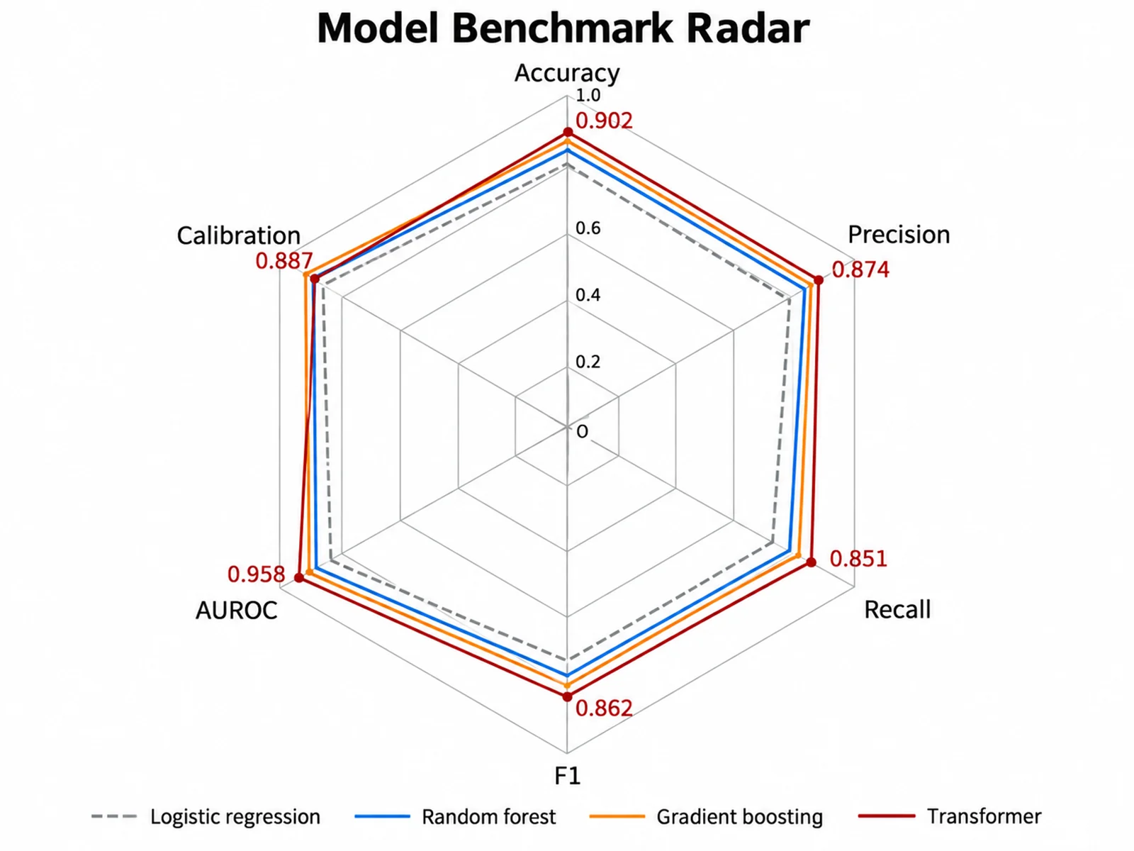
Model Benchmark Radar radar chart example preview

These are sample previews. Upload your dataset to generate your own radar chart.

Radar chart examples

Use these examples as starting points for material selection, sports science testing, machine learning benchmarks, and sensory panel profiles.

Radar Chart Maker: Material Property Profile scientific chart example

Prompt

Based on the uploaded alloy_properties.csv file, create a radar chart comparing Al 6061-T6, Ti-6Al-4V, 316L stainless steel, and a CFRP laminate on six mechanical and thermal properties. Normalize each axis 0-1, treat density as lower is better, and show raw ranges on the axis labels.
Material Property Profile

Radar Chart Maker: Athlete Performance Profile scientific chart example

Prompt

Based on the uploaded athlete_testing.xlsx file, create a spider chart of five athletes across VO2max, countermovement jump, 30 m sprint, back squat, Yo-Yo test distance, and HRV. Normalize axes, treat sprint time as lower is better, and use a compact legend.

Athlete Performance Profile

Radar Chart Maker: Model Benchmark Radar scientific chart example

Prompt

Based on the uploaded model_benchmarks.csv file, create a radar chart of four classifiers on accuracy, precision, recall, F1, AUROC, and calibration. Keep the raw 0-1 values on the same scale, use outline-only polygons, and print values for the best model.

Model Benchmark Radar

Radar Chart Maker: Sensory Panel Profile scientific chart example

Prompt

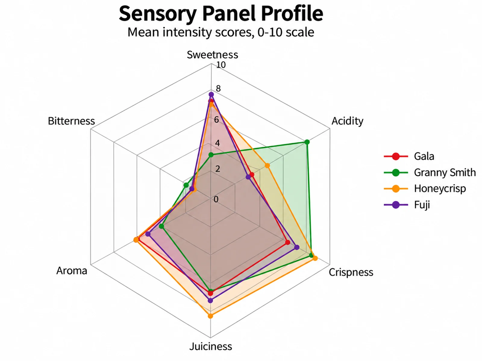
Based on the uploaded apple_sensory_panel.tsv file, create a spider web chart of mean panel scores for four apple cultivars on sweetness, acidity, crispness, juiciness, aroma, and bitterness. Use the raw 0-10 intensity scale with ring labels.

Sensory Panel Profile

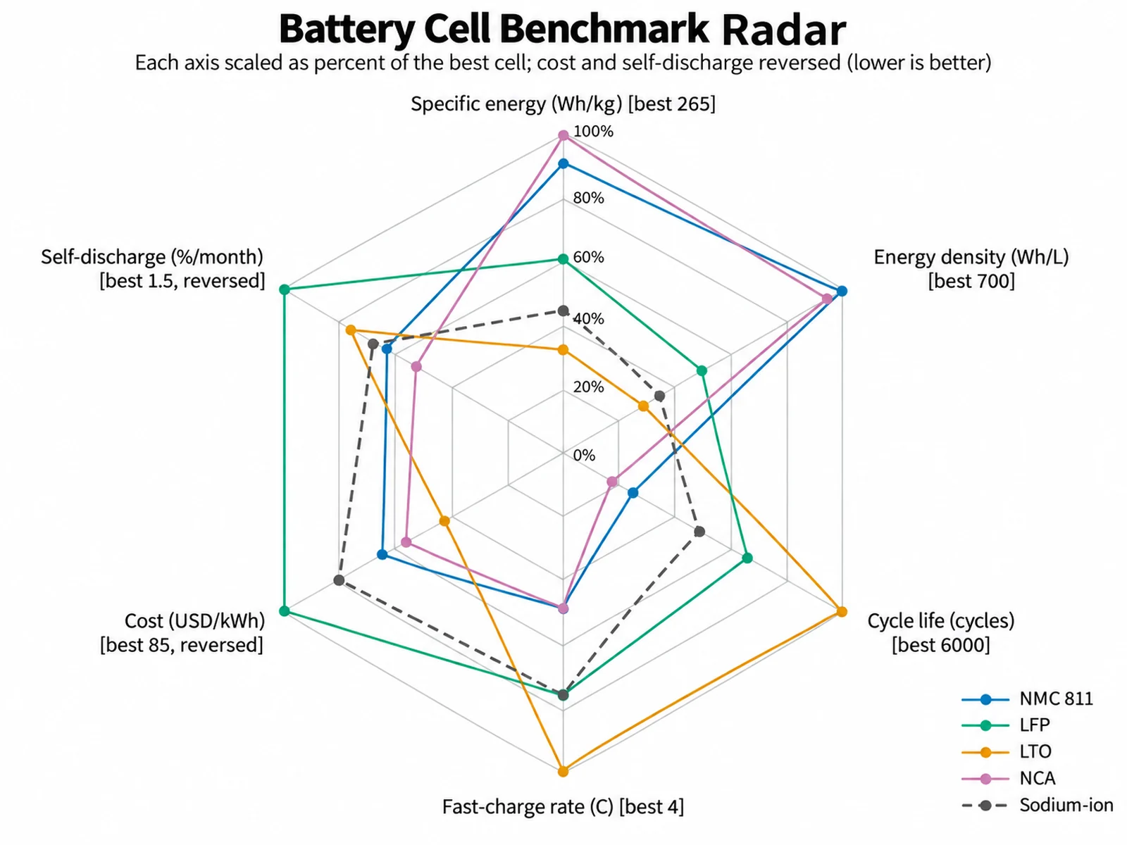
Radar Chart Maker: Battery Cell Benchmark Radar scientific chart example

Prompt

Based on the uploaded battery_cell_benchmark.csv file, create a radar chart of five lithium cell chemistries across specific energy, energy density, cycle life, fast-charge rate, cost per kWh, and self-discharge. Scale each axis as percent of the best value so zero stays at the center, lower is better: cost per kWh and self-discharge, use outline-only polygons with vertex markers, and print the raw best value on each axis label.

Battery Cell Benchmark Radar

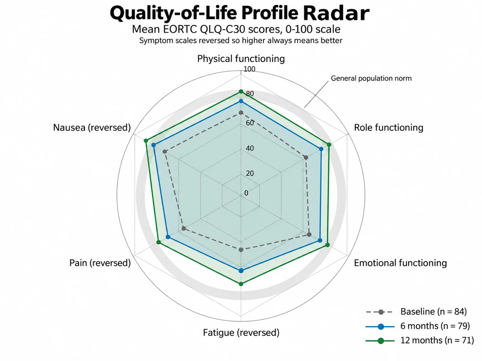
Radar Chart Maker: Quality-of-Life Profile Radar scientific chart example

Prompt

Based on the uploaded qol_timepoints.tsv file, which has Timepoint, Scale, and MeanScore columns, create a spider chart of mean EORTC QLQ-C30 scores for one cohort at baseline, 6 months, and 12 months. Keep the raw 0-100 scale with ring labels every 20, reverse the fatigue, pain, and nausea symptom scales so better outcomes plot outward, shade a light gray reference band at the population norm, and label each series with its n.

Quality-of-Life Profile Radar

How to make a radar chart

1

Upload your metrics

Add CSV, TSV, TXT, or Excel data. Use a wide table with a series name column and one numeric column per axis, or a long table with series, metric, and value columns.

2

Describe the chart

Say whether axes should be normalized or kept on a raw shared scale, which metrics are lower-is-better, and how the outlines, fills, and legend should look.

3

Generate, review & download

SciFigure computes axis ranges and plotted positions, draws the spider chart, and lets you download a PNG for papers, theses, and slides.

What does this radar chart maker do?

It draws each series, such as a material, athlete, model, or product, as a closed polygon across three or more axes that radiate from a common center. The shape makes strengths, weaknesses, and trade-offs visible at a glance, which is why radar graphs are common in materials selection, sports science testing, machine learning benchmark summaries, and sensory analysis. This radar chart maker averages repeated rows, computes the minimum and maximum of every axis, decides whether axes need normalization, and calculates each plotted position before the figure is drawn. The image model only handles layout and styling.

Normalization: when axes use different units

  • If the largest axis magnitude is more than 5 times the smallest (for example MPa next to g/cm3), each axis is min-max normalized across series to 0-1, so the lowest series sits at the center and the highest at the outer ring.
  • Write "raw" or "same scale" to keep original values on one shared radial scale with 5 evenly spaced rings. That is best when all metrics share a unit, such as 0-1 scores or a 0-10 sensory scale.
  • Write "normalize" to force min-max scaling, or "percent of max" to divide each axis by its best value so zero stays at the center.
  • Write "lower is better: Density, Cost" to reverse those axes after normalization so the better value always plots farther out.
  • The prompt keeps both the raw value and the plotted position for every vertex, and normalized axis labels show the raw range.

How to read a spider chart

  • Each spoke is one metric; the distance from the center is the plotted value on that spoke.
  • A larger enclosed area suggests a stronger overall profile only when every axis points in the same "better" direction.
  • Min-max normalization is relative to the series shown: adding or removing a series changes every position.
  • Axis order changes the polygon shape, so keep related metrics next to each other and use the same order across figures.

Tips and common mistakes

  • Keep to about 8 series and 12 axes; the chart includes the first 8 series and first 12 axes in source order.
  • Average replicates before comparing, or upload them and let the tool average rows that share a series name.
  • Do not compare polygon areas when axes mix higher-is-better and lower-is-better metrics without reversing them.
  • Use outline-only polygons or small multiples when more than four series overlap heavily.
  • Report the normalization method and the raw ranges in the figure caption so readers can recover the original values.

When a radar graph is the right choice

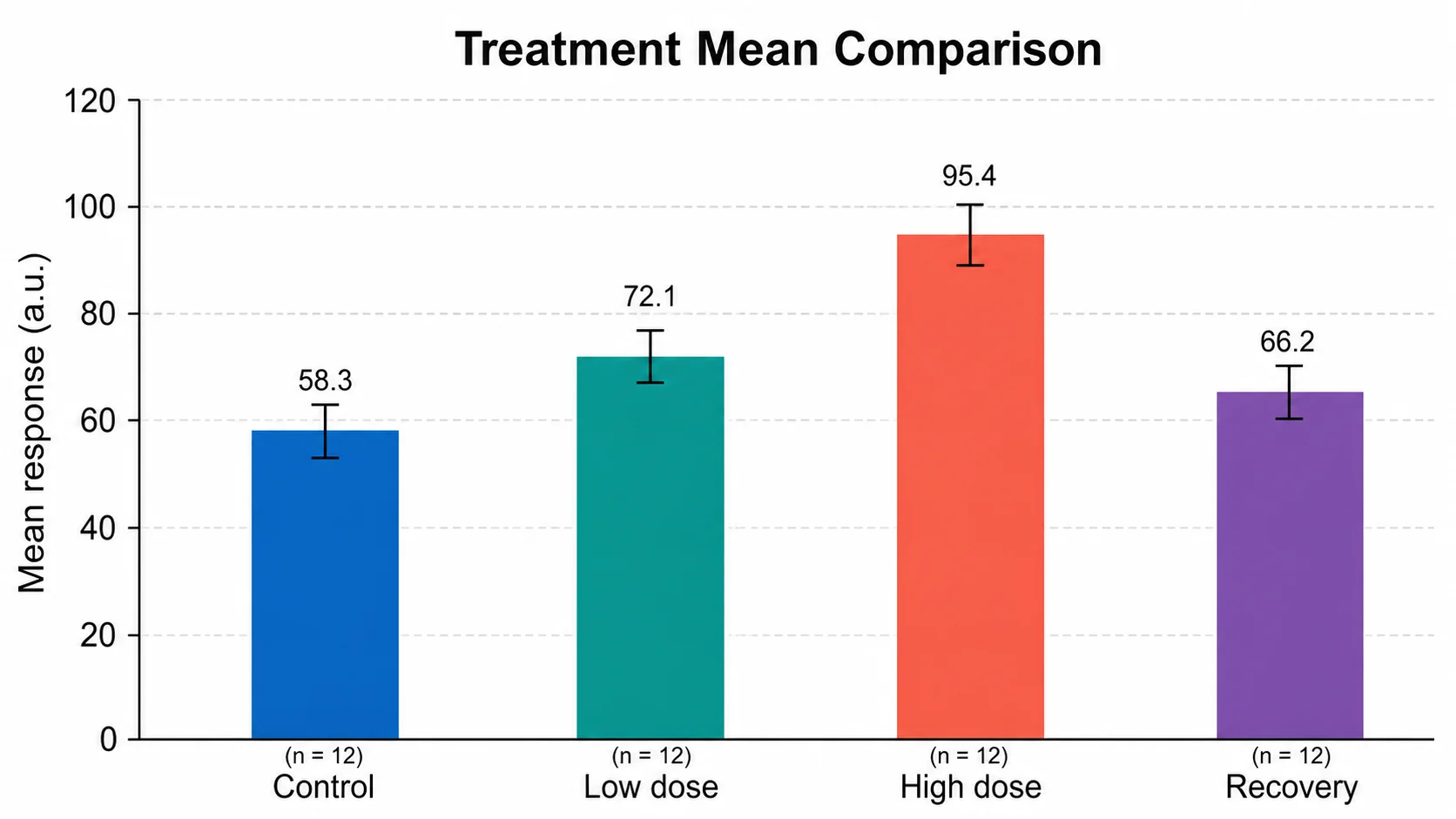
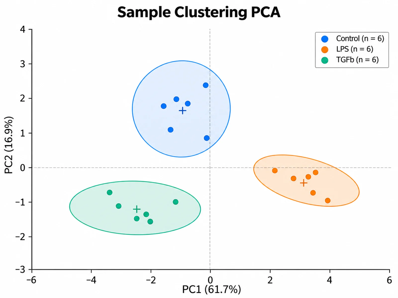
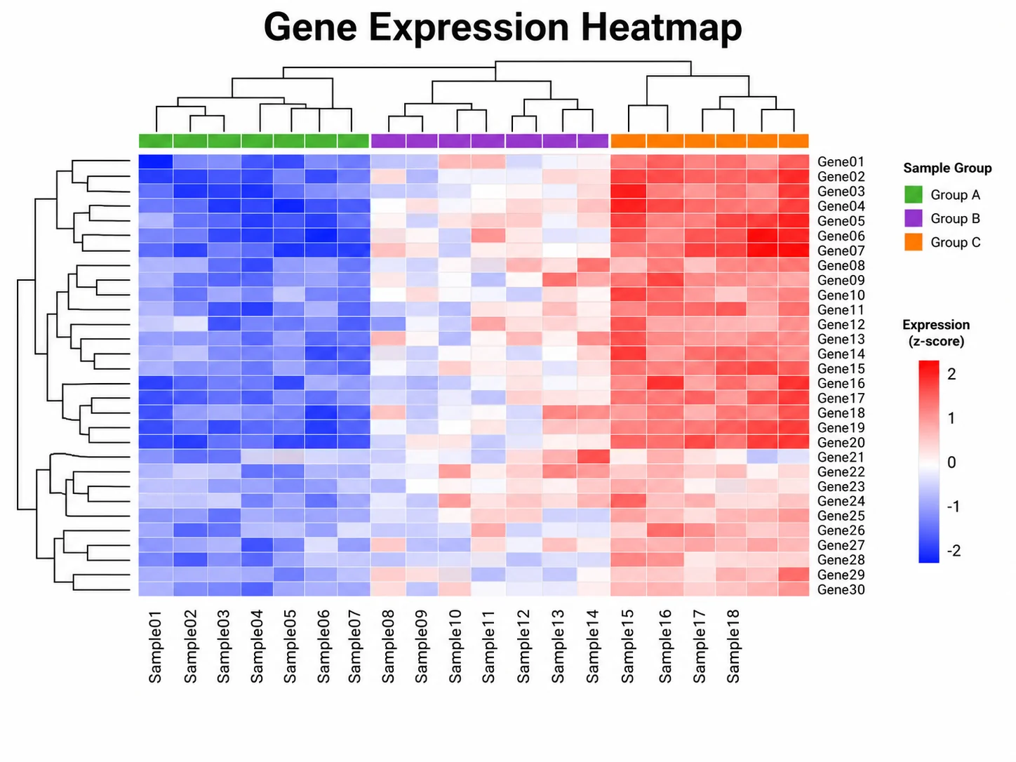
Radar charts work best for a small number of series measured on the same set of 3 to 12 metrics, where the overall profile matters more than exact values. For precise comparisons of individual metrics, a grouped bar chart or dot plot is easier to read, and for many samples across many features a heatmap or PCA plot scales better. A spider web chart is a strong summary figure, but pair it with a table of raw values in the paper or supplement.

Radar Chart Maker FAQ

What data format does the radar chart maker accept?

Two layouts work. Wide: one row per series, a text column with the series name, and one numeric column per axis. Long: a series column, an axis or metric name column, and a numeric value column. Rows that share a series name are averaged.

Does the tool calculate the statistics or does AI estimate them?

The tool calculates them from your uploaded values: series means, per-axis minimum and maximum, the scale ratio, normalization, and each plotted position. Those numbers are passed to the image model, which draws the outlines and labels without computing anything itself.

Why are my axes normalized?

When axis magnitudes differ by more than a factor of 5, raw values would squash small-unit metrics near the center, so each axis is min-max scaled to 0-1. Write "raw" or "same scale" in your instructions to turn this off.

Can I reverse metrics where lower is better?

Yes. Write "lower is better:" followed by the axis names, for example sprint time, latency, density, or cost. Those axes are reversed after normalization so better values plot farther from the center.

Is a spider chart maker the same as a radar chart maker?

Yes. Radar chart, spider chart, spider web chart, star plot, and radar graph all describe the same figure: values on spokes around a circle joined into polygons.

Can I use the radar chart in a paper?

Yes. Verify the series names, axis order, normalization method, and raw ranges before submission, and include the raw values in a table or supplement because normalized radar positions are relative.

Need to compare profiles across many metrics?

Generate radar charts, PCA plots, heatmaps, and other research-ready visualizations with SciFigure AI.