Scatter Plot Generator for Scientific Data

Create publication-ready scatter plots from uploaded research data.

Upload paired measurements, map x and y variables, describe the figure you need, then generate a clean scatter plot with trends, groups, labels, outliers, and manuscript-ready styling.

X-Y data readyCorrelation & trendsPublication-ready PNG

AI Scatter Plot Generator

Upload data and describe the AI chart you need.

Aspect ratio
322 / 2000 characters

Costs 5 credits. Uses your uploaded data and prompt to generate a publication-ready PNG.

Preview

Scatter Plot Example Previews

Aspect ratio: 16:9

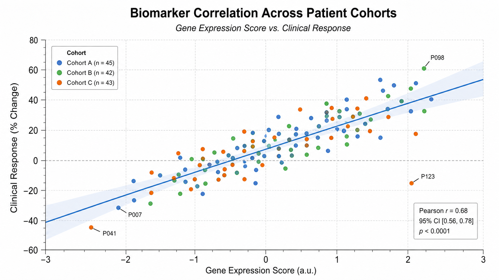
Biomarker Correlation scatter plot example preview
Dose Response Relationship scatter plot example preview
Patient Outcome Score scatter plot example preview

These are sample previews. Upload your dataset to generate your own scatter plot.

Scatter plot examples

Use these examples as visual directions for correlations, dose-response data, calibration curves, clusters, QC trends, and manuscript-ready relationship figures.

Scatter Plot Generator for Scientific Data: Biomarker Correlation scientific chart example

Prompt

Based on the uploaded biomarker_response.csv file, create a clean scientific scatter plot showing biomarker expression on the x-axis and treatment response on the y-axis. Color points by patient cohort, add a linear trend line with a light confidence band, label only the most important outliers, and use a publication-ready white background with readable axis labels.
Biomarker Correlation

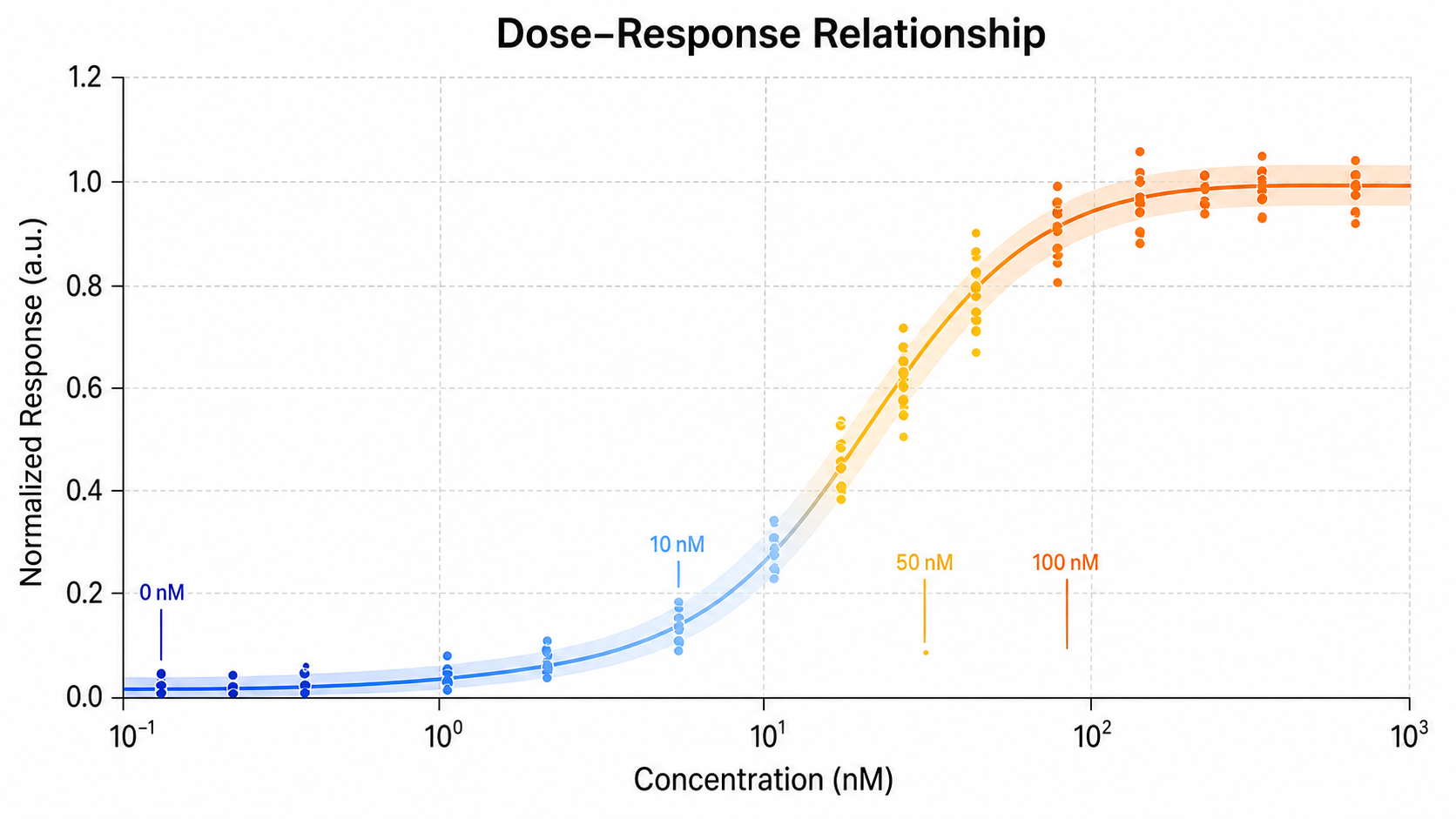
Scatter Plot Generator for Scientific Data: Dose Response Relationship scientific chart example

Prompt

Based on the uploaded dose_response_measurements.xlsx file, create a scatter plot showing drug concentration on the x-axis and measured response on the y-axis. Use a subtle dose-response curve or fitted trend line, show individual replicate points, color groups by treatment condition, and include clear units, compact legends, and manuscript-ready styling.

Dose Response Relationship

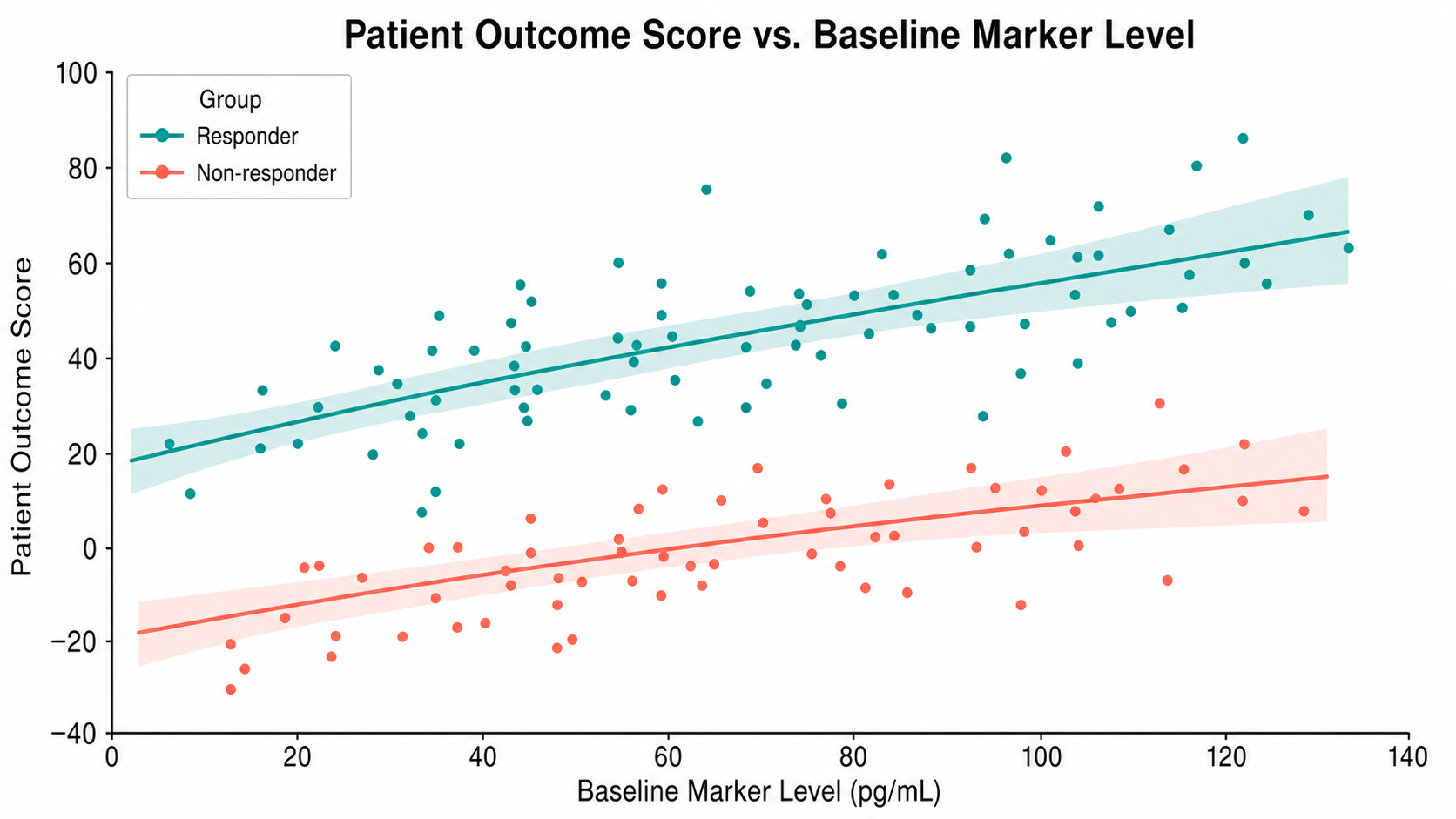
Scatter Plot Generator for Scientific Data: Patient Outcome Score scientific chart example

Prompt

Based on the uploaded patient_outcome_scores.csv file, create a clinical scatter plot comparing baseline score on the x-axis with follow-up outcome score on the y-axis. Color points by responder group, add a diagonal reference line, highlight high-response and low-response clusters, and keep the figure clean for use in a research presentation.

Patient Outcome Score

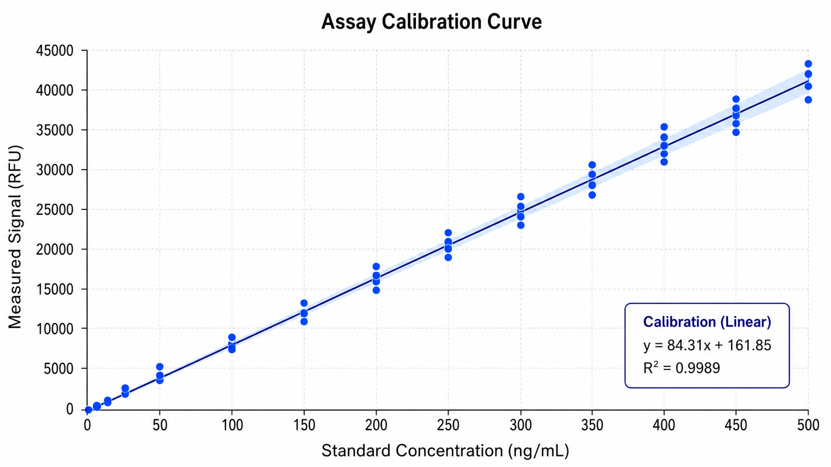
Scatter Plot Generator for Scientific Data: Assay Calibration Curve scientific chart example

Prompt

Based on the uploaded assay_calibration_curve.tsv file, create a scientific calibration scatter plot with known concentration on the x-axis and signal intensity on the y-axis. Add a fitted regression line, display the equation or R-squared value only if available, show replicate points with light jitter, and use precise axis labels suitable for a methods or supplementary figure.

Assay Calibration Curve

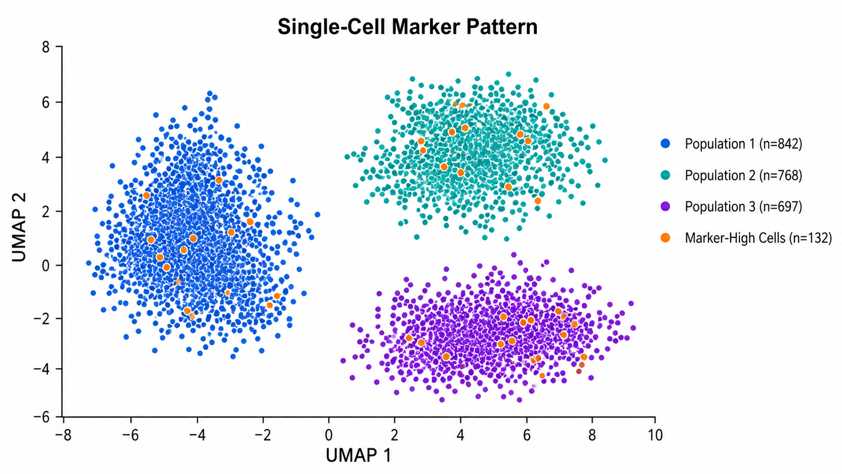
Scatter Plot Generator for Scientific Data: Single-Cell Marker Pattern scientific chart example

Prompt

Based on the uploaded single_cell_marker_intensity.csv file, create a scatter plot showing Marker A intensity on the x-axis and Marker B intensity on the y-axis. Color points by cell population, use semi-transparent markers for dense regions, add simple cluster labels where helpful, and preserve a clean scientific layout without excessive decoration.

Single-Cell Marker Pattern

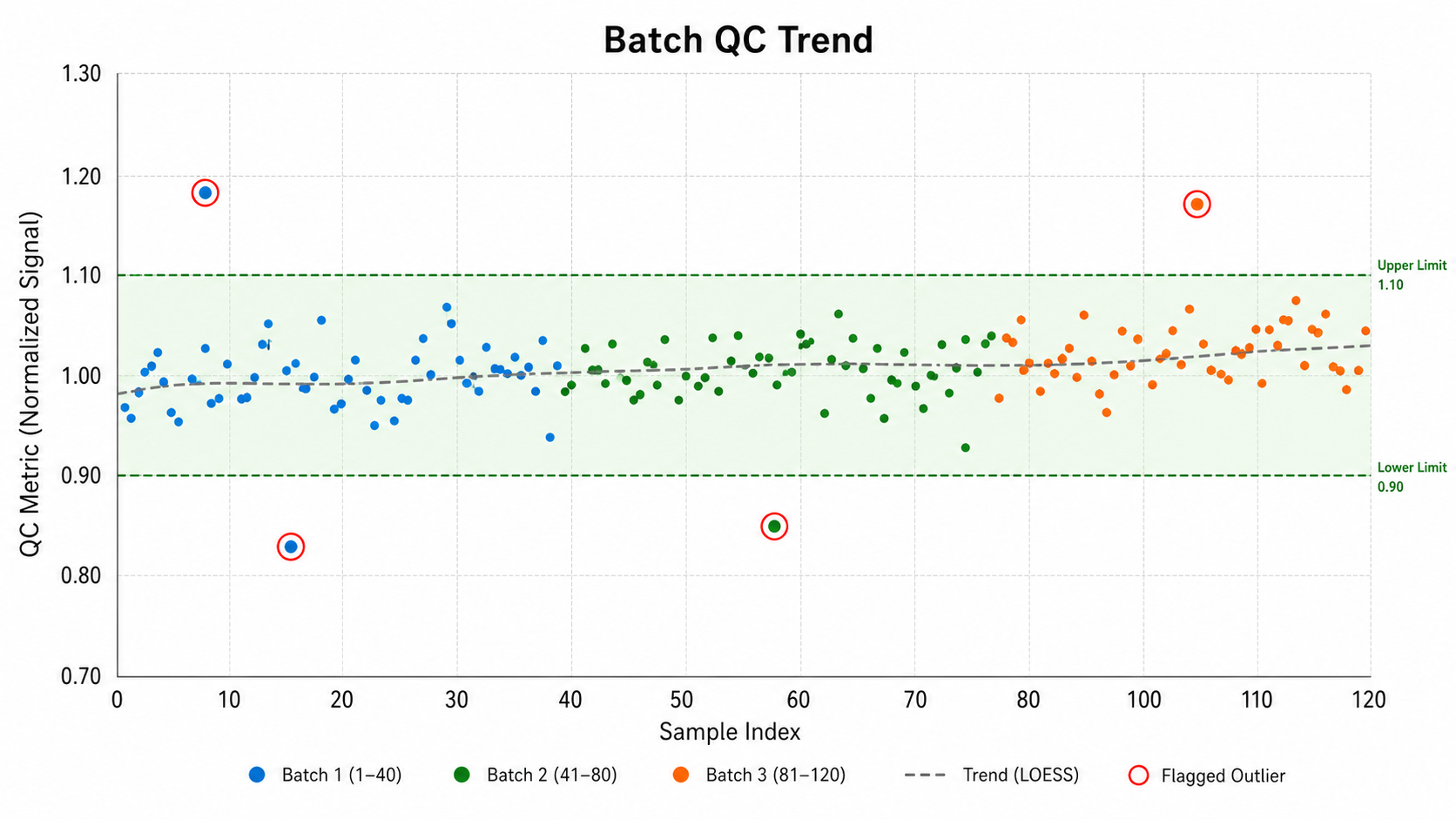
Scatter Plot Generator for Scientific Data: Batch QC Trend scientific chart example

Prompt

Based on the uploaded batch_qc_metrics.csv file, create a scatter plot showing run order on the x-axis and quality-control measurement on the y-axis. Color points by batch, add a subtle trend line, mark the acceptable QC range with a light shaded band, and label only clear outliers so the chart is easy to read in a lab report.

Batch QC Trend

How to make a scatter plot

1

Upload your dataset

Add CSV, TSV, TXT, or Excel data with at least two numeric columns for the x and y variables.

2

Describe the chart

Tell SciFigure AI which variables to compare, how to color groups, and whether to include trends, labels, or outlier highlights.

3

Generate, review & export

Create a clean scatter plot, check the mapping and labels, then download PNG for papers and slides.

What does this scatter plot generator do?

It turns paired scientific measurements into a clear scatter plot for exploring relationships between variables. Use it for expression levels, assay signals, patient outcomes, dose-response measurements, calibration curves, QC metrics, and other x-y datasets.

Why use a scatter plot generator

  • Show relationships between two continuous variables.
  • Identify trends, clusters, correlations, and outliers.
  • Compare groups with color-coded points and clean legends.
  • Move from raw spreadsheet data to a polished scientific figure faster.

Types and parts of a scatter plot

  • Each point represents one observation or sample.
  • The x-axis and y-axis show the two measured variables.
  • Colors or marker styles can separate cohorts, treatments, batches, or cell types.
  • Trend lines, confidence bands, reference lines, and labels can clarify the result.

Scatter Plot Generator FAQ

What data does the scatter plot need?

A scatter plot works best with at least two numeric columns: one for the x-axis and one for the y-axis. Optional group, label, or batch columns can improve the final figure.

Can I color points by group?

Yes. Use a group column such as treatment, cohort, genotype, batch, responder status, or cell population.

Can the chart include a trend line?

Yes. You can request a linear trend, confidence band, calibration fit, reference line, or other visual guide when it helps explain the data.

Can I highlight outliers?

Yes. Ask the generator to label only the most important outliers or unusual samples so the figure stays readable.

Can I use the result in a paper?

Yes, but always verify the source data, axis labels, statistics, and figure caption before submission.

Need clearer relationship figures?

Create clean scatter plots, correlation figures, calibration curves, and grouped data visuals from your research data.