Histogram Generator for Scientific Data

Create publication-ready histograms from raw experimental measurements.

Upload values, describe the distribution you need, then generate a clean AI-made PNG with readable bins, axes, labels, and optional group overlays.

Raw values readyCustom binsPublication-ready PNG

AI Histogram Generator

Upload data and describe the AI chart you need.

Aspect ratio
276 / 2000 characters

Costs 5 credits. Uses your uploaded data and prompt to generate a publication-ready PNG.

Preview

Histogram Example Previews

Aspect ratio: 16:9

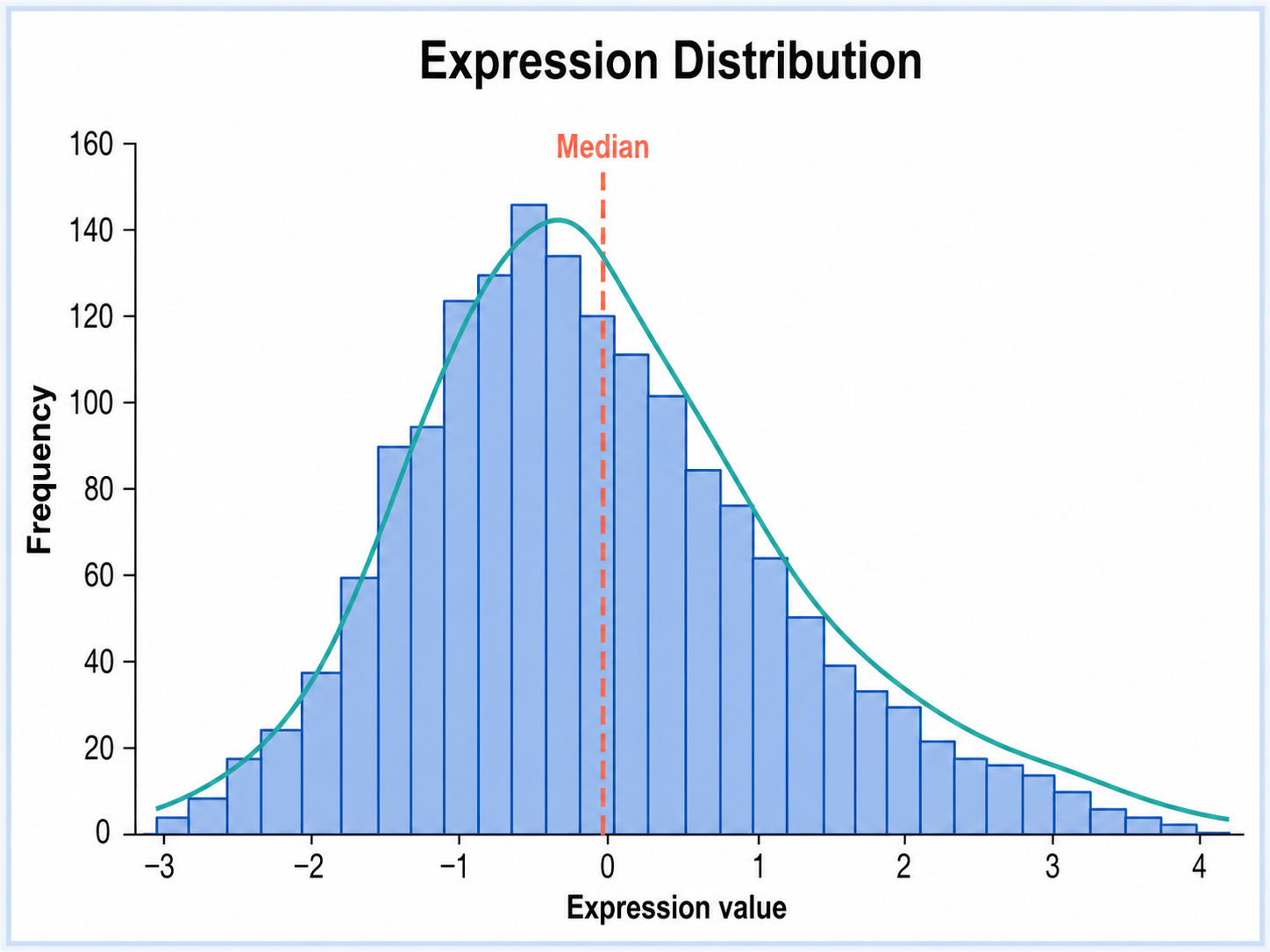
Expression Distribution histogram example preview
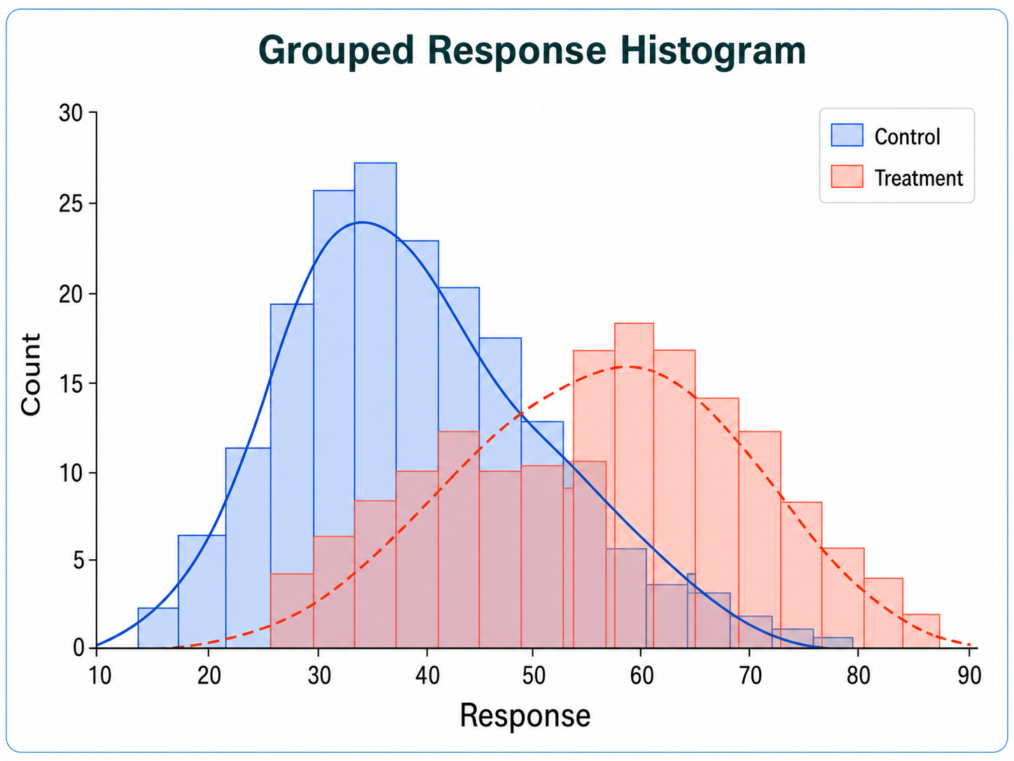
Grouped Response Histogram histogram example preview
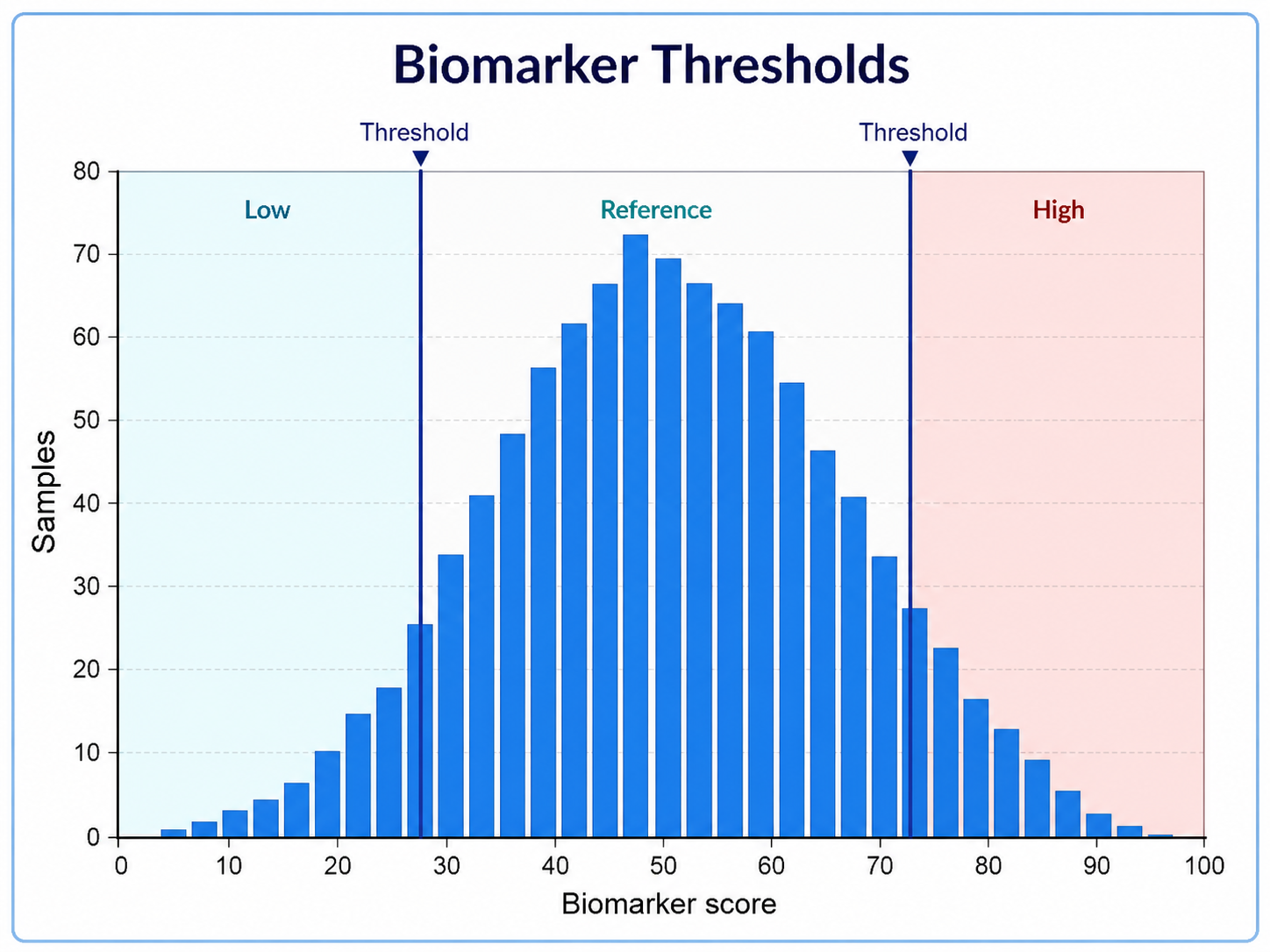
Biomarker Thresholds histogram example preview

These are sample previews. Upload your dataset to generate your own histogram.

Histogram examples

Use these examples as visual directions for raw values, grouped overlays, thresholds, and manuscript-ready distribution figures.

Histogram Generator for Scientific Data: Expression Distribution scientific chart example

Prompt

Based on the uploaded gene_expression_values.csv file, create a publication-ready histogram showing the distribution of normalized gene expression values. Use clean bins, a frequency y-axis, a subtle mean reference line, readable axis labels, and a restrained scientific color palette.
Expression Distribution

Histogram Generator for Scientific Data: Grouped Response Histogram scientific chart example

Prompt

Based on the uploaded treatment_response_groups.xlsx file, create overlaid histograms comparing response distributions for control, low-dose, and high-dose groups. Use transparent fills, shared bin widths, clear group labels, and a compact legend suitable for a manuscript figure.

Grouped Response Histogram

Histogram Generator for Scientific Data: Biomarker Thresholds scientific chart example

Prompt

Based on the uploaded biomarker_thresholds.tsv file, create a histogram of biomarker scores with a vertical clinical cutoff line. Show sample counts, label the threshold clearly, use publication-ready typography, and keep the chart uncluttered.

Biomarker Thresholds

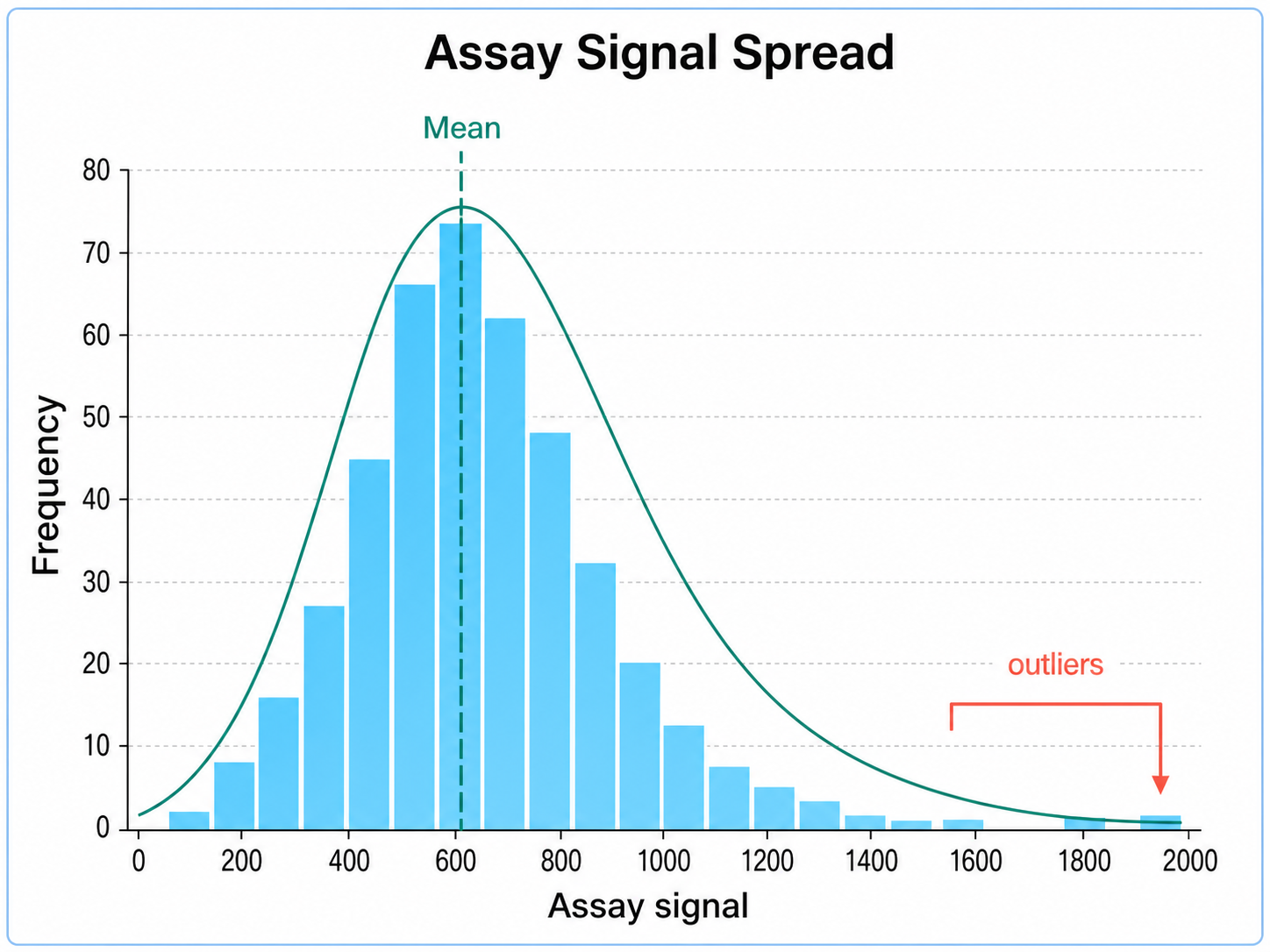
Histogram Generator for Scientific Data: Assay Signal Spread scientific chart example

Prompt

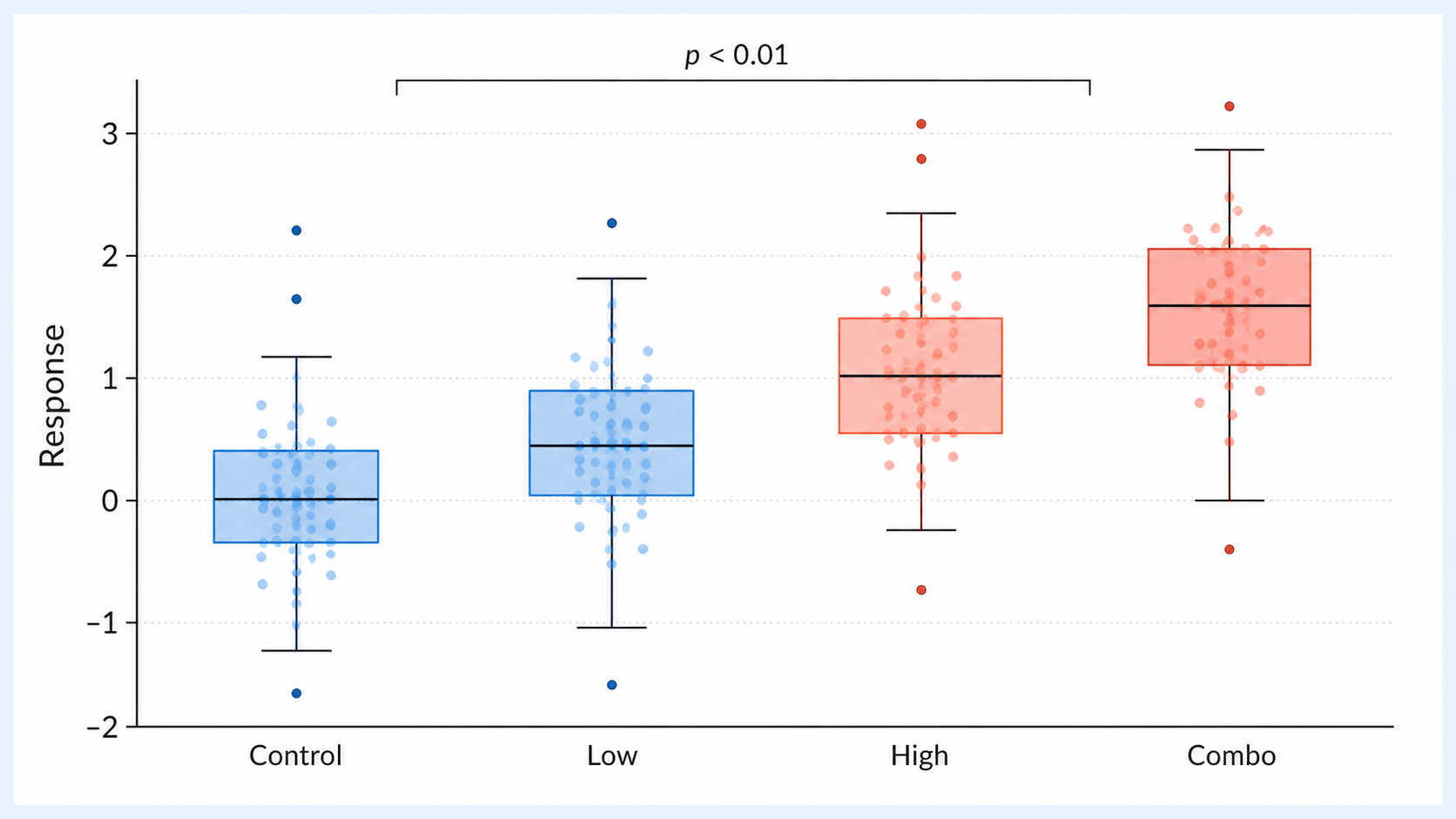
Based on the uploaded assay_signal_spread.csv file, create a histogram showing assay signal intensity across replicate wells. Use evenly spaced bins, mark the median and interquartile range, label outliers subtly, and use a clean lab-report style.

Assay Signal Spread

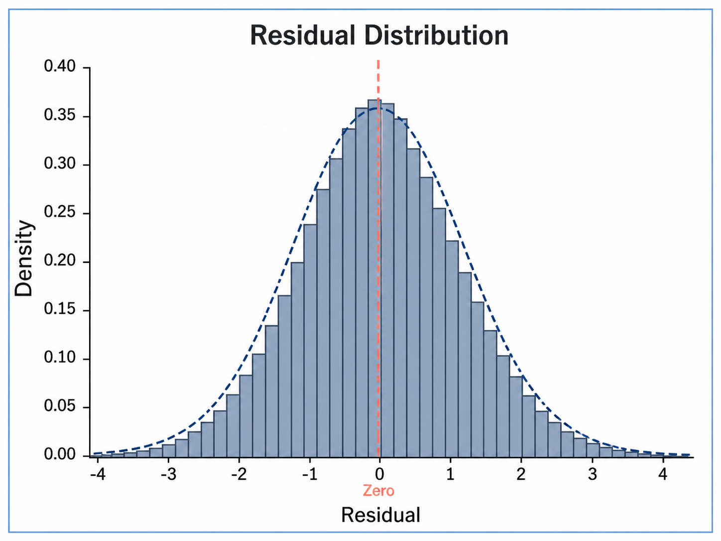
Histogram Generator for Scientific Data: Residual Distribution scientific chart example

Prompt

Based on the uploaded model_residuals.csv file, create a histogram of residual values with a smooth density curve overlay. Center the x-axis around zero, include a dashed zero reference line, and use a simple statistical figure style.

Residual Distribution

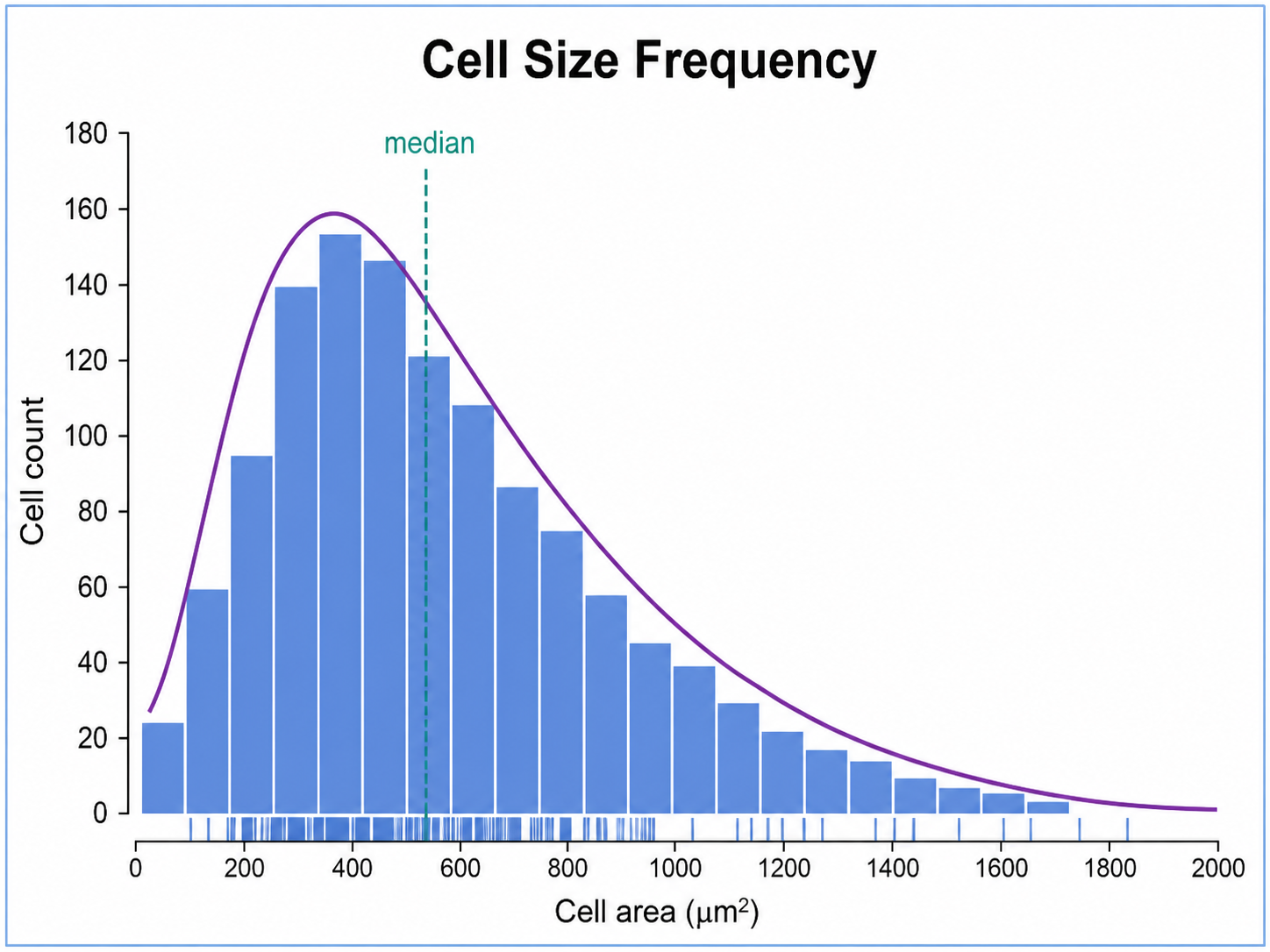
Histogram Generator for Scientific Data: Cell Size Frequency scientific chart example

Prompt

Based on the uploaded cell_size_measurements.xlsx file, create a histogram showing cell size frequency across measured cells. Use micron units on the x-axis, show sample size, choose readable binning, and produce a clean figure for a biology report.

Cell Size Frequency

How to make a histogram

1

Upload your dataset

Add CSV, TSV, TXT, or Excel data with at least one numeric measurement column.

2

Describe the chart

Tell SciFigure AI the bins, labels, overlays, threshold lines, and palette you need.

3

Generate, review & download

Create a clean histogram, review the result, then download PNG for papers and slides.

What does this histogram generator do?

It turns raw numeric measurements into a clean histogram for showing distribution shape, spread, skew, peaks, tails, and outliers. The result is designed for manuscripts, lab reports, posters, and research presentations.

Why use a histogram generator

  • Inspect measurement distributions before choosing a summary statistic.
  • Compare raw values, skew, tails, and potential multimodality with readable binning.
  • Add threshold lines, density cues, or group overlays without rebuilding the chart by hand.
  • Move from spreadsheet values to a polished scientific figure faster.

Types and parts of a histogram

  • Bins divide a numeric range into intervals.
  • Bar height shows frequency, count, or density within each bin.
  • Shared bins make grouped overlays easier to compare.
  • Reference lines, sample sizes, and units make the figure manuscript-ready.

Histogram Generator FAQ

What data does the histogram need?

A numeric measurement column is required. An optional group column can be used for overlays or separate panels.

Can I compare multiple groups in one histogram?

Yes. Use a group column and ask for transparent overlays, shared bins, or separate small panels.

Can I control bin width or bin count?

Yes. Describe the bin count, bin width, or binning rule in the prompt, then verify the result against your data.

Can I show density instead of frequency?

Yes. Ask for a density-scaled histogram or a smooth density curve overlay when that better fits your figure.

Can I use the result in a paper?

Yes, but always verify the source data, binning rule, units, labels, and caption before submission.

Need clearer distribution figures?

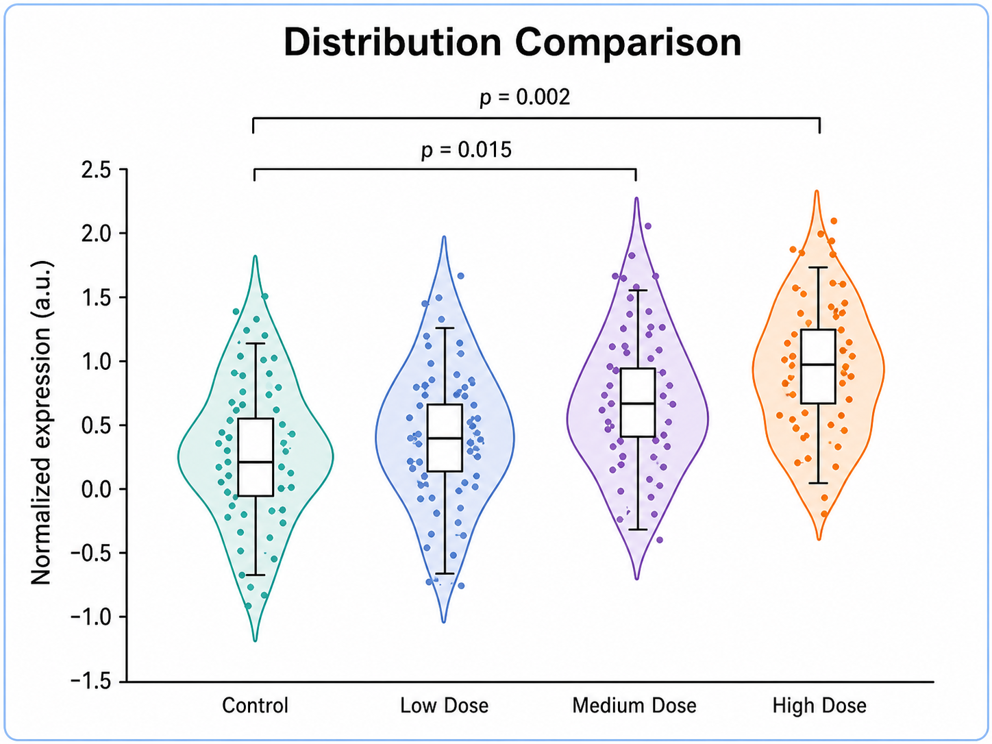
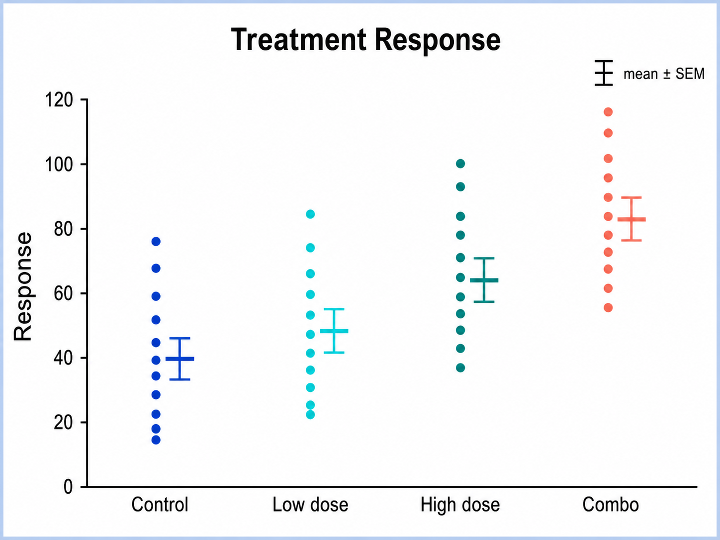
Generate histograms, box plots, violin plots, and other research-ready visualizations with SciFigure AI.