Box Plot Generator for Scientific Data

Create publication-ready box plots from grouped experimental data.

Upload raw measurements, map groups and values, then generate a clean AI chart with median, IQR, whiskers, and outliers.

Grouped data readyMedian, IQR & whiskersPublication-ready PNG

AI Box Plot Generator

Upload data and describe the AI chart you need.

Aspect ratio
256 / 2000 characters

Costs 5 credits. Uses your uploaded data and prompt to generate a publication-ready image.

Preview

Box Plot Example Previews

Aspect ratio: 16:9

Treatment Response box plot example preview
Cell Viability box plot example preview
Dose Response box plot example preview

These are sample previews. Upload your dataset to generate your own chart.

Box plot examples

Use these examples as visual directions for grouped measurements, cohort comparisons, and manuscript-ready statistical charts.

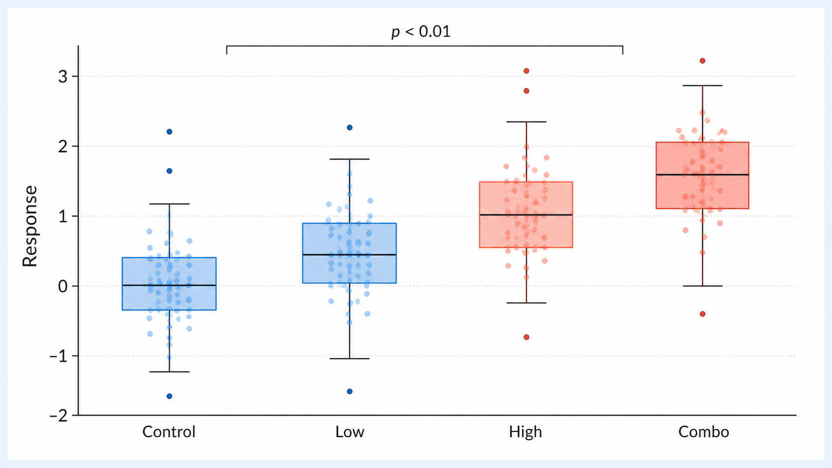
Box Plot Generator: Treatment Response scientific chart example

Prompt

Based on the uploaded treatment_response_groups.csv file, create a grouped box plot comparing Control, Low, High, and Combo response values. Show medians, IQR boxes, whiskers, outliers, raw dots, clear axes, and a blue/coral publication style.
Treatment Response

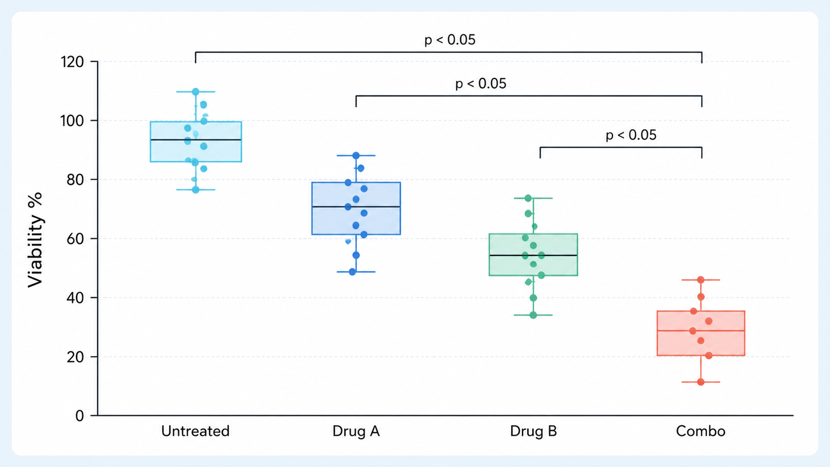
Box Plot Generator: Cell Viability scientific chart example

Prompt

Based on the uploaded cell_viability_assay.xlsx file, create a scientific box plot of cell viability by treatment condition. Show medians, IQR boxes, whiskers, outliers, replicate dots, group labels, Cell viability (%) axis, and a clean light-blue manuscript style.

Cell Viability

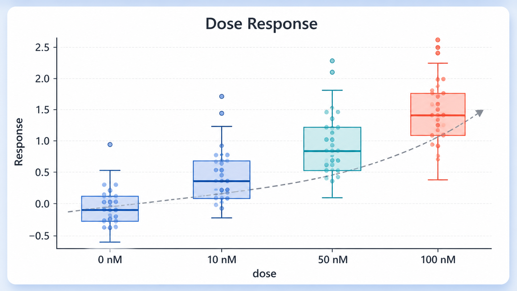
Box Plot Generator: Dose Response scientific chart example

Prompt

Based on the uploaded dose_response_replicates.csv file, create a dose-response box plot across 0 nM, 10 nM, 50 nM, and 100 nM groups. Show medians, IQR boxes, whiskers, outliers, raw dots, clear dose labels, and a clean blue scientific style.

Dose Response

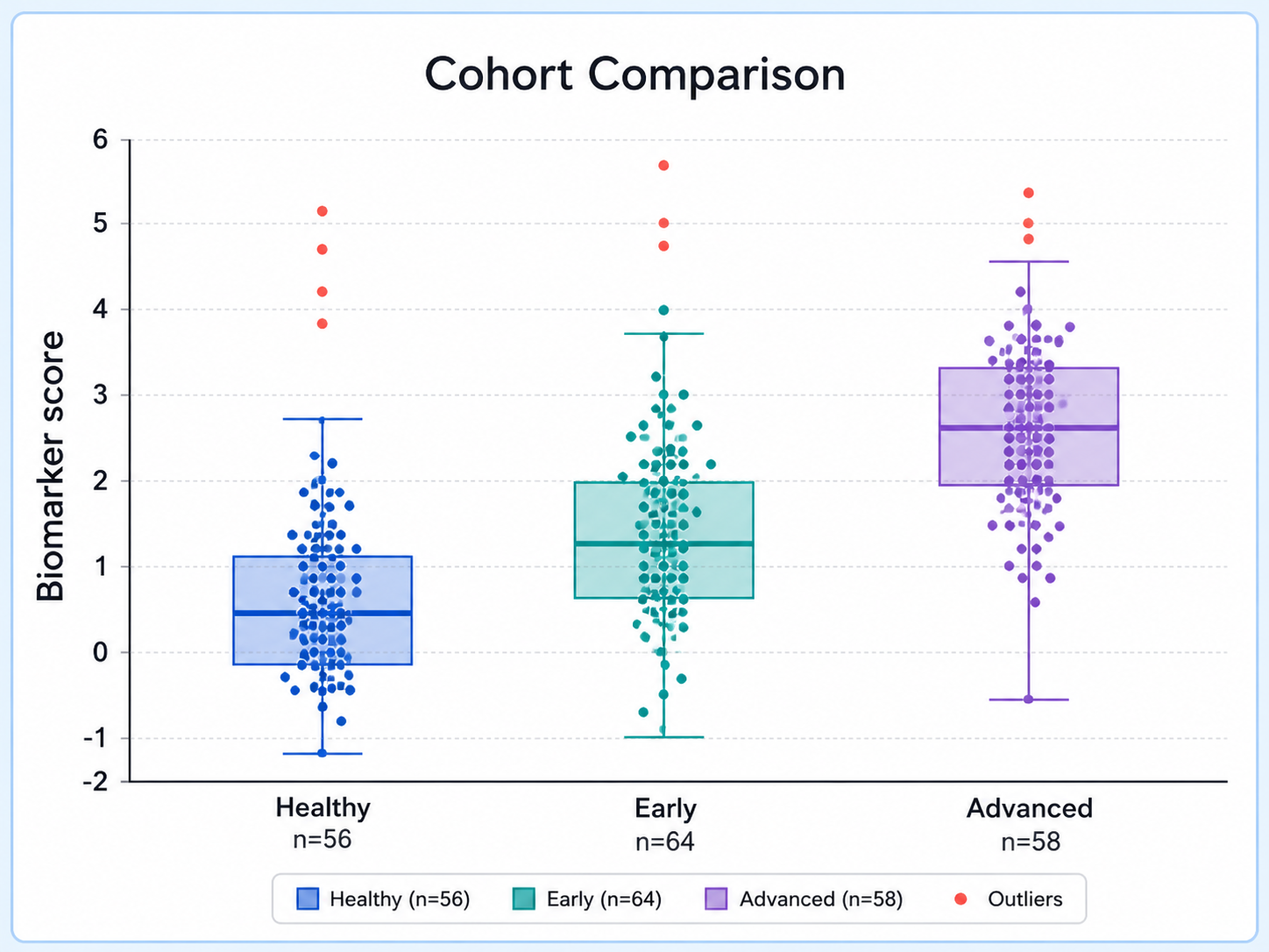
Box Plot Generator: Cohort Comparison scientific chart example

Prompt

Based on the uploaded cohort_comparison_samples.csv file, create a cohort-stratified box plot comparing baseline biomarker values across patient groups. Show medians, IQR boxes, whiskers, outliers, raw dots, compact labels, and a clean manuscript style.

Cohort Comparison

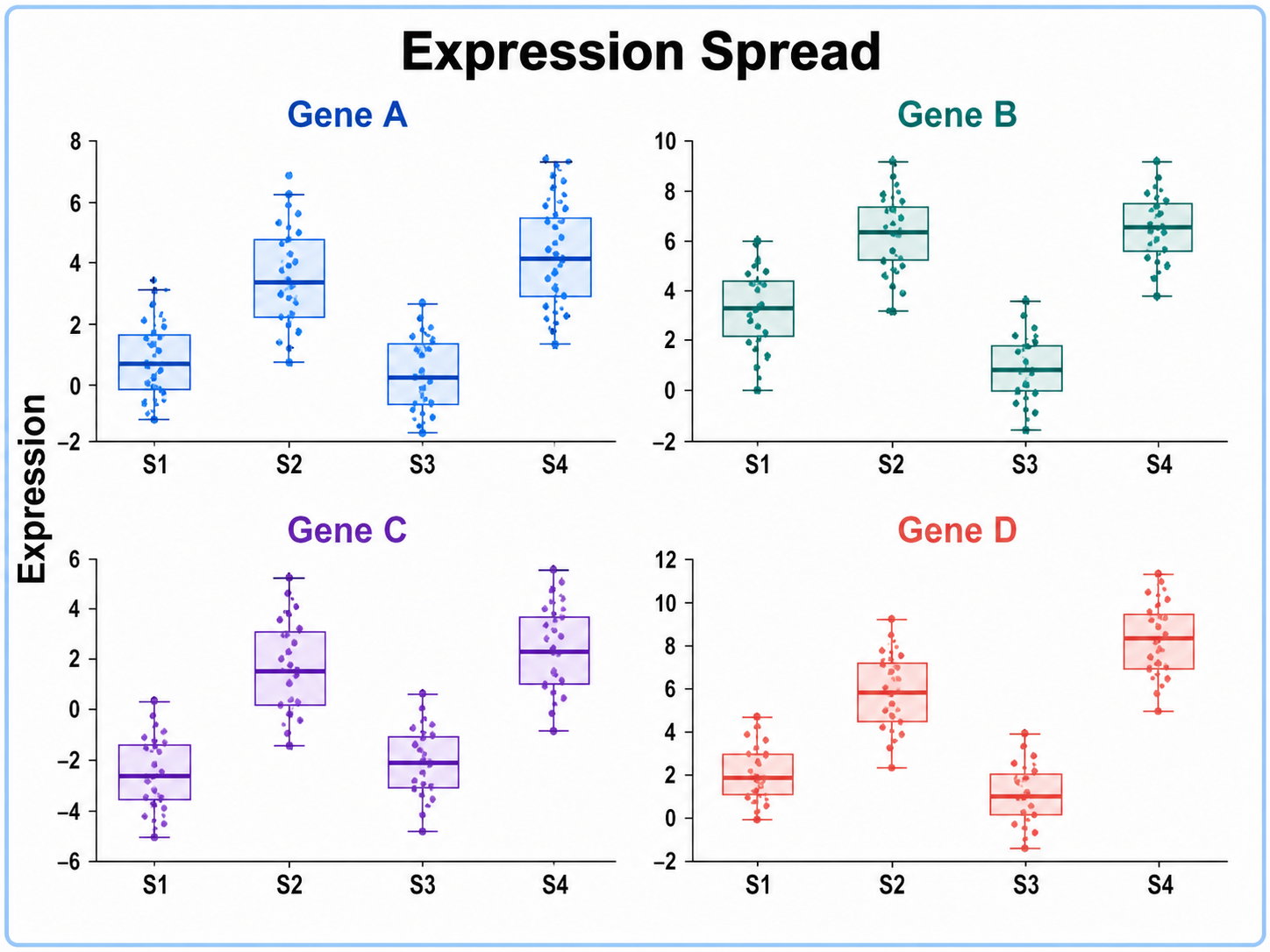
Box Plot Generator: Expression Spread scientific chart example

Prompt

Based on the uploaded gene_expression_spread.tsv file, create a multi-gene expression box plot showing spread across selected genes or clusters. Include medians, IQR boxes, whiskers, outliers, raw dots, subtle significance marks, and restrained scientific colors.

Expression Spread

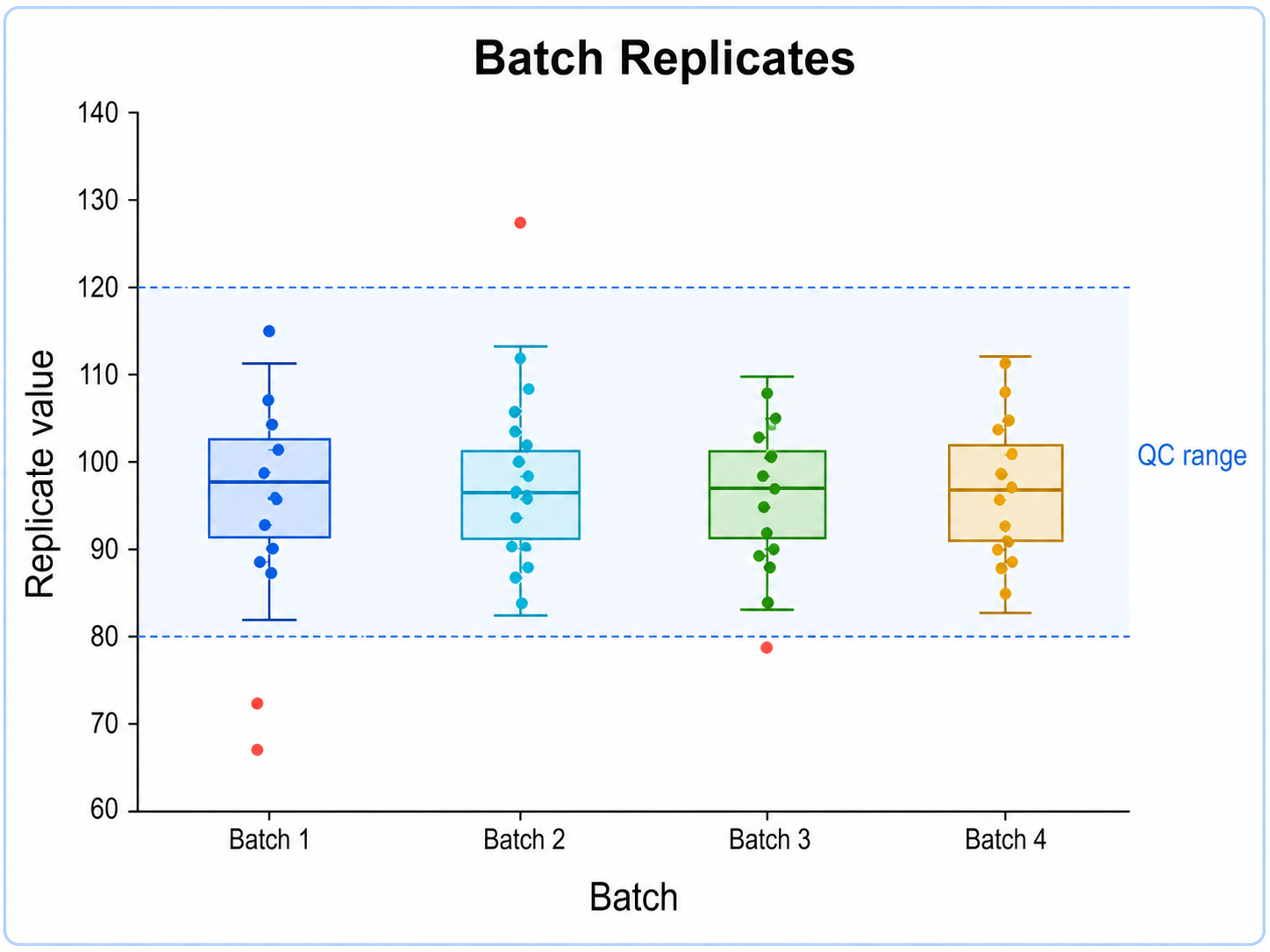
Box Plot Generator: Batch Replicates scientific chart example

Prompt

Based on the uploaded batch_replicates_qc.xlsx file, create a batch-level QC box plot comparing replicate measurements across sites. Show medians, IQR boxes, whiskers, outliers, raw dots, sample-size labels, a subtle QC range band, and clean scientific styling.

Batch Replicates

How to make a box plot

1

Upload your dataset

Add CSV, TSV, TXT, or Excel measurements with one row per observation.

2

Describe the chart

Tell SciFigure AI the labels, palette, group order, and statistical style you need.

3

Generate, review & download

Create a clean box plot, review the figure, then download PNG for papers and slides.

What does this box plot generator do?

It turns grouped measurements into a clean box plot with medians, interquartile ranges, whiskers, outliers, labels, and optional raw points. The result is designed for manuscripts, lab reports, posters, and research presentations.

Why use a box plot generator

  • Compare distributions across treatments, cohorts, time points, or experimental conditions.
  • Preserve medians, IQR, whiskers, and outlier cues without rebuilding the chart by hand.
  • Move from spreadsheet data to a polished scientific figure faster.
  • Export clean PNG output for papers, posters, reports, and slides.

Types and parts of a box plot

  • The line inside each box is the median.
  • The box spans Q1 to Q3 and represents the middle 50%.
  • Whiskers show the selected range rule, commonly 1.5x IQR.
  • Outliers and raw observations can be shown when transparency is useful.

Box Plot Generator FAQ

What data does the box plot need?

Long-form data works best: one group column and one numeric measurement column, with one row per observation.

Can a box plot show individual observations?

Yes. You can show jittered raw points when sample size and transparency allow it, especially for small groups.

Can I create grouped box plots?

Yes. Use group labels such as condition, cohort, dose, time point, or treatment arm to compare distributions.

Can I edit or export the result?

The generated result is a PNG image that you can download after generation. Review labels, statistics, and units before using it.

Can I use the result in a paper?

Yes, but always verify source data, field mapping, statistical method, units, and caption before submission.

Need clearer statistical figures?

Generate box plots, violin plots, histograms, and other research-ready visualizations with SciFigure AI.