Manhattan Plot Generator for GWAS Summary Statistics
Turn GWAS summary statistics into a clean, publication-ready Manhattan plot.
Upload PLINK, REGENIE, SAIGE, or BOLT-LMM results, and SciFigure computes -log10 p-values, genome-wide significance counts, lead SNPs, and genomic inflation before drawing a labeled GWAS Manhattan plot for your manuscript.
5e-8 and 1e-5 linesClumped lead SNP labelsOptional QQ plot panel
AI Manhattan Plot Generator
Upload summary statistics and describe the plot you need.
Aspect ratio
302 / 2000 characters
Costs 5 credits. -log10 p-values, thresholds, lead SNPs, and lambda are computed from your uploaded data, then drawn as a PNG.
Preview
Manhattan Plot Examples
Aspect ratio: 16:9
These are sample previews. Upload your summary statistics to generate your own Manhattan plot.
Manhattan plot examples
Start from a standard human GWAS, REGENIE output with LOG10P, a combined Manhattan and QQ figure, a crop or mouse association study, or an epigenome-wide methylation scan.
Prompt
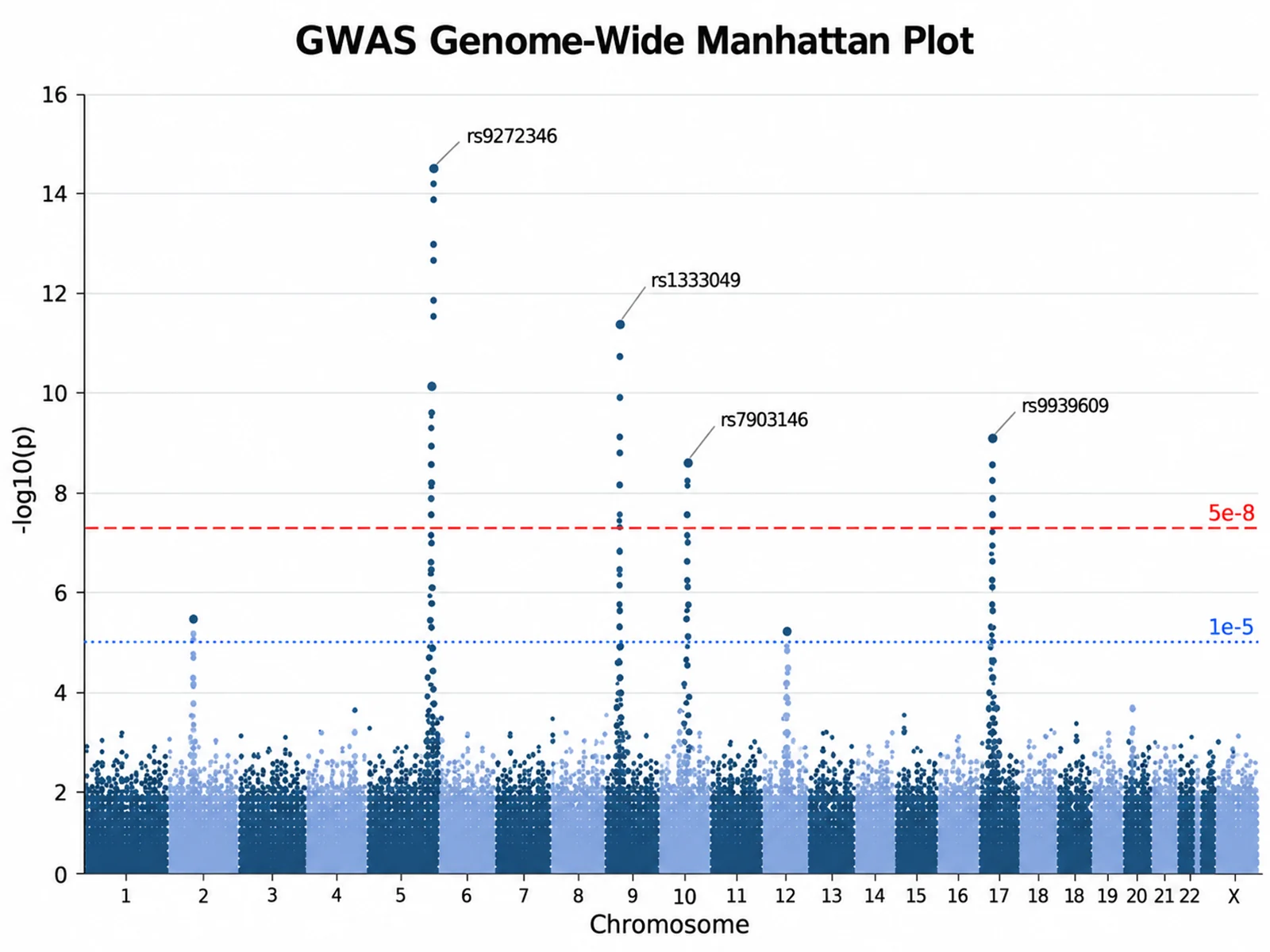
Based on the uploaded gwas_summary_stats.csv file, create a GWAS Manhattan plot with chromosomes 1-22 and X in natural order, alternating dark and light blue points, a red dashed genome-wide line at 5e-8, a blue dotted suggestive line at 1e-5, and labels for the lead SNP at each genome-wide locus.
GWAS Genome-Wide Manhattan Plot
Prompt
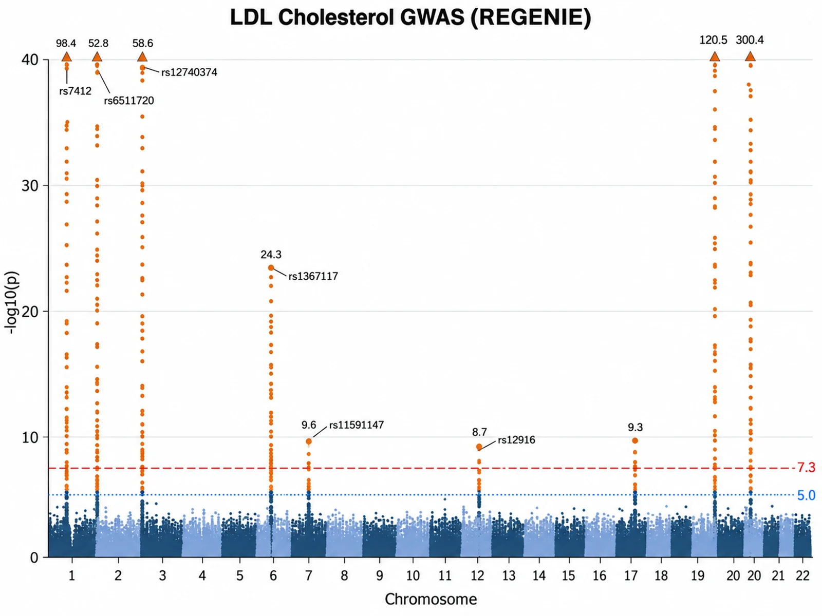
Based on the uploaded ldl_step2.regenie file, create a Manhattan plot from the LOG10P column for LDL cholesterol. Highlight genome-wide significant variants in orange, label the lead variants, and cap the y-axis at 40 with triangles for stronger signals.
REGENIE LOG10P Manhattan Plot
Prompt
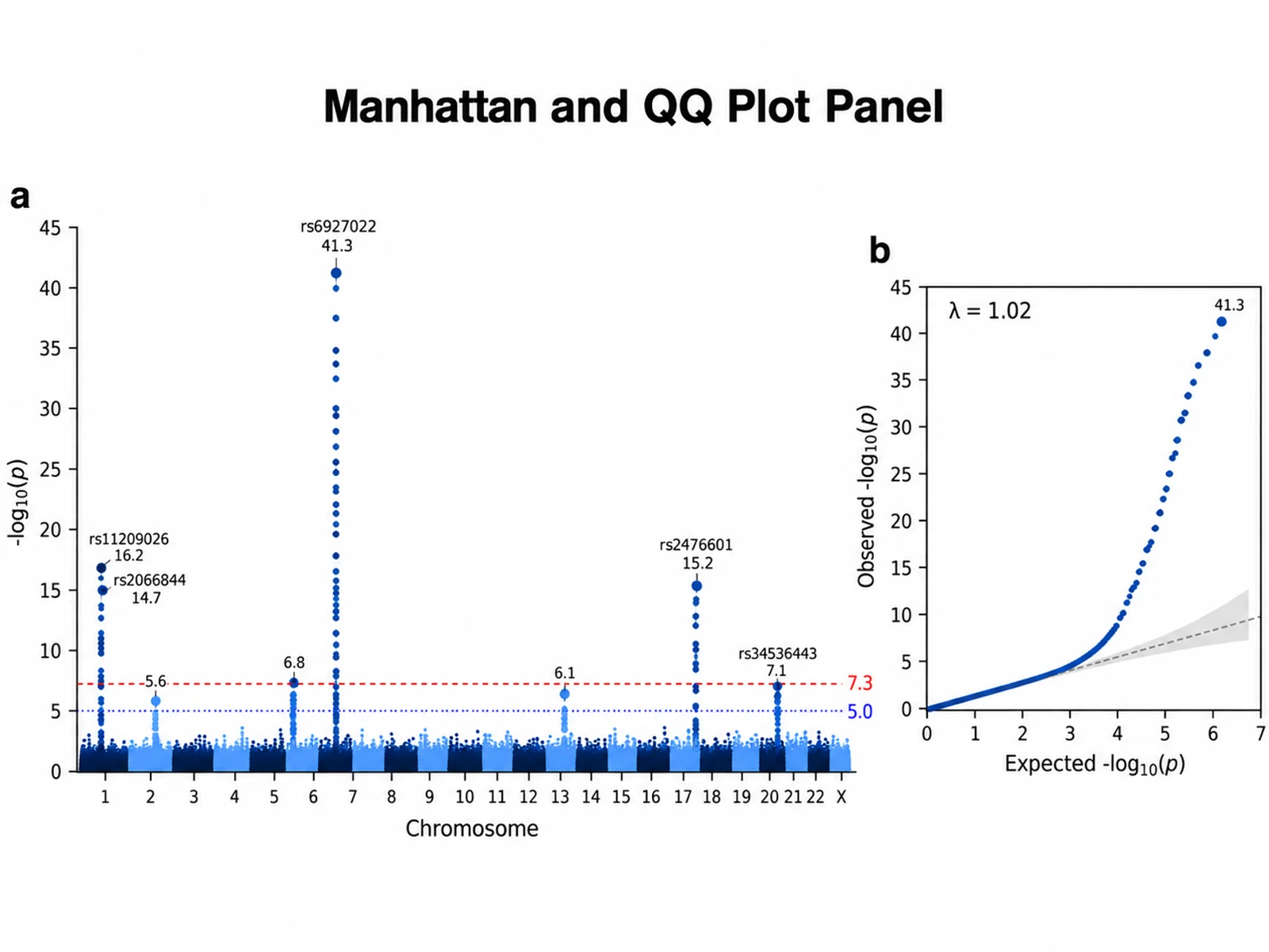
Based on the uploaded saige_binary_trait.txt file, create a Manhattan plot with a QQ plot panel on the right. Print the genomic inflation lambda on the QQ plot, keep the 5e-8 and 1e-5 lines, and label the top 5 lead SNPs.
Manhattan and QQ Plot Panel
Prompt
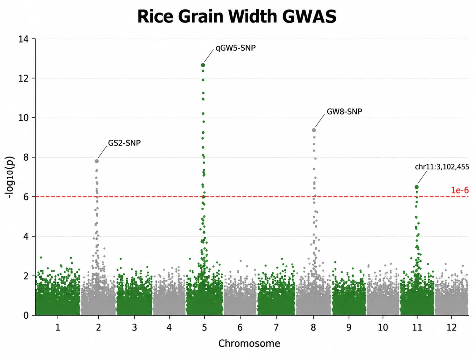
Based on the uploaded rice_grain_width_gemma.csv file, create a Manhattan plot for rice chromosomes 1-12 using the observed position span, a significance threshold of 1e-6, no suggestive line, and green and gray alternating chromosome colors.
Rice Grain Width GWAS
Prompt
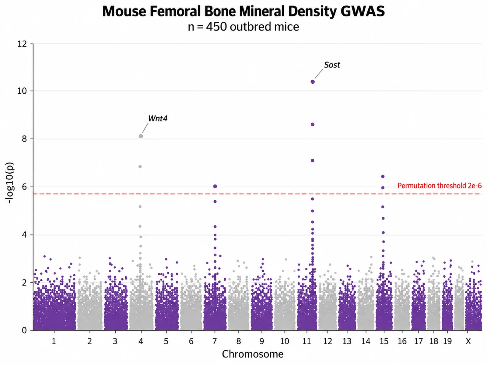
Based on the uploaded mouse_bmd_gemma.csv file, create a Manhattan plot of femoral bone mineral density in 450 outbred mice across chromosomes 1-19 and X. Treat the data as non-human so band widths follow the observed position spans, use a permutation threshold of 2e-6 for the red dashed line, drop the suggestive line, alternate purple and light gray points by chromosome, and label the lead markers at the chromosome 11 and chromosome 4 peaks with their nearest gene names.
Mouse Bone Density GWAS
Prompt
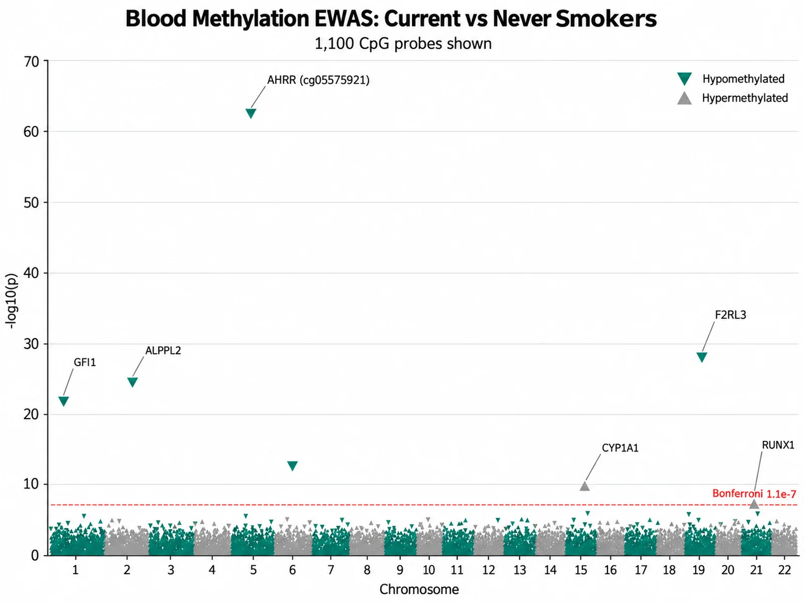
Based on the uploaded smoking_ewas_450k.csv file, create an EWAS Manhattan plot of 1,100 CpG probes tested against smoking status. Use the Bonferroni threshold for 450,000 probes as the red dashed line, draw hypomethylated probes as downward triangles and hypermethylated probes as upward triangles, keep chromosomes 1-22 in alternating dark teal and gray, and label the top CpGs with their nearest gene, including the AHRR probe on chromosome 5.
Blood Methylation EWAS Manhattan Plot
How to make a Manhattan plot
1
Upload summary statistics
Add CSV, TSV, TXT, or Excel output with chromosome, base-pair position, and p-value columns. Headers from PLINK, REGENIE, SAIGE, BOLT-LMM, and the GWAS Catalog are detected automatically.
2
Describe the figure
Set custom thresholds, colors, how many lead SNPs to label, a y-axis cap, or a QQ plot panel. Defaults follow common GWAS conventions.
3
Generate, review & download
SciFigure computes every plotted value, draws the GWAS Manhattan plot, and lets you download a PNG for papers, posters, and slides.
What does this Manhattan plot generator do?
A Manhattan plot shows every tested variant from a genome-wide association study as a point: genomic position on the x-axis, chromosome by chromosome, and -log10(p) on the y-axis. True associations rise above the background as tall "skyscrapers". This Manhattan plot generator sorts chromosomes naturally (1 to 22, X, Y, MT, with any "chr" prefix removed), converts p-values to -log10 p, and computes cumulative genomic offsets so each chromosome gets a band proportional to its length. It then counts variants above each threshold, identifies lead SNPs, and estimates genomic inflation. Only then does the image model draw the figure, so point heights, threshold lines, and labels come from your data.
Genome-wide significance, suggestive lines, and lead SNPs
The genome-wide significance threshold of p = 5e-8 is a Bonferroni-style correction for roughly one million independent common-variant tests in European-ancestry genomes. It appears as a dashed line at -log10 p ≈ 7.3.
The suggestive line at p = 1e-5 (-log10 p = 5) flags loci worth follow-up or replication, but it is not evidence of association on its own.
Override either line in your instructions, for example "threshold 1e-6", "suggestive 1e-4", "no suggestive line", or "Bonferroni" for 0.05 divided by the number of uploaded variants.
Lead SNPs are found by distance-based clumping: the most significant variant is kept, every weaker variant within ±500 kb on the same chromosome joins its locus, and the process repeats. Up to 15 leads are labeled. Change the window with "clump window 1 Mb". This is not LD-based clumping; for r²-based loci, run PLINK --clump and upload the result.
Genomic inflation λ and pairing with a QQ plot
Each p-value is converted to a 1-df chi-square statistic (χ² = z², with z from the normal quantile of p/2). λ is the median χ² divided by 0.4549, the median expected under the null.
λ close to 1.00 suggests well-calibrated test statistics. Values above about 1.05 can reflect population stratification or cryptic relatedness, but highly polygenic traits in large samples also inflate λ; the LD score regression intercept separates the two.
A QQ plot compares observed and expected -log10 p. Early deviation from the diagonal points to inflation, while deviation only in the tail usually reflects true signals. Add "QQ plot" to your instructions to place one beside the Manhattan plot with λ printed on it.
λ is only meaningful when computed from all tested variants. If you upload a filtered subset, compute λ in your analysis pipeline and quote that value.
How to read a GWAS Manhattan plot
Each column of points is one chromosome, drawn in alternating colors so neighboring chromosomes stay distinct.
A tower of points reaching above the genome-wide line is a locus: many correlated variants in linkage disequilibrium share the signal.
An isolated point above the line with no supporting neighbors deserves quality-control checks (low minor allele frequency, poor imputation, or genotyping error).
Point height reflects statistical evidence, not effect size; report betas or odds ratios separately.
Columns named LOG10P, NegLog10P, or MLOG10P are treated as already -log10 transformed. Raw p-values must lie between 0 and 1; p = 0 from numeric underflow is clamped to the smallest double and flagged.
Uploads are capped at 1,200 rows, and extra rows are cut from the end of the file. Filter to variants with p < 1e-3 plus a thinned random sample of the rest, so later chromosomes are not dropped.
Chromosome widths use GRCh38 lengths by default. Say "GRCh37" for hg19 lengths, or "non-human" or a species name to use observed position spans. PLINK codes 23 to 26 become X, Y, XY, and MT for human data.
Manhattan Plot Generator FAQ
What columns does the Manhattan plot generator need?
Three columns are required: chromosome (1, chr1, X, MT...), base-pair position (numeric), and a p-value or -log10 p column. A SNP or variant ID column is optional but needed for lead SNP labels.
Does the tool calculate the statistics or does AI estimate them?
The statistics are calculated from your uploaded rows: -log10 p, chromosome offsets, threshold counts, clumped lead SNPs, λ, and QQ plot quantiles. The image model receives those numbers and handles layout and styling. Very dense background points are passed as per-chromosome summaries, so check labels and lines against your own results before publication.
Can I use a genome-wide significance threshold other than 5e-8?
Yes. Write "threshold 1e-6", "genome-wide 5x10^-9", or "Bonferroni" in your instructions. You can also set "suggestive 1e-4" or ask for "no suggestive line". Counts and lead SNPs update to match.
Can I upload full summary statistics with millions of variants?
Not directly. Uploads are limited to 1,200 rows. Keep every variant with p < 1e-3 plus a thinned sample of the background. Significant loci are plotted exactly; the background band is drawn from per-chromosome summaries.
How do I add a QQ plot or show lambda?
Mention "QQ plot" to add a side panel with expected versus observed -log10 p and λ printed on it. Mention "lambda" to print λ on the Manhattan plot alone.
Does it work for non-human GWAS, EWAS, or QTL scans?
Yes. Any data with chromosome, position, and p-value columns works, including mouse, crop, and livestock studies or methylation and eQTL scans. Add "non-human" or the species name so chromosome widths follow your data instead of human reference lengths.