Time Series Plot Generator for Scientific Data

Create publication-ready time series plots from uploaded research data.

Upload repeated measurements, map time and response columns, describe the figure you need, then generate a clean time series plot with trends, groups, labels, event cues, and manuscript-ready styling.

Longitudinal data readyTrends, groups & annotationsPublication-ready PNG

AI Time Series Plot Generator

Upload data and describe the time series figure you need.

Aspect ratio
347 / 2000 characters

Costs 5 credits. Uses your uploaded data and prompt to generate a publication-ready PNG.

Preview

Time Series Plot Example Previews

Aspect ratio: 16:9

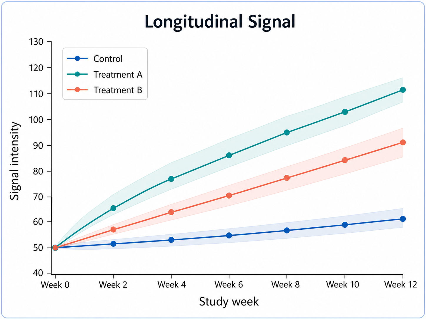
Longitudinal Signal time series plot example preview
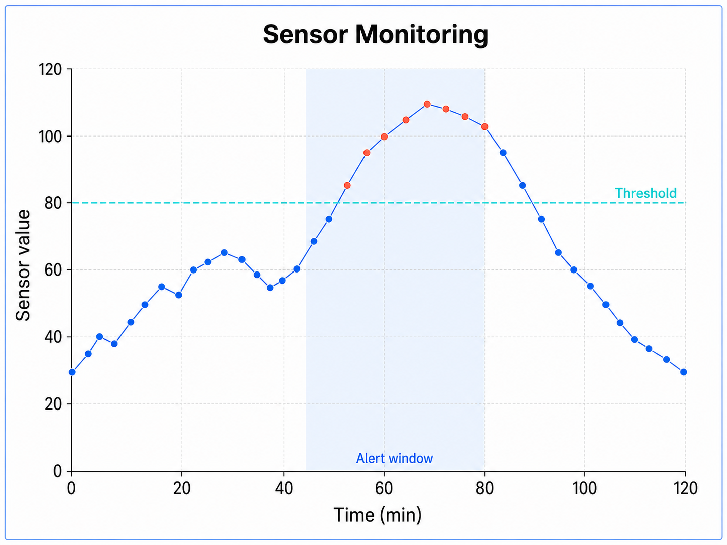
Sensor Monitoring time series plot example preview
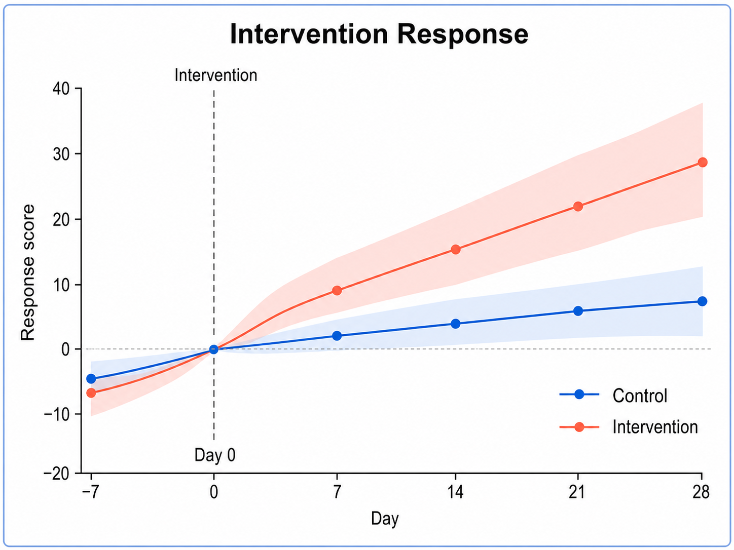
Intervention Response time series plot example preview

These are sample previews. Upload your dataset to generate your own time series plot.

Time series plot examples

Use these examples as visual directions for longitudinal measurements, sensor traces, intervention timelines, cyclic signals, and monitoring data.

Time Series Plot Generator for Scientific Data: Longitudinal Signal scientific chart example

Prompt

Based on the uploaded longitudinal_signal.csv file, create a publication-ready time series plot showing study day on the x-axis and signal intensity on the y-axis. Use clean lines and markers, highlight any uploaded intervention window with a subtle shaded region, and keep the chart accurate to the recorded time points.
Longitudinal Signal

Time Series Plot Generator for Scientific Data: Sensor Monitoring scientific chart example

Prompt

Based on the uploaded sensor_monitoring_timeseries.tsv file, create a multi-signal time series plot comparing sensor measurements over elapsed time. Use one line per sensor, readable markers at sampled points, compact legends, and avoid connecting across missing intervals unless the uploaded data supports continuity.

Sensor Monitoring

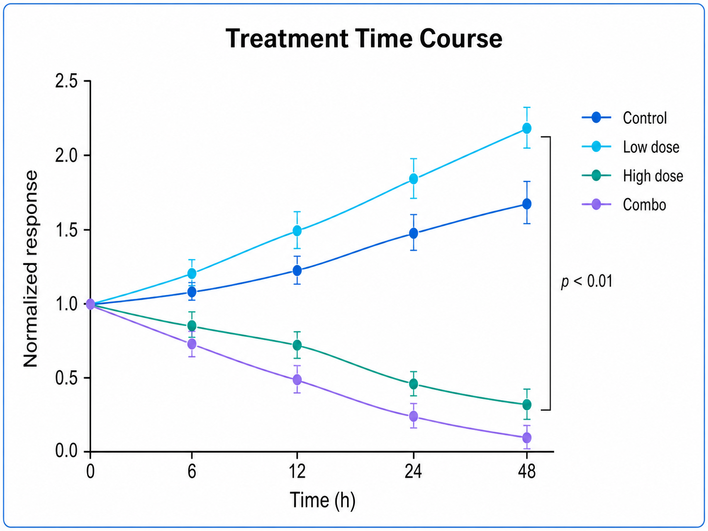
Time Series Plot Generator for Scientific Data: Intervention Response scientific chart example

Prompt

Based on the uploaded intervention_response_visits.xlsx file, create a clinical time series plot showing response before and after an intervention. Use visit week on the x-axis, clinical score on the y-axis, add an event marker only if the intervention time is included, and keep annotations restrained.

Intervention Response

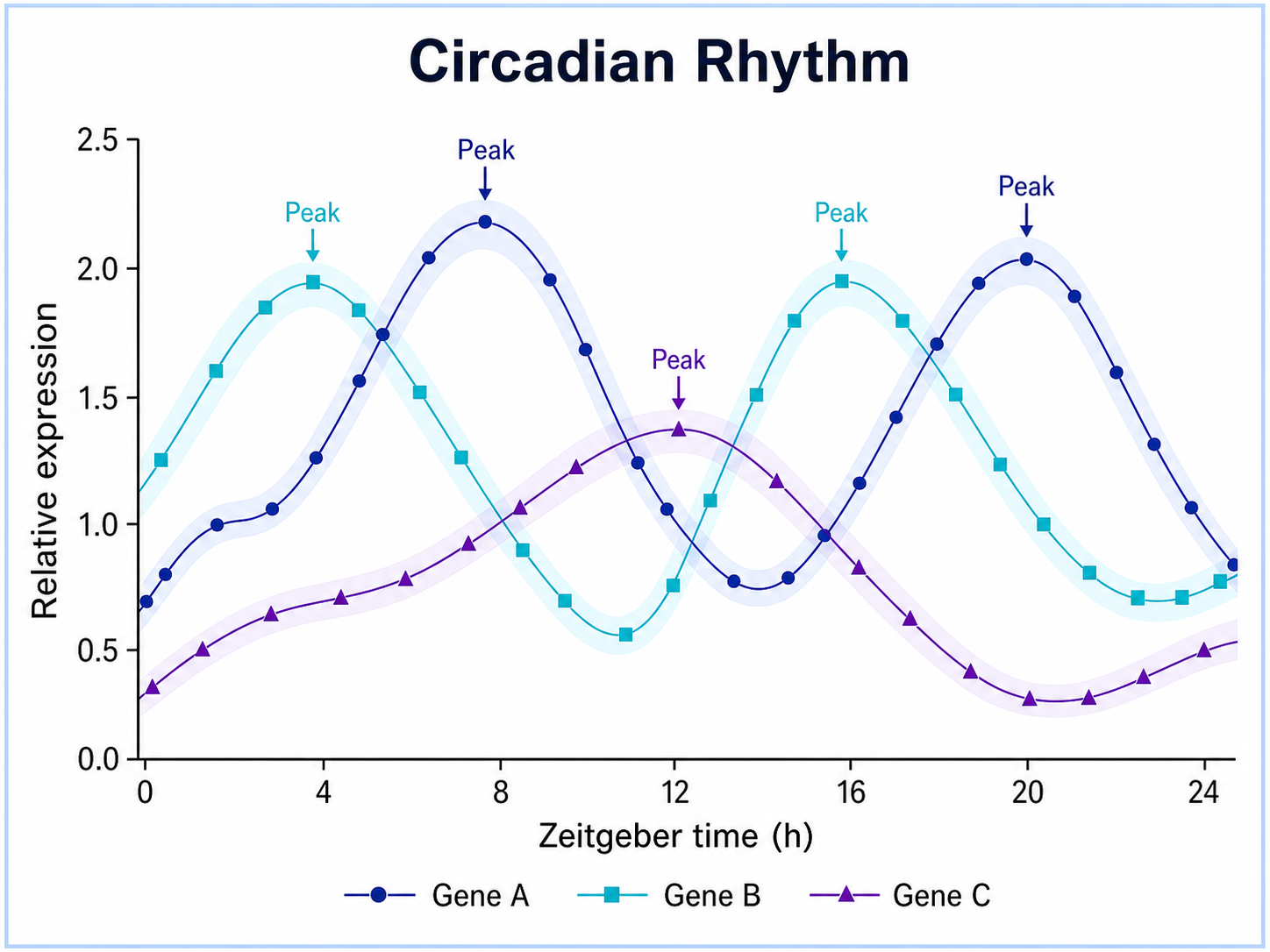
Time Series Plot Generator for Scientific Data: Circadian Rhythm scientific chart example

Prompt

Based on the uploaded circadian_expression.csv file, create a time series plot showing relative expression across circadian time. Preserve the cyclic trend, shade dark phases only if those intervals are present in the file, use clean markers, and keep the figure suitable for a physiology manuscript.

Circadian Rhythm

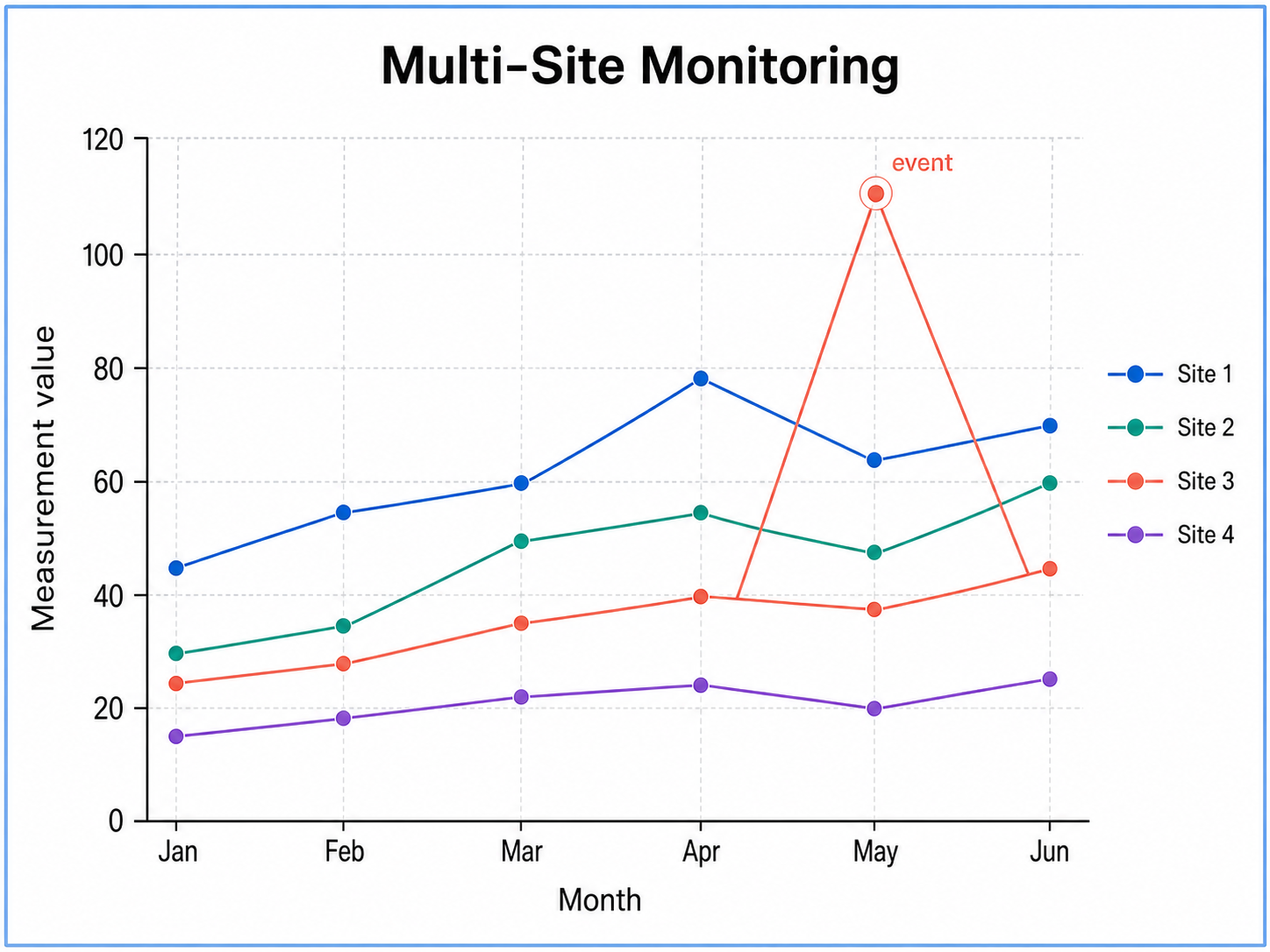
Time Series Plot Generator for Scientific Data: Multi-Site Monitoring scientific chart example

Prompt

Based on the uploaded multi_site_monitoring.xlsx file, create a grouped time series plot comparing measurement trends across study sites. Use separate lines and colors for each site, align all series on the shared collection-day axis, keep the legend clear, and show uncertainty only if provided.

Multi-Site Monitoring

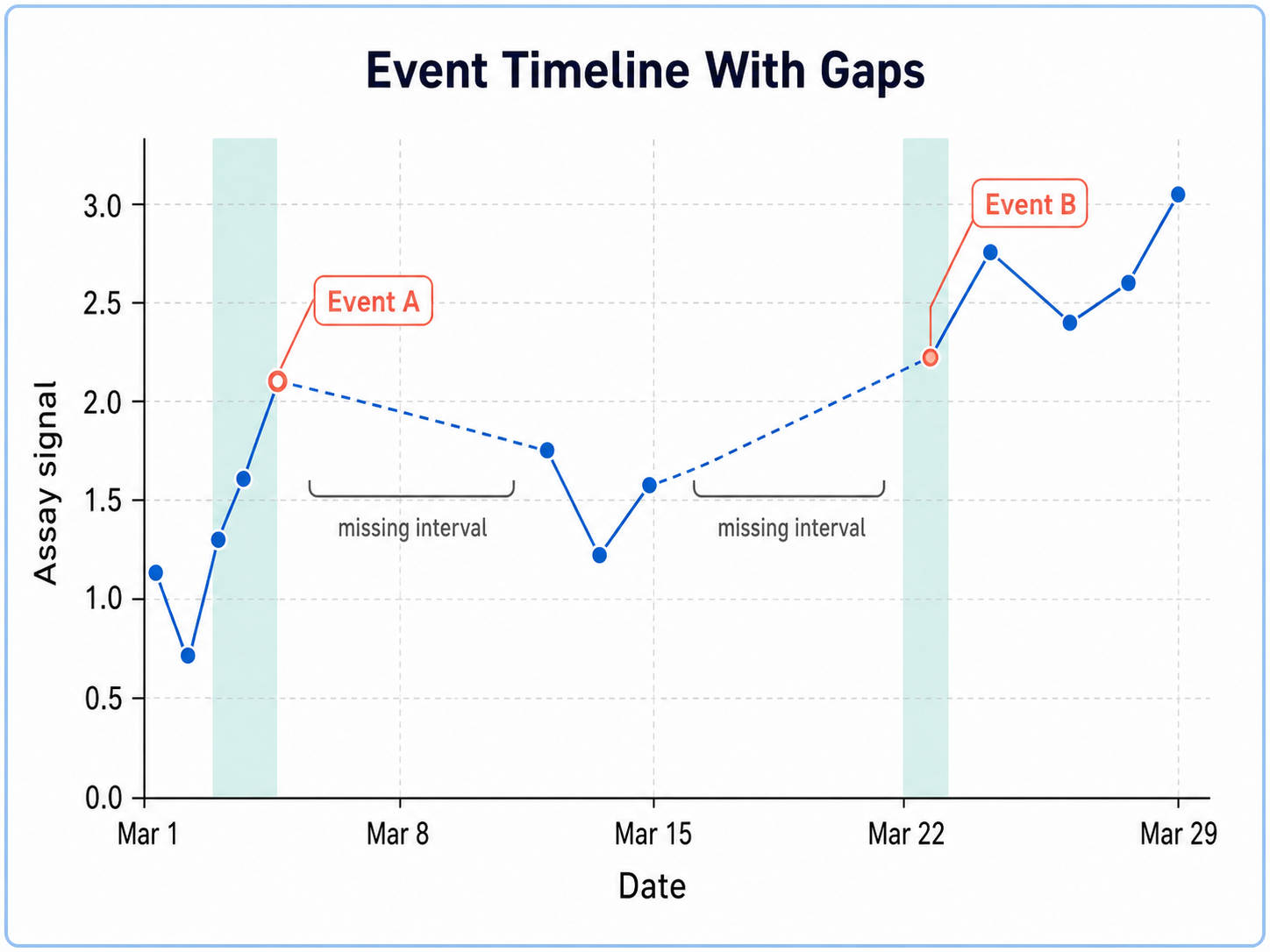
Time Series Plot Generator for Scientific Data: Event Timeline With Gaps scientific chart example

Prompt

Based on the uploaded event_timeline_with_gaps.csv file, create a time series plot that preserves missing intervals as visible gaps. Add event markers or shaded windows only for events present in the file, use a clean continuous style for observed values, and label the gap without overcrowding the chart.

Event Timeline With Gaps

How to make a time series plot

1

Upload your dataset

Add CSV, TSV, TXT, or Excel data with one time or order column and at least one numeric measurement column.

2

Describe the chart

Tell SciFigure AI which trends, groups, markers, labels, error bars, gaps, or event windows should appear.

3

Generate, review & export

Create a clean time series plot, check the time order and labels, then download PNG for papers and slides.

What does this time series plot generator do?

It turns longitudinal or repeated-measurement data into a clean time series plot. Use it when the x-axis represents dates, visits, days, weeks, hours, timestamps, or ordered measurement points.

Why use a time series plot generator

  • Show how a measurement changes over time.
  • Compare treatment groups, cohorts, batches, sites, or conditions.
  • Preserve readable markers, lines, labels, and uncertainty cues.
  • Move from spreadsheet data to a polished scientific figure faster.

Types and parts of a time series plot

  • The x-axis usually shows time, visit number, date, or ordered sampling points.
  • The y-axis shows the measured response, intensity, count, score, or outcome.
  • Lines connect ordered observations to reveal trends.
  • Gaps, thresholds, and event windows should only appear when supported by uploaded data or prompt.

Time Series Plot Generator FAQ

What data does the time series plot need?

A time series plot works best with one time or order column and at least one numeric measurement column. Optional group, subject, or event columns can guide styling.

Can I compare multiple groups over time?

Yes. Upload a group or condition column and describe whether you want separate colored lines, markers, or confidence bands.

Can the plot show error bars or confidence bands?

Yes, when the uploaded data includes replicate, standard deviation, standard error, confidence interval, or similar uncertainty columns.

Can I use dates instead of numeric time points?

Yes. Date, day, week, month, visit, and timestamp columns can be used as the x-axis when they are clearly represented in the file.

Can I use the result in a paper?

Yes, but verify the uploaded data, axis labels, time ordering, grouping, and annotations before submission.

Need clearer longitudinal figures?

Upload your time series data and create a publication-ready scientific plot in minutes.