
Free statistics tool
Stem and leaf plot generator with the five-number summary
Paste a list of numbers and this stem and leaf plot generator sorts them, builds the display with a key and depth column, and reports n, minimum, Q1, median, Q3, maximum, and mean. It handles decimals and negative values, and you can split each stem two or five ways when the plot gets too tall.
20 values
Splitting each stem spreads a tall plot over more rows, so the shape of the distribution shows.
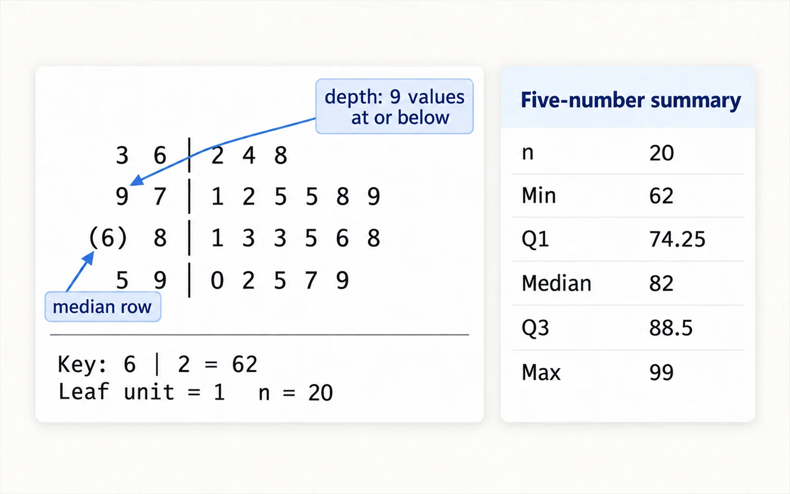
  3 6 | 2 4 8
  9 7 | 1 2 5 5 8 9
(6) 8 | 1 3 3 5 6 8
  5 9 | 0 2 5 7 9

Key: 6 | 2 = 62
Leaf unit = 1   n = 20
- n
- 20
- Min
- 62
- Q1
- 74.25
- Median
- 82
- Q3
- 88.5
- Max
- 99
- Mean
- 81.15
- Range
- 37
How to make a stem and leaf plot
A stem-and-leaf plot splits every value into a stem, the leading digits, and a leaf, the final retained digit. Written one leaf per value beside its stem, it shows the shape of the distribution like a histogram while keeping every original number readable. John Tukey introduced the display in Exploratory Data Analysis (1977) for exactly that reason.
- Decide the leaf unit. With a unit of 1, the value 83 splits into stem 8 and leaf 3. With a unit of 0.1, the value 4.7 splits into stem 4 and leaf 7.
- Truncate each value to the leaf unit, then write its stem in a column, in ascending order, including any stems with no values.
- Write each leaf beside its stem, sorted ascending, one digit per value.
- Add a key such as "8 | 3 = 83" so a reader can reconstruct the original numbers. A plot without a key is ambiguous.
- State n, the number of values. The tool above does all of this and adds the depth column and quartiles.
Reading the depth column
The numbers to the left of the stems are depths, not counts of that row alone. Each depth is a running total counted inward from whichever end of the distribution is nearer, which lets you find any quantile by eye without arithmetic.
- Above the median, a depth is the cumulative count from the smallest value down to the end of that row.
- Below the median, a depth is the cumulative count from the largest value up to the start of that row.
- The row containing the median shows its own leaf count in parentheses instead of a depth. That is how you spot the median row instantly.
- To find the median position, count (n + 1) / 2 from either end; the depths tell you which row you land in.
When to split the stems
If all your data falls on three or four stems the plot becomes a few long rows and the shape disappears. Splitting each stem spreads the same data over more rows without changing a single value.
- No split: one row per stem. Leaves 0 through 9 share a row. Use it when you already have roughly 5 to 15 stems.
- Two ways: each stem becomes two rows, marked * for leaves 0 to 4 and . for leaves 5 to 9. This is the usual first step when a plot is too compressed.
- Five ways: each stem becomes five rows (*, t, f, s, .) holding leaf pairs 01, 23, 45, 67, 89. Reserve this for large samples on very few stems.
- Aim for about 5 to 20 rows overall. Fewer and the shape is hidden; many more and the plot becomes as sparse as a list.
Stem-and-leaf plot or histogram?
The two displays show the same distributional shape. The difference is what survives the drawing.
- A stem-and-leaf plot keeps every individual value, so you can read the minimum, maximum, repeated values, and exact quartiles straight off the page. A histogram throws that away once values enter a bin.
- A histogram scales to thousands of observations. A stem-and-leaf plot stops being readable past roughly 100 values, because each one needs its own printed digit.
- Bin width in a histogram is a free choice you have to justify. In a stem-and-leaf plot the equivalent choice is the leaf unit and the stem split, and the key makes it explicit.
- For a paper or a poster use a histogram or a dot plot. For a lab notebook, a problem set, or a first look at a small sample, the stem-and-leaf plot carries more information per line.
Frequently asked questions
Is this stem and leaf plot generator free?
Yes. It runs entirely in your browser, needs no account, and has no limit on how many values you can paste. Nothing you enter is uploaded to a server.
What is the stem and what is the leaf?
The leaf is the final digit you keep, and the stem is everything to the left of it. With a leaf unit of 1, the value 147 has stem 14 and leaf 7. The key printed under the plot, such as "14 | 7 = 147", states the split so a reader can rebuild the original numbers.
Can it handle decimals and negative numbers?
Yes. Set the leaf unit to 0.1 or 0.01 for decimals, and negative values get negative stems so the number line stays continuous across zero. The tool rounds away floating-point error, so a value of 0.3 with a leaf unit of 0.1 lands on leaf 3, not leaf 2.
What does the number in parentheses mean?
It marks the row that contains the median, and it gives that row’s own leaf count rather than a cumulative depth. Every other row shows a depth counted inward from the nearer end of the distribution.
How many values is a stem and leaf plot good for?
Roughly 15 to 100. Below about 15 there is not enough data for the shape to mean anything, and past about 100 the rows grow too long to read. For larger samples use a histogram, a dot plot, or a box plot instead.
How do I make a back-to-back stem and leaf plot?
A back-to-back plot compares two groups by sharing one column of stems and writing one group’s leaves to the left and the other’s to the right. This tool builds single-group plots; to compare two groups, generate each one and place them side by side, or use a box plot.
Can I paste data from Excel?
Yes. Copy a column or row of numbers and paste it in. Values separated by spaces, tabs, commas, semicolons, or new lines are all accepted, and anything that is not a number is counted as ignored rather than silently dropped.
Related tools

Box Plot Generator
Build box and whisker plots with quartiles and outliers from your own data.
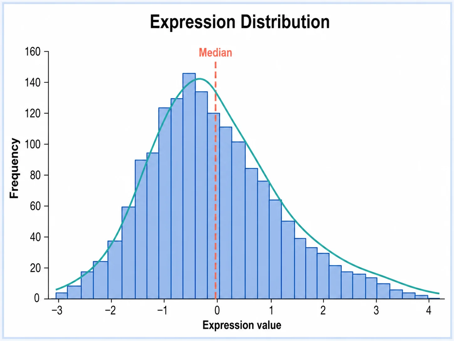
Histogram Generator
Turn a column of values into a publication-ready histogram.
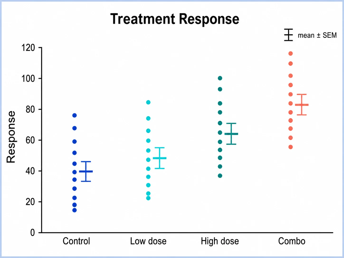
Dot Plot Generator
Show every observation as a point, useful for small samples.
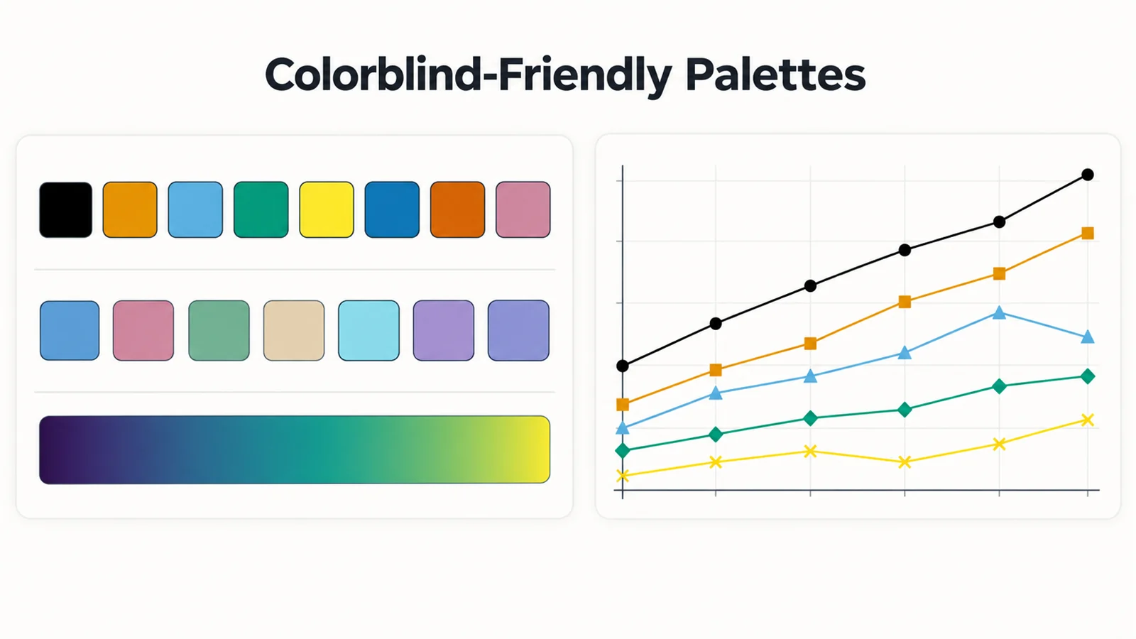
Colorblind-Friendly Palettes
Okabe-Ito and other colorblind-safe palettes with HEX and code snippets.
Need the chart as well as the plot?
SciFigure AI turns your data into publication-ready box plots, histograms, and dot plots for papers, posters, and slides.
Explore the chart generatorsLast checked: September 20, 2026. Sources: Tukey, Exploratory Data Analysis (1977); NIST/SEMATECH e-Handbook: Stem and Leaf Plot.