
Free biochemistry tool
Michaelis-Menten plot generator with Km and Vmax
Enter your substrate concentrations and initial rates. This Michaelis-Menten plot generator fits the saturation curve to your untransformed data, reports Km, Vmax and R², marks Km and Vmax on the graph, and draws the Lineweaver-Burk double-reciprocal plot beside it. Export a PNG, an editable SVG, or the fitted values as CSV.
| [S] (mM) | Rate v (µmol/min) | |
|---|---|---|
Tabs, commas or spaces all work, and a header row is ignored. This replaces the table above.
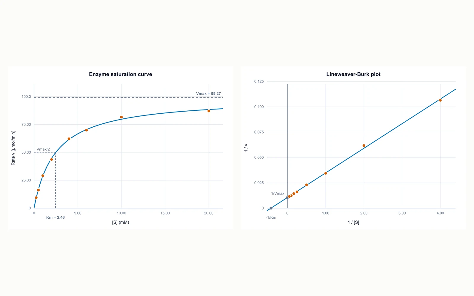
v against [S]: the saturation curve, with Vmax as the ceiling and Km at half of it.
Km and Vmax above come from a non-linear fit to your untransformed rates, not from the straight line on the Lineweaver-Burk plot. Reading them off the reciprocal plot gives different numbers because that transform stretches your least reliable low-[S] points and squashes the high-[S] ones. Show the reciprocal plot if your class asks for it; report the values from the curve.
How to plot a Michaelis-Menten graph
A Michaelis-Menten plot shows initial reaction rate against substrate concentration. It rises steeply while substrate is scarce, bends over as the enzyme runs out of free active sites, and flattens towards a ceiling. Two numbers describe the whole curve: Vmax, the ceiling, and Km, the substrate concentration that gives half of it.
- Measure the initial rate at each substrate concentration — the slope at the very start, before enough product accumulates to slow the reaction down. A rate taken from the middle of a progress curve is too low and will flatten your graph.
- Hold everything except substrate constant: same enzyme concentration, same temperature, same pH, same buffer. Km and Vmax are only comparable across readings that share those conditions.
- Spread the concentrations across the curve, not evenly along the axis. Points below Km define the rising part; points above about 5x Km define the plateau. Doubling each time is a good default.
- Enter the pairs in the table, or paste two columns straight from a spreadsheet.
- Plot rate on the vertical axis and concentration on the horizontal axis. The curve is a rectangular hyperbola: it approaches Vmax without ever reaching it.
What Km and Vmax actually tell you
The two constants answer different questions, and conflating them is the most common error in a kinetics write-up.
- Vmax is the rate when every active site is occupied. It scales with how much enzyme you added, so it is a property of your particular assay, not of the enzyme itself. Divide by the enzyme concentration to get kcat, the turnover number, which is comparable between labs.
- Km is the substrate concentration at which the rate is half of Vmax. It does not change when you add more enzyme — it is a property of the enzyme-substrate pair.
- A low Km means the enzyme reaches half speed at a low concentration, which is usually described as high apparent affinity. Km equals the dissociation constant only when the chemical step is much slower than substrate release, so treat "Km measures affinity" as a rule of thumb rather than a definition.
- The units follow the data: Km carries the unit of your concentrations, Vmax the unit of your rates. The tool labels both axes with whatever units you type.
- Km appears at a single point on the graph: drop a line from where the curve crosses Vmax/2 down to the concentration axis.
Why the fitted values differ from a Lineweaver-Burk reading
Both plots are shown here because both are asked for, but they do not deserve equal trust. The Lineweaver-Burk plot exists because a straight line could be drawn with a ruler in 1934, not because the reciprocal transform is a good idea statistically.
- The double-reciprocal transform plots 1/v against 1/[S]. The line has slope Km/Vmax, y-intercept 1/Vmax, and x-intercept -1/Km, so all three can be read off by hand.
- Taking reciprocals crushes the high-concentration points into a cluster near the origin and flings the low-concentration points far out along the axis — and those low-concentration rates are exactly the ones with the largest relative measurement error.
- The result is a line dominated by your least reliable readings. A point with 10% error at low [S] can shift the slope more than five accurate points near saturation.
- This tool therefore fits the curve directly to your untransformed rates by non-linear least squares and reports those values. On simulated data with realistic scatter, the direct fit lands closer to the true Km in the large majority of trials.
- Show the reciprocal plot if your course asks for it. Report the numbers from the curve, and say in your methods which method you used — that sentence is what a marker is looking for.
Reading the warnings
The tool flags the three situations in which the numbers it prints should not be quoted without a caveat. They are all about the data rather than the arithmetic.
- Not saturated: if your highest concentration is less than about three times Km, the plateau was never reached, so Vmax is an extrapolation and Km inherits that uncertainty. The fix is more readings at higher substrate, not a different fitting method.
- Low R²: the points are not following a rectangular hyperbola. Look for substrate inhibition, where the rate falls again at high concentration, or a sigmoid curve, which means a cooperative enzyme that needs the Hill equation instead.
- Fell back to the reciprocal line: the non-linear fit could not converge, usually because there are too few points or the scatter is severe. Treat those values as provisional.
- Points at [S] = 0 or rate = 0 stay on the saturation curve but cannot appear on the reciprocal plot, since 1/0 is undefined. The tool says so rather than dropping them silently.
- Rows that are not a pair of numbers are skipped, so a stray header or a blank line in pasted data is harmless.
Frequently asked questions
Is this Michaelis-Menten plot generator free?
Yes. It runs entirely in your browser, needs no account, and exports PNG, SVG and CSV without a watermark. Nothing you enter is uploaded to a server.
How do I calculate Km and Vmax from my data?
Enter your substrate concentrations and initial rates and the tool fits them directly. It seeds the fit from the Lineweaver-Burk line, then improves it by non-linear least squares on your untransformed rates, and reports Km, Vmax and R². You do not need to linearise anything by hand.
How many data points do I need?
Three is the arithmetic minimum for a two-parameter fit, but a fit from three points has no degrees of freedom left to detect a problem. Six to eight concentrations spanning roughly 0.2x to 5x Km gives a curve you can defend, and lets R² mean something.
What is the difference between a Michaelis-Menten and a Lineweaver-Burk plot?
They show the same data in different coordinates. The Michaelis-Menten plot puts rate against concentration and gives a curve; the Lineweaver-Burk plot puts 1/rate against 1/concentration and gives a straight line. The line is easier to draw and to read intercepts from, which is why it is taught, but it weights your noisiest low-concentration readings most heavily, so it is the worse way to get numbers.
Why is my Km different from the published value?
Km depends on the conditions, not just the enzyme. Temperature, pH, ionic strength, buffer identity and the presence of any inhibitor all move it, and an assay run on a crude extract rather than purified enzyme gives an apparent Km. Check that your substrate range actually bracketed Km, too: if every reading sits below it, the value is an extrapolation.
What does a low R² mean here?
That your points do not lie on a rectangular hyperbola. The usual causes are substrate inhibition, where the rate peaks and then falls at high concentration; a cooperative enzyme, which gives an S-shaped curve that needs the Hill equation; or rates measured too late in the reaction, which flattens the curve. A low R² is information about the enzyme, not a reason to discard points.
Can I use this for enzyme inhibition data?
Yes, one curve at a time. Fit each inhibitor concentration separately and compare the Km and Vmax you get. Competitive inhibition raises apparent Km and leaves Vmax alone; non-competitive inhibition lowers Vmax and leaves Km alone; uncompetitive inhibition lowers both. The tool does not fit a shared inhibition model across several curves at once.
What units should I use?
Whichever your readings are in — the tool does not convert. Type them into the two unit boxes and they appear on the axes and next to the results. Km comes out in your concentration unit and Vmax in your rate unit, so mM and µmol/min give Km in mM and Vmax in µmol/min.
Related tools
Dose Response Curve Generator
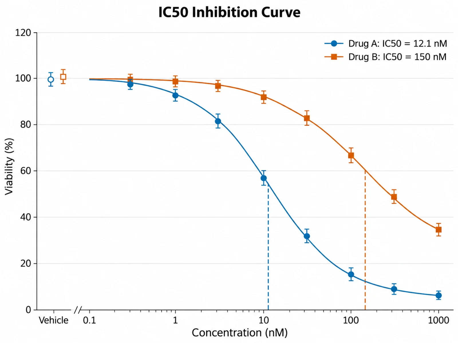
Fit a sigmoid dose-response curve and get EC50 or IC50 from your own points.
Regression Plot Generator
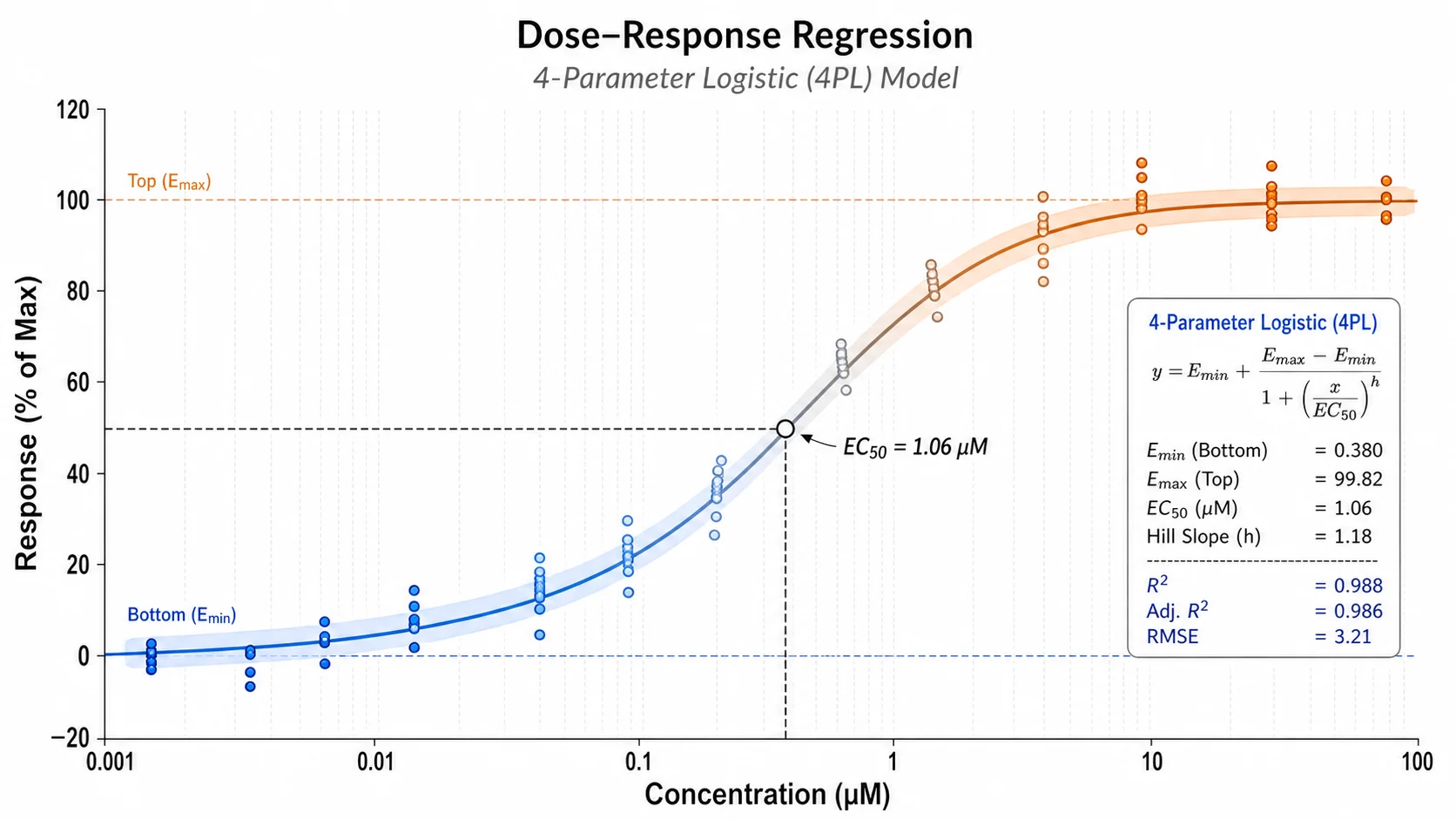
Fit a line to your data and see the equation, R squared, and residuals.
Error Bar Chart Generator
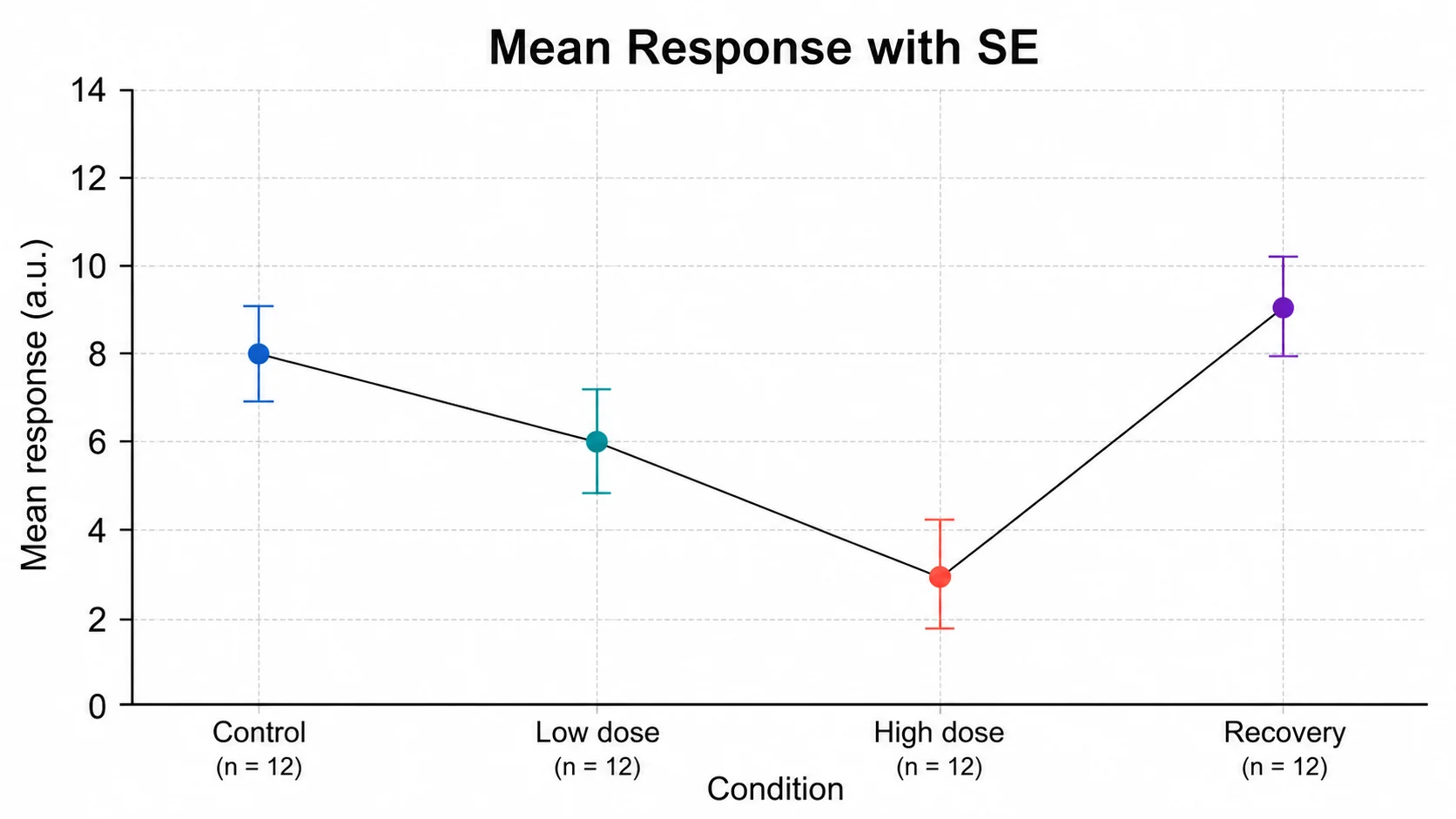
Plot means with standard deviation, standard error, or confidence intervals.
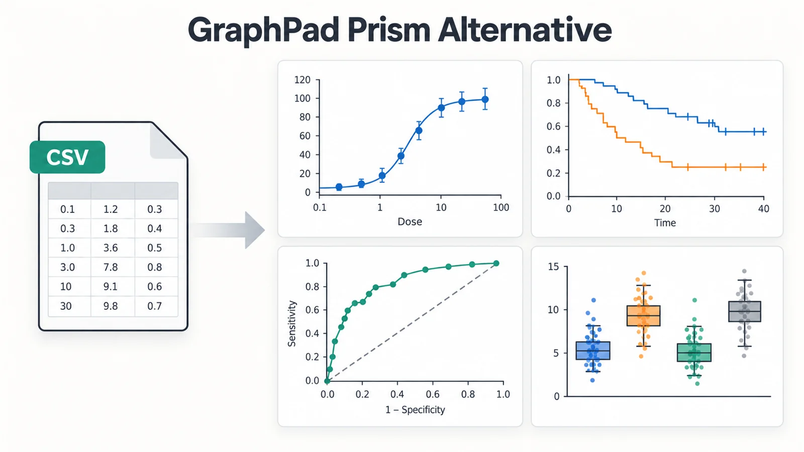
GraphPad Prism Alternative
Free browser tools that cover the plots a Prism licence is usually bought for.
Need a labelled diagram rather than a graph?
SciFigure AI draws labelled biology and chemistry diagrams, worksheets, and publication-ready figures from a description.
Explore the diagram generatorsLast checked: September 28, 2026. Sources: Johnson & Goody, The original Michaelis-Menten paper (Biochemistry, 2011 translation); IUBMB recommendations on enzyme kinetics nomenclature; Okabe & Ito, colour-blind safe palette.