Sankey Diagram Generator for Research Flows

Turn source-target-value tables into a clean, publication-ready Sankey diagram.

Upload patient pathways, energy balances, nutrient budgets, or cohort transitions. SciFigure sums duplicate flows, computes node totals and stages, and then draws a labeled flow diagram for your paper or report.

Computed node totalsAutomatic stage columnsPublication-ready PNG

AI Sankey Diagram Generator

Upload a link table and describe the diagram you need.

宽高比
310 / 2000

Costs 5 credits. Node totals, stages, and flow percentages are computed from your uploaded data, then drawn as a PNG.

预览

Sankey Diagram Examples

宽高比: 16:9

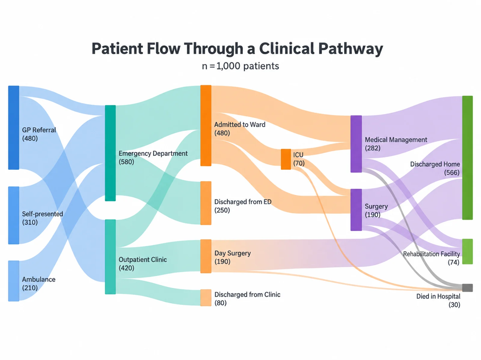
Patient Flow Through a Clinical Pathway Sankey diagram example preview
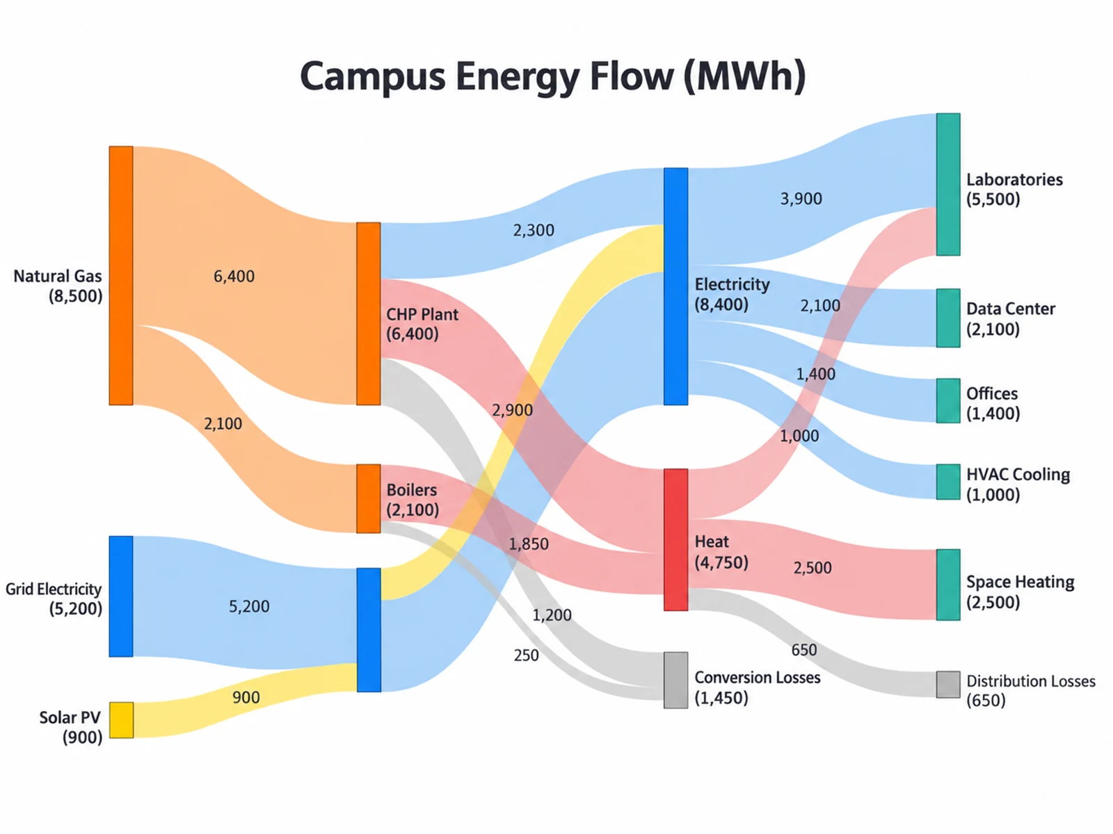
Campus Energy Flow Diagram Sankey diagram example preview
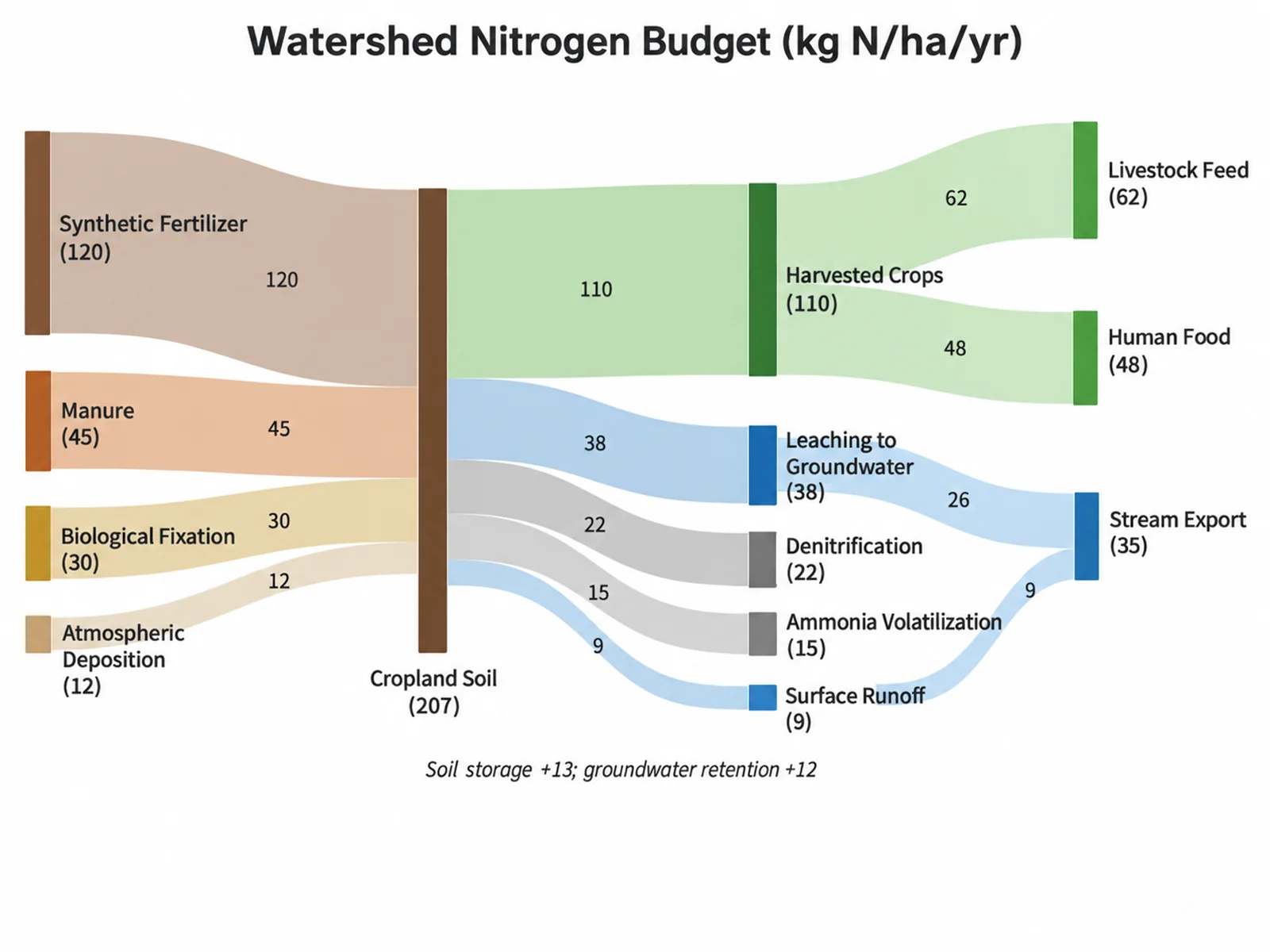
Watershed Nitrogen Budget Sankey diagram example preview

These are sample previews. Upload your link table to generate your own Sankey diagram.

Sankey diagram examples

Use these examples as starting points for clinical pathways, energy and material flows, nutrient or carbon budgets, and cohort or career transitions.

Sankey Diagram Generator: Patient Flow Through a Clinical Pathway scientific chart example

提示词

Based on the uploaded patient_pathway.csv file, create a Sankey diagram of 1,000 patients moving from referral source through the emergency department or clinic, ward, ICU, and treatment to discharge outcomes. Label each node with its name and patient count and color ribbons by source.
Patient Flow Through a Clinical Pathway

Sankey Diagram Generator: Campus Energy Flow Diagram scientific chart example

提示词

Based on the uploaded campus_energy_2024.xlsx file, create an energy flow Sankey diagram from supply (grid, solar PV, natural gas) through conversion (CHP plant, boilers) to end uses and losses. Units: MWh. Print values on links and show conversion losses in gray.

Campus Energy Flow Diagram

Sankey Diagram Generator: Watershed Nitrogen Budget scientific chart example

提示词

Based on the uploaded nitrogen_budget.csv file, create a nutrient budget Sankey diagram of nitrogen inputs to cropland soil and its fate as crops, leaching, gaseous losses, and stream export. Units: kg N/ha/yr. Keep source order and print values on links.

Watershed Nitrogen Budget

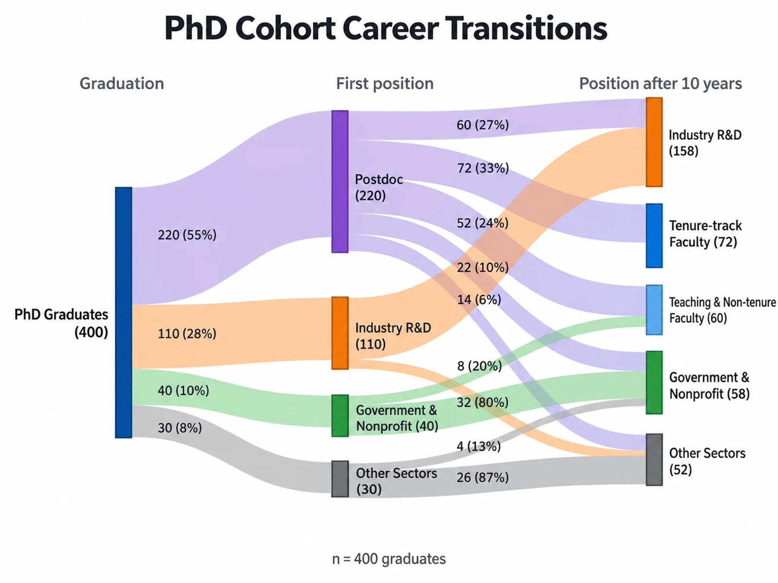
Sankey Diagram Generator: PhD Cohort Career Transitions scientific chart example

提示词

Based on the uploaded phd_cohort_outcomes.csv file, create a Sankey chart of a PhD graduate cohort moving through first positions to career outcomes ten years later. Print percent of each source on links and align final outcomes on the right.

PhD Cohort Career Transitions

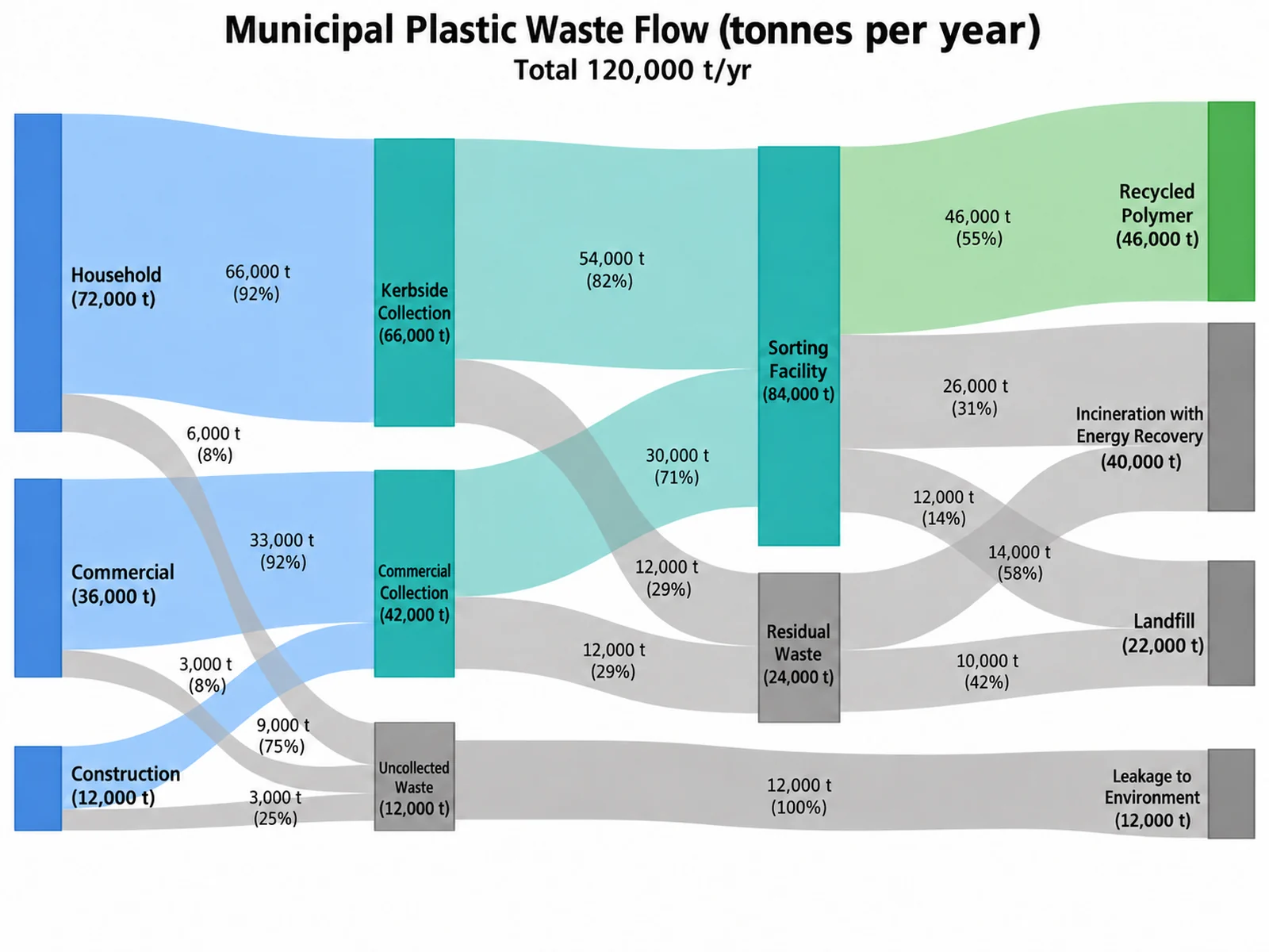
Sankey Diagram Generator: Municipal Plastic Waste Flow scientific chart example

提示词

Based on the uploaded plastic_waste_flow.csv file, create a material flow Sankey diagram of 120,000 tonnes of municipal plastic waste moving from household, commercial, and construction sources through collection and sorting to recycling, incineration, landfill, and leakage to the environment. Units: tonnes per year. Show the percent of each source on the links, draw the landfill, incineration, and leakage nodes in gray, and align the final fates on the right.

Municipal Plastic Waste Flow

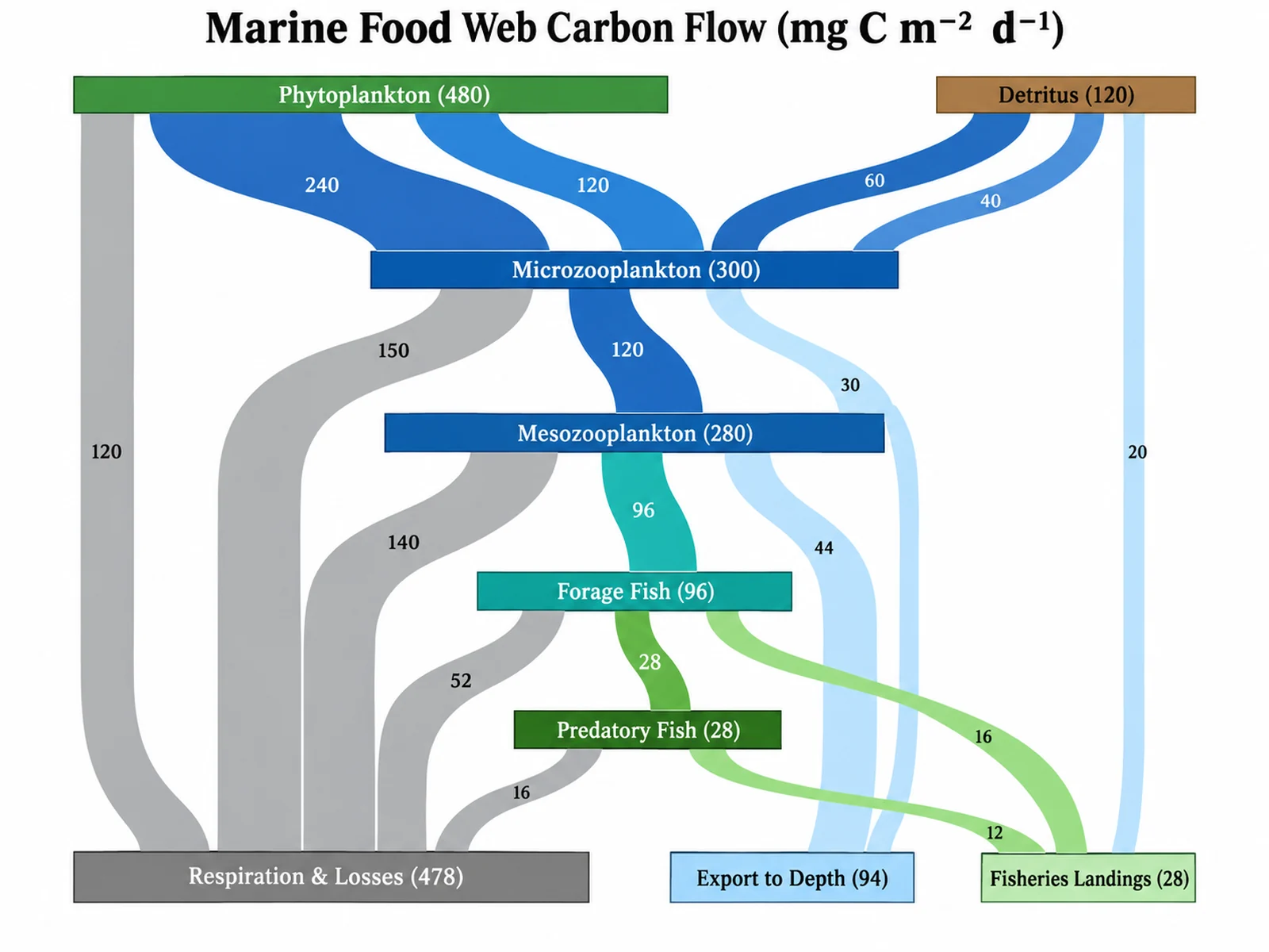
Sankey Diagram Generator: Marine Food Web Carbon Flow scientific chart example

提示词

Based on the uploaded food_web_carbon.csv file, create a vertical Sankey diagram of carbon moving from phytoplankton and detritus through zooplankton, forage fish, and predatory fish to respiration, export to depth, and fisheries landings. Units: mg C per square meter per day. Keep source order, print values on links, color ribbons by their target node in a blue-to-green ocean palette, and show respiration losses in gray.

Marine Food Web Carbon Flow

How to make a Sankey diagram

1

Upload a link table

Add CSV, TSV, TXT, or Excel data with one row per flow: a source node, a target node, and a numeric amount. Repeated source-target pairs are summed.

2

Describe the diagram

Ask for values or percentages on links, units, source order, vertical layout, end nodes aligned right, or ribbons colored by target.

3

Generate, review & download

SciFigure computes every node total and flow share, draws the Sankey diagram, and lets you download a PNG for papers and slides.

What does this Sankey diagram generator do?

A Sankey diagram shows how a quantity moves between states or stages. Nodes are drawn as bars and flows as ribbons whose width is proportional to the amount. This Sankey diagram generator reads a simple source, target, and value table and does the bookkeeping before any drawing happens. It sums duplicate links, computes each node's inflow, outflow, and throughput, and assigns nodes to columns. It also calculates each flow's share of its source. The image model receives those numbers as fixed values, so ribbon widths, node totals, and percentages reflect your data instead of a visual guess. It works as a Sankey diagram maker for clinical pathways, energy and material flow analysis, carbon or nutrient budgets, and cohort studies.

How nodes, stages, and flows are computed

  • Throughput is the larger of a node's inflow and outflow, and it sets the node height and the total in its label.
  • Columns follow the longest path from the source nodes, so every ribbon moves forward. Add "align end nodes right" to push final outcomes into the last column.
  • Within a column, nodes are ordered by throughput, largest first. Write "keep source order" to use the order in which nodes first appear in your file.
  • Each link reports its percent of the source node's outflow, which is useful for pathway proportions such as "38% of ED patients were admitted".
  • Diagrams are capped at 30 nodes and 60 links. Past that, the smallest nodes in a column are merged into an "Other" node, and a note lists what was merged.

How to read a Sankey chart

  • Read from left to right: each column is a stage, and ribbon width shows how much flows between two nodes.
  • Compare node heights to see where most of the quantity ends up, and ribbon widths to see the dominant routes.
  • When an intermediate node receives more than it passes on, the difference is storage, loss, or missing follow-up. The generator flags these imbalances instead of hiding them.
  • Colors usually track the source node, so you can follow one origin through later stages.

Tips and common mistakes

  • Sankey diagrams need a directed acyclic flow. A loop such as Ward → ICU → Ward produces a clear error that names the cycle. Rename repeated stages, for example "Ward (post-ICU)".
  • A node cannot flow into itself, and flows must be positive. Rows with zero flow are ignored.
  • Keep one unit throughout, and state it in your instructions ("units: MWh") so it appears in labels.
  • Values on links are printed only when you ask ("print values on links" or "show percent on links"). Node totals are always shown.
  • For budgets, add explicit loss or storage nodes so inputs and outputs balance and readers can see the gap.

When to use a flow diagram, and when not to

Choose a Sankey chart when the story is about magnitude along routes: where patients go, how energy is converted and lost, or how a cohort splits over time. If you only need composition at a few time points, a stacked bar chart is easier to compare precisely. If flows are truly bidirectional or cyclic, such as migration between regions, a chord diagram or transition matrix heatmap is a better fit.

Sankey Diagram Generator FAQ

What data format does the Sankey diagram generator need?

A long link table with three columns: source node, target node, and a numeric flow amount. Each row is one flow, for example "Emergency Department, Admitted to Ward, 330". Node names can be any text or numbers.

Does the tool calculate the statistics or does AI estimate them?

The numbers are calculated from your uploaded rows: summed links, node inflow and outflow, throughput, stage columns, percent of each source, and imbalance notes. The image model only draws those listed values. Proportional ribbon widths are an instruction to the model, so check the printed totals against your data before publishing.

Why do I get a cycle error?

Sankey layouts need every flow to move forward. If the links form a loop, such as A → B → A, the generator stops and lists the cycle. Split repeated states into separate stage names, or show the loop in a transition matrix instead.

Can I show values or percentages on the links?

Yes. Write "print values on links" to label each ribbon with its amount, or "show percent on links" to print its share of the source outflow. Without that instruction, only node labels and totals are printed.

How many nodes can a Sankey diagram have?

Up to 30 nodes and 60 links are drawn. Larger networks keep their biggest nodes, and the smallest nodes in each stage are merged into "Other" so the diagram stays readable and flows still add up.

Can I use the Sankey diagram in a paper?

Yes. Download the PNG, then confirm node totals, units, and category names against your source table. For clinical flows, the CONSORT or STROBE diagram your journal requires still applies; a Sankey diagram works well as a complementary figure.

Ready to map your flows?

Generate Sankey diagrams, stacked bar charts, heatmaps, and other research-ready figures from your own data with SciFigure AI.