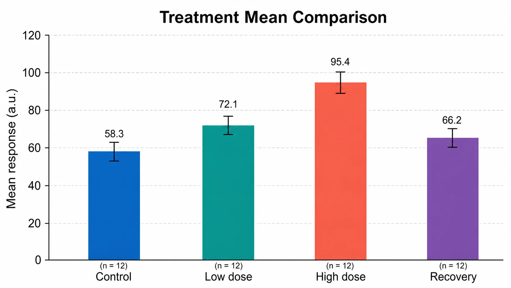
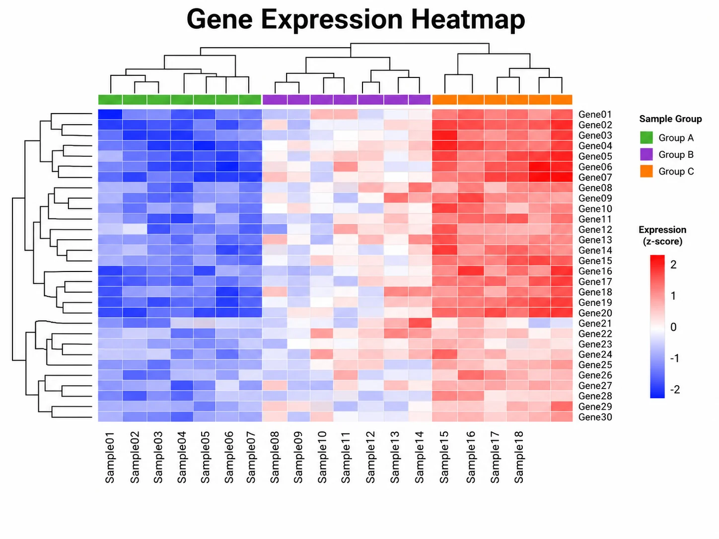
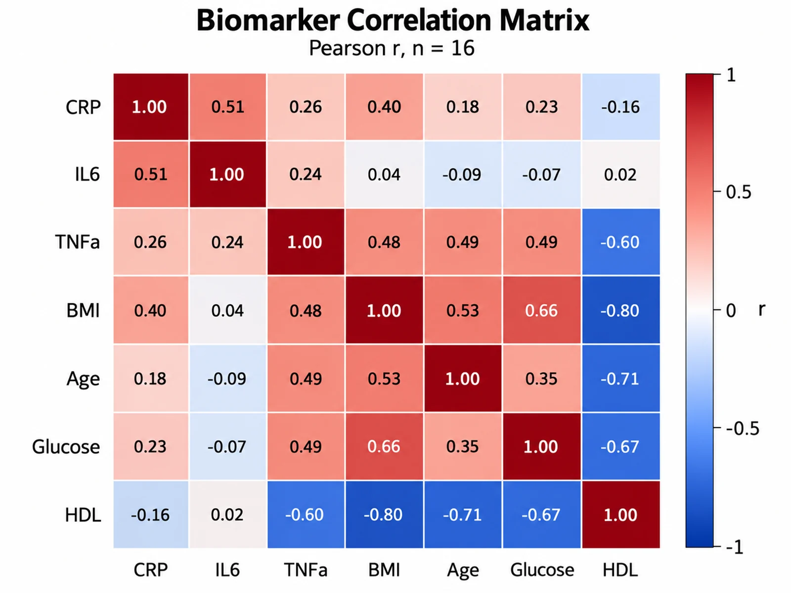
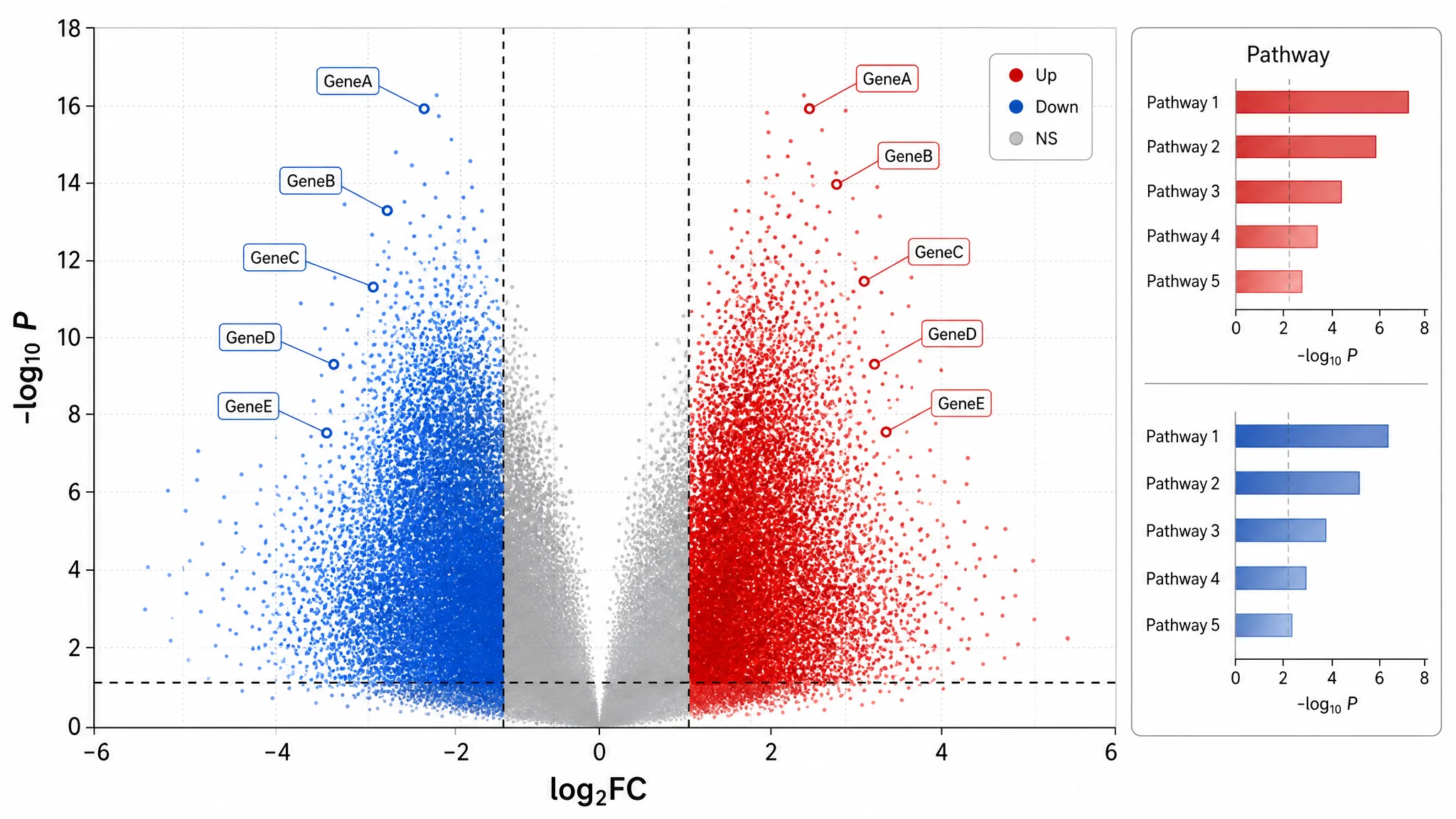
Free color reference for figures

Colorblind friendly palette for scientific figures

Browse tested colorblind safe colors for charts and diagrams: Okabe-Ito, Paul Tol's schemes, IBM's palette, viridis, and cividis. Preview each colorblind friendly palette with deuteranopia, protanopia, and tritanopia, then copy HEX, CSS, matplotlib, ggplot2, MATLAB, or JSON code.

Free, no sign-upHEX values checked against primary sourcesColor vision deficiency previewsRuns in your browser

Categorical palettes

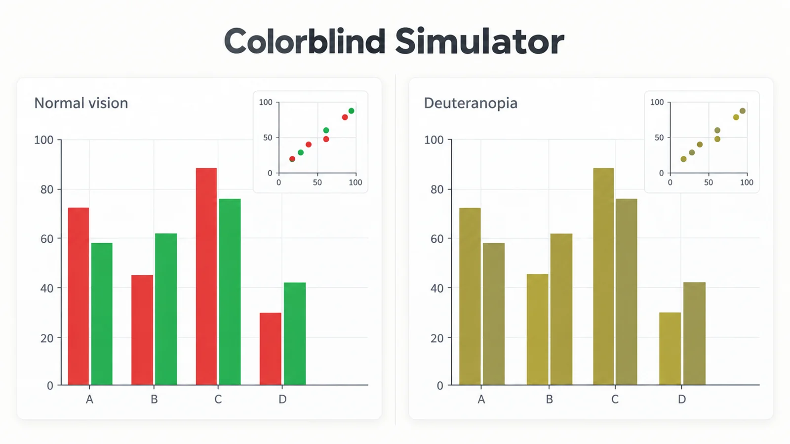
Click a HEX value to copy it. Previews use the Machado et al. (2009) simulation at full severity, computed in your browser.

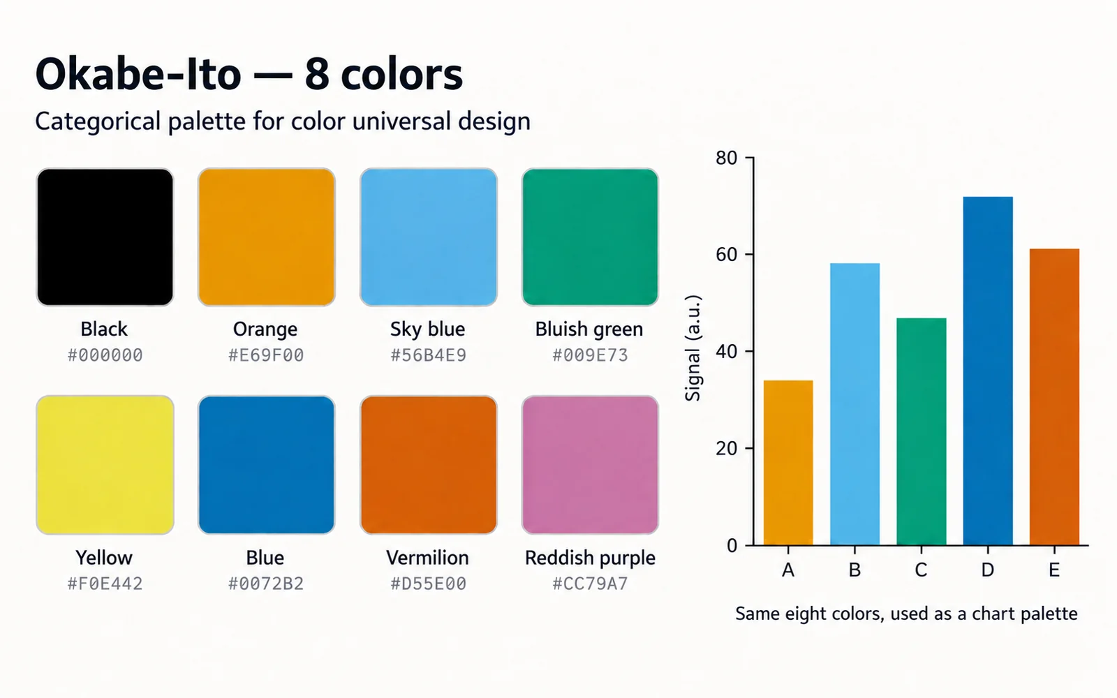
Okabe-Ito

8 colors

The default choice for categorical data: lines, points, and bars.

  • BlackRGB 0, 0, 0
  • OrangeRGB 230, 159, 0
  • Sky blueRGB 86, 180, 233
  • Bluish greenRGB 0, 158, 115
  • YellowRGB 240, 228, 66
  • BlueRGB 0, 114, 178
  • VermilionRGB 213, 94, 0
  • Reddish purpleRGB 204, 121, 167

Also called the Wong palette: Bang Wong's 2011 Nature Methods column presented a palette based on Okabe & Ito's work. RGB values are from Okabe & Ito's Color Universal Design page.

#000000, #E69F00, #56B4E9, #009E73, #F0E442, #0072B2, #D55E00, #CC79A7
Source: Okabe & Ito, Color Universal Design (jfly.uni-koeln.de)

Paul Tol bright

7 colors

Lines and their labels; Tol's default qualitative scheme.

  • RGB 68, 119, 170
  • RGB 238, 102, 119
  • RGB 34, 136, 51
  • RGB 204, 187, 68
  • RGB 102, 204, 238
  • RGB 170, 51, 119
  • RGB 187, 187, 187
#4477AA, #EE6677, #228833, #CCBB44, #66CCEE, #AA3377, #BBBBBB
Source: Paul Tol, Colour schemes, Fig. 1

Paul Tol high-contrast

3 colors

Two or three groups that must also survive greyscale printing.

  • RGB 0, 68, 136
  • RGB 221, 170, 51
  • RGB 187, 85, 102

The three colours have clearly different luminance, so they stay distinct in a monochrome printout.

#004488, #DDAA33, #BB5566
Source: Paul Tol, Colour schemes, Fig. 2

Paul Tol vibrant

7 colors

Screen figures and dashboards that need stronger colours.

  • RGB 238, 119, 51
  • RGB 0, 119, 187
  • RGB 51, 187, 238
  • RGB 238, 51, 119
  • RGB 204, 51, 17
  • RGB 0, 153, 136
  • RGB 187, 187, 187
#EE7733, #0077BB, #33BBEE, #EE3377, #CC3311, #009988, #BBBBBB
Source: Paul Tol, Colour schemes, Fig. 3

Paul Tol muted

9 colors

Up to nine categories, such as map regions or many groups.

  • RGB 204, 102, 119
  • RGB 51, 34, 136
  • RGB 221, 204, 119
  • RGB 17, 119, 51
  • RGB 136, 204, 238
  • RGB 136, 34, 85
  • RGB 68, 170, 153
  • RGB 153, 153, 51
  • RGB 170, 68, 153

Bad data: #DDDDDD

Tol reserves pale grey #DDDDDD for bad data in maps.

#CC6677, #332288, #DDCC77, #117733, #88CCEE, #882255, #44AA99, #999933, #AA4499
Source: Paul Tol, Colour schemes, Fig. 4

IBM colour-blind safe

5 colors

Five or fewer groups where saturated colours are acceptable.

  • Ultramarine 40RGB 100, 143, 255
  • Indigo 50RGB 120, 94, 240
  • Magenta 50RGB 220, 38, 127
  • Orange 40RGB 254, 97, 0
  • Gold 20RGB 255, 176, 0

Published in the IBM Design Language colour library (archived page).

#648FFF, #785EF0, #DC267F, #FE6100, #FFB000
Source: IBM Design Language, Color library: "Color blind safe"

Sequential and diverging scales

Gradient strips interpolate linearly in sRGB between the documented stops listed under each scale.

viridis

sequential

Continuous values from low to high (heatmaps, density, intensity).

  • #440154
  • #482878
  • #3E4A89
  • #31688E
  • #26828E
  • #1F9E89
  • #35B779
  • #6CCD5A
  • #B5DE2B
  • #FDE725

Entries 0, 28, 57, 85, 113, 142, 170, 198, 227 and 255 of the 256-entry matplotlib table, rounded to 8-bit.

#440154, #482878, #3E4A89, #31688E, #26828E, #1F9E89, #35B779, #6CCD5A, #B5DE2B, #FDE725
Source: matplotlib _cm_listed.py (_viridis_data)

cividis

sequential

Sequential data where the scale should look nearly the same with red-green deficiency.

  • #00224E
  • #123570
  • #3C4A6C
  • #575D6D
  • #707173
  • #8A8678
  • #A59C74
  • #C2B369
  • #E1CC55
  • #FEE838

Entries 0, 28, 57, 85, 113, 142, 170, 198, 227 and 255 of the 256-entry matplotlib table, rounded to 8-bit.

#00224E, #123570, #3C4A6C, #575D6D, #707173, #8A8678, #A59C74, #C2B369, #E1CC55, #FEE838
Source: matplotlib _cm_listed.py (_cividis_data)

Tol sunset

diverging

Values around a meaningful midpoint, such as fold change or anomalies.

  • #364B9A
  • #4A7BB7
  • #6EA6CD
  • #98CAE1
  • #C2E4EF
  • #EAECCC
  • #FEDA8B
  • #FDB366
  • #F67E4B
  • #DD3D2D
  • #A50026

All 11 colours of Fig. 13; bad data is shown white (#FFFFFF). Interpolate linearly for a continuous scale.

#364B9A, #4A7BB7, #6EA6CD, #98CAE1, #C2E4EF, #EAECCC, #FEDA8B, #FDB366, #F67E4B, #DD3D2D, #A50026
Source: Paul Tol, Colour schemes, Fig. 13

Tol BuRd

diverging

Correlation matrices and signed effects centred on zero.

  • #2166AC
  • #4393C3
  • #92C5DE
  • #D1E5F0
  • #F7F7F7
  • #FDDBC7
  • #F4A582
  • #D6604D
  • #B2182B

All 9 colours of Fig. 15 (reversed ColorBrewer RdBu); bad data #FFEE99.

#2166AC, #4393C3, #92C5DE, #D1E5F0, #F7F7F7, #FDDBC7, #F4A582, #D6604D, #B2182B
Source: Paul Tol, Colour schemes, Fig. 15
The eight Okabe-Ito colours as labelled swatches with hex codes, beside a bar chart drawn from the same palette

Choosing categorical, sequential, or diverging colors

Choose a colorblind friendly palette by the type of data first, then by taste. Paul Tol's colour-scheme notes make the same three-way split.

  • Categorical (qualitative): unordered groups such as genotypes, treatments, or cell types. Use distinct hues of similar visual weight, for example Okabe-Ito or Tol bright.
  • Sequential: ordered values from low to high such as expression, concentration, or density. Use a scale that changes steadily from dark to light, such as viridis or cividis.
  • Diverging: values around a meaningful midpoint such as zero, a fold change of 1, or a reference mean. Use two contrasting hues that meet at a light neutral center, such as Tol's BuRd or sunset.
  • Do not use a categorical palette for ordered values, and avoid rainbow scales for continuous data; abrupt hue changes can suggest boundaries that are not in the data.

How many categories can one palette handle?

The categorical palettes on this page hold three to nine colors: Tol's high-contrast scheme has three, the IBM set five, Tol bright and vibrant seven, Okabe-Ito eight including black, and Tol muted nine. Tol notes that for more than nine distinct colors you would have to fall back on a banded or rainbow-style sequential scheme. Fewer is easier to read, so aim for six or fewer colors in a single panel where you can. With more groups, split the plot into small multiples, show the few groups that matter in color and the rest in gray, or label lines directly.

Combine color with shape and line style

No palette is safe for every reader in every situation, so do not let color carry meaning alone. Redundant encoding keeps a figure readable for people with color vision deficiency, in grayscale print, and on a washed-out projector.

  • Give each group its own marker shape (circle, square, triangle, diamond) as well as a color.
  • Use solid, dashed, and dotted lines for series in line charts and survival curves.
  • Add hatching or direct text labels to bars, areas, and map regions.
  • Keep the same color for the same group across every panel and figure in the paper.

Figures that survive grayscale printing

Hue differences disappear in black-and-white printing and photocopies, but lightness differences remain. Tol designed his high-contrast scheme so its three colors map to clearly different gray levels, and viridis and cividis rise steadily in lightness from one end to the other. Palettes with many hues, including Okabe-Ito, contain pairs of similar lightness (orange #E69F00 and sky blue #56B4E9, for example), so pair them with shapes or line styles when grayscale matters. The grayscale view in the Colorblind Simulator is a quick way to check.

Where these HEX values come from

Every value was checked on September 15, 2026 against its primary source. Okabe-Ito RGB values come from Okabe and Ito's Color Universal Design page. Bang Wong's 2011 Points of View column in Nature Methods presented a colorblind-safe palette based on their work, and Nature's research figure guide cites that column as an example of an accessible palette. Paul Tol's schemes come from his colour-scheme page, the IBM set from the IBM Design Language color library, and the viridis and cividis stops from matplotlib's colormap data file, sampled at ten evenly spaced entries.

Frequently asked questions

What is the best colorblind friendly palette for scientific figures?

For categorical data, Okabe-Ito is a strong default: eight distinct colors designed with Color Universal Design principles. For continuous data, use viridis or cividis. Whatever you choose, preview it with deuteranopia and protanopia, and add shapes or labels.

Is the Okabe-Ito color palette the same as the Wong palette?

Bang Wong's 2011 Nature Methods column presented a colorblind-safe palette based on Okabe and Ito's Color Universal Design work, and the name Wong palette is commonly used for the same eight colors. This page lists the RGB values from Okabe and Ito's own page.

What are the Okabe-Ito HEX codes?

#000000 black, #E69F00 orange, #56B4E9 sky blue, #009E73 bluish green, #F0E442 yellow, #0072B2 blue, #D55E00 vermilion, and #CC79A7 reddish purple. Yellow is very light, so avoid it for thin lines or text on a white background.

Which Paul Tol colors should I use?

Start with the bright scheme for lines and points. Use high-contrast for up to three groups that must also print in grayscale, vibrant for screen-first figures, and muted when you need up to nine categories. Tol's BuRd and sunset schemes suit diverging data.

How do I use these colorblind safe colors in matplotlib or ggplot2?

Pick a palette, choose the Python or R tab, and copy the snippet. In matplotlib it sets the default color cycle with cycler; in ggplot2 it passes the colors to scale_color_manual. Use scale_fill_manual for bars and areas.

Are red and green ever acceptable together?

Red and green are the pair most often confused with the common red-green deficiencies. If a convention requires them, make their lightness very different, add shapes or labels, and check the result in the Colorblind Simulator. Magenta and green, or blue and orange, are safer alternatives.

Apply an accessible palette to your chart

Upload a CSV or Excel file to the bar chart generator and ask for Okabe-Ito colors. Charts cost 5 credits each, and new accounts get 10 free credits.

Open the bar chart generator