Turn diagnostic scores and true outcomes into a publication-ready ROC curve.
Upload CSV or Excel data with case/control labels and one or more predictor scores. SciFigure computes every ROC point, the AUC with a 95% confidence interval, and the Youden-optimal threshold before generating a clean figure.
AUC with DeLong 95% CIYouden cutoffCompare models
AI ROC Curve Generator
Upload labels and scores, then describe the figure you need.
宽高比
302 / 2000 字
Costs 5 credits. ROC points, AUC, confidence intervals, and cutoffs are computed from your uploaded data, then drawn as a PNG.
预览
ROC Curve Examples
宽高比: 16:9
These are sample previews. Upload your dataset to generate your own ROC curve.
ROC curve examples
Use these examples as starting points for biomarker validation, machine learning model comparison, diagnostic cutoff selection, and multi-marker panels.
提示词
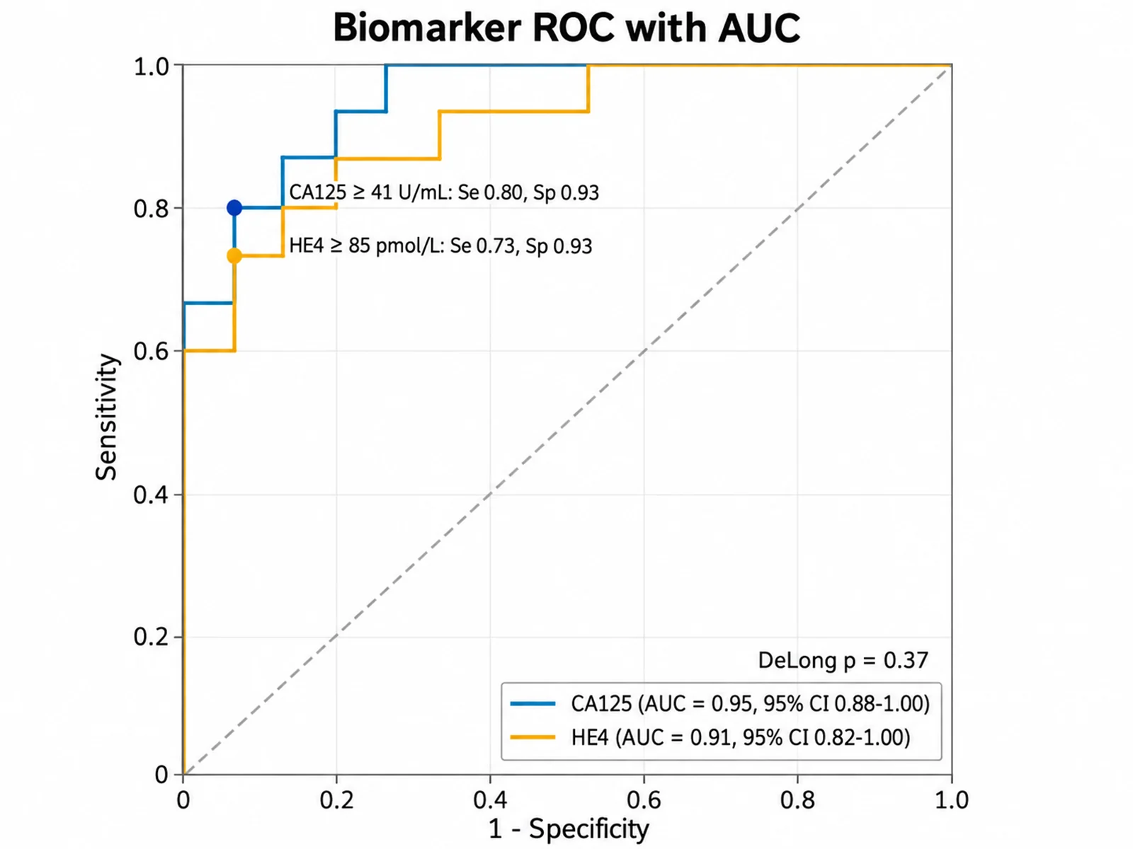
Based on the uploaded ovarian_biomarkers.csv file, create ROC curves for CA125 and HE4 with Diagnosis as the outcome and Cancer as the positive class. Show AUC with 95% CI in the legend, mark the Youden cutoff on each curve, and print the DeLong p-value.
Biomarker ROC with AUC
提示词
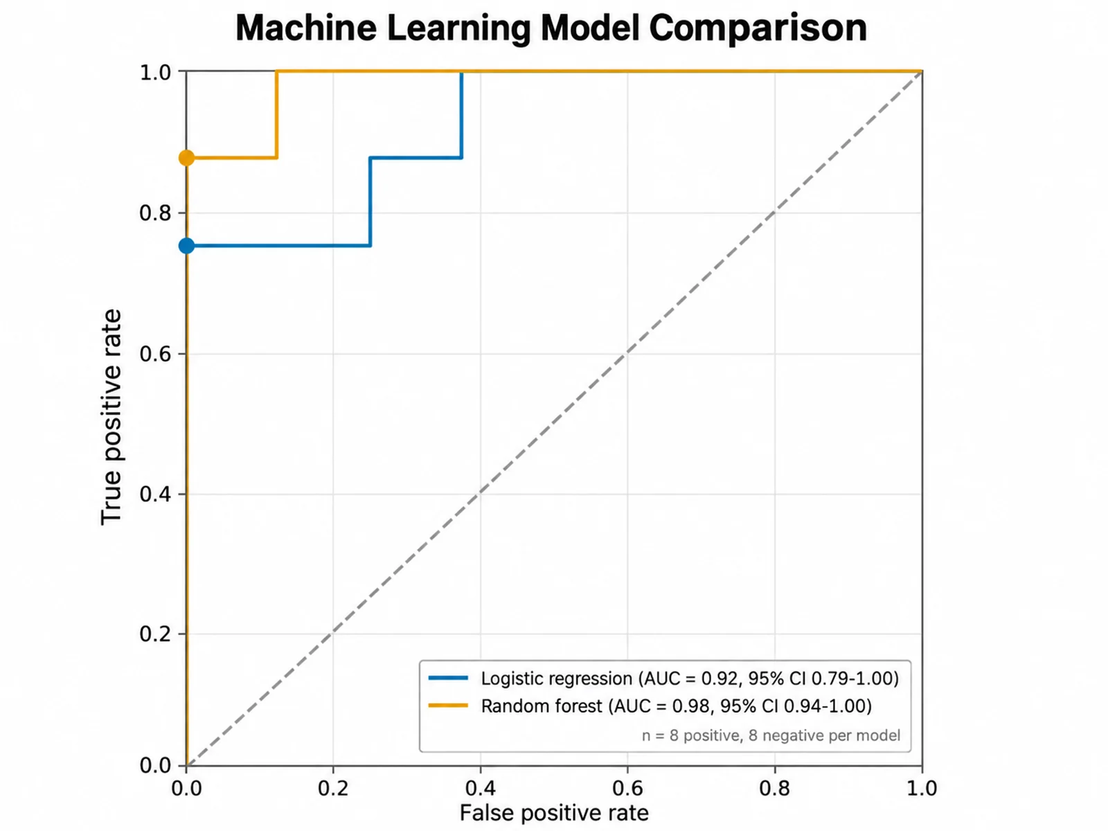
Based on the uploaded model_predictions.csv file, compare the logistic regression and random forest ROC curves from the predicted probabilities. Use one color per model, list AUC with 95% CI in the legend, and keep a dashed chance diagonal.
Machine Learning Model Comparison
提示词
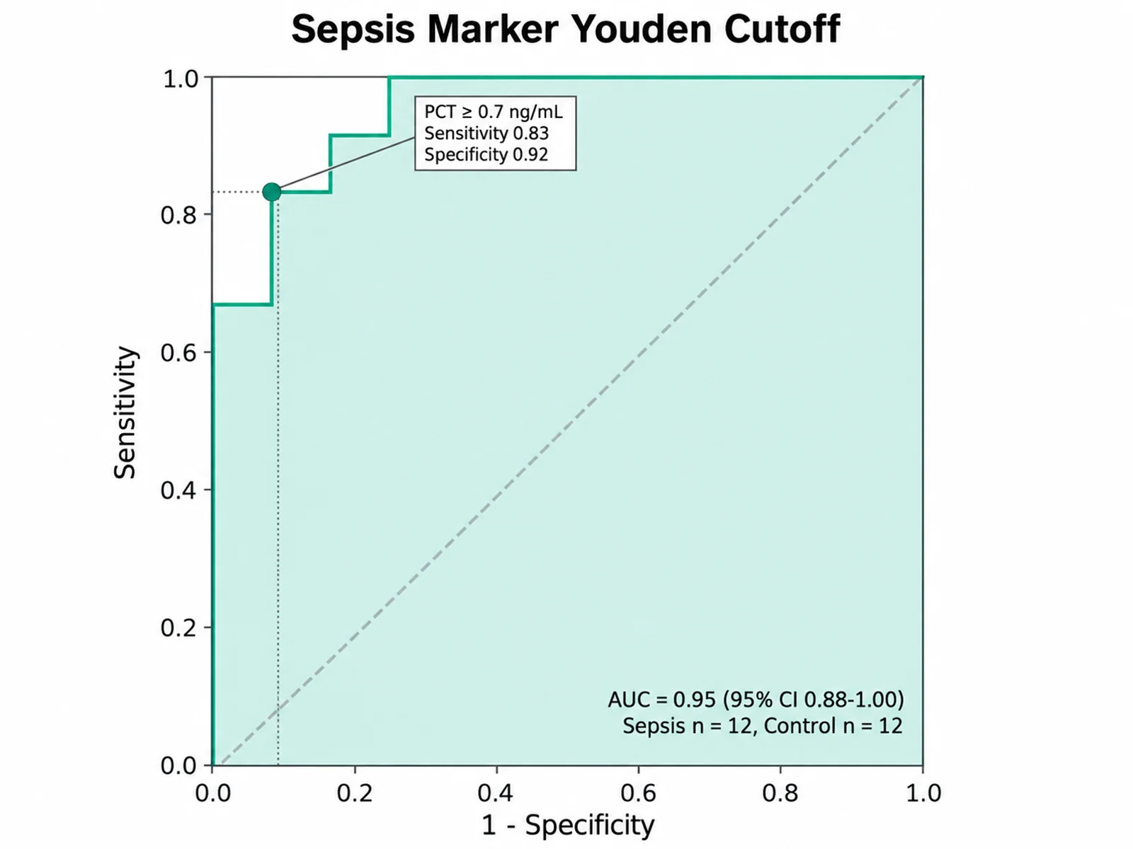
Based on the uploaded procalcitonin_sepsis.xlsx file, create a single ROC curve for PCT with Sepsis as the positive class. Shade the area under the curve, mark the Youden-optimal cutoff, and label it with the threshold, sensitivity, and specificity.
Sepsis Marker Youden Cutoff
提示词
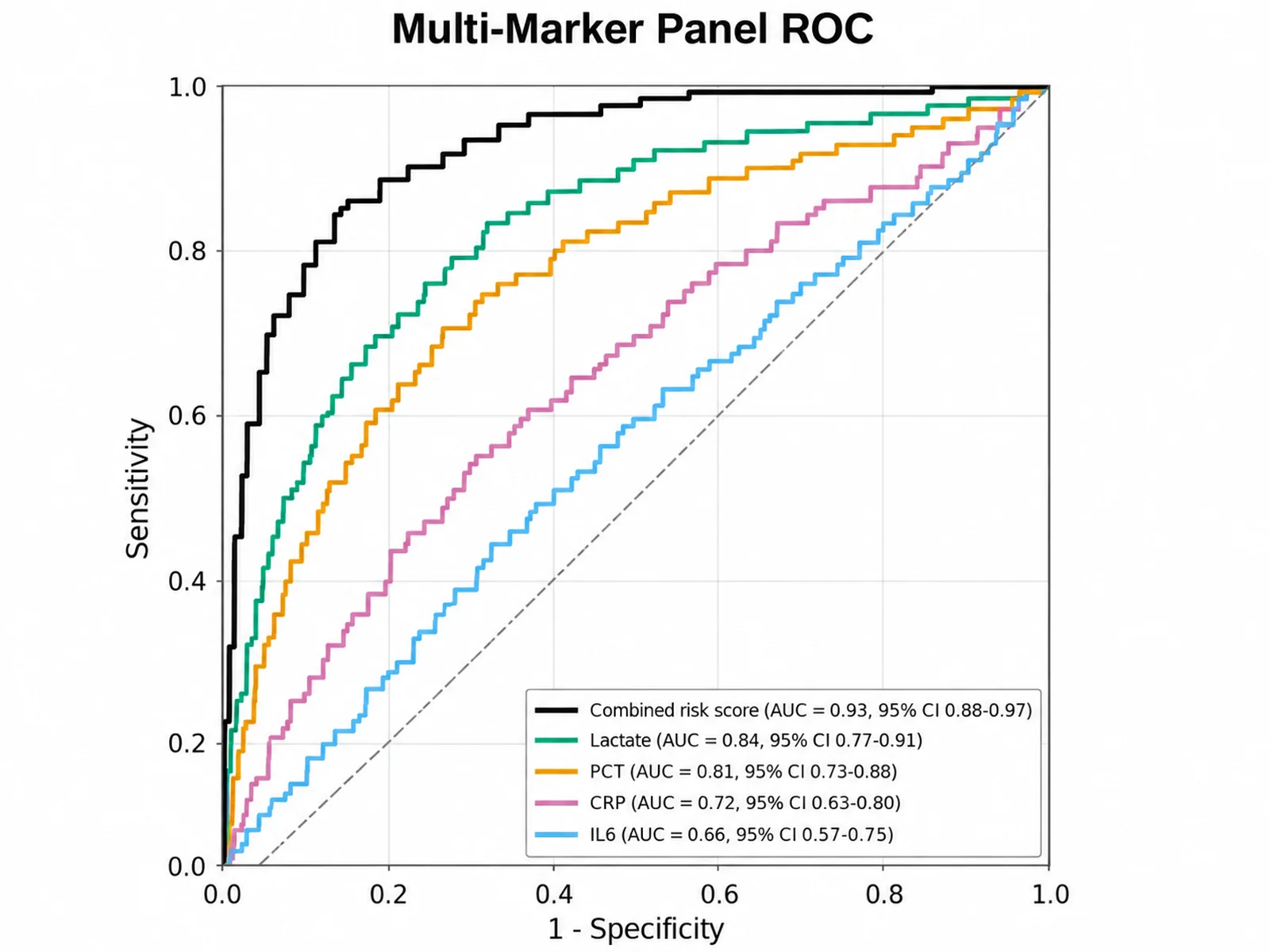
Based on the uploaded marker_panel_wide.csv file, create ROC curves for four biomarkers and a combined risk score, one numeric column each. Order the legend by AUC, show 95% CI, and use a colorblind-safe palette with the combined score as a thicker line.
Multi-Marker Panel ROC
提示词
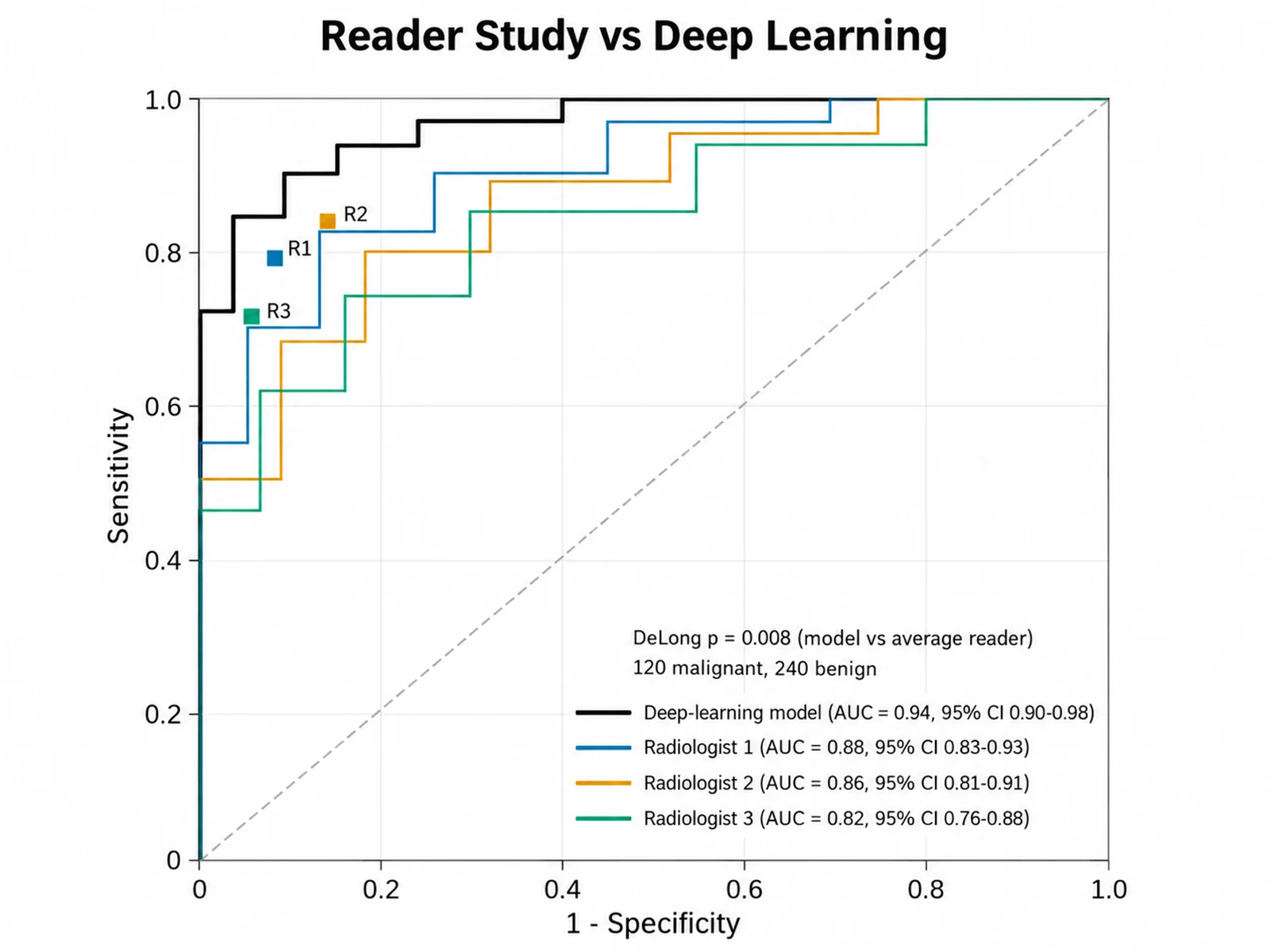
Based on the uploaded reader_study_ai.csv file, compare the ModelScore column with the confidence ratings from three radiologists, using Truth with Malignant as the positive class. Draw the model as a thick black curve and the reader curves as thin colored lines, plot each radiologist binary operating point as a labeled square, list AUC with 95% CI in the legend, and print the paired DeLong p-value for the model against the average reader.
Reader Study vs Deep Learning
提示词
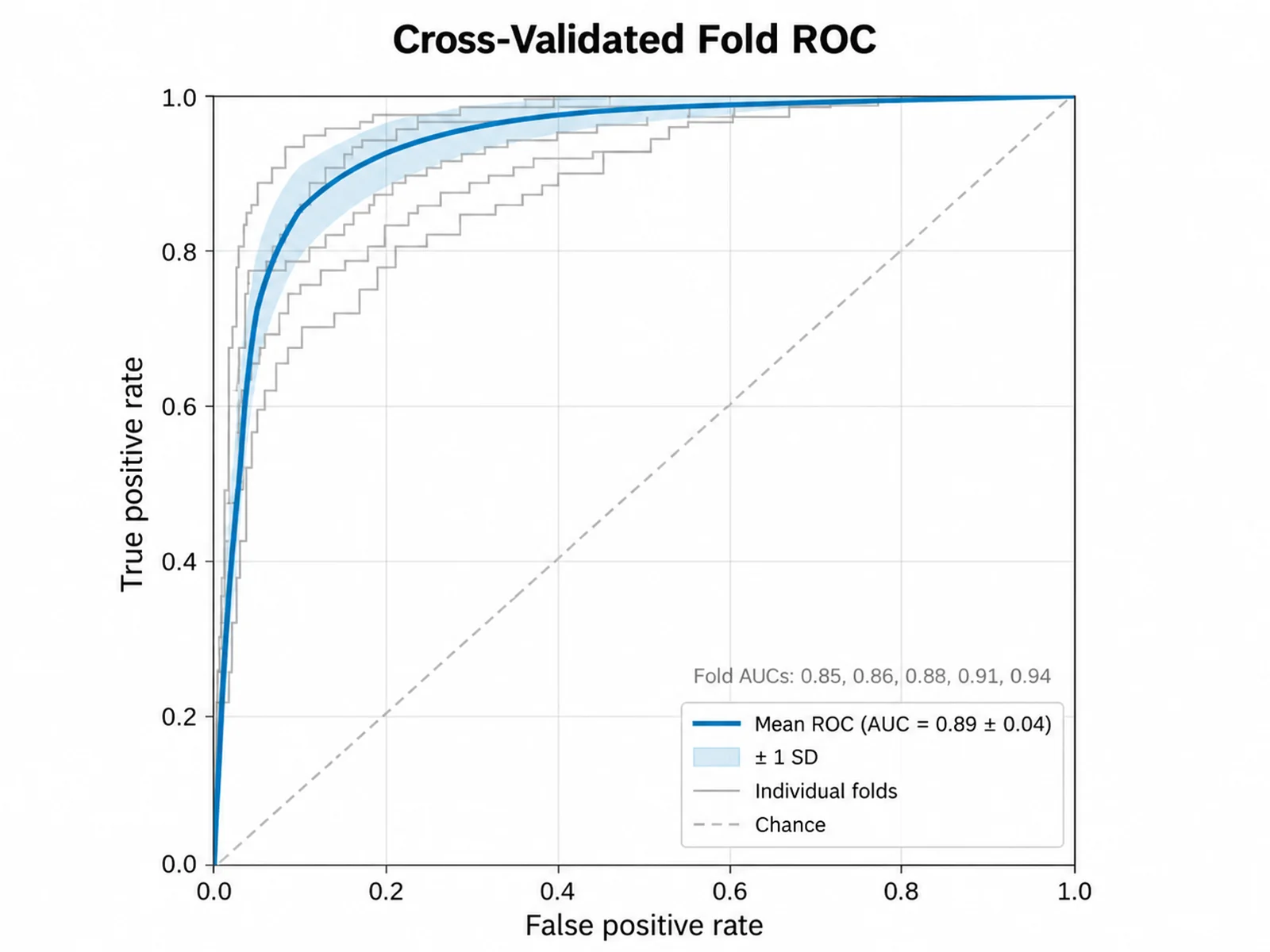
Based on the uploaded cv_folds.csv file, create ROC curves for a 5-fold cross-validated classifier using Fold as the curve name, Label as the outcome, and PredProb as the score. Draw the five folds as thin light-gray curves, overlay the mean ROC as a thick blue line with a shaded plus or minus one standard deviation band, list the mean AUC with its standard deviation and the per-fold AUCs in the legend, and keep a dashed chance diagonal.
Cross-Validated Fold ROC
How to make an ROC curve
1
Upload labels and scores
Add CSV, TSV, TXT, or Excel data with a true outcome column (case/control, disease/healthy, or 1/0) and one or more numeric predictor scores or predicted probabilities.
2
Describe the ROC analysis
Name the positive class if it is not obvious, say whether lower scores indicate disease, and ask for cutoff labels, shading, or a specificity x-axis.
3
Generate, review & download
SciFigure computes the ROC points, AUC, confidence intervals, and optimal cutoff, draws the curves, and lets you download a PNG for papers and slides.
What does this ROC curve generator do?
It evaluates how well a continuous score separates two classes. For every unique threshold in your data, the generator counts true positives and false positives, converts them to sensitivity and 1 - specificity, and connects the points into a receiver operating characteristic curve. It then reports the area under the curve with a confidence interval and marks the threshold with the best balance of sensitivity and specificity. The ROC curve generator doubles as an AUC calculator: every number on the figure comes from your uploaded rows, not from an AI estimate.
AUC, DeLong confidence intervals, and the Youden index
AUC is calculated with the trapezoid rule over all thresholds. It equals the Mann-Whitney probability that a random positive scores higher than a random negative, with ties counted as one half.
The 95% CI uses the DeLong variance estimate, which makes no assumption about the score distribution.
The Youden index J = sensitivity + specificity - 1. The cutoff with the largest J is reported with its sensitivity, specificity, and confusion counts.
When two score columns are measured on the same subjects, a paired DeLong test compares their AUCs.
An AUC below 0.5 usually means the score runs the other way. The curve is not flipped automatically; write "lower scores indicate positive" to reverse the direction.
How to read an ROC curve
The y-axis is sensitivity (true positive rate); the x-axis is 1 - specificity (false positive rate).
A curve that bows toward the top-left corner discriminates well; the dashed diagonal is a test with no discrimination (AUC = 0.5).
Moving along the curve trades sensitivity for specificity, so the best clinical cutoff depends on the cost of missed cases versus false alarms.
Overlapping confidence intervals do not prove two tests are equivalent; use the paired DeLong p-value for the comparison.
Data formats, tips, and common mistakes
Wide format: one outcome column and one numeric column per marker or model. Each numeric column becomes a curve; write "single curve" to plot only the mapped score.
Long format: map a model or marker name column, a score column, and the outcome. Use this for predictions from several models stacked in one table.
Each curve needs at least 3 positive and 3 negative observations. With fewer than about 20 per class the AUC confidence interval will be wide.
Do not report a cutoff chosen on the same data as validated performance; confirm it in an independent sample.
ROC Curve Generator FAQ
What data does the ROC curve need?
One row per subject with a true outcome column and at least one numeric score, such as a biomarker level, risk score, or predicted probability. The outcome can be 1/0 or text such as case/control, disease/healthy, positive/negative, or yes/no.
Does the tool calculate the statistics or does AI estimate them?
The tool calculates them. ROC points, AUC, DeLong confidence intervals, the Youden cutoff, and the paired comparison p-value are computed from your uploaded values in code and passed to the image model as exact numbers. The image model only draws and styles the figure, so check the plotted values against the listed results.
How is the positive class chosen?
The generator recognizes common labels such as 1, case, disease, cancer, positive, and yes, or treats control, healthy, normal, negative, and 0 as the reference. You can always override it by writing "positive class is Relapse" in your instructions.
Can I compare two ROC curves or several models?
Yes. Up to 6 curves can share one plot. When exactly two score columns come from the same subjects, the generator runs a paired DeLong test and reports the AUC difference, z statistic, and p-value.
What if lower scores mean disease?
Write "lower scores indicate positive" and thresholds are applied as score less than or equal to the cutoff. Without that instruction, higher scores are treated as positive and an AUC below 0.5 is flagged rather than silently flipped.
Can I use this ROC curve online output in a paper?
Yes, after you confirm the positive class, sample sizes, AUC, and cutoff against your analysis. Report how the cutoff was chosen and whether it was validated in separate data.