
Free clinical trial reporting tool
CONSORT diagram generator for randomized trials
Fill in enrollment, allocation, follow-up, and analysis counts, and this free CONSORT diagram generator draws the participant flow diagram as you type. It follows the box structure of the official CONSORT 2025 template, supports two to four arms, and warns you when the numbers do not add up. Your trial data stays in your browser.
Start from
Your draft is saved in this browser only. Nothing is uploaded.
Arms (2)
All filled-in counts add up.
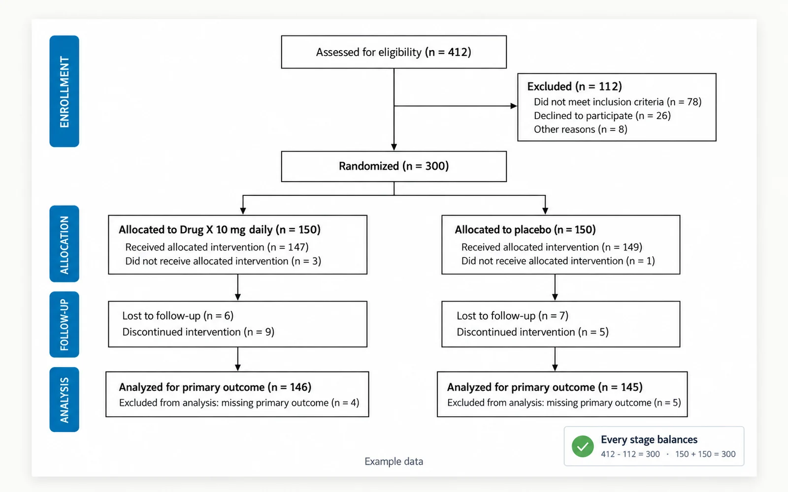
What a CONSORT flow diagram is
CONSORT (Consolidated Standards of Reporting Trials) is the reporting guideline for randomized trials. Its flow diagram shows how participants moved through each phase of a trial: how many were assessed for eligibility and excluded, how many were randomized to each group, how many received the allocated intervention, how many were lost to follow-up or discontinued, and how many were included in the analysis of the primary outcome. Readers use it to judge attrition and to check that the analysis matches the randomized groups.
- CONSORT 2025 was published on April 14, 2025, simultaneously in BMJ, JAMA, The Lancet, Nature Medicine, and PLOS Medicine. It updates CONSORT 2010 and comes with a 30-item checklist and a flow diagram template.
- The ICMJE Recommendations name CONSORT as the reporting guideline for randomized trials. Whether a flow diagram is mandatory is set by each journal, so check the instructions for authors of your target journal.
- The official template is drawn for a two-group trial. For three or four arms, add a parallel column per arm, as this consort flow diagram tool does.
What changed in the CONSORT 2025 flow diagram
Comparing the official 2010 and 2025 templates, the four stages (Enrollment, Allocation, Follow-Up, Analysis) and the order of the boxes are the same. The visible wording change is that follow-up and analysis now refer to the primary outcome: "Lost to follow-up" became "Lost to follow-up for primary outcome", and "Analysed" became "Analysed for primary outcome". This generator uses the 2025 labels, in US or UK spelling. If your journal still asks for the 2010 wording, edit the text in the exported SVG, which keeps every label as editable text.
How to fill in each box
- Assessed for eligibility: everyone screened against the eligibility criteria.
- Excluded: people screened but not randomized, split into not meeting inclusion criteria, declined to participate, and other reasons. The three counts should add up to the excluded total.
- Randomized: participants who were randomly assigned. It should equal assessed minus excluded.
- Allocated to intervention: everyone assigned to each arm, whether or not they received it. Arm totals should add up to the randomized count. Below it, record how many received the allocated intervention and how many did not, with reasons.
- Follow-up: participants lost to follow-up for the primary outcome and participants who discontinued the intervention, each with reasons. People who stop treatment can still attend outcome visits and be analyzed, so discontinuations are not automatically subtracted from the analysis box.
- Analysis: participants analyzed for the primary outcome in each arm, and those excluded from the analysis with reasons. When every allocated participant is accounted for, analyzed plus excluded from analysis equals allocated.
Common mistakes the checker catches
Most problems in a randomized controlled trial flow diagram are arithmetic slips and missing reasons. The tool checks both as you type and shows warnings instead of blocking the diagram, because real trials have legitimate complexities such as participants randomized in error or withdrawals of consent for data use.
- Numbers that do not add up: assessed minus excluded differs from randomized, arm totals differ from the randomized count, received plus did not receive differs from allocated, or reasons do not sum to their box total.
- Unaccounted participants: analyzed plus excluded from analysis does not equal the number allocated to the arm, or more people are analyzed than were allocated.
- Missing reasons: a nonzero count of exclusions, losses, discontinuations, or analysis exclusions with no reasons listed. The 2025 template asks for reasons in each of these boxes.
- Mixing up discontinued and lost to follow-up. Someone who stopped the intervention but completed the outcome assessment is not lost to follow-up.
- When a warning reflects a real feature of your trial, write an override note. Print it under the diagram, or keep it for your records and explain it in the manuscript.
CONSORT vs PRISMA flow diagrams
Both are flow diagrams, but they count different things. A CONSORT diagram follows people through one randomized trial. A PRISMA 2020 flow diagram follows information through a systematic review: the records identified, screened, included, and excluded, and the reasons for exclusion. If you are writing up a systematic review or meta-analysis of trials, you need a PRISMA diagram, not a CONSORT diagram. Use CONSORT when you report the results of the trial itself.
Export for your manuscript
The consort diagram template renders in a plain journal style: Arial text, thin black boxes, and black arrows, with an optional accent color for the side stage labels. Export an SVG to edit in a vector editor, or a PNG that is 2,400 pixels wide, which is 300 DPI across 8 inches (203 mm). Save the form as a JSON file to reopen it during revisions; a draft is also kept in this browser's local storage so a page refresh does not lose your counts. Everything in this consort diagram generator runs client-side, so you can prepare the figure for a blinded or unpublished trial without sending any counts to a server.
Frequently asked questions
Is this CONSORT diagram generator free, and is my trial data uploaded?
It is free and needs no account. The diagram is drawn in your browser, and counts, arm names, and reasons are not sent to a server. Drafts are saved only in this browser's local storage, and you can download the form as a JSON file.
Does it follow CONSORT 2025?
Yes. The boxes and labels follow the official CONSORT 2025 flow diagram template from the CONSORT and SPIRIT group, including "Lost to follow-up for primary outcome" and "Analysed for primary outcome". You can switch between US and UK spelling.
Can I make a diagram for a three- or four-arm trial?
Yes. Add up to four arms. Each arm gets its own column for allocation, follow-up, and analysis, and the randomization line splits across all of them. Some trial designs need a different diagram, so check the CONSORT website if your design is not a parallel-group trial.
What happens if my numbers do not add up?
The diagram still renders, and the checker lists each mismatch with the arithmetic, for example allocated counts adding up to 298 when 300 were randomized. Fix the count, or add an override note that explains the difference.
What resolution is the PNG export?
The PNG is 2,400 pixels wide, which is 300 DPI at a printed width of 8 inches (203 mm). The SVG export is vector, so it stays sharp at any size. Check the journal figure requirements page and your journal guide for the column width you need.
Should the diagram numbers match the rest of the manuscript?
Yes. The randomized, allocated, and analyzed counts should match the baseline table, the results text, and the primary outcome analysis. Save the final form as JSON so you can update the diagram quickly if counts change during revision.
Related tools
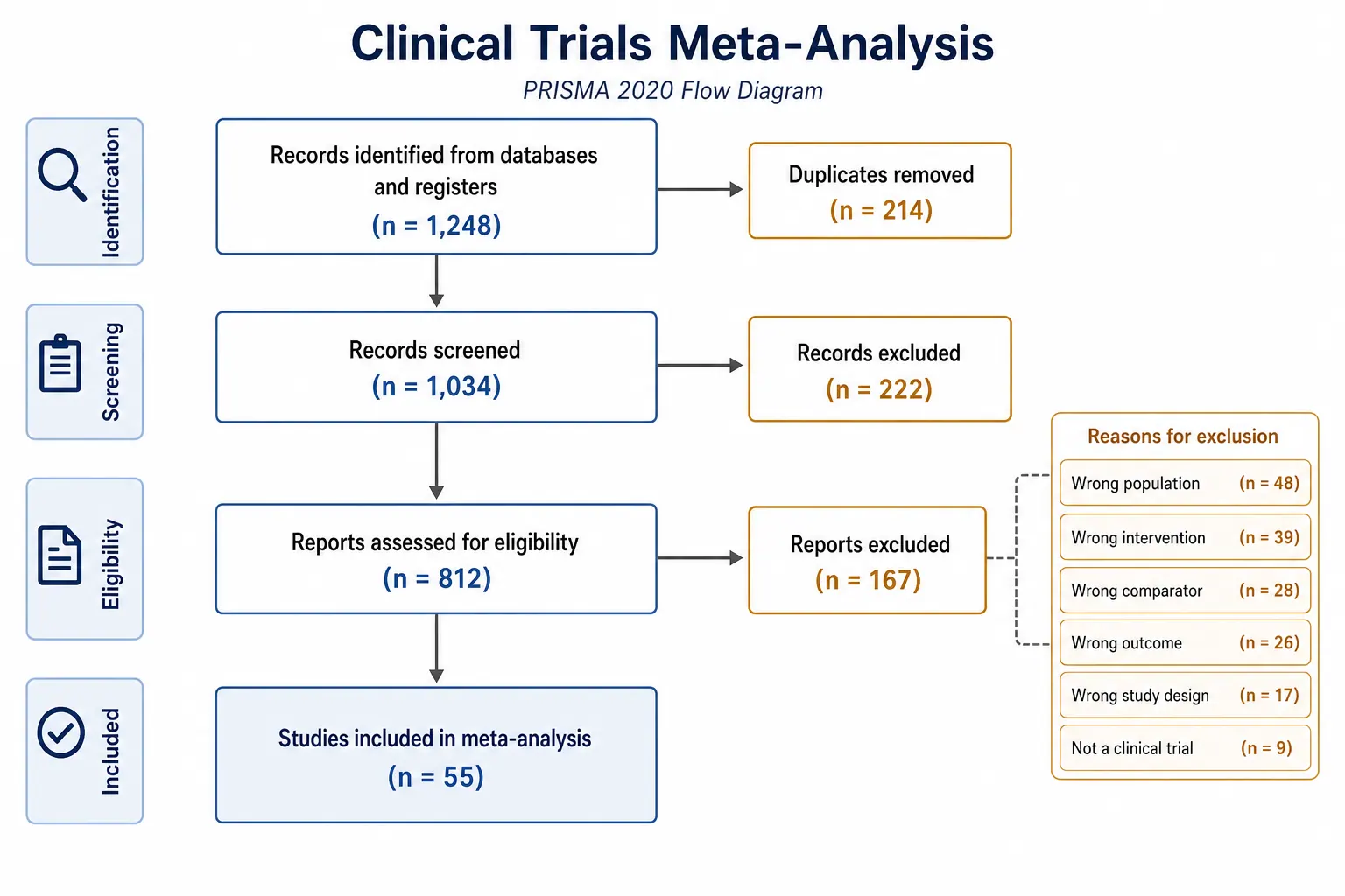
PRISMA flow diagram generator
Create the flow diagram for a systematic review or meta-analysis.
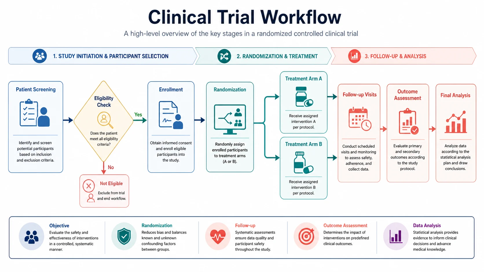
Workflow diagram generator
Draw study procedures, lab protocols, and analysis pipelines as clean workflow figures.
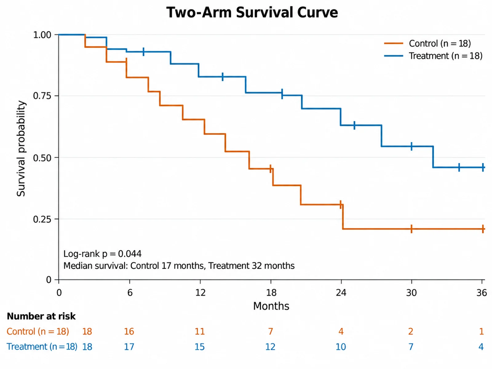
Kaplan-Meier plot generator
Upload time-to-event data and plot survival curves for each trial arm.
Forest plot generator
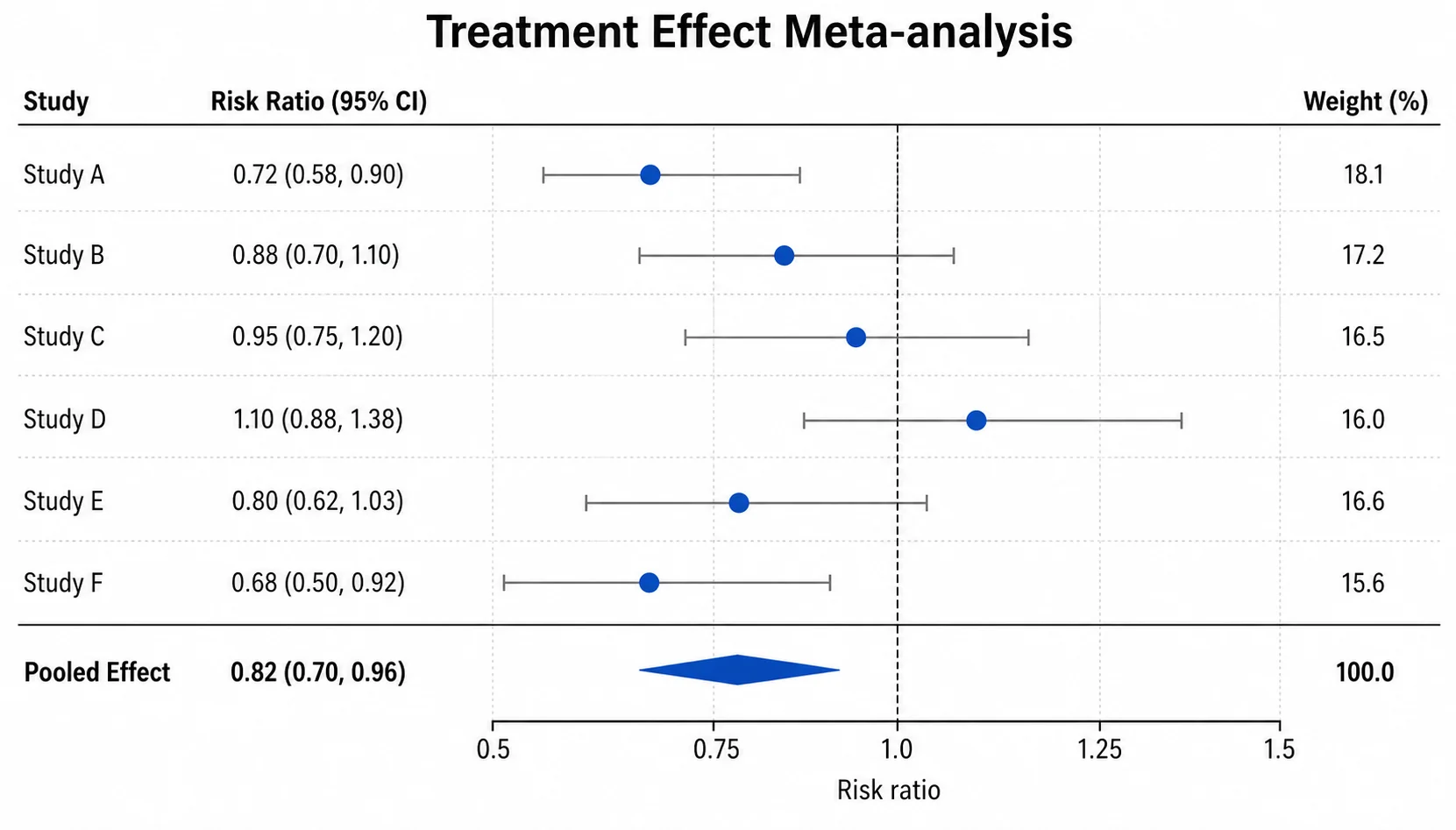
Show subgroup effects or pooled estimates with confidence intervals.

Journal figure requirements
Column widths, resolution, file formats, and fonts for major publishers, with official sources.
Bland-Altman plot generator
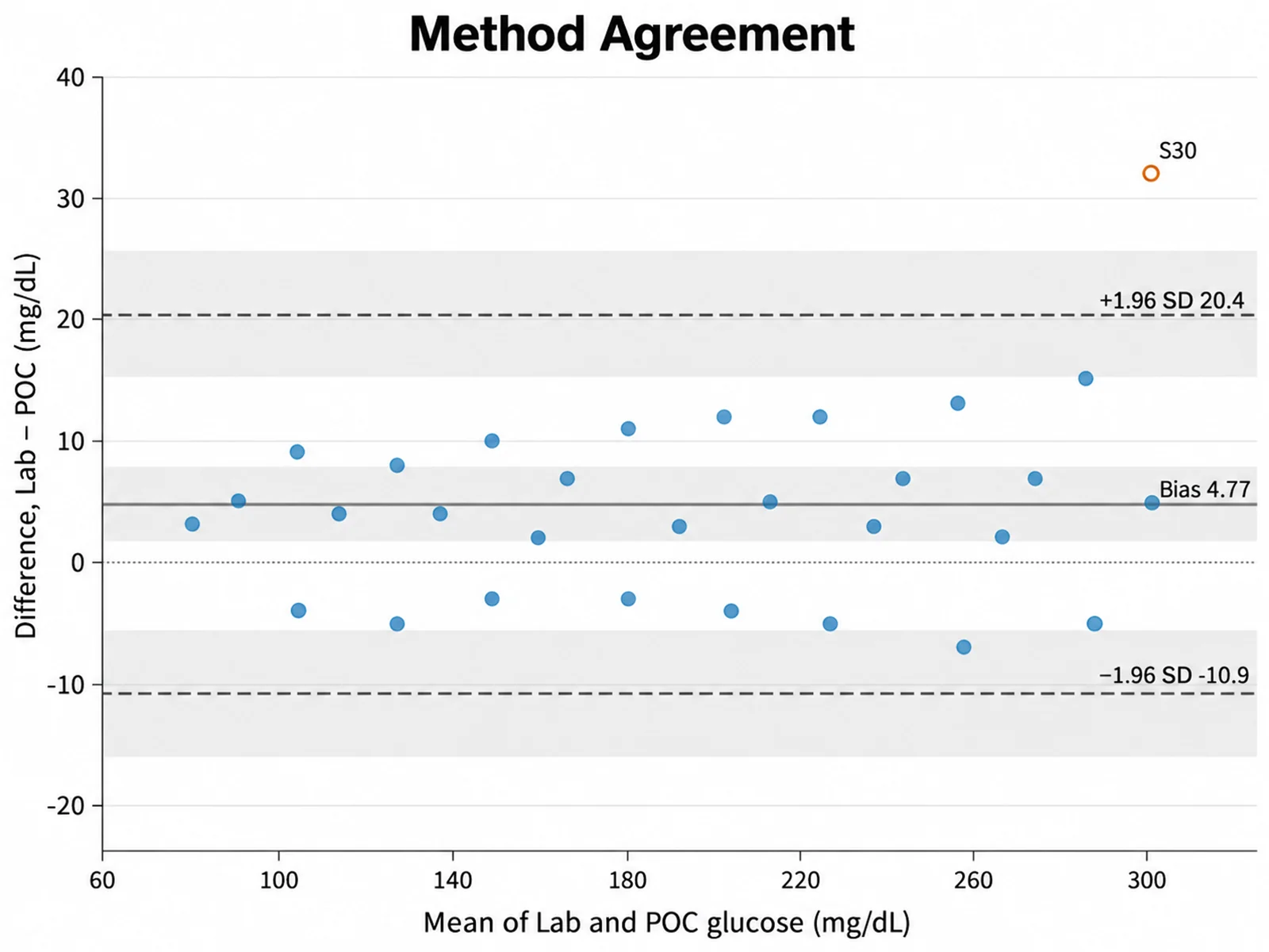
Compare two measurement methods with bias and 95% limits of agreement.
Plot the primary outcome next
Upload your time-to-event data as CSV or Excel to the SciFigure Kaplan-Meier plot generator. Charts cost 5 credits each, and the 10 free credits new accounts get work for charts.
Open the Kaplan-Meier plot generatorLast checked: September 15, 2026. Diagram structure and box labels follow the official CONSORT 2025 flow diagram template. Sources: CONSORT 2025 flow diagram template (consort-spirit.org); CONSORT 2025 published statements; Hopewell et al., CONSORT 2025 statement, BMJ; Schulz et al., CONSORT 2010 statement, BMJ; ICMJE Recommendations: preparing for submission; PRISMA 2020 flow diagram.