Heatmap Generator for Scientific Matrix Data

Create publication-ready heatmaps from uploaded matrix data.

Upload expression, correlation, assay, or sample-by-feature data, describe the color scale and annotations, then generate a clean AI-made heatmap with manuscript-ready PNG output.

Matrix data readyLabels, scales & annotationsPublication-ready PNG

AI Heatmap Generator

Upload data and describe the AI chart you need.

Aspect ratio
279 / 2000 characters

Costs 5 credits. Uses your uploaded data and prompt to generate a publication-ready PNG.

Preview

Heatmap Example Previews

Aspect ratio: 16:9

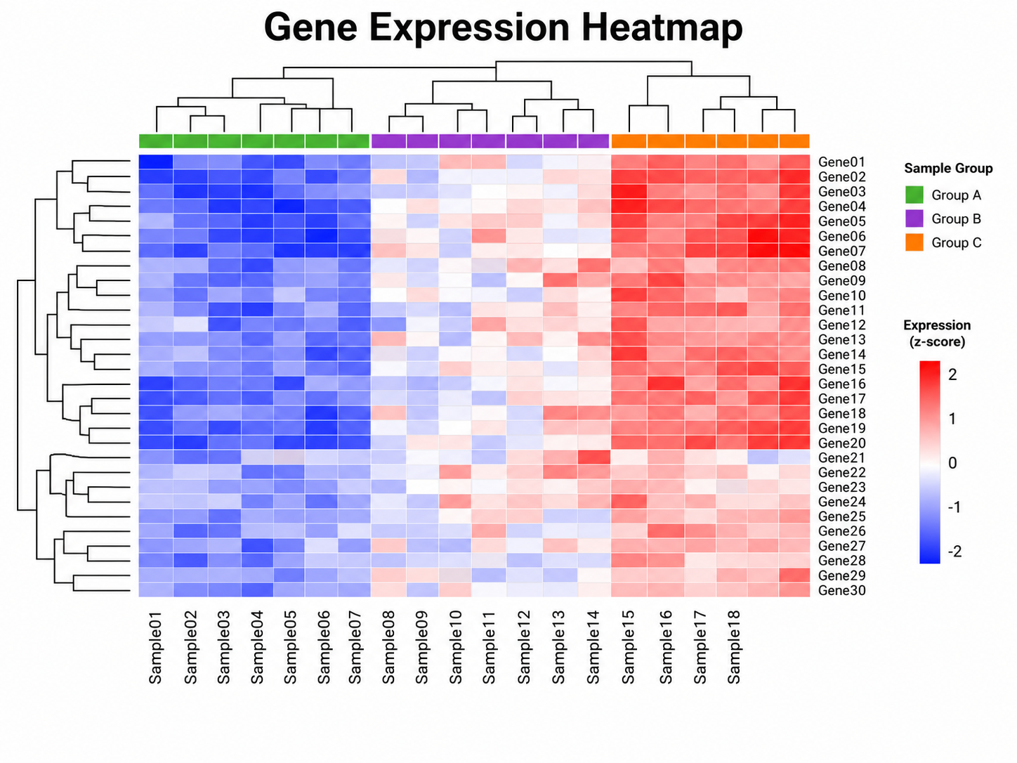
Gene Expression Heatmap heatmap example preview
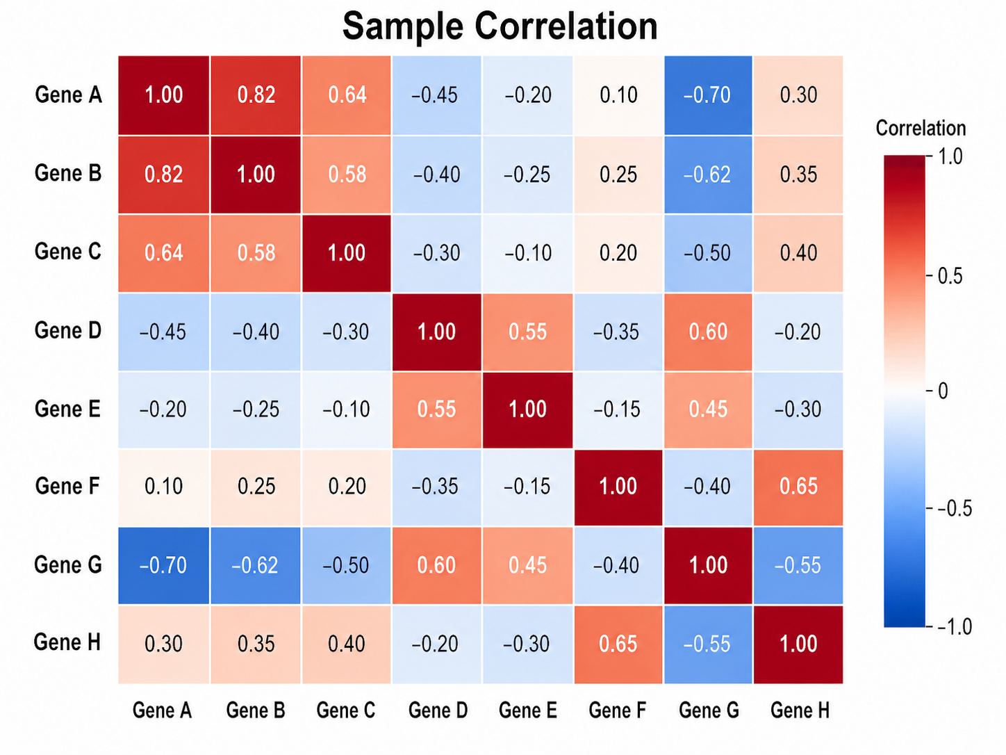
Sample Correlation heatmap example preview
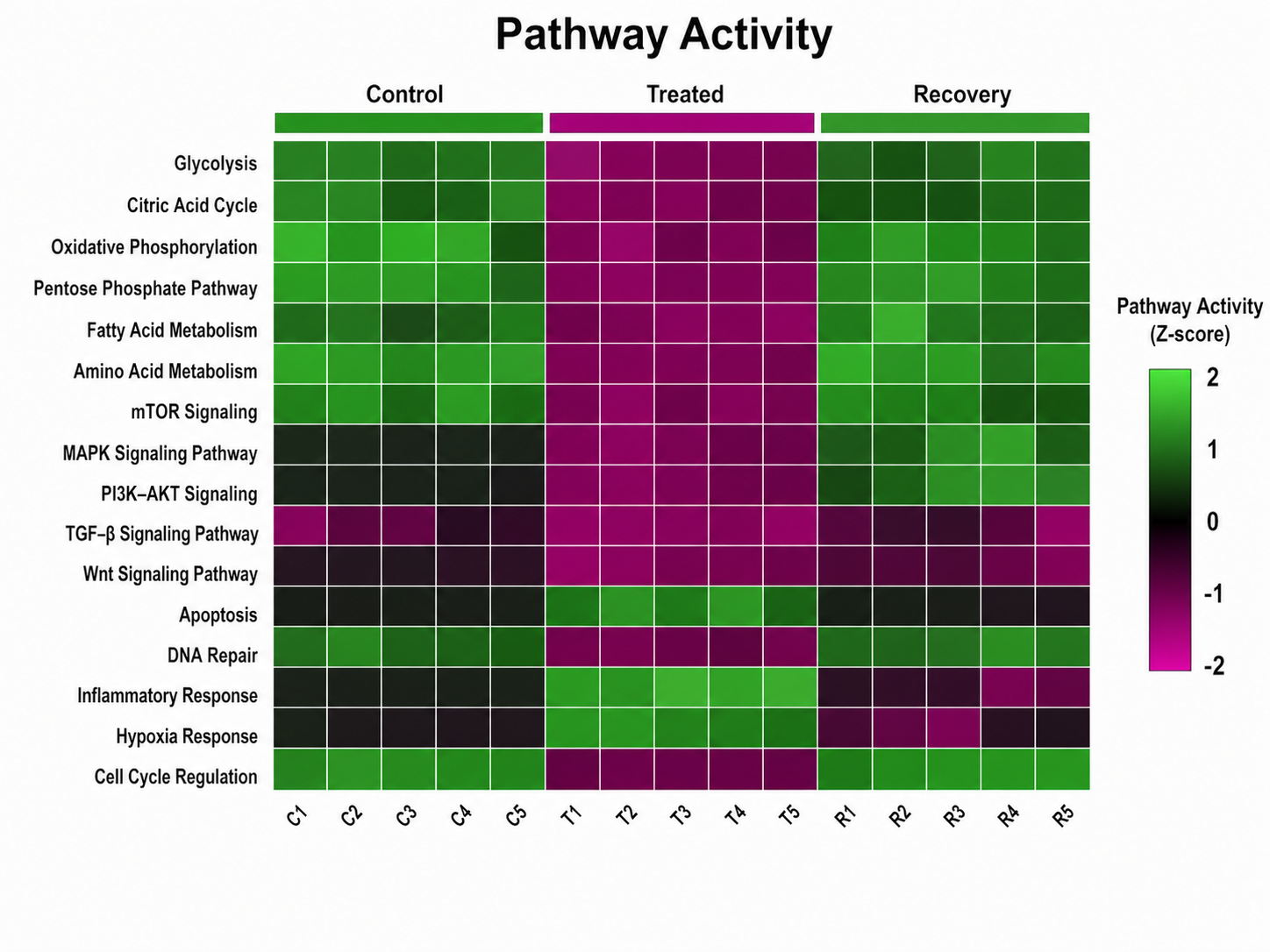
Pathway Activity heatmap example preview

These are sample previews. Upload your dataset to generate your own heatmap.

Heatmap examples

Use these examples as visual directions for expression matrices, correlations, pathway scores, immune profiles, time courses, and manuscript-ready heatmaps.

Heatmap Generator: Gene Expression Heatmap scientific chart example

Prompt

Based on the uploaded gene_expression_matrix.csv file, create a publication-ready gene expression heatmap. Use genes as rows and samples as columns, preserve labels, apply a blue-white-red scale when values are centered, add compact dendrograms only if requested or appropriate, and include a readable colorbar.
Gene Expression Heatmap

Heatmap Generator: Sample Correlation scientific chart example

Prompt

Based on the uploaded sample_correlation_matrix.xlsx file, create a clean sample correlation heatmap. Use the uploaded sample order unless clustering is requested, show a perceptually clear correlation color scale, keep cell labels readable only when space allows, and include a compact legend from low to high correlation.

Sample Correlation

Heatmap Generator: Pathway Activity scientific chart example

Prompt

Based on the uploaded pathway_activity_scores.tsv file, create a pathway activity heatmap comparing pathway rows across experimental cohorts. Use a restrained diverging palette for centered activity scores, add cohort annotation strips when supplied, keep labels readable, and avoid overcrowding dense rows.

Pathway Activity

Heatmap Generator: Immune Profile scientific chart example

Prompt

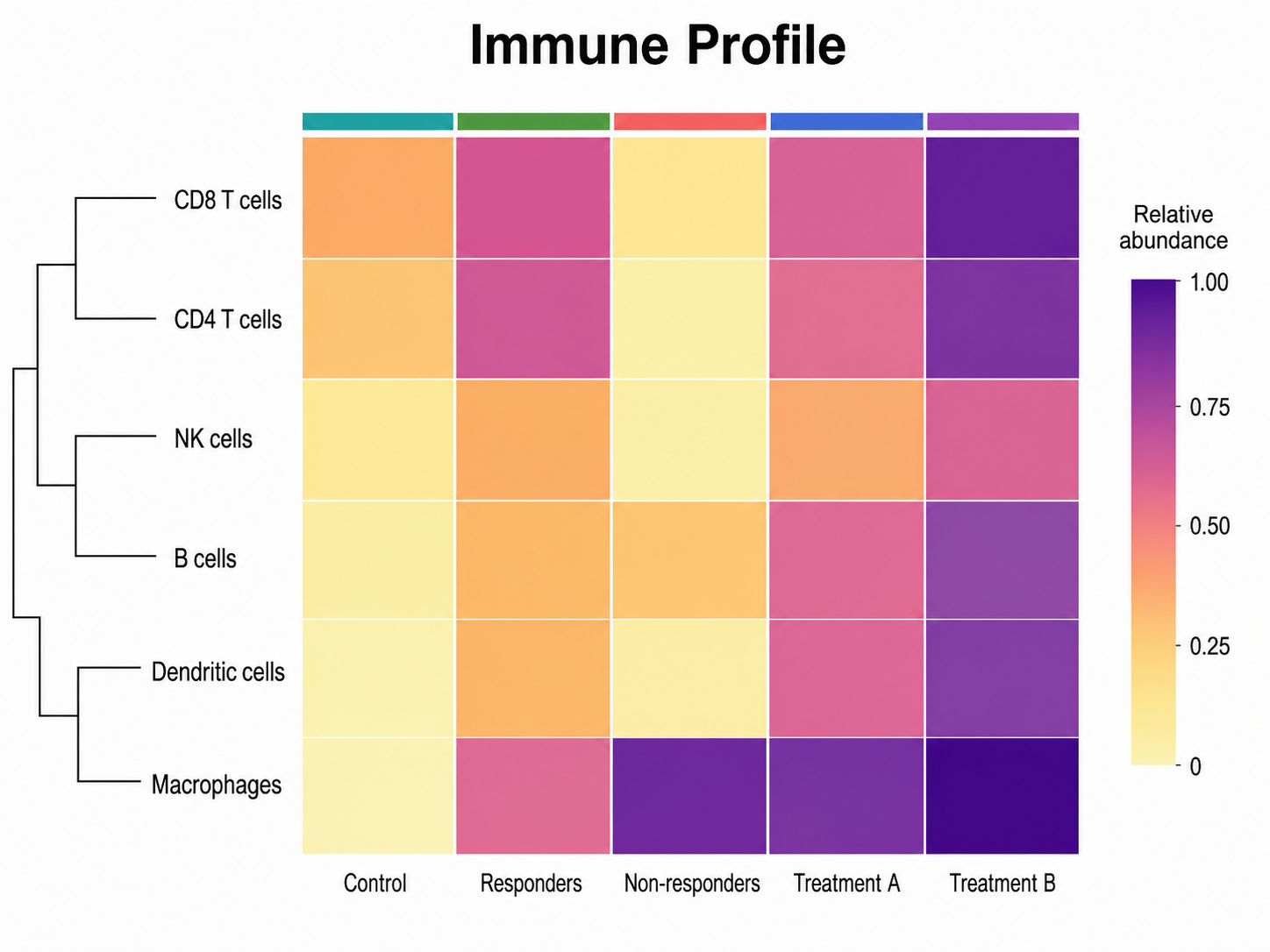
Based on the uploaded immune_cell_abundance.csv file, create an immune cell abundance heatmap. Use immune cell types as rows and treatment or response groups as columns, apply a yellow-to-purple low-to-high scale, add a compact abundance legend, and preserve group labels for manuscript readability.

Immune Profile

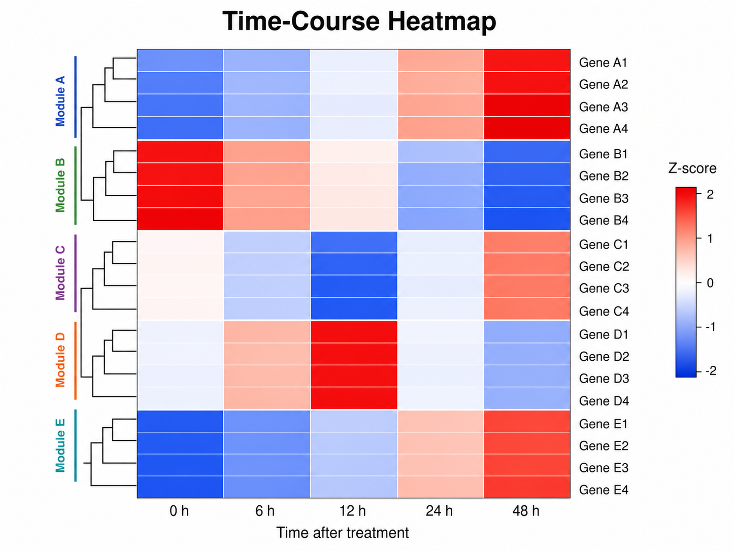
Heatmap Generator: Time-Course Heatmap scientific chart example

Prompt

Based on the uploaded time_course_gene_modules.xlsx file, create a time-course heatmap showing gene module changes across ordered time points. Preserve chronological column order, use a centered blue-white-red scale for z-scores, group related rows visually, and label time points clearly.

Time-Course Heatmap

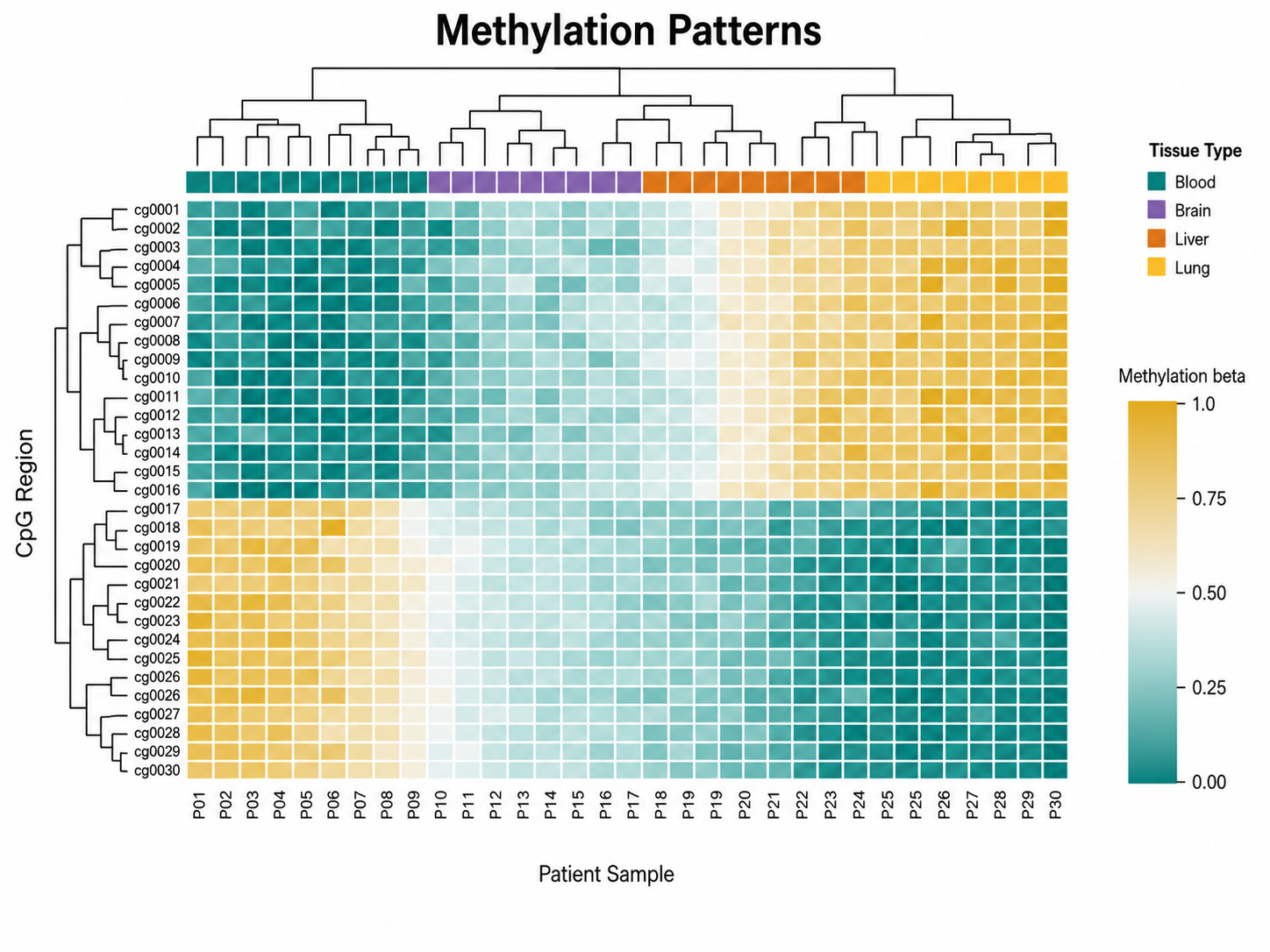
Heatmap Generator: Methylation Patterns scientific chart example

Prompt

Based on the uploaded methylation_beta_matrix.csv file, create a methylation heatmap with CpG regions as rows and patient samples as columns. Use a teal-to-gold methylation beta scale, include tissue-type annotation colors when supplied, keep labels compact, and show clustering only when it supports the analysis.

Methylation Patterns

How to make a heatmap

1

Upload your matrix

Add CSV, TSV, TXT, or Excel data with a row-label column followed by numeric sample, condition, feature, or matrix columns.

2

Describe the chart

Tell SciFigure AI the color scale, clustering preference, annotation bars, labels, and figure title you need.

3

Generate, review & download

Create a clean AI heatmap, verify labels and scale choices, then download PNG for papers and slides.

What does this heatmap generator do?

It turns row-by-column scientific matrix data into a clean heatmap that shows patterns across genes, proteins, metabolites, samples, cohorts, pathways, or assay conditions. The result is designed for manuscripts, lab reports, posters, and research presentations.

Why use a heatmap generator

  • Turn dense numeric matrices into readable color-coded scientific figures.
  • Preserve uploaded labels, ordering, and numeric relationships while improving layout and styling.
  • Add color scales, annotation strips, clustering cues, and compact legends from your prompt.
  • Move from spreadsheet matrices to polished publication visuals faster.

Types and parts of a heatmap

  • Rows and columns represent features, samples, time points, conditions, or matrix members.
  • Cell color represents the numeric value using a sequential or diverging scale.
  • Annotation strips can show cohort, treatment, tissue type, batch, or time group metadata.
  • Clustering should be used only when the distance metric and preprocessing fit the analysis.

Heatmap Generator FAQ

What data does the heatmap need?

Use one row-label column and at least two numeric matrix columns, such as sample, condition, pathway, assay, or correlation columns.

Can I preserve the uploaded row and column order?

Yes. Ask to preserve uploaded order. If you request clustering, verify that the preprocessing, distance metric, and grouping make scientific sense.

Should I use a diverging or sequential color scale?

Use a diverging scale when zero or another center has meaning, such as z-scores. Use a sequential scale for abundance, intensity, methylation beta values, or other low-to-high measurements.

Can I add annotation bars?

Yes. Upload annotation columns or describe the sample groups, then ask for compact top or side annotation strips.

Can I use the result in a paper?

Yes, but verify the values, scaling, normalization, clustering choices, labels, and caption before submission.

Need clearer matrix figures?

Generate heatmaps, volcano plots, scatter plots, and other research-ready visualizations with SciFigure AI.