Kaplan-Meier Plot Generator for Survival Analysis

Turn time-to-event data into a publication-ready survival curve.

Upload follow-up times, event status, and groups from CSV or Excel. SciFigure computes the Kaplan-Meier estimates, median survival, number-at-risk table, and log-rank test before generating a clean figure for your manuscript.

Log-rank testNumber-at-risk tableCensor marks & median survival

AI Kaplan-Meier Plot Generator

Upload survival data and describe the curve you need.

宽高比
306 / 2000

Costs 5 credits. Survival estimates, medians, and log-rank statistics are computed from your uploaded data, then drawn as a PNG.

预览

Kaplan-Meier Plot Examples

宽高比: 16:9

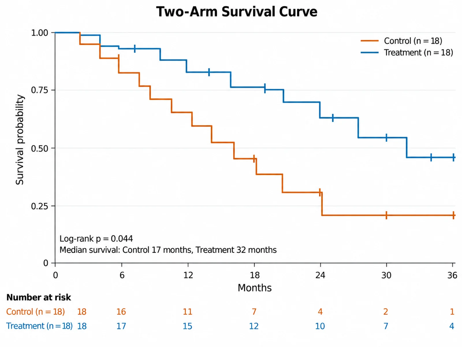
Two-Arm Survival Curve Kaplan-Meier plot example preview
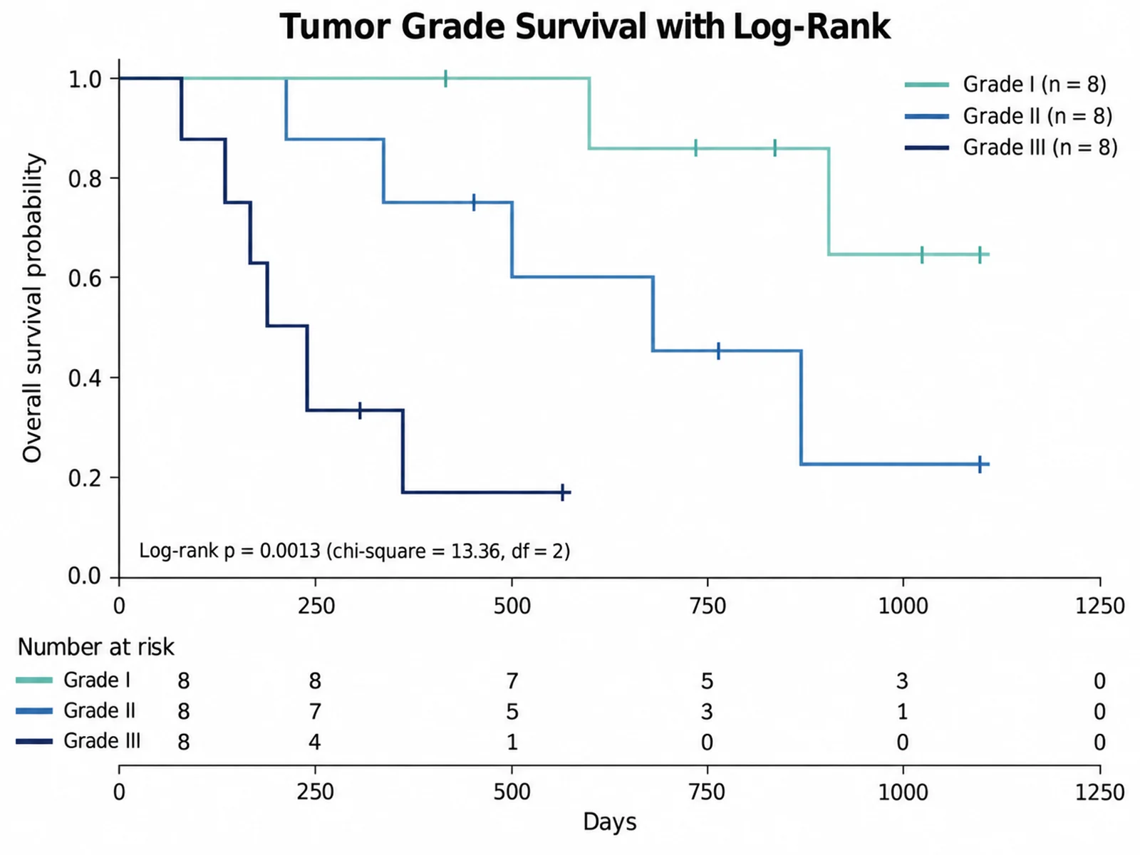
Tumor Grade Survival with Log-Rank Kaplan-Meier plot example preview
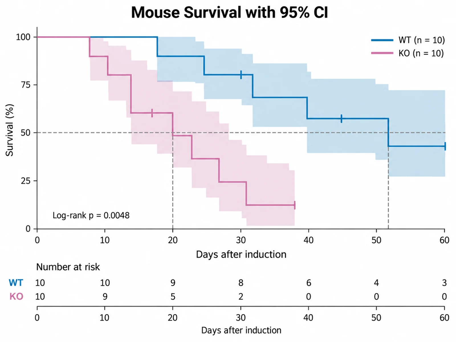
Mouse Survival with 95% CI Kaplan-Meier plot example preview

These are sample previews. Upload your dataset to generate your own Kaplan-Meier plot.

Kaplan-Meier plot examples

Use these examples as starting points for clinical trial arms, tumor grade comparisons, animal survival studies, and relapse-free survival figures with risk tables.

Kaplan-Meier Plot Generator: Two-Arm Survival Curve scientific chart example

提示词

Based on the uploaded two_arm_trial.csv file, create a Kaplan-Meier survival plot of Months by Arm. Draw step curves with vertical censor ticks, print the log-rank p-value, list median survival for Control and Treatment, and add a number-at-risk table below the x-axis.
Two-Arm Survival Curve

Kaplan-Meier Plot Generator: Tumor Grade Survival with Log-Rank scientific chart example

提示词

Based on the uploaded tumor_grade_survival.xlsx file, create a Kaplan-Meier overall survival plot for tumor Grade I, II, and III. Status is coded 2 = death and 1 = censored. Use an ordered color scale, print the three-group log-rank p-value, and add a risk table.

Tumor Grade Survival with Log-Rank

Kaplan-Meier Plot Generator: Mouse Survival with 95% CI scientific chart example

提示词

Based on the uploaded mouse_survival.csv file, create a Kaplan-Meier survival plot of Day by Genotype with shaded 95% confidence bands, survival shown in percent, censor marks, dashed median survival lines, and the log-rank p-value.

Mouse Survival with 95% CI

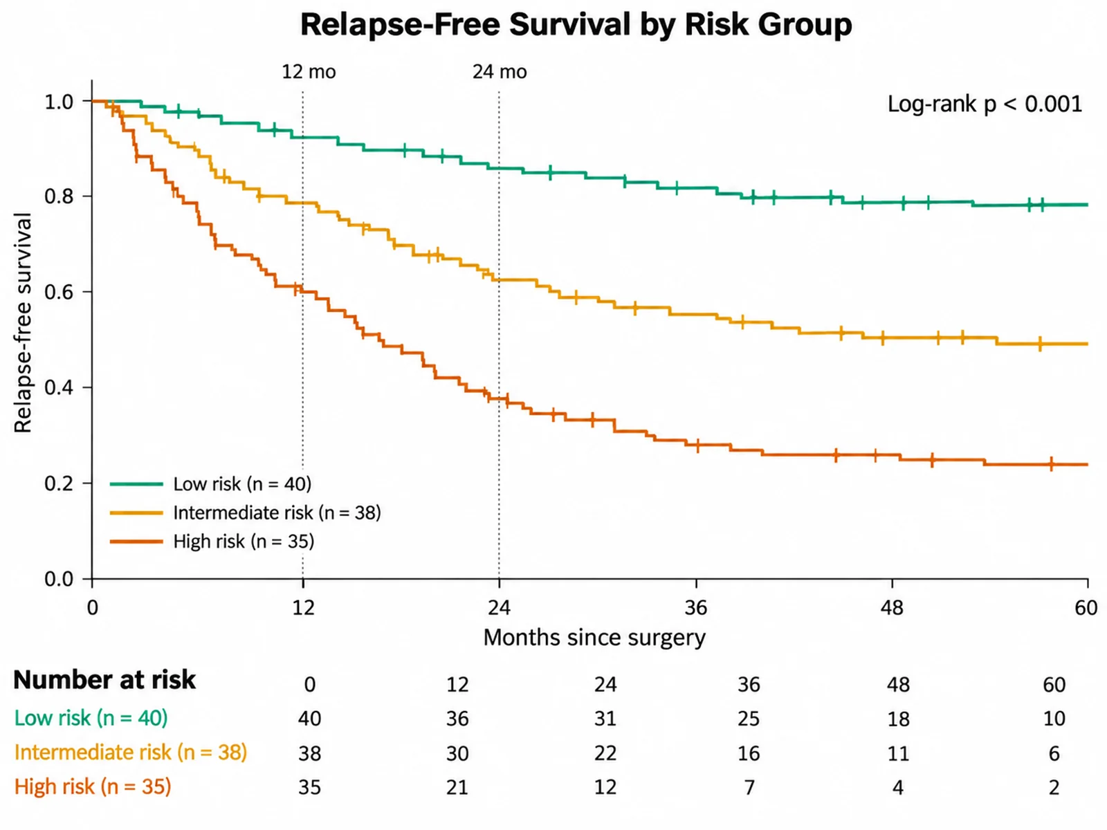
Kaplan-Meier Plot Generator: Relapse-Free Survival Risk Table scientific chart example

提示词

Based on the uploaded relapse_free_survival.tsv file, create a Kaplan-Meier relapse-free survival plot for low, intermediate, and high risk groups. Show landmark survival at 12 and 24 months, a number-at-risk table with group colors, and a compact legend with n per group.

Relapse-Free Survival Risk Table

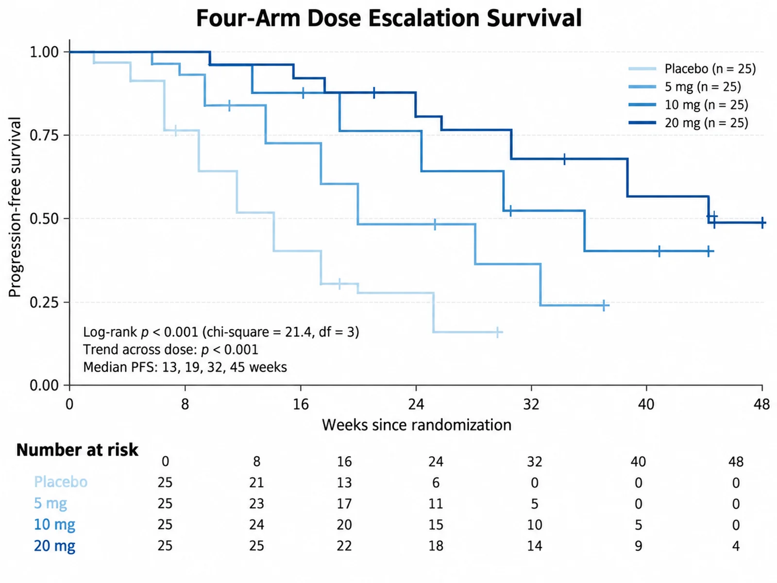
Kaplan-Meier Plot Generator: Four-Arm Dose Escalation Survival scientific chart example

提示词

Based on the uploaded dose_escalation_survival.csv file, create a Kaplan-Meier progression-free survival plot of Weeks by DoseArm for placebo, 5 mg, 10 mg, and 20 mg, with Event coded 1 = progression and 0 = censored. Use an ordered light-to-dark blue scale, add censor ticks, print the four-group log-rank p-value together with the log-rank test for trend across dose, list median PFS per arm, and put a number-at-risk table with n per arm under the x-axis.

Four-Arm Dose Escalation Survival

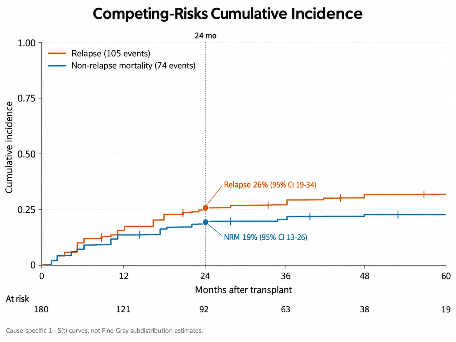
Kaplan-Meier Plot Generator: Competing-Risks Cumulative Incidence scientific chart example

提示词

Based on the uploaded transplant_competing_risks.xlsx file, create a cumulative incidence figure of Months after transplant. EventType is coded 0 = censored, 1 = relapse, 2 = non-relapse mortality. Draw one rising step curve per event type on a 0 to 1 axis, print the 24-month cumulative incidence with its 95% CI for each, add censor ticks and a shared number-at-risk table, and note in a footnote that these are 1 - S(t) cause-specific curves rather than Fine-Gray subdistribution estimates.

Competing-Risks Cumulative Incidence

How to make a Kaplan-Meier plot

1

Upload your survival data

Add CSV, TSV, TXT, or Excel data with one row per subject: a numeric follow-up time, an event column (1 = event, 0 = censored), and an optional group or treatment arm.

2

Describe the figure

Ask for confidence bands, percent scale, landmark times, median lines, or a cumulative incidence curve, and say which time unit to show on the x-axis.

3

Generate, review & download

SciFigure computes the survival estimates and log-rank test, draws the curves with a number-at-risk table, and lets you download a PNG for papers and slides.

What does this Kaplan-Meier plot generator do?

It estimates the survival function for each group in your time-to-event table and draws the result as a stepped survival curve. Every drop in the curve happens at an observed event time, censored subjects appear as small tick marks, and the figure can include median survival, a log-rank p-value, and a number-at-risk table aligned with the time axis. All of these numbers are calculated from your uploaded rows before the image is generated, so the Kaplan-Meier plot generator works as a survival curve generator you can check against your statistics software rather than an AI sketch.

The Kaplan-Meier estimator, censoring, and the log-rank test

  • At each event time, survival is multiplied by (1 - d/n), where d is the number of events and n is the number still at risk. When events and censorings share a time, events are counted first.
  • Censored subjects leave the risk set without causing a drop. They still contribute information up to their last follow-up.
  • Median survival is the first time the curve reaches 0.5 or lower. If the curve never gets there, the median is reported as "not reached".
  • 95% confidence bands use the Greenwood variance on the log-log scale, which keeps the limits between 0 and 1.
  • The log-rank test compares observed and expected events across 2 or more groups and reports a chi-square statistic with k - 1 degrees of freedom.

How to read a Kaplan-Meier curve

  • The y-axis is the estimated probability of remaining event-free; the x-axis is time since baseline.
  • Steep drops mean many events in a short interval, while long flat segments mean few events or few subjects left.
  • The right tail is uncertain when the number at risk is small, so always read the curve together with the risk table.
  • Crossing curves suggest non-proportional hazards; a single log-rank p-value may then hide important differences over time.

Tips and common mistakes

  • Code the event column as 1 = event and 0 = censored. The 2 = event, 1 = censored coding used by R datasets is detected automatically; write "1 = censored" in your instructions if your column is a censoring flag.
  • Use one row per subject and measure time from the same origin, such as randomization or diagnosis.
  • Do not stop the x-axis where the last event occurs if follow-up continues; censored subjects at the end matter.
  • Mention "95% CI", "percent", "landmark 12, 24", "median lines", "cumulative incidence", or "no risk table" in your instructions to switch those options.

Kaplan-Meier Plot Generator FAQ

What data format does the Kaplan-Meier plot need?

Use one row per subject with a numeric time column, a numeric event column (1 = event such as death or relapse, 0 = censored), and an optional group column such as treatment arm, genotype, or tumor grade. Up to 6 groups are supported.

Does the tool calculate the statistics or does AI estimate them?

The tool calculates them. The product-limit estimates, censor positions, median survival, confidence limits, number at risk, and log-rank test are computed from your uploaded values in code, then passed to the image model as exact values to draw. The image model handles layout and styling only, so review the final figure against the listed numbers before publishing.

How does the log-rank test work here?

For 2 or more groups, the generator sums observed and expected events at every event time, builds the variance matrix, and reports the chi-square statistic, degrees of freedom (groups minus 1), and p-value. It does not adjust for covariates; use Cox regression in your own analysis for that.

Can I add confidence intervals or a number-at-risk table?

Yes. The number-at-risk table is included by default at about six evenly spaced time points. Ask for "95% confidence bands" to add Greenwood log-log intervals, or write "no risk table" to leave the table out.

Can I plot cumulative incidence instead of survival?

Yes. Ask for a "cumulative incidence" or "1 - survival" curve and the values are converted to 1 - S(t). This is the complement of the Kaplan-Meier curve, not a competing-risks estimate.

Can I use this Kaplan-Meier curve online output in a paper?

Yes, after you check the event coding, group sizes, median survival, and p-value against your analysis plan. State the time origin, censoring rules, and test used in the figure legend.

Need a survival figure for your next paper?

Generate Kaplan-Meier plots, forest plots, ROC curves, and other research-ready visualizations with SciFigure AI.