
Free figure accessibility tool
Colorblind simulator for scientific figures
Drop in a chart, micrograph, or diagram and see it with protanopia, deuteranopia, tritanopia, and achromatopsia side by side. This free colorblind simulator runs entirely in your browser and flags the colors in your figure that become hard to tell apart.
Loading sample...
Your image never leaves your device.
Applies to protan, deutan, and tritan views. 100% = dichromacy; lower values model anomalous trichromacy.
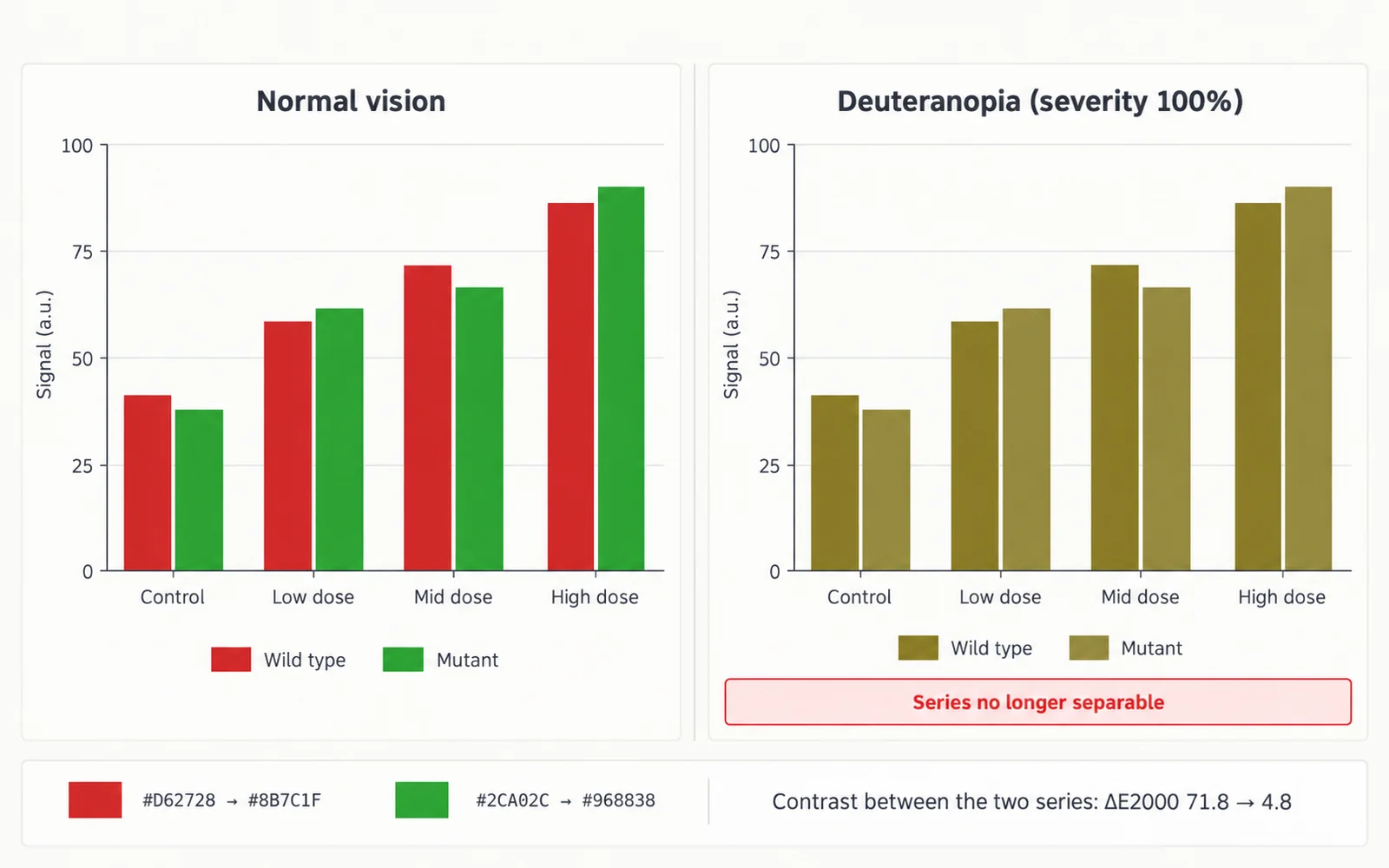
Why check scientific figures for color blindness
Inherited red-green color vision deficiency is common enough that almost every paper, poster, and lecture reaches readers who have it. Large population surveys reviewed by Birch (2012) put the prevalence at about 8% of men and about 0.4% of women of European descent, and Colour Blind Awareness gives a similar estimate of roughly 1 in 12 men and 1 in 200 women. The US National Eye Institute describes the most common type as trouble telling red from green, while a rarer type makes blue and yellow look alike. In a department seminar with fifty men in the audience, around four may see your red and green treatment groups as nearly the same color. A colorblind simulator lets you catch that before reviewers, readers, or your audience do.
What journals ask for
Publishers increasingly treat color accessibility as part of figure quality, although the exact wording differs between journals.
- Nature's research figure guide asks authors to use an accessible color palette and points to Bang Wong's 2011 Nature Methods column on color blindness as an example.
- The same guide shows red and green combinations that become very hard to tell apart when a color-blindness filter is applied, and asks for color combinations that keep enough contrast under such a filter.
- It also advises against colored text; use keys, labels, and keylines instead.
- The American Society for Cell Biology notes that many journals now strongly encourage authors to replace red/green combinations.
- Requirements vary, so read your target journal's author guide before submission.
How the deuteranopia simulator and other views work
The tool uses the physiologically based model of Machado, Oliveira, and Fernandes (2009). Each pixel is decoded from sRGB to linear RGB, multiplied by the published 3×3 matrix for protanopia, deuteranopia, or tritanopia, and encoded back to sRGB. The authors publish matrices for severities from 0.0 to 1.0 in steps of 0.1, and the severity slider interpolates linearly between neighboring matrices, as the authors suggest for intermediate values. Achromatopsia is shown as Rec. 709 relative luminance, a grayscale view that also approximates a black-and-white printout. Transparent areas are placed on white, and images longer than 2,000 pixels on either side are scaled down first.
- Simulations are approximations. Color perception varies between people with the same diagnosis, and screen calibration changes what you see.
- Use the preview as a screening check, then fix the original figure rather than publishing the simulated image.
How to fix a figure that fails the check
- Add redundant encoding: pair every color with a marker shape, line style, hatch pattern, or position so meaning never depends on hue alone.
- Switch to a tested categorical palette such as Okabe-Ito, designed to stay distinguishable for the common types of color vision deficiency.
- Avoid red versus green for opposite conditions. Blue and orange, or magenta and green, are safer pairs for up/down or treated/control.
- Label lines, groups, and regions directly on the plot instead of relying on a separate color legend.
- For heatmaps and other continuous data, use an ordered scale such as viridis or cividis instead of a rainbow or red-green scale.
- Make key colors differ in lightness, not just hue, so the figure still reads in grayscale.
Reading the palette check
Below the previews, the tool extracts up to eight dominant colors from a downsampled copy of your image with median-cut quantization. For every pair that is clearly different in normal vision, it computes the CIEDE2000 color difference after simulating full deuteranopia and protanopia. Pairs whose simulated difference falls below ΔE 10 are flagged with swatches and HEX values, so you know exactly which colors to change. White backgrounds and anti-aliased edges can appear as dominant colors; ignore pairs that carry no meaning in your figure.
Frequently asked questions
Is this colorblind simulator free, and is my image uploaded?
It is free and needs no account. All processing happens in your browser with the Canvas API, so your image never leaves your device and nothing is stored on a server.
Which types of color vision deficiency can I preview?
Protanopia and deuteranopia (the two red-green types), tritanopia (blue-yellow), and achromatopsia, shown as a grayscale luminance view. Lower the severity slider to approximate the milder forms: protanomaly, deuteranomaly, and tritanomaly.
How accurate is the simulation?
The Machado et al. (2009) model is widely used in accessibility tools, but every simulation is an approximation. People with the same diagnosis perceive color differently, and uncalibrated screens shift colors. Treat the preview as a screening check, not a diagnostic test.
What severity should I check at?
Start at 100%, which represents dichromacy and the hardest case. A figure that works there will also work for milder anomalous trichromacy. Lower values show how people with a milder deficiency are likely to see it.
How do I check a figure for color blindness before journal submission?
Export each figure as PNG, JPEG, WebP, or SVG, drop it into the tool, and review the grid view and palette check. Fix flagged color pairs in your plotting software, check again, and confirm your target journal's own figure guidelines.
Should I publish the simulated image?
No. The PNG download is meant for sharing with coauthors or documenting your check. Improve the original figure with a colorblind-friendly palette, shapes, and direct labels instead.
Related tools
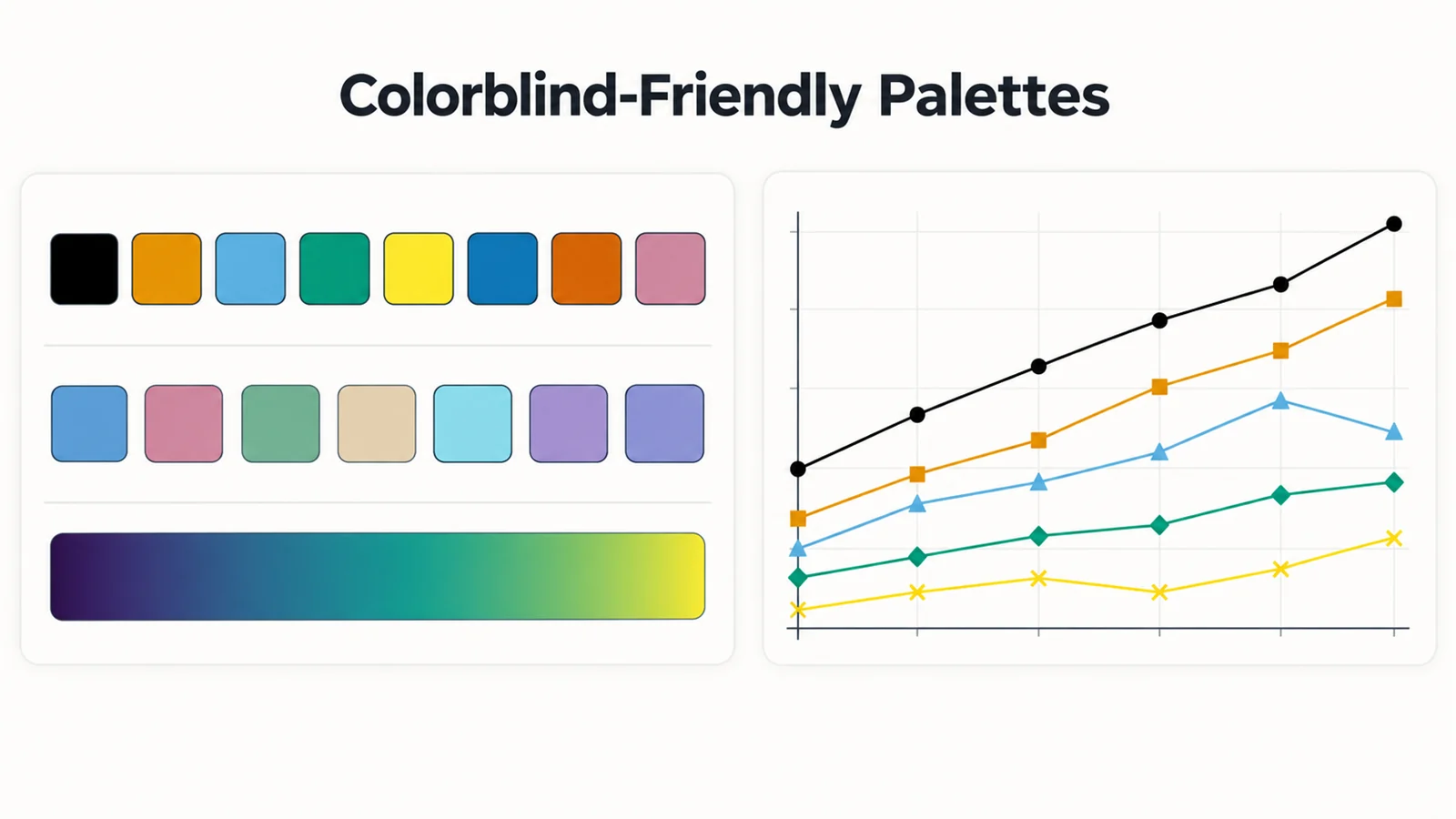
Colorblind-friendly palettes
Okabe-Ito, Paul Tol, IBM, viridis, and cividis with HEX, matplotlib, ggplot2, and CSS snippets.
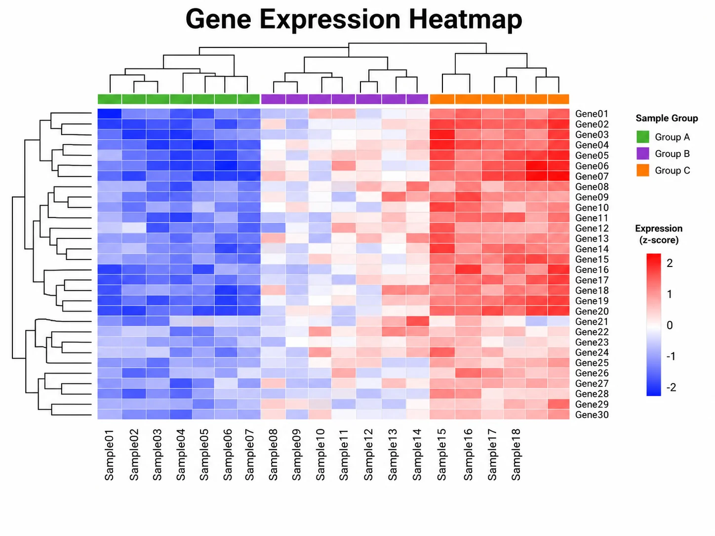
Heatmap generator
Upload a CSV or Excel file and turn it into a heatmap with a readable color scale.
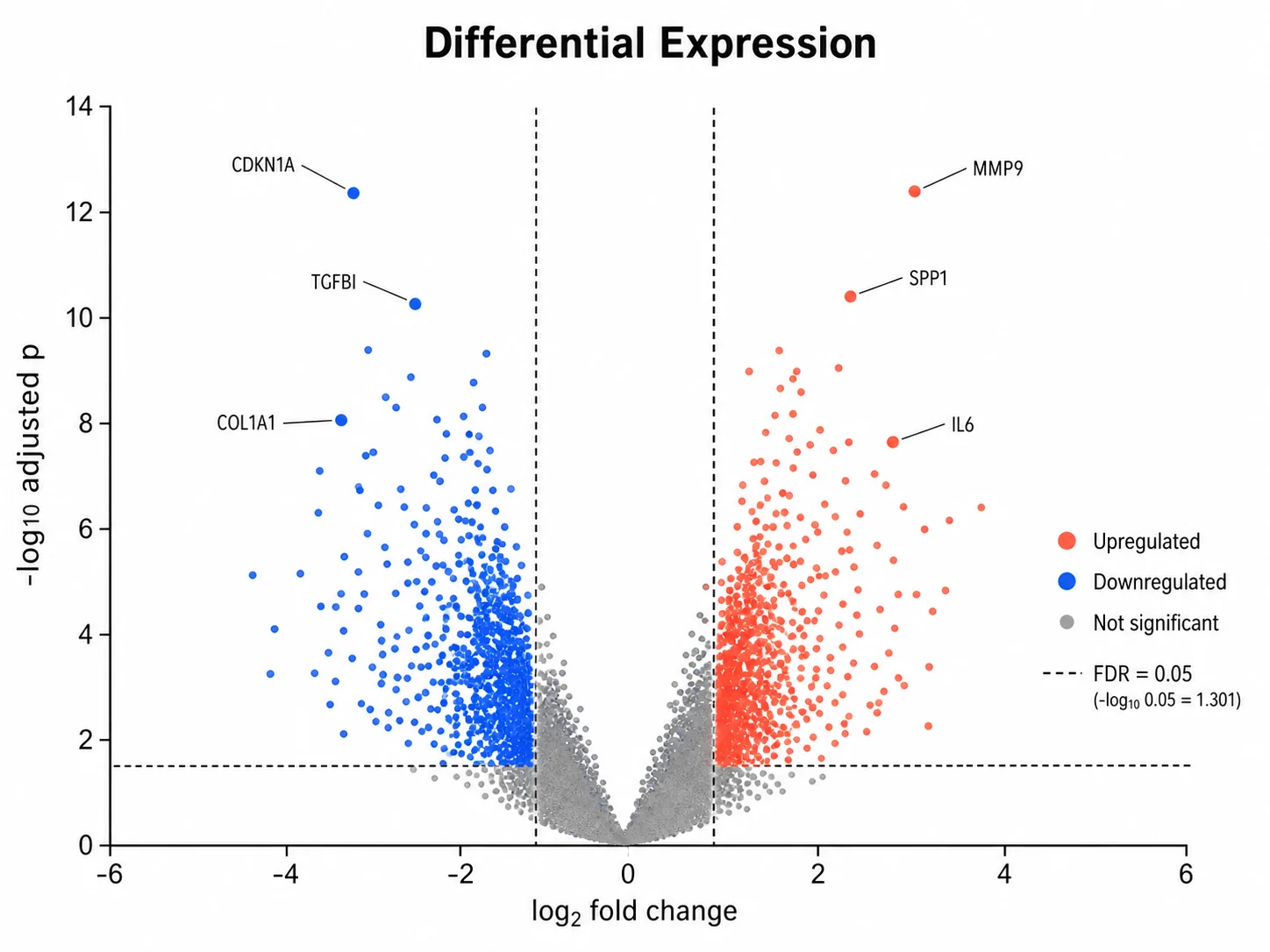
Volcano plot generator
Plot differential expression results without relying on red versus green alone.
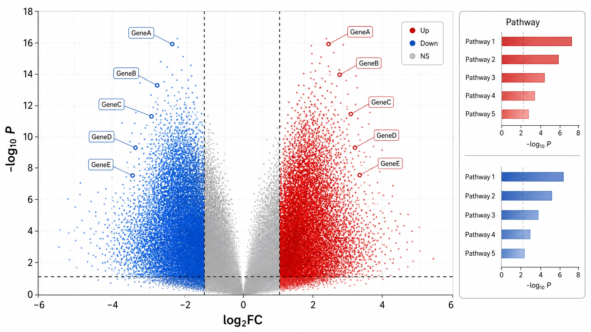
Colorblind-safe palettes guide
Blog guide to accessible palettes, redundant encoding, and prompting for accessible figures.
Image DPI checker
Check the same figure against journal column widths and resolution thresholds.
Journal figure requirements
Column widths, resolution, formats, and fonts for major publishers, with official sources.
Build an accessible chart from your data
Upload a CSV or Excel file to a SciFigure chart generator and ask for a colorblind-safe palette. Charts cost 5 credits each, and new accounts get 10 free credits.
Open the heatmap generator