Bland-Altman Plot Generator for Method Comparison Studies
Show how well two measurement methods agree, with bias and limits of agreement computed from your data.
Upload paired measurements, and SciFigure calculates the mean difference, 95% limits of agreement, their confidence intervals, and a proportional bias test before drawing a clean Bland-Altman plot for your manuscript.
Bias & 95% limits of agreementConfidence intervalsPublication-ready PNG
AI Bland-Altman Plot Generator
Upload paired data and describe the plot you need.
宽高比
313 / 2000 字
Costs 5 credits. Bias, limits of agreement, confidence intervals, and the proportional bias test are computed from your uploaded data, then drawn as a PNG.
预览
Bland-Altman Plot Examples
宽高比: 16:9
These are sample previews. Upload your dataset to generate your own Bland-Altman plot.
Bland-Altman plot examples
Use these examples as starting points for assay validation, medical device comparison, inter-rater agreement, and laboratory method transfer studies.
提示词
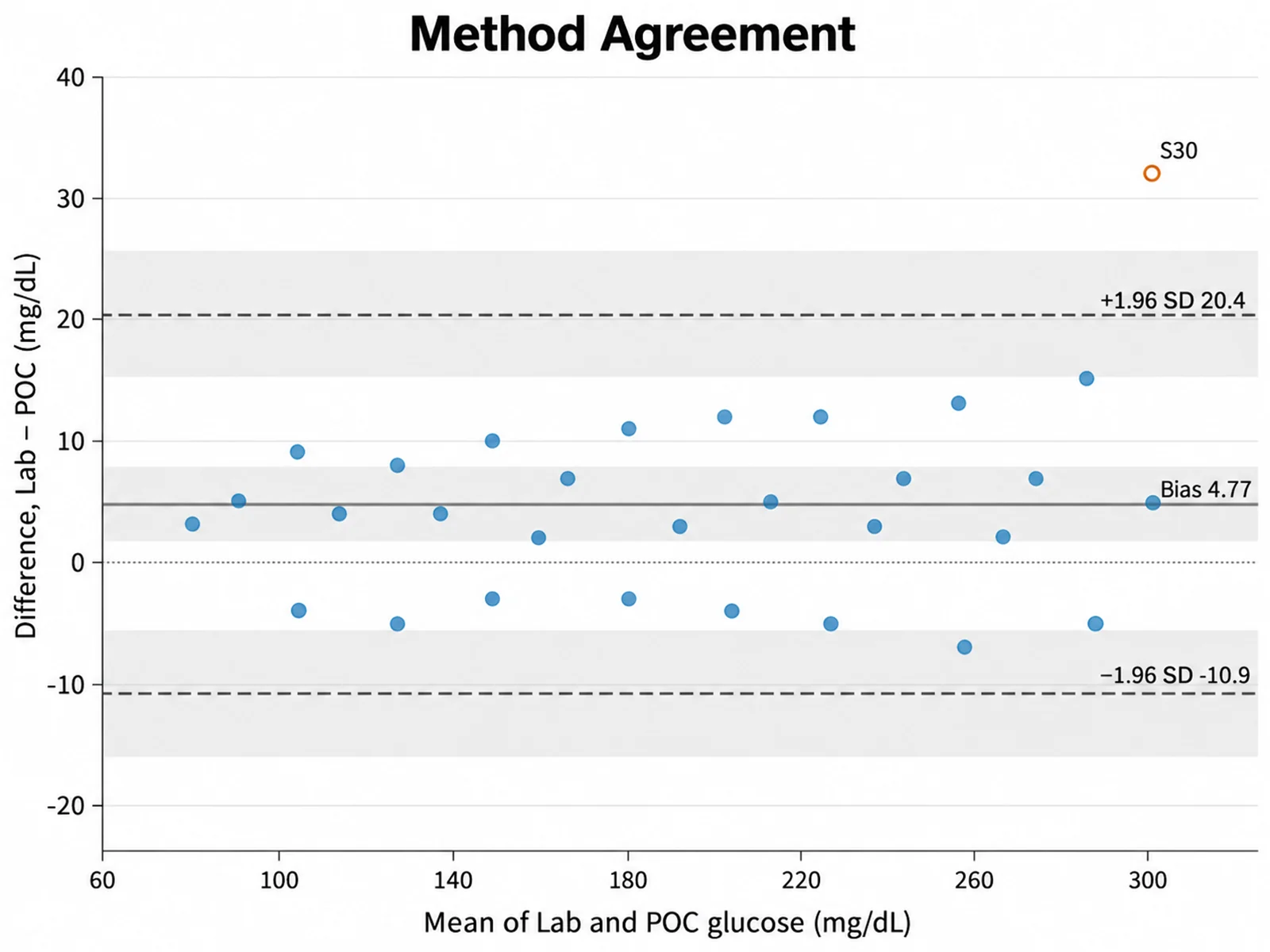
Based on the uploaded glucose_methods.csv file, create a Bland-Altman plot of lab analyzer minus point-of-care glucose. Draw the bias and 95% limits of agreement with printed values, shade their confidence intervals, and label subjects outside the limits.
Method Agreement
提示词
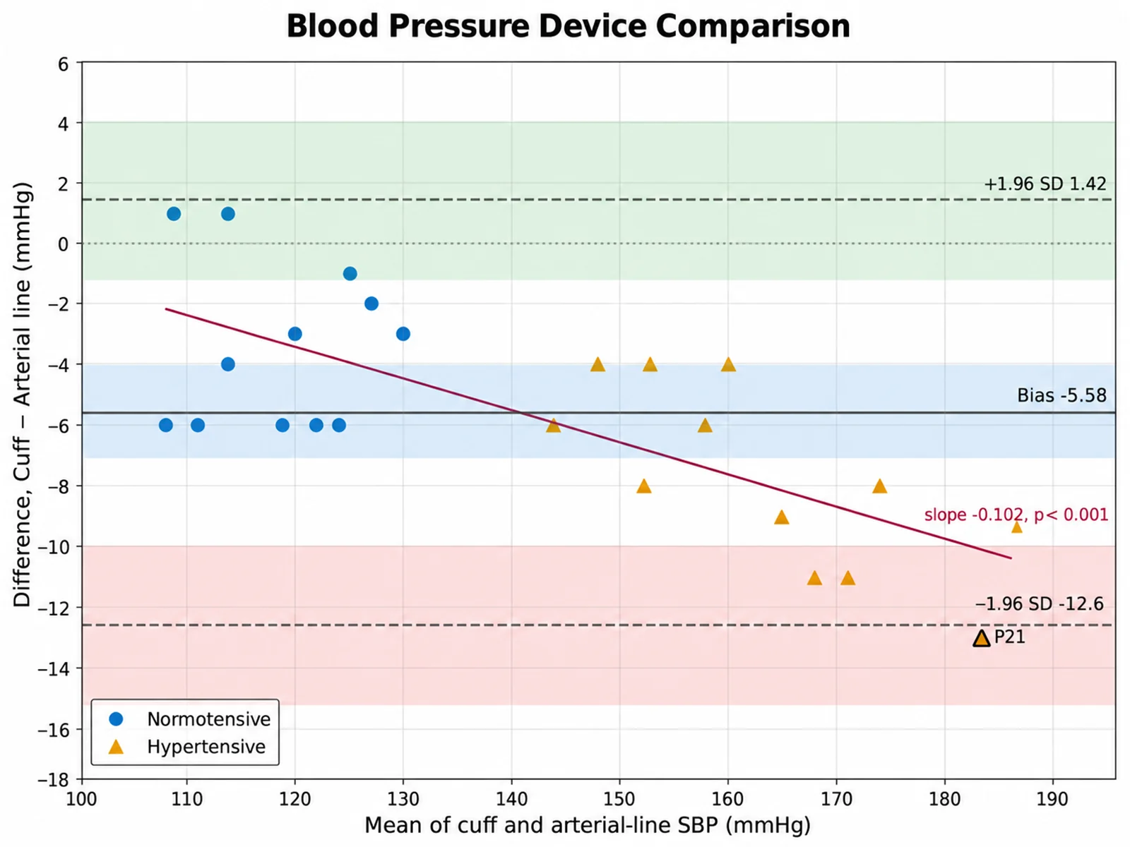
Based on the uploaded bp_devices.csv file, compare cuff and arterial-line systolic pressure. Color points by normotensive or hypertensive group, draw the overall bias and limits of agreement, and show the proportional bias regression line.
Blood Pressure Device Comparison
提示词
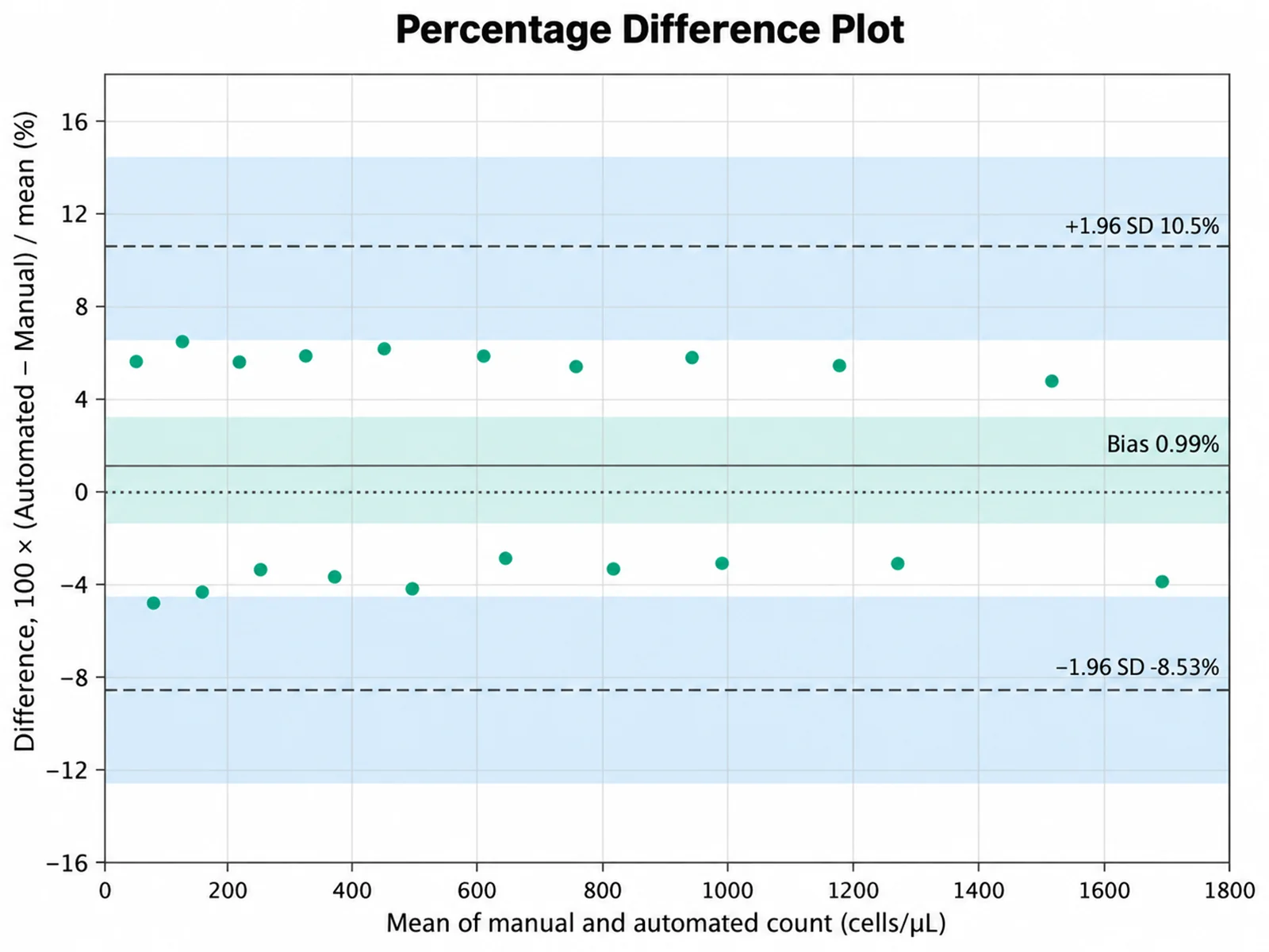
Based on the uploaded cell_counts.xlsx file, plot the percentage difference between automated and manual counts against their mean, using B − A, with bias and 95% limits of agreement in percent.
Percentage Difference Plot
提示词
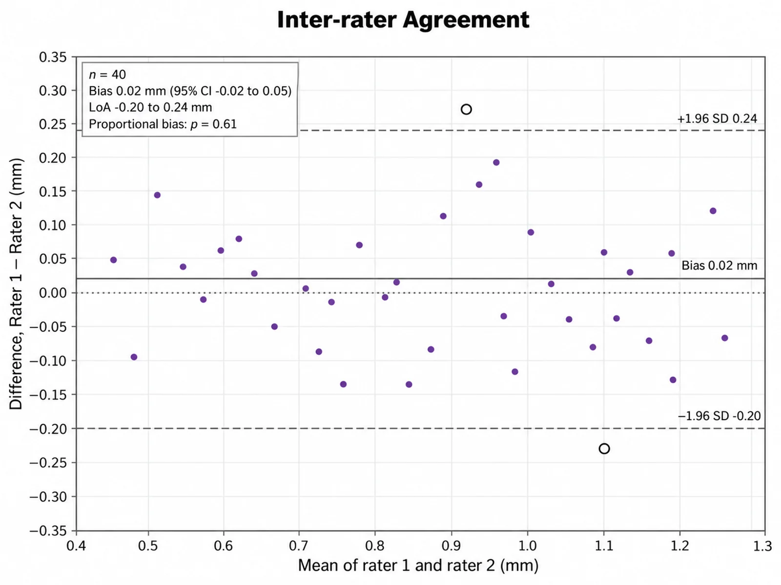
Based on the uploaded ultrasound_raters.csv file, create a Bland-Altman plot of rater 1 minus rater 2 thickness measurements with a zero reference line, bias, limits of agreement, and a compact summary box.
Inter-rater Agreement
提示词
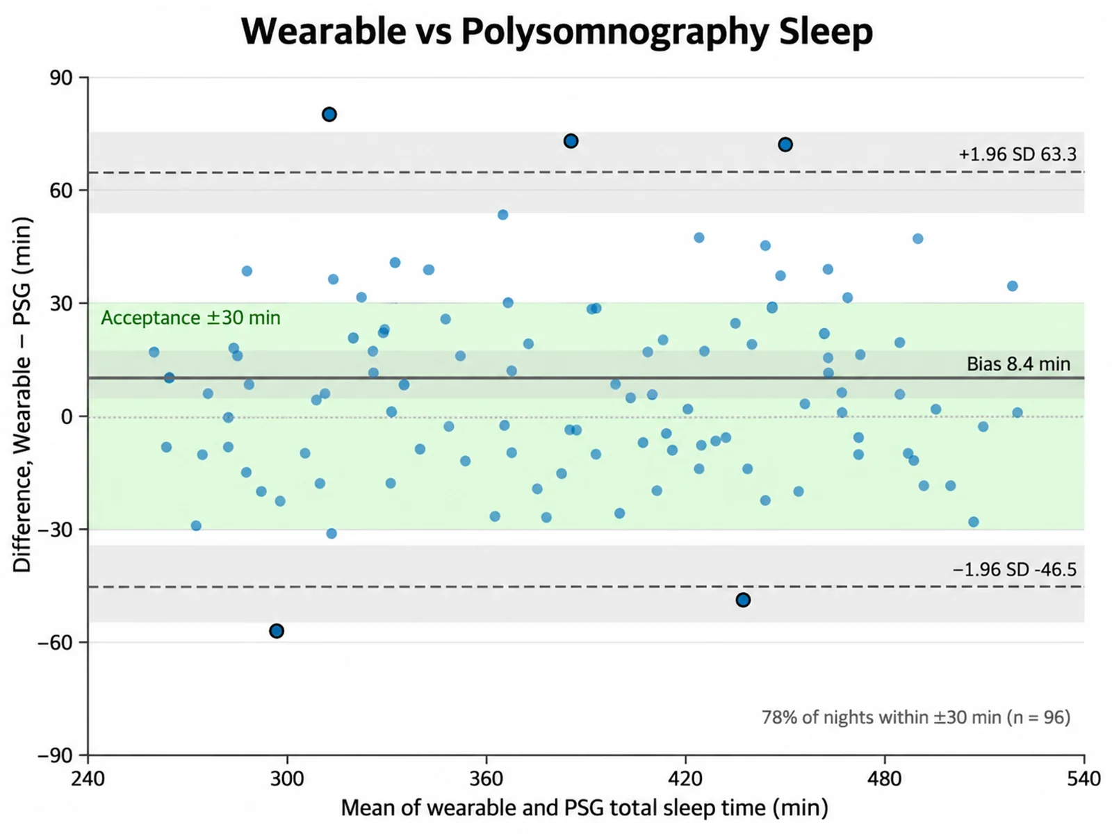
Based on the uploaded sleep_devices.csv file, create a Bland-Altman plot of wearable minus polysomnography total sleep time in minutes across 96 nights. Shade a predefined clinical acceptance band of ±30 minutes behind the data, draw the bias and 95% limits of agreement with printed values and confidence bands, use semi-transparent markers so dense regions stay readable, and state the percentage of nights inside the acceptance band in a corner note.
Wearable vs Polysomnography Sleep
提示词
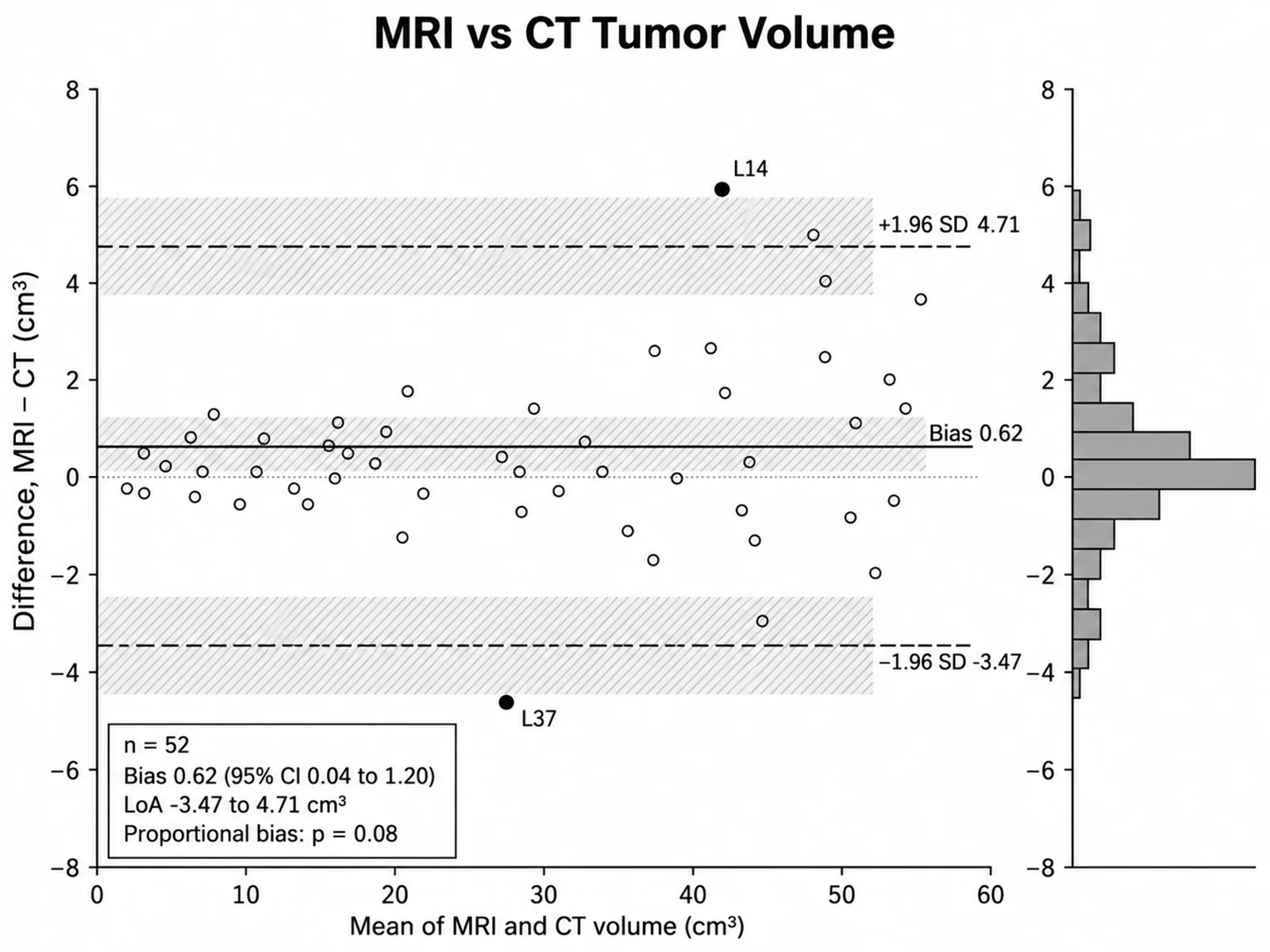
Based on the uploaded tumor_volumes.xlsx file, compare MRI and CT tumor volumes in cm³ for 52 lesions. Draw a print-ready monochrome Bland-Altman plot with black open circles, a solid bias line, dashed limits of agreement, and no color at all. Add a small histogram of the differences along the right margin, print the bias and limits with their confidence intervals in a plain box, and keep the difference as MRI minus CT.
Monochrome Imaging Volume Agreement
How to make a Bland-Altman plot
1
Upload paired measurements
Add CSV, TSV, TXT, or Excel data with one row per subject and one numeric column per method. An ID column and a group column are optional.
2
Map methods and describe the plot
Choose method A and method B, then describe the difference direction, percent or absolute scale, colors, and which annotations to show.
3
Generate, review & download
SciFigure computes the agreement statistics, draws the plot with those exact values, and lets you download a PNG.
What does this Bland-Altman plot generator do?
It turns paired measurements from two methods into a Bland-Altman plot, the standard method comparison plot in clinical chemistry, medical devices, and physiology. For every subject it computes the mean of the two readings and their difference, then plots difference against mean. The mean difference (bias) and the 95% limits of agreement are calculated from your uploaded values, together with confidence intervals and a check for proportional bias, so every line and label in the figure matches your data.
Bias and limits of agreement
Bias is the mean of the differences. A bias far from zero means one method reads systematically higher.
The 95% limits of agreement are bias ± 1.96 × SD of the differences. About 95% of differences between the methods should fall inside them.
Confidence intervals use t quantiles: bias ± t × SD/√n, and each limit ± t × SD × √(3/n), following Bland and Altman (1999).
Proportional bias is tested by regressing the differences on the means; a significant slope means disagreement grows with magnitude.
Whether the limits are clinically acceptable is a subject-matter decision, not a statistical one.
How to read a Bland-Altman plot
Points scattered evenly around the bias line with no trend suggest constant agreement across the measurement range.
A funnel shape, where spread increases with the mean, suggests using percentage differences instead of absolute differences.
A sloping cloud of points signals proportional bias, which the regression line and its p-value help confirm.
Points outside the limits of agreement deserve a check for transcription errors or real outliers.
Tips and supported instructions
The default difference is method A − method B. Write "B − A" or "B minus A" to reverse it.
Mention "percent" or "%" (other than "95%") to plot 100 × difference / mean.
Write "regression line" to always draw the proportional bias line; otherwise it appears only when p < 0.05.
Aim for at least 30 pairs. With small samples the confidence intervals around the limits are wide.
Do not use a correlation coefficient to claim agreement; two methods can correlate strongly and still disagree.
Bland-Altman Plot Generator FAQ
What data format does the Bland-Altman plot need?
Use one row per subject or sample with two numeric columns, one for each method, measured on the same units. An optional ID column labels outlying points and an optional group column colors them.
Does the tool calculate the limits of agreement or does AI estimate them?
The tool calculates them. Bias, SD, limits of agreement, confidence intervals, the regression slope, and its p-value are computed from your uploaded pairs. The numbers are then passed to the image model, which only draws the layout and styling.
Can I make a Bland-Altman plot online with percentage differences?
Yes. Mention "percent" or "percentage difference" in your instructions and each difference is divided by the pair mean and multiplied by 100. Pairs with a mean of zero are excluded.
Which direction is the difference?
By default the difference is method A minus method B, where A is the column mapped as method A. Write "B − A" or "B minus A" to reverse it; the bias sign and axis label update accordingly.
What if my dataset is large or has repeated measurements?
All pairs are used in the statistics, while the plot shows up to 150 points and always keeps points outside the limits. Repeated measurements per subject need a specialized variance model, so treat those limits as approximate.
Can I use this Bland-Altman plot generator for a paper?
Yes, but verify the pairing, units, and difference direction, report the bias and limits with their confidence intervals, and state your predefined clinical acceptance limits in the methods.