PCA Plot Generator for Research Data

Turn a samples-by-features table into a clean principal component analysis plot.

Upload expression, metabolomics, morphometric, or assay data, and SciFigure computes the principal components, explained variance, and group ellipses before generating a publication-ready PCA score plot or biplot.

Computed PC scoresScore plot or biplotPublication-ready PNG

AI PCA Plot Generator

Upload data and describe the PCA plot you need.

宽高比
283 / 2000

Costs 5 credits. Principal components, scores, and ellipses are computed from your uploaded data, then drawn as a PNG.

预览

PCA Plot Examples

宽高比: 16:9

Sample Clustering PCA PCA plot example preview
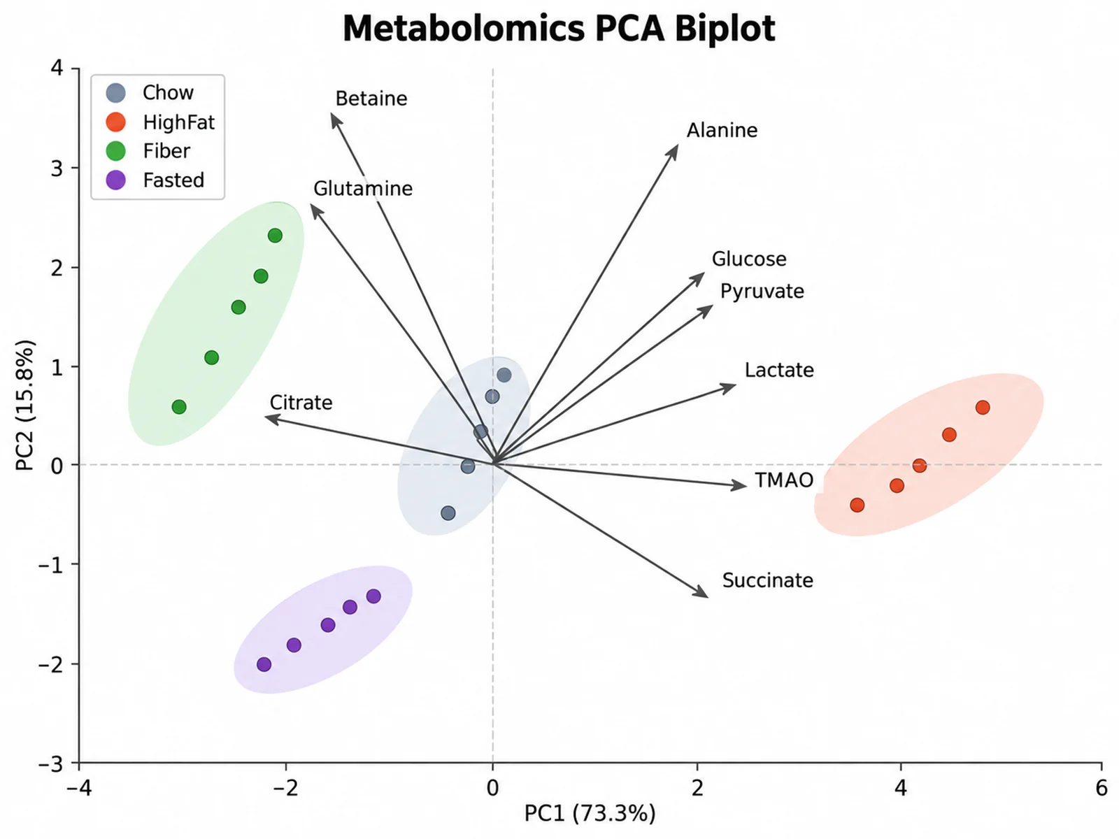
Metabolomics PCA Biplot PCA plot example preview
Morphometric Species PCA PCA plot example preview

These are sample previews. Upload your dataset to generate your own PCA plot.

PCA plot examples

Use these examples as starting points for transcriptomics sample clustering, metabolomics biplots, morphometric species separation, and batch-effect quality control.

PCA Plot Generator: Sample Clustering PCA scientific chart example

提示词

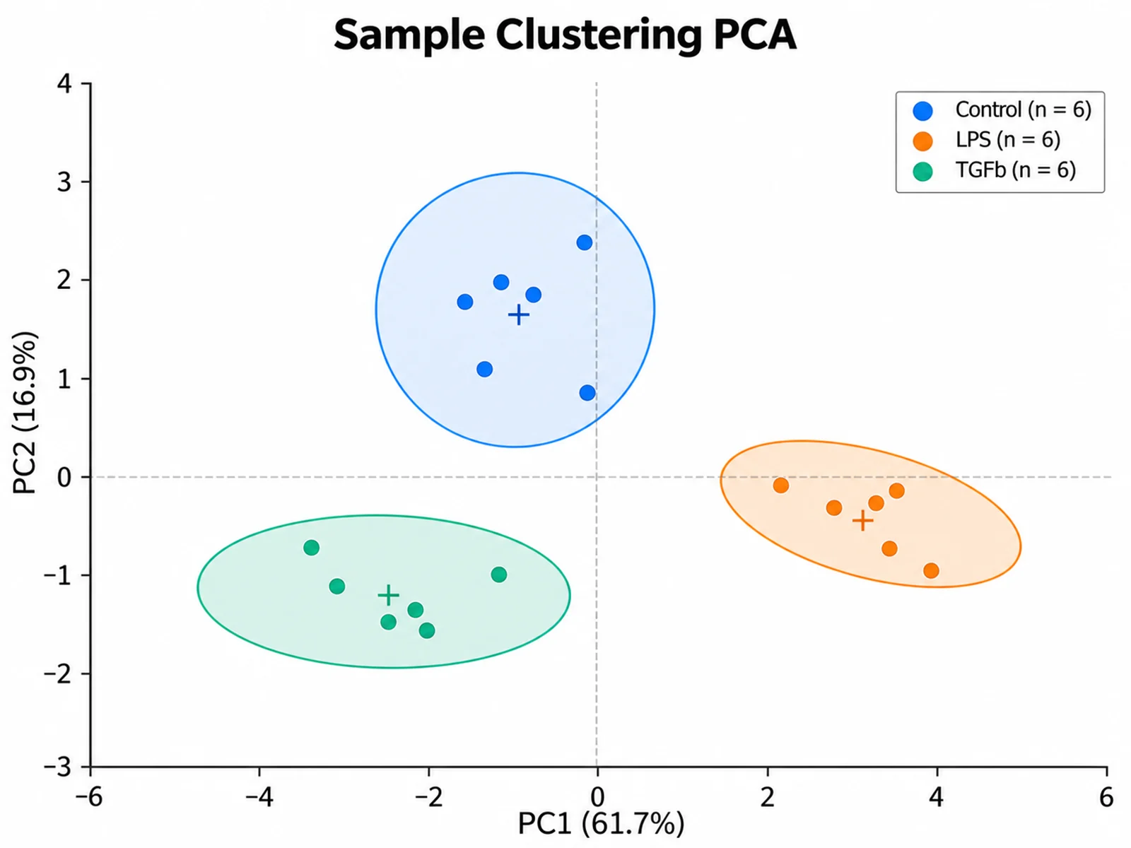
Based on the uploaded rnaseq_log2cpm.csv file, create a PCA score plot of PC1 vs PC2 for 18 samples across Control, LPS, and TGFb conditions. Standardize genes before PCA, color points by condition, draw 95% confidence ellipses, and show explained variance in the axis titles.
Sample Clustering PCA

PCA Plot Generator: Metabolomics PCA Biplot scientific chart example

提示词

Based on the uploaded serum_metabolomics.xlsx file, create a PCA biplot of nine serum metabolites across four diet groups. Z-score the metabolites, color mice by diet, add loading arrows labeled with metabolite names, and keep 95% ellipses light.

Metabolomics PCA Biplot

PCA Plot Generator: Morphometric Species PCA scientific chart example

提示词

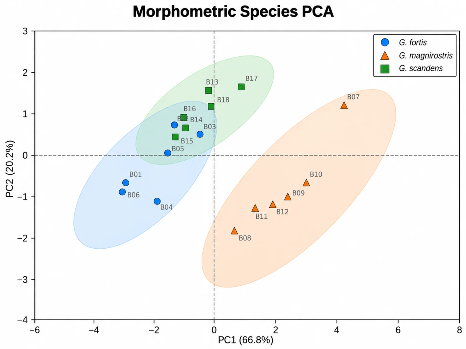
Based on the uploaded finch_morphometrics.csv file, create a PCA score plot of bill, wing, tarsus, tail, and mass measurements for three Darwin finch species. Use species colors with distinct marker shapes, 95% ellipses, and a compact legend.

Morphometric Species PCA

PCA Plot Generator: Batch Effect QC PCA scientific chart example

提示词

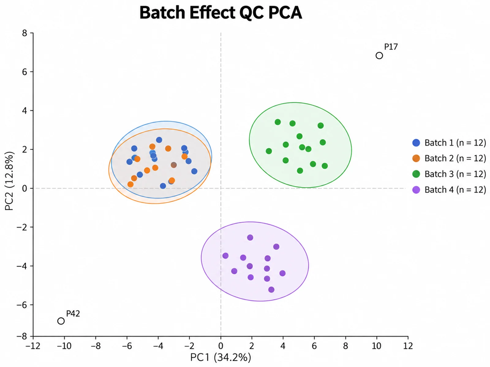
Based on the uploaded proteomics_batches.tsv file, create a quality-control PCA score plot of 48 plasma samples colored by acquisition batch. Standardize protein intensities, draw ellipses per batch, label outlier samples, and report PC1 and PC2 variance.

Batch Effect QC PCA

PCA Plot Generator: Soil Microbiome Site PCA scientific chart example

提示词

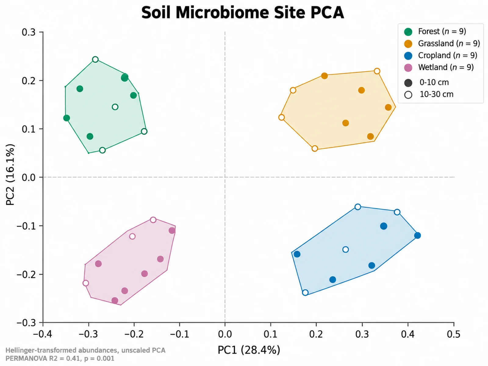
Based on the uploaded soil_microbiome_genera.csv file, create a PCA score plot of 36 soil samples from four field sites using Hellinger-transformed genus abundances. Use no scaling because every feature shares one unit, color points by Site, separate the two sampling depths with filled and open circles, draw convex hulls instead of ellipses, and report the PC1 and PC2 explained variance in the axis titles.
Soil Microbiome Site PCA

PCA Plot Generator: Wine Chemistry PCA with Scree Panel scientific chart example

提示词

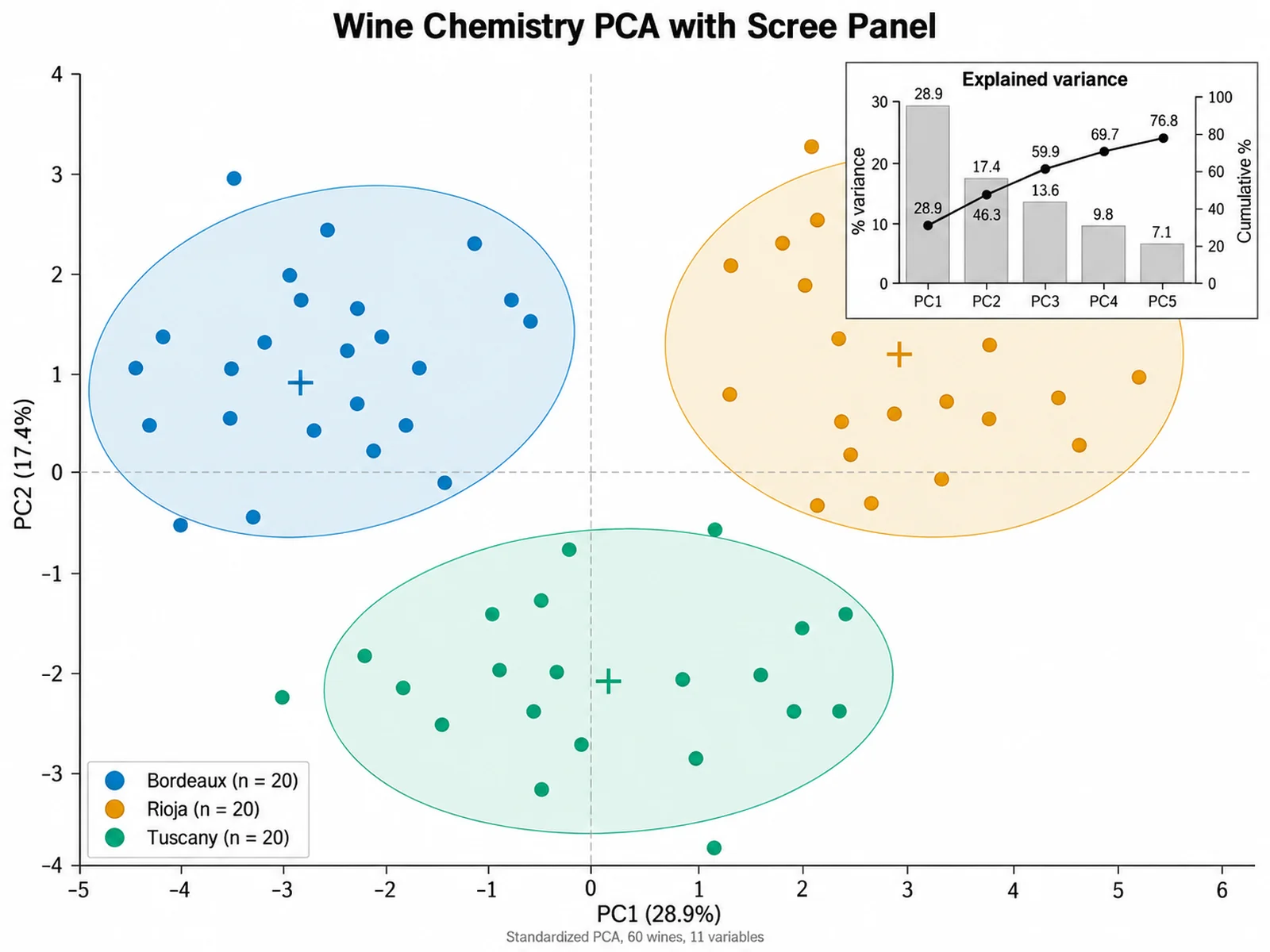
Based on the uploaded wine_chemistry.xlsx file, create a PCA of 60 wines across eleven physicochemical measurements, standardized before analysis. Show the PC1 vs PC2 score plot as the main panel with points colored by Region and light 95% ellipses, and add a small scree bar panel in the upper right giving the explained variance of PC1 through PC5 with a cumulative line. Keep dashed zero lines and put the variance percentages in the axis titles.

Wine Chemistry PCA with Scree Panel

How to make a PCA plot

1

Upload your feature table

Add CSV, TSV, TXT, or Excel data with one row per sample, an optional sample ID and group column, and one numeric column per gene, metabolite, or measurement.

2

Describe the plot

Choose a score plot or biplot, standardized or covariance PCA, group ellipses, point labels, and the colors or title you need.

3

Generate, review & download

SciFigure computes the components and scores, draws the figure, and lets you download a PNG ready for manuscripts, posters, and slides.

What does this PCA plot generator do?

It runs principal component analysis on every numeric feature in your table and draws the samples on the first two principal components. Samples with similar multivariate profiles land close together, so treatment effects, species differences, batch effects, and outliers become visible in a single scatter. The PCA plot generator calculates the standardization, eigenvalues, loadings, sample scores, and group ellipses on the server before any drawing happens; the image model only lays out and styles those exact coordinates. Sample ID and group columns are excluded from the calculation and used for labels and colors instead.

How principal component analysis works

  • Each feature is centered and, by default, z-score standardized so genes or metabolites on large scales do not dominate. PCA then uses the correlation matrix.
  • Write "no scaling", "unscaled", or "covariance" in your instructions to center features only and analyze the covariance matrix, which is appropriate when all features share the same unit.
  • The covariance or correlation matrix is decomposed with the Jacobi eigenvalue method. Each eigenvalue divided by the total variance gives the explained variance of that component.
  • Loadings are the eigenvector coefficients. Their sign is arbitrary in PCA, so the tool makes the largest absolute loading of each component positive for reproducible orientation.
  • Group ellipses are 95% normal-theory ellipses built from each group score covariance with the chi-square quantile 5.991 (2 degrees of freedom).

How to read a PCA score plot or PCA biplot

  • The axis titles show how much of the total variance PC1 and PC2 capture. A PC2 with little variance means vertical spread is less important than it looks.
  • Distance between points reflects multivariate similarity; tight, separated clusters suggest consistent group differences.
  • In a PCA biplot, an arrow pointing toward a cluster means that feature is higher in those samples. Arrows at small angles are positively correlated features.
  • Overlapping ellipses do not prove groups are equal. PCA is unsupervised, so formal group tests such as PERMANOVA belong in your own analysis.

Tips and common mistakes

  • Put samples in rows and features in columns. A transposed table gives a PCA of features instead of samples.
  • Log-transform count or intensity data before upload; PCA is sensitive to skewed values and a few extreme samples.
  • Missing values are mean-imputed when fewer than 10% of cells are empty; otherwise incomplete rows are dropped. Constant columns are removed automatically.
  • Ask for a "biplot" or "loadings" to add arrows, "label points" to print sample IDs, and "no ellipses" to hide the group ellipses.
  • Report the number of samples, features, scaling choice, and explained variance in the figure caption.

When to use a PCA plot, and when to choose another chart

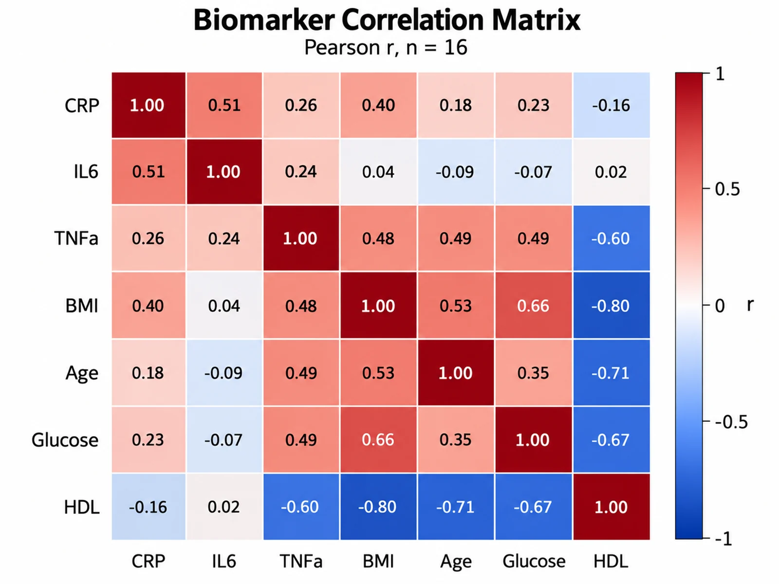
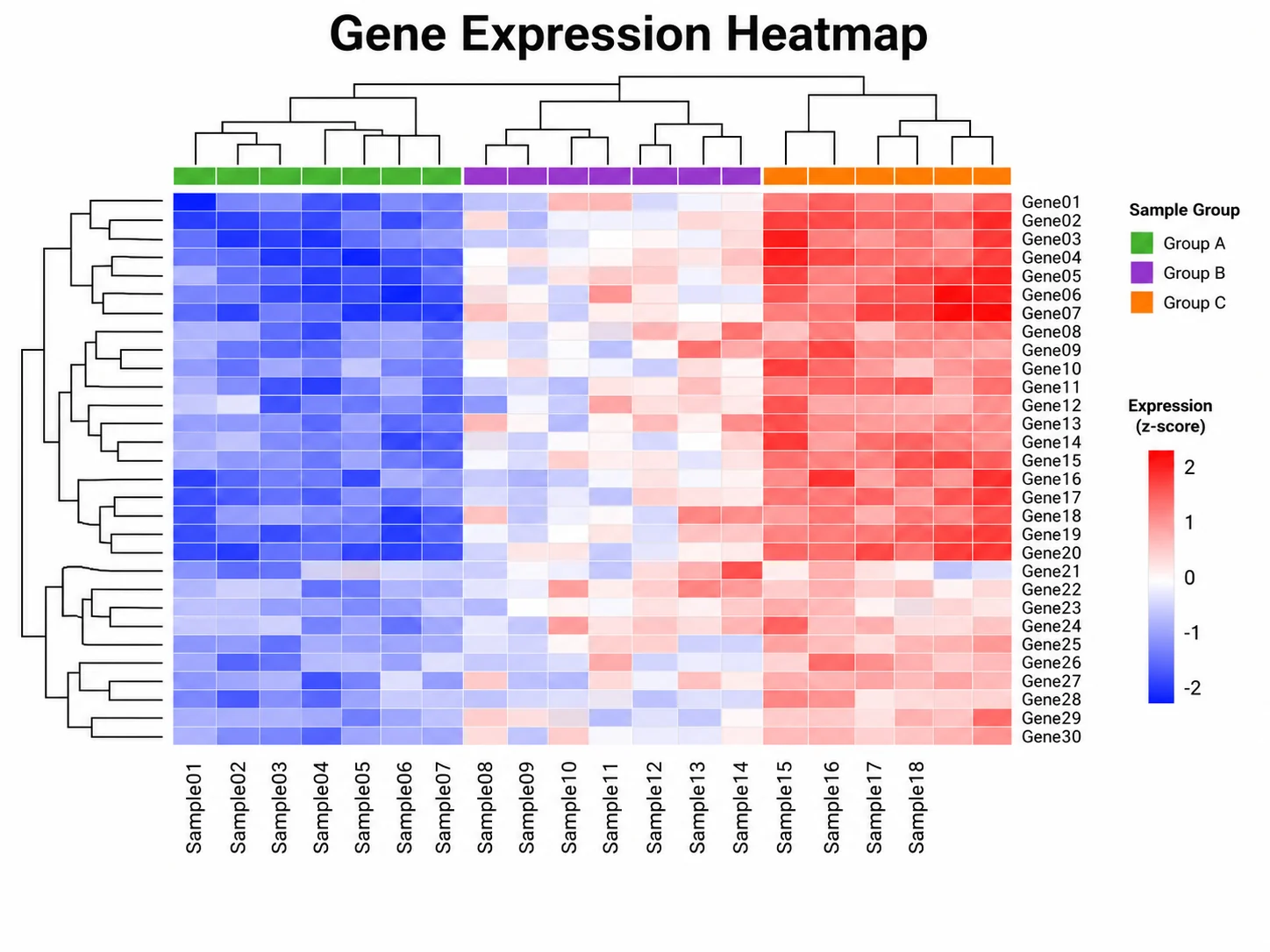
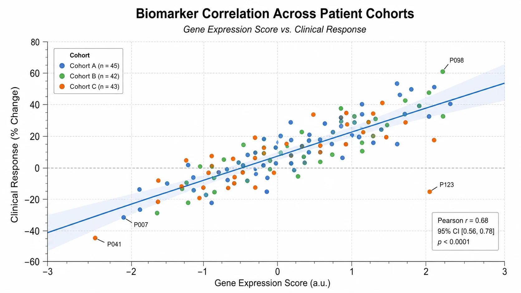
A PCA plot generator is most useful when you have many correlated measurements per sample and want a first look at structure: RNA-seq or proteomics sample clustering, metabolomics diet or drug studies, morphometric comparisons between species, sensor panels, and quality control for batch effects or outlier samples before downstream statistics. It is less useful when PC1 and PC2 together explain only a small share of the variance, when you have fewer samples than groups, or when the relationships are strongly nonlinear. In those cases a correlation matrix, a heatmap of scaled features, or a dedicated method such as PLS-DA, UMAP, or t-SNE may describe the data better. If you only have two or three variables, a scatter plot is usually clearer than a principal component analysis.

PCA Plot Generator FAQ

What data format does the PCA plot need?

Use a wide table with one row per sample and one numeric column per feature, plus optional text columns for the sample ID and group. At least 3 varying numeric features and 4 complete samples are required; up to 50 features and 300 samples are analyzed.

Does the tool calculate the PCA or does AI estimate it?

The PCA is calculated from your uploaded values: standardization, eigen-decomposition, explained variance, scores, loadings, and ellipse parameters are computed first. The image model receives those numbers and only handles drawing and styling, so check the plotted positions against your own analysis before publication.

Should I standardize features before PCA?

Standardize when features use different units or scales, such as metabolite concentrations or clinical measurements. That is the default. If every feature shares a unit, for example log2 expression values, you can ask for "no scaling" to use the covariance matrix.

What is the difference between a PCA score plot and a PCA biplot?

A PCA score plot shows only the samples on PC1 and PC2. A PCA biplot overlays loading arrows so you can see which features drive the separation. Mention "biplot" or "loadings" in your instructions to add the arrows.

How are missing values and constant columns handled?

If fewer than 10% of feature cells are missing, each gap is filled with that feature mean. Otherwise rows with any missing feature are dropped. Features with zero variance are removed and listed in the prompt notes.

Can I use this principal component analysis plot online in a paper?

Yes. Verify the explained variance, group sizes, and scaling method, and describe the preprocessing in your methods section. PCA is exploratory, so pair visual separation with an appropriate statistical test.

Need to see how your samples group?

Generate PCA plots, correlation matrices, heatmaps, and other research-ready visualizations with SciFigure AI.