Dose-Response Curve Generator with 4PL IC50 and EC50 Fitting

Fit sigmoidal dose-response curves and report IC50 or EC50 values from your own data.

Upload concentration and response measurements, and SciFigure fits a four-parameter logistic model per compound before drawing a clean, log-scaled curve with replicate error bars for your manuscript.

4PL curve fittingIC50 / EC50 with 95% CIPublication-ready PNG

AI Dose-Response Curve Generator

Upload data and describe the curve you need.

宽高比
287 / 2000

Costs 5 credits. Curve fits, IC50/EC50 values, and statistics are computed from your uploaded data, then drawn as a PNG.

预览

Dose-Response Curve Examples

宽高比: 16:9

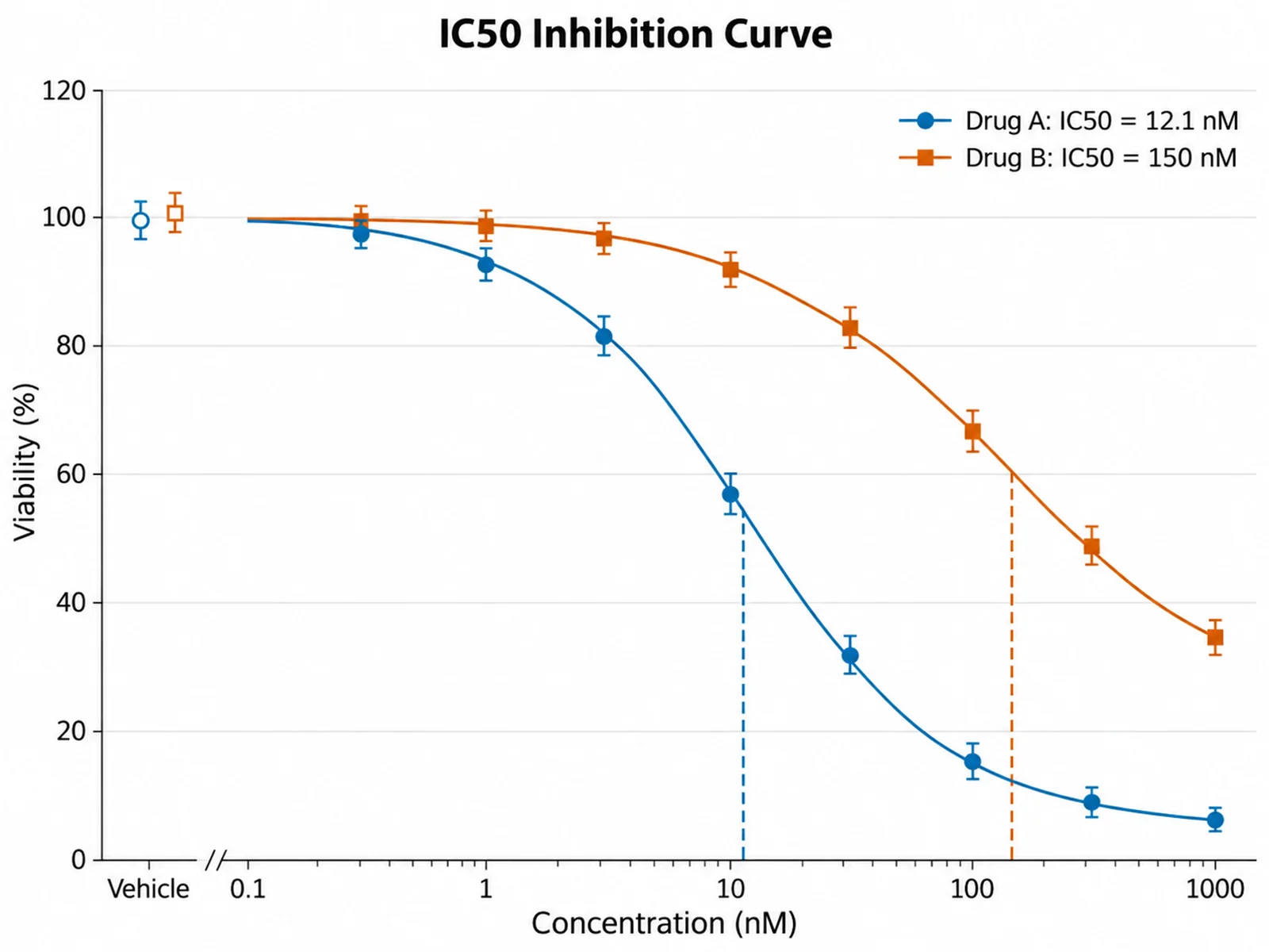
IC50 Inhibition Curve dose-response curve example preview
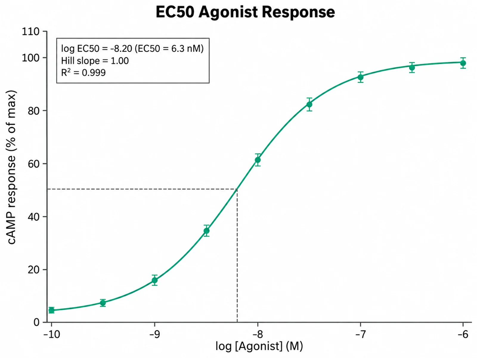
EC50 Agonist Response dose-response curve example preview
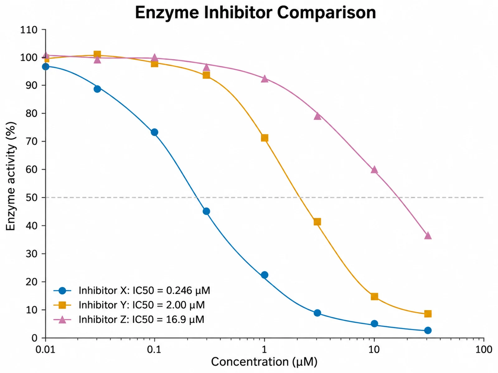
Enzyme Inhibitor Comparison dose-response curve example preview

These are sample previews. Upload your dataset to generate your own dose-response curve.

Dose-response curve examples

Use these examples as starting points for cell viability assays, receptor agonist studies, enzyme inhibition screens, and compound potency comparisons.

Dose-Response Curve Generator: IC50 Inhibition Curve scientific chart example

提示词

Based on the uploaded viability_assay.csv file, fit four-parameter logistic curves for Drug A and Drug B on a log10 concentration axis in nM. Show mean ± SD markers for duplicate wells, add dashed IC50 drop lines, and list each IC50 in the legend.

IC50 Inhibition Curve

Dose-Response Curve Generator: EC50 Agonist Response scientific chart example

提示词

Based on the uploaded camp_agonist.csv file with log molar agonist concentrations, fit a stimulatory 4PL curve, show triplicate mean ± SD, mark the EC50 with a dashed line, and print EC50, Hill slope, and R² in a small box.

EC50 Agonist Response

Dose-Response Curve Generator: Enzyme Inhibitor Comparison scientific chart example

提示词

Based on the uploaded enzyme_inhibitors.xlsx file, fit a separate 4PL curve for three inhibitors in µM, use one colorblind-safe color per compound, and sort the legend by potency with IC50 values.

Enzyme Inhibitor Comparison

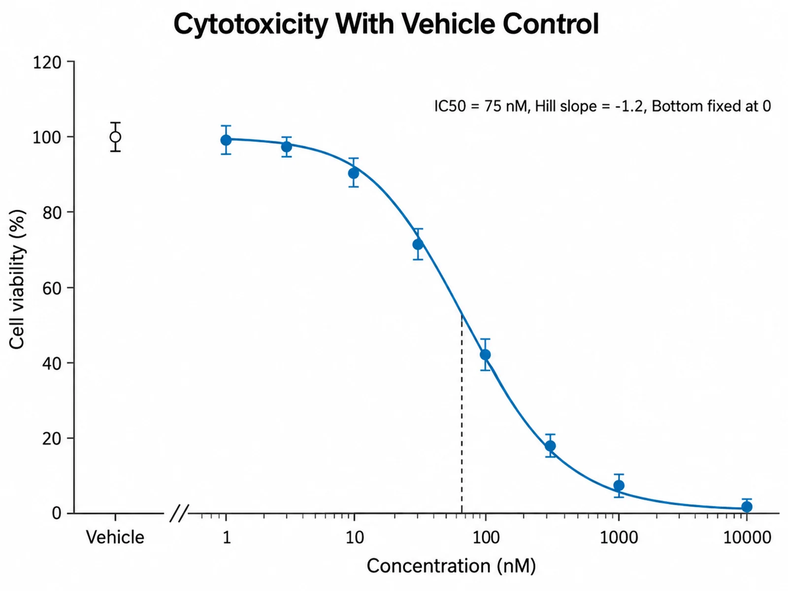
Dose-Response Curve Generator: Vehicle Control With Axis Break scientific chart example

提示词

Based on the uploaded cytotoxicity_plate.csv file, fit a 4PL inhibition curve, show the 0 nM vehicle control as a separate point left of an axis break, and constrain the bottom plateau to 0.

Vehicle Control With Axis Break

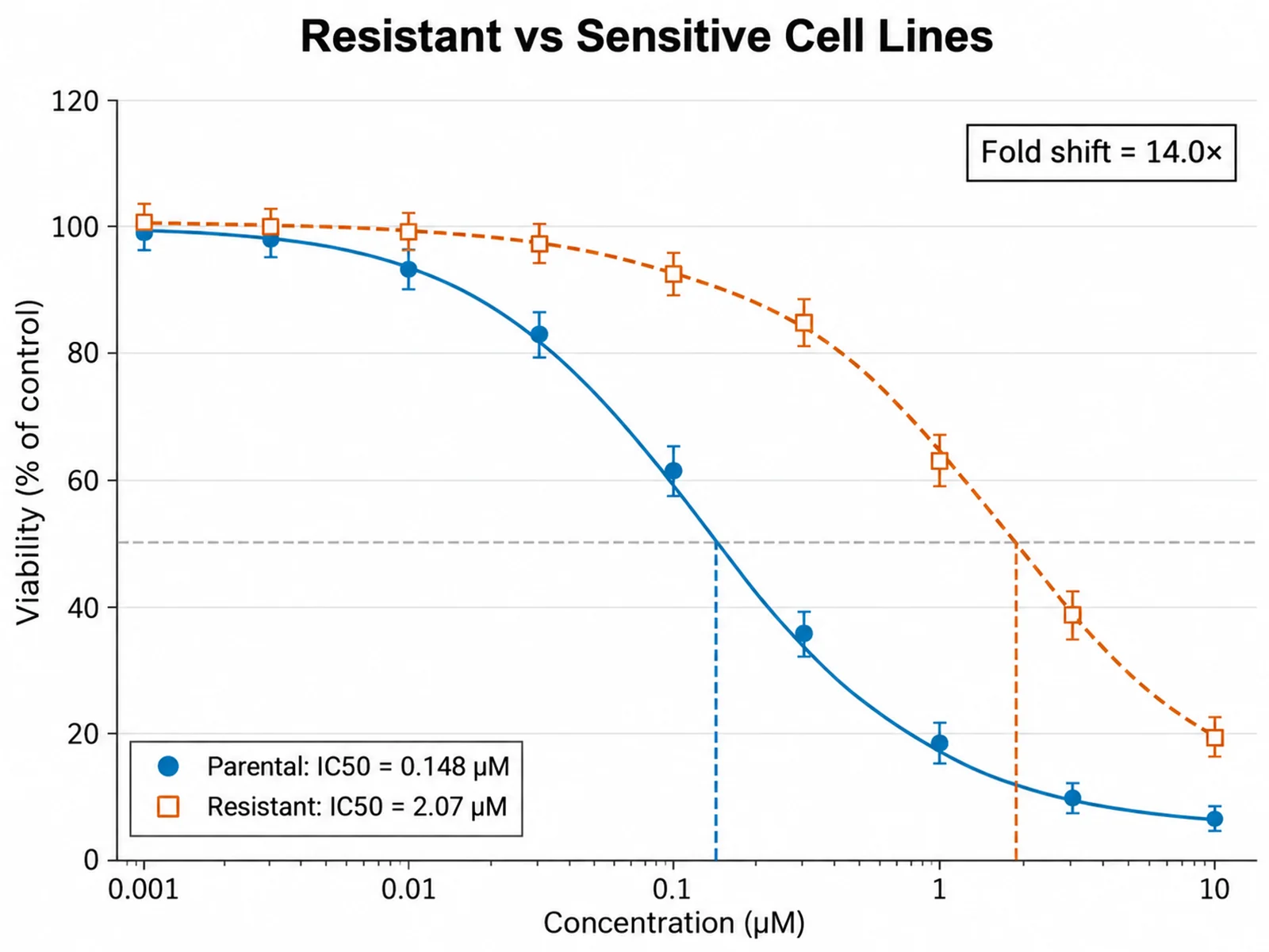
Dose-Response Curve Generator: Resistant vs Sensitive Cell Lines scientific chart example

提示词

Based on the uploaded cell_line_resistance.csv file, fit 4PL viability curves for the parental and drug-resistant sublines of the same cell line from 0.001 to 10 µM. Draw both curves in one panel on a log10 axis, use filled circles for parental and open squares for resistant, show mean ± SEM from four replicates, add a dashed IC50 drop line for each line, and print the resistance fold shift between the two IC50 values in the upper right.

Resistant vs Sensitive Cell Lines

Dose-Response Curve Generator: In Vivo Tumor Growth Inhibition scientific chart example

提示词

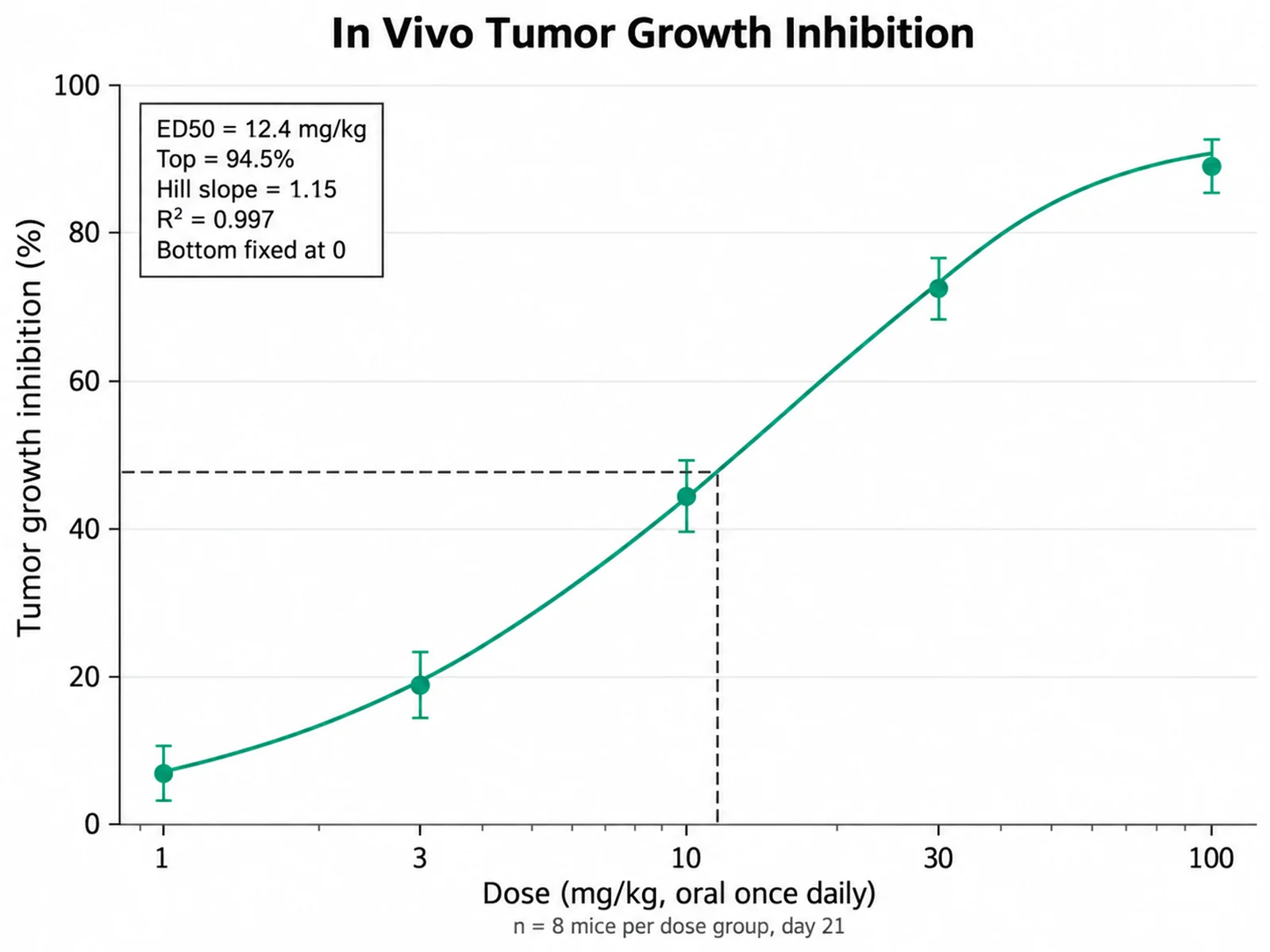
Based on the uploaded xenograft_dosing.xlsx file, fit a four-parameter logistic curve to tumor growth inhibition measured at oral doses of 1, 3, 10, 30, and 100 mg/kg in mice. Plot dose on a log10 mg/kg axis and inhibition from 0 to 100 percent, show mean ± SEM for eight animals per dose, constrain the bottom plateau to 0, mark the ED50 with a dashed drop line, and note the group size under the x-axis label.

In Vivo Tumor Growth Inhibition

How to make a dose-response curve

1

Upload your assay data

Add CSV, TSV, TXT, or Excel data in long format: one row per well with concentration, response, and an optional compound column. Replicate rows are welcome.

2

Map columns and describe the figure

Confirm the concentration, response, and compound columns, then describe colors, error bars, IC50 or EC50 labels, and any plateau constraints.

3

Generate, review & download

SciFigure fits every curve, draws the figure with the computed parameters, and lets you download a PNG for papers and slides.

What does this dose-response curve generator do?

It fits a four-parameter logistic (4PL) model to your concentration and response measurements and draws the fitted sigmoid on a log-scaled concentration axis. Each compound or series gets its own fit, so you can compare potency across drugs, ligands, or inhibitors in one figure. Bottom and top plateaus, EC50 or IC50, Hill slope, and R² are calculated from your uploaded values before any drawing happens, which means the curve and the numbers in the legend reflect your data rather than an image model guess.

The four-parameter logistic model

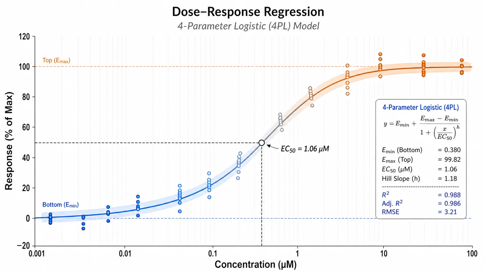
  • The model is Response = Bottom + (Top − Bottom) / (1 + 10^((logEC50 − logX) × Hill slope)). 4PL curve fitting uses Levenberg-Marquardt least squares on log10 concentration with several starting guesses.
  • Bottom and Top are the plateaus, EC50 or IC50 is the concentration giving a response halfway between them, and the Hill slope describes steepness.
  • A falling curve is labeled IC50 and a rising curve EC50. Write "IC50" or "EC50" in your instructions to force the label.
  • The IC50 calculator also reports a 95% confidence interval from the fit covariance when enough points are available.
  • Write "constrain bottom to 0" or "top = 100" to fix a plateau when your data are normalized.

How to read a dose-response curve

  • Concentration increases from left to right on a log10 axis, so each tick is usually a ten-fold step.
  • A curve shifted to the left means a more potent compound, because it reaches half-maximal effect at a lower concentration.
  • A steeper Hill slope means the response changes over a narrower concentration range.
  • Markers show observed means with SD error bars when replicates exist; the smooth line is the fitted model.

Tips and common mistakes

  • Use at least 4 distinct concentrations per compound, and ideally 8 to 12 spanning both plateaus.
  • Zero concentration cannot sit on a log axis. Rows at 0 are shown as a vehicle control beside an axis break and excluded from the fit.
  • An EC50 curve that never reaches a plateau gives an extrapolated, unreliable estimate; the tool flags this.
  • Normalize responses to percent of control before uploading if plates differ in raw signal.
  • Keep replicate wells as separate rows so the fit and the SD bars both use them.

Dose-Response Curve Generator FAQ

What data format does the dose-response curve need?

Use a long table with one row per well or replicate: a numeric concentration column, a numeric response column, and an optional compound column. Concentrations can be linear (for example nM) or already log10-transformed if the column name contains "log".

Does the tool calculate the IC50 or does AI estimate it?

The tool calculates it. A 4PL model is fitted to your uploaded values with a least-squares optimizer, and the fitted parameters, curve coordinates, and R² are passed to the image model, which only handles layout and styling. Always check the reported values against your own analysis software before publishing.

Can I use it as an IC50 calculator and an EC50 curve maker?

Yes. The curve direction decides the label: decreasing responses give IC50 and increasing responses give EC50. Mention "IC50" or "EC50" in your instructions to override the automatic choice.

How are replicates and the vehicle control handled?

Every replicate row is used in the fit, and the figure shows mean ± SD at each concentration. Rows with a concentration of 0 are treated as vehicle controls, drawn separately beside an axis break, and excluded from the fit.

What happens if the curve does not fit?

If the optimizer does not converge or the data show no sigmoidal trend, the figure shows the observed points without a fitted curve and the prompt states that no IC50 or EC50 could be estimated.

Can I use this dose-response curve generator for a paper?

Yes, but verify the concentration units, normalization, fitted parameters, and replicate counts first, and describe the 4PL model and any plateau constraints in your methods section.

Need a clean potency figure for your assay?

Use the dose-response curve maker for potency figures, then generate error bar charts, regression plots, and other research-ready visualizations with SciFigure AI.