Bubble Chart Maker for Enrichment and Research Data

Show three variables at once, from GO and KEGG enrichment results to trait and screening data.

Upload a CSV or Excel table, and SciFigure computes area-true bubble sizes, color scales, axis ranges, and term order before generating a clean enrichment bubble plot or numeric bubble graph for your manuscript.

Enrichment or x-y-size modeArea-true bubble sizesPublication-ready PNG

AI Bubble Chart Maker

Upload data and describe the bubble chart you need.

宽高比
252 / 2000

Costs 5 credits. Bubble sizes, scales, and -log10 values are computed from your uploaded data, then drawn as a PNG.

预览

Bubble Chart Examples

宽高比: 16:9

GO Pathway Enrichment Bubble Plot bubble chart example preview
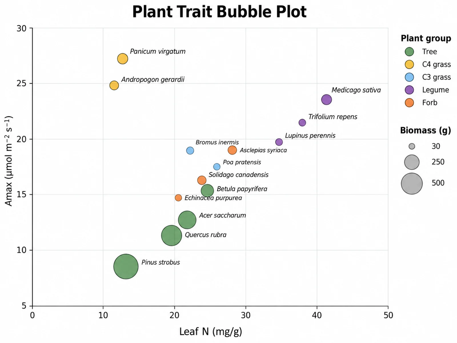
Plant Trait Bubble Plot bubble chart example preview
KEGG Pathway Enrichment by Category bubble chart example preview

These are sample previews. Upload your dataset to generate your own bubble chart.

Bubble chart examples

Use these examples as starting points for GO, KEGG, and GSEA enrichment results, plant functional traits, compound screening data, and global health surveillance.

Bubble Chart Maker: GO Pathway Enrichment Bubble Plot scientific chart example

提示词

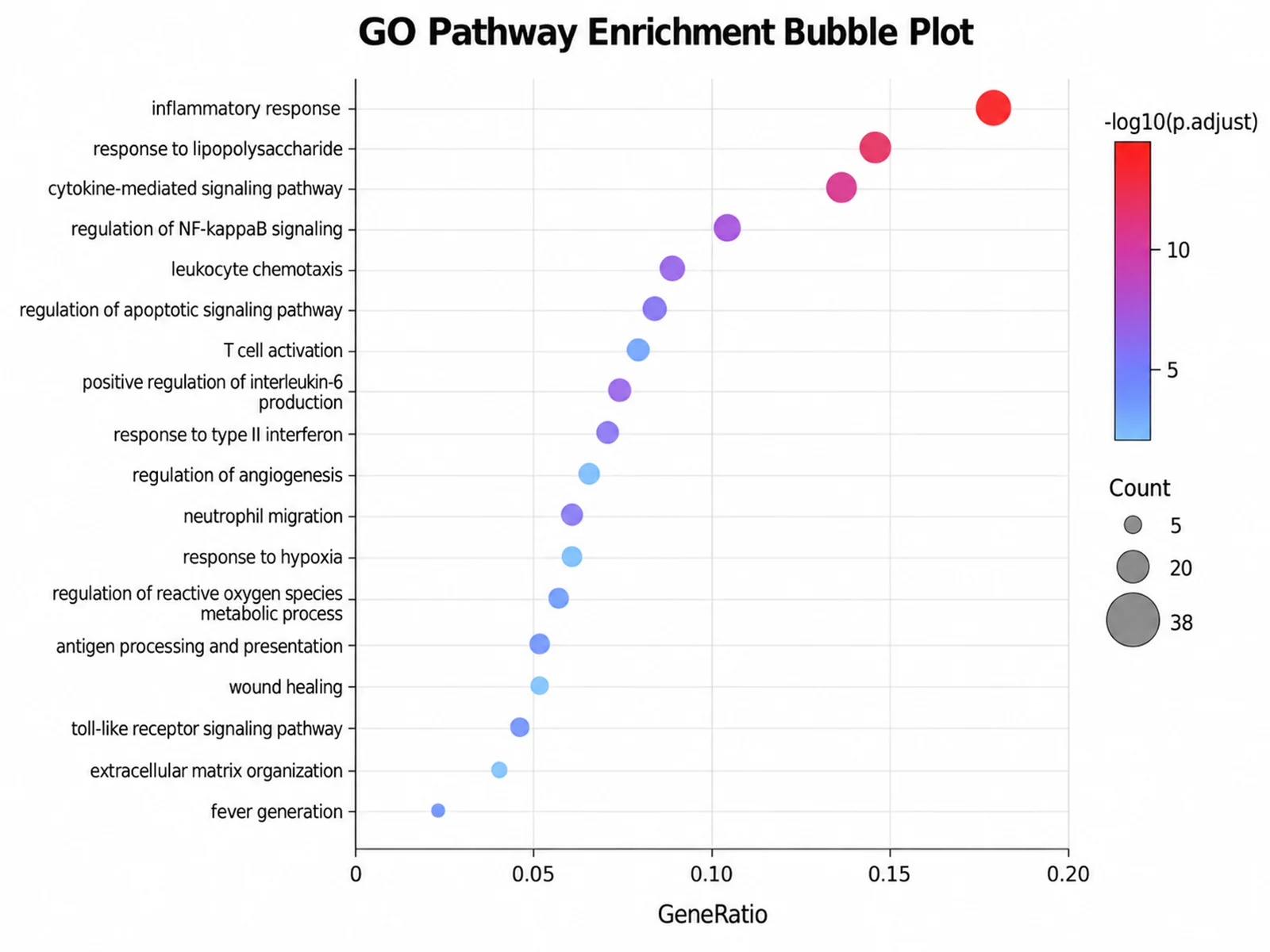
Based on the uploaded go_enrichment_results.csv file, create a GO biological process enrichment bubble plot of 18 terms. Put GeneRatio on the x-axis, order terms by gene ratio, scale bubble area by gene count, and color by -log10 adjusted p-value.

GO Pathway Enrichment Bubble Plot

Bubble Chart Maker: Plant Trait Bubble Plot scientific chart example

提示词

Based on the uploaded leaf_traits.xlsx file, create a bubble plot of leaf nitrogen versus maximum photosynthetic rate for 14 prairie and forest species. Size bubbles by plant biomass, color them by functional group, and label every species in italics.

Plant Trait Bubble Plot

Bubble Chart Maker: KEGG Pathway Enrichment by Category scientific chart example

提示词

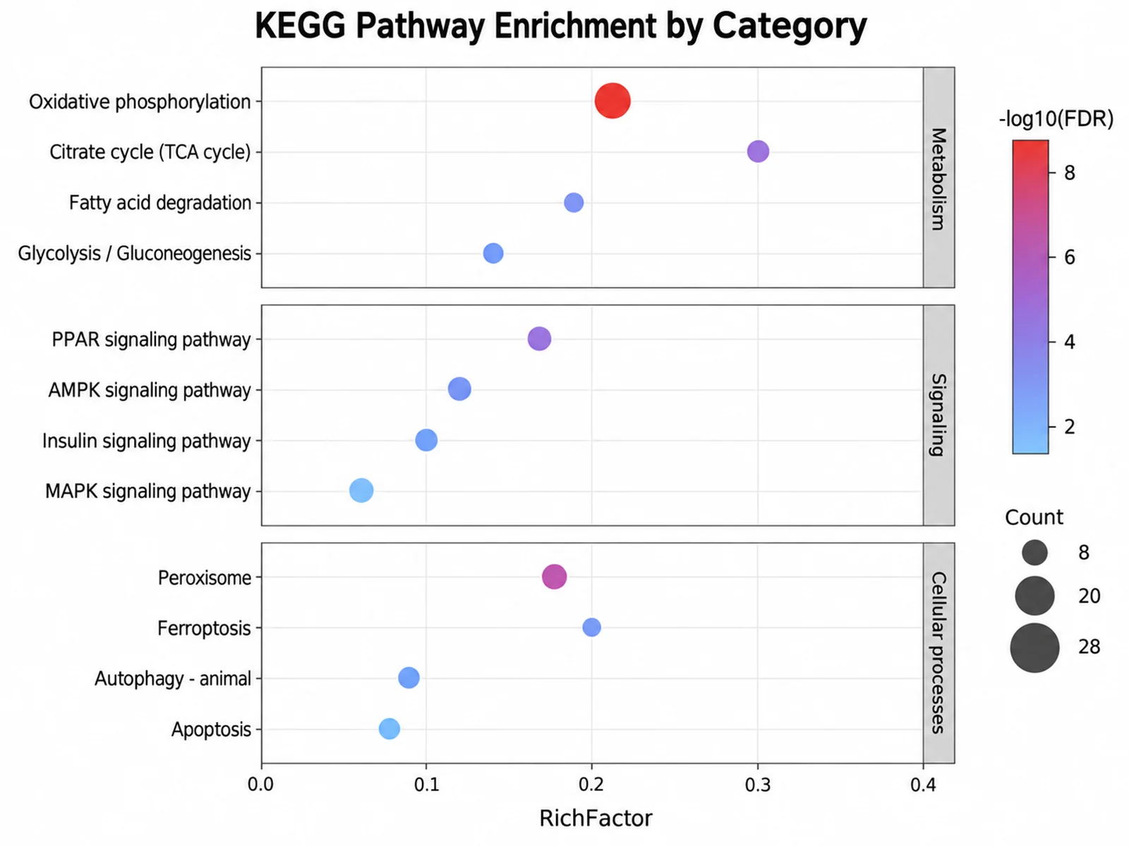
Based on the uploaded kegg_enrichment.tsv file, create a KEGG enrichment bubble plot with pathways grouped into Metabolism, Signaling, and Cellular processes panels. Sort by FDR within each panel, use rich factor on the x-axis, and size bubbles by gene count.

KEGG Pathway Enrichment by Category

Bubble Chart Maker: Drug Screen Potency Bubble Chart scientific chart example

提示词

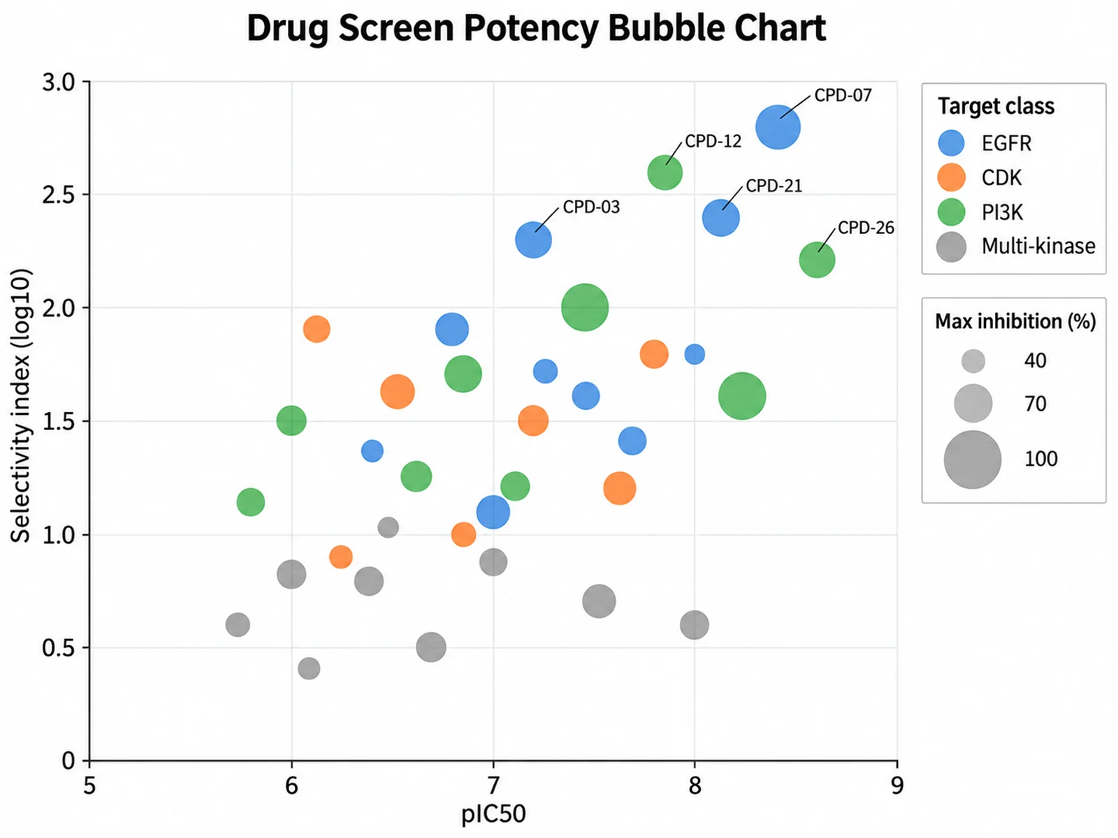
Based on the uploaded compound_screen.csv file, create a bubble chart of pIC50 versus selectivity index for 30 kinase inhibitors. Size bubbles by maximal inhibition, color by target class, and label the five most selective compounds.

Drug Screen Potency Bubble Chart

Bubble Chart Maker: GSEA Hallmark Pathway Bubble Plot scientific chart example

提示词

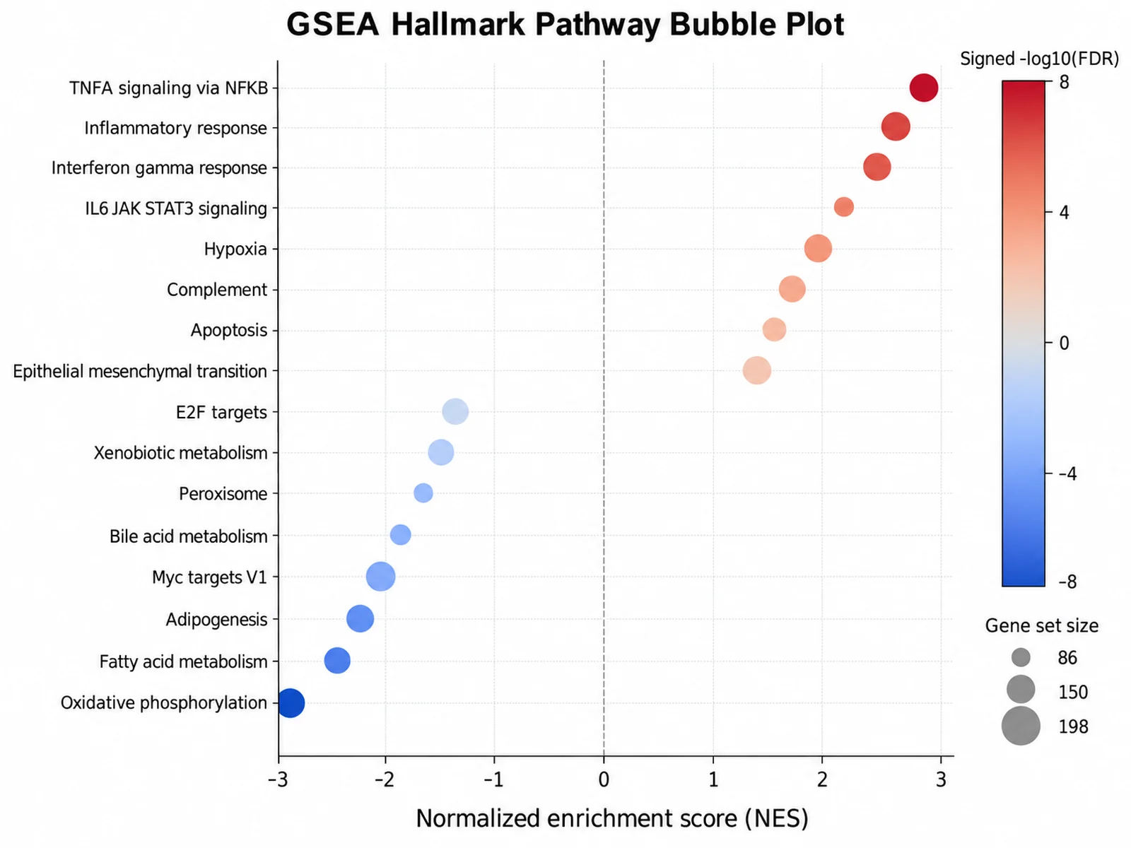
Based on the uploaded gsea_hallmark_results.csv file, create a GSEA bubble plot of 16 hallmark gene sets. Put the normalized enrichment score on the x-axis from -3 to 3 with a dashed line at zero, order the gene sets by NES, scale bubble area by gene set size, and color bubbles on a diverging blue-to-red scale by signed -log10 FDR so suppressed and activated hallmarks separate on either side of the line.

GSEA Hallmark Pathway Bubble Plot

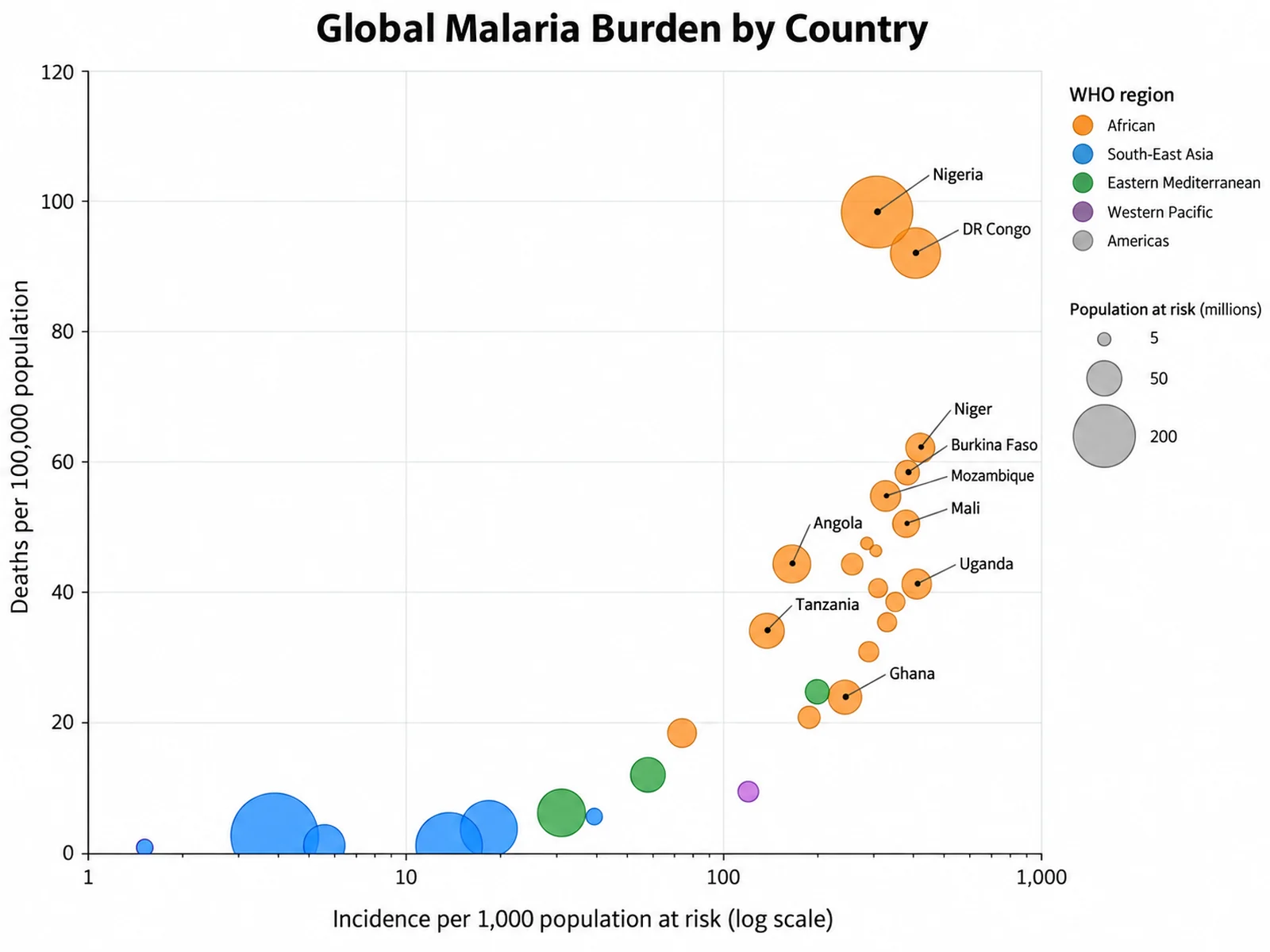
Bubble Chart Maker: Global Malaria Burden Bubble Chart scientific chart example

提示词

Based on the uploaded malaria_burden_2023.xlsx file, create a bubble chart of malaria incidence per 1,000 population at risk versus deaths per 100,000 for 28 countries. Use a log x-axis, scale bubble area by population at risk, color bubbles by WHO region, label the ten countries with the highest burden, and add a size legend with 5, 50, and 200 million reference bubbles.

Global Malaria Burden Bubble Chart

How to make a bubble chart

1

Upload your table

Add CSV, TSV, TXT, or Excel data. For enrichment, include term, gene ratio or rich factor, gene count, and adjusted p-value columns. For a numeric bubble graph, include x, y, and size columns.

2

Map columns and describe the chart

Confirm the x, y, size, label, and group roles, then describe term ordering, colors, labels, and log axes in plain language.

3

Generate, review & download

SciFigure computes bubble sizes and scales, draws the figure, and lets you download a PNG for manuscripts, posters, and slides.

What does this bubble chart maker do?

It encodes three variables in one figure: horizontal position, vertical position, and bubble size, with color for a fourth variable when you need it. The bubble chart maker runs in two modes. Enrichment mode turns GO, KEGG, or Reactome over-representation results into the familiar enrichment bubble plot, with terms on the y-axis, gene ratio or rich factor on the x-axis, gene count as size, and -log10 adjusted p-value as color. Numeric scatter mode draws any x-y table with a size column, such as plant traits, compound screens, or field survey data. In both modes the scales, legend values, and plotted numbers are computed before the image is drawn.

How the two modes are chosen

  • Enrichment mode starts when a term label column is mapped and the Y column name looks like a p-value (p, pvalue, padj, p.adjust, FDR, qvalue), or when your instructions mention enrichment, GO, KEGG, or pathways.
  • In enrichment mode, Y is used for color as -log10(adjusted p), terms become the categorical y-axis, and gene ratios written as "18/212" are converted to decimals.
  • Terms are ordered by the x value by default. Write "sort by p" or "sort by FDR" to put the most significant terms on top, or "sort by count".
  • Up to 25 terms are drawn, keeping the most significant ones. Map a category column to split terms into ontology or pathway-class panels.
  • Numeric scatter mode uses X and Y as numeric axes, a group column for color, and an optional label column. Write "log x" or "log y" for logarithmic axes.

How to read a bubble plot

  • Bubble area, not diameter, is proportional to the size value, so a bubble with four times the count has twice the diameter. This avoids exaggerating large values.
  • The size legend shows three reference values across the observed range; compare bubbles against it rather than against each other.
  • In an enrichment bubble plot, redder bubbles have smaller adjusted p-values, and bubbles further right cover a larger fraction of the input gene list.
  • Overlapping bubbles are drawn semi-transparent with larger bubbles behind smaller ones, so small values stay visible.

Tips and common mistakes

  • Upload adjusted p-values, not raw p-values, for enrichment results, and name the column clearly (p.adjust, padj, or FDR).
  • Sizes must be positive numbers. Rows with zero or negative sizes are skipped and reported.
  • Numeric scatter mode draws up to 60 bubbles, keeping the largest ones, any named in your instructions, and the x and y extremes.
  • Do not use a bubble graph maker for more than a few dozen points with similar sizes; a plain scatter plot is easier to read.
  • State in the caption what size and color encode, including the p-value adjustment method.

When to use a bubble chart, and when to choose another figure

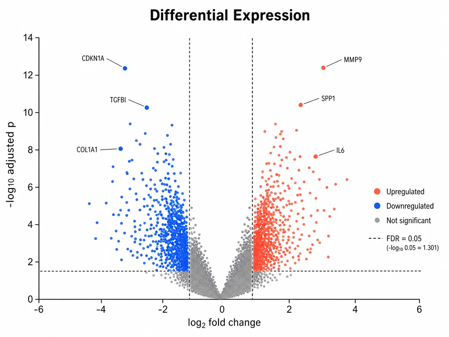
A bubble chart maker is the right tool when a third variable changes how the x-y pattern should be read: how many genes support an enriched term, how much biomass sits behind a trait combination, or how potent a compound is at a given selectivity. It works best with roughly 5 to 60 bubbles whose sizes differ clearly. If sizes are all similar, drop the size channel and use a scatter plot. If you need to compare exact values between many categories, a dot plot or bar chart is easier to read. For genome-wide differential expression results, a volcano plot shows effect size and significance for every gene before you summarize the enriched pathways in a bubble plot.

Bubble Chart Maker FAQ

What data does the bubble chart maker need?

For enrichment mode: a term or pathway column, a gene ratio or enrichment score column, a gene count column, and an adjusted p-value column. For numeric mode: numeric X, Y, and size columns, plus optional label and group columns.

Does the tool calculate the statistics or does AI estimate them?

The tool calculates everything it shows from your uploaded values: parsed gene ratios, -log10 adjusted p-values, term order, bubble diameters from area scaling, legend reference sizes, and axis ranges. It does not rerun the enrichment test, so p-values come from your own analysis. The image model only draws the listed numbers.

How do I make an enrichment bubble plot from clusterProfiler results?

Upload the enrichGO or enrichKEGG result table and map Description as the label, GeneRatio as X, Count as size, and p.adjust as Y. Ratios such as "38/212" are converted automatically.

Why is bubble area used instead of diameter?

Readers judge bubbles by area. Scaling diameter directly with the value makes large values look far bigger than they are, so diameters here grow with the square root of the size value.

Can I color bubbles by group instead of p-value?

Yes. In numeric scatter mode, map a group column to Color group. In enrichment mode, color always shows -log10 adjusted p, and a mapped category splits terms into panels.

Can I use the bubble plot in a paper?

Yes. Check term names, the p-value adjustment method, the gene ratio denominator, and the size legend before submission, and describe what each visual channel encodes in the caption.

Need to show three variables in one figure?

Generate bubble charts, volcano plots, PCA plots, and other research-ready visualizations with SciFigure AI.