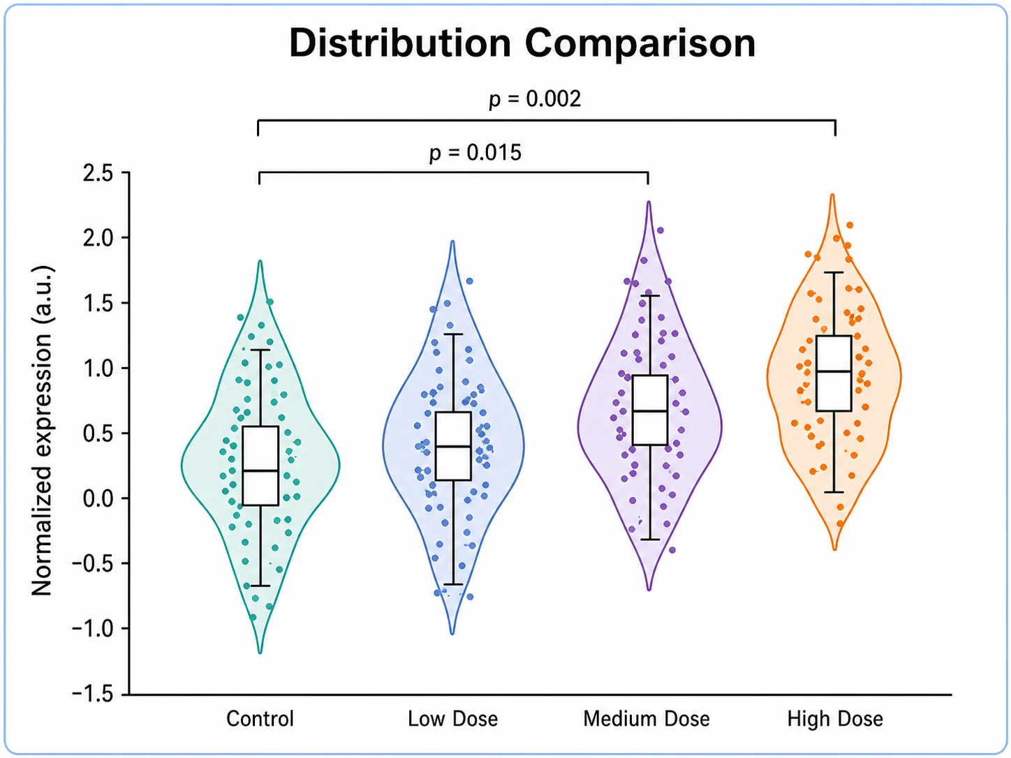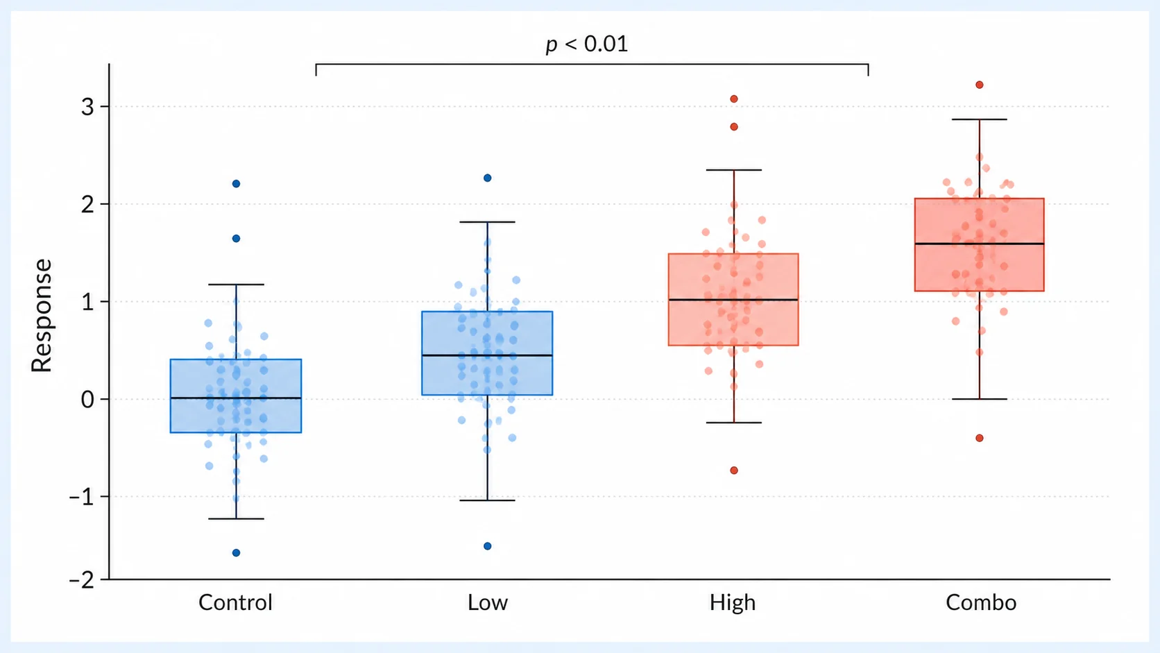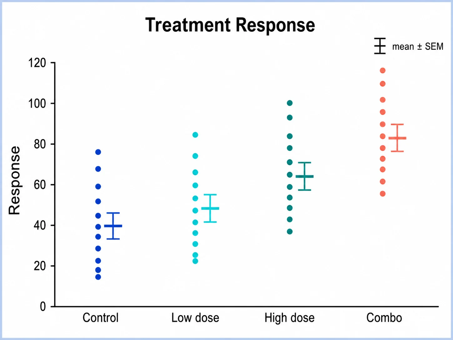
提示词
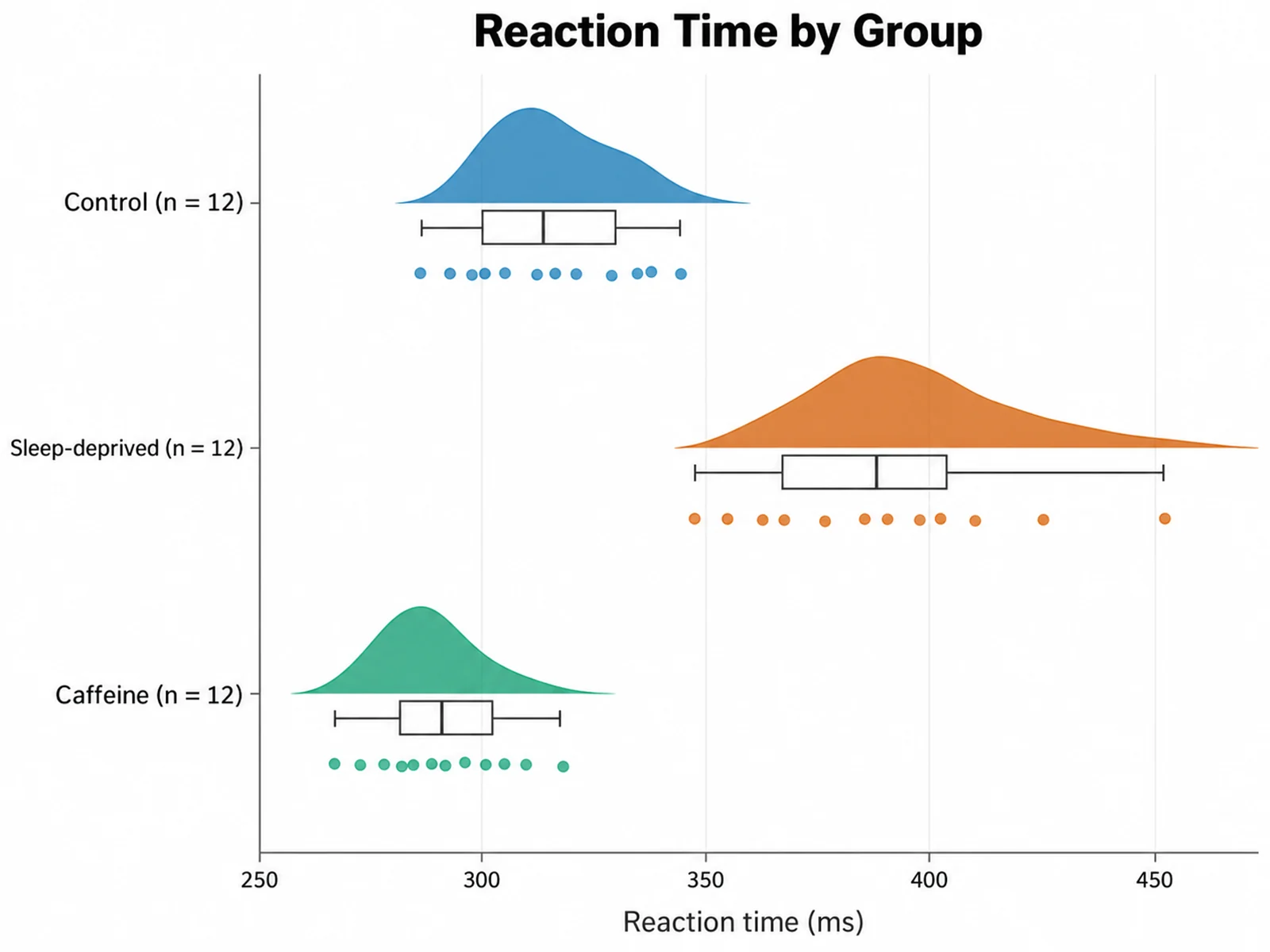
Based on the uploaded reaction_time.csv file, create a horizontal raincloud plot of ReactionTime for Control, Sleep-deprived, and Caffeine. Show half-violin clouds, narrow box plots, and jittered raw points, with each group labeled by n.
Show distribution shape, summary statistics, and every data point in one figure.
Upload grouped measurements from CSV or Excel. SciFigure computes a kernel density cloud, box plot statistics, and the raw values for each group, then generates a clean raincloud plot for your paper or poster.
Upload grouped data and describe the plot you need.
Costs 5 credits. Densities, quartiles, and summary statistics are computed from your uploaded data, then drawn as a PNG.
预览
宽高比: 16:9
These are sample previews. Upload your dataset to generate your own raincloud plot.
Use these examples as starting points for behavioral experiments, plant growth trials, physiological time points, pre-post clinical scores, ecological survey data, and paired within-subject measurements.
提示词
Based on the uploaded reaction_time.csv file, create a horizontal raincloud plot of ReactionTime for Control, Sleep-deprived, and Caffeine. Show half-violin clouds, narrow box plots, and jittered raw points, with each group labeled by n.
提示词
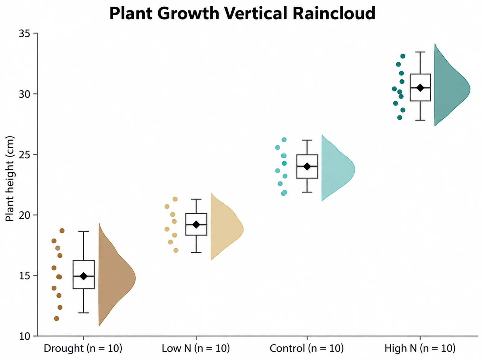
Based on the uploaded plant_height.xlsx file, create a vertical raincloud plot of plant height for Control, Low N, High N, and Drought. Order groups by median, mark the mean with a diamond, and use a green-to-brown palette that stays colorblind safe.
提示词
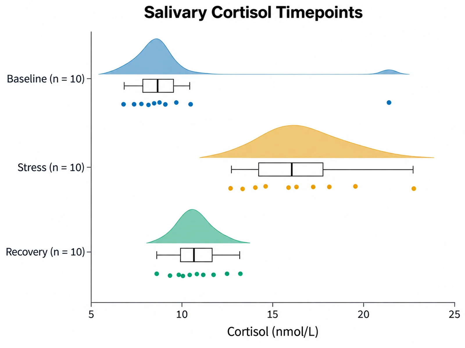
Based on the uploaded cortisol_timepoints.csv file, create a horizontal raincloud plot of cortisol at Baseline, Stress, and Recovery. Keep the timepoints in their original order and make the high baseline outlier visible as a rain point.
提示词
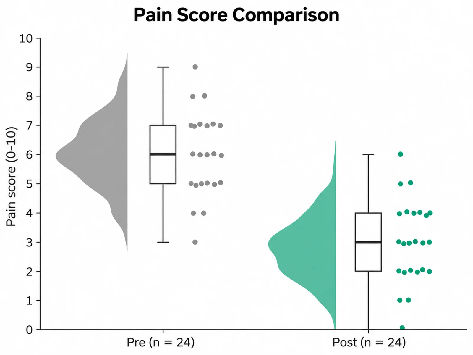
Based on the uploaded pain_scores.tsv file, create a vertical raincloud plot comparing pain scores before and after treatment. Use gray for Pre and teal for Post, show box plots with medians, and label the y-axis "Pain score (0-10)".
提示词
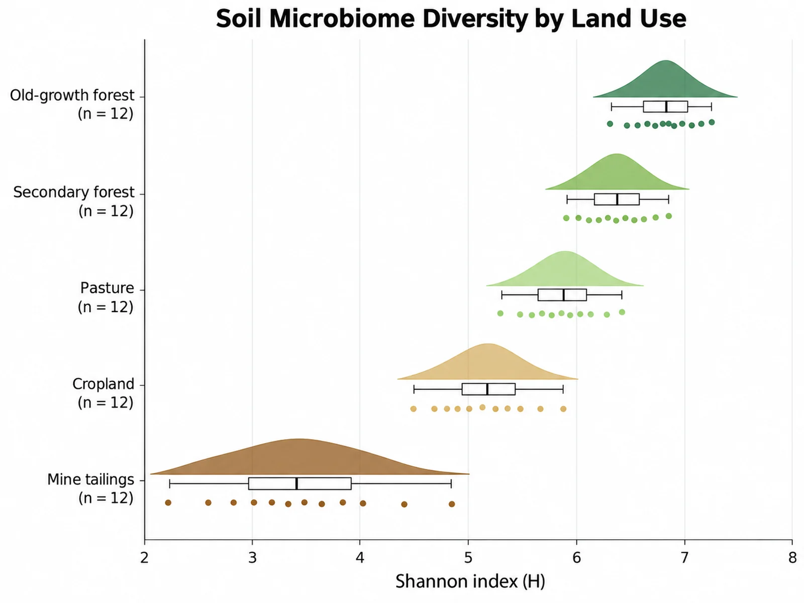
Based on the uploaded soil_shannon_diversity.csv file, create a horizontal raincloud plot of bacterial Shannon diversity across five land uses: Old-growth forest, Secondary forest, Pasture, Cropland, and Mine tailings. Order the groups by median from highest to lowest, label the x-axis "Shannon index (H)", print each group name with its n, show a narrow box plot with the median beside each cloud, and use an earthy green-to-brown colorblind-safe palette so the degraded mine tailings sites stand out at the bottom.
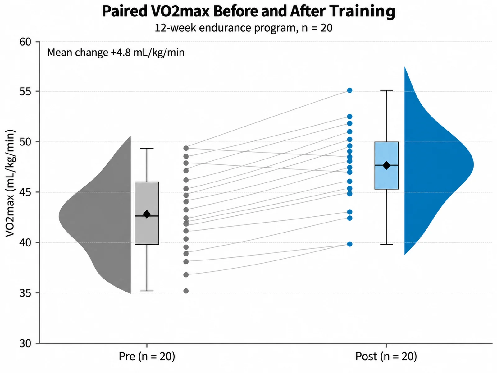
提示词
Based on the uploaded vo2max_paired.xlsx file, create a vertical raincloud plot of VO2max before and after a 12-week endurance program in 20 participants. Face the two clouds outward, place the raw points between them, and connect the pre and post value of each participant with a thin gray line so individual gains stay visible. Label the y-axis "VO2max (mL/kg/min)", use gray for Pre and blue for Post, and mark each mean with a diamond.
Add CSV, TSV, TXT, or Excel data in long format: one row per observation, a group or condition column, and a numeric measurement column.
Choose horizontal or vertical orientation, group order, colors, whether to show the mean, and the axis labels and units you need.
SciFigure computes the density, quartiles, and raw point positions, draws the raincloud plot, and lets you download a PNG for papers and slides.
A raincloud plot stacks three views of the same data: a half-violin density "cloud", a box plot, and the raw observations as jittered "rain". This raincloud plot maker computes each layer from your uploaded values, so readers can see the shape of each distribution, its median and spread, and every data point without switching figures. Bar charts with error bars hide skew, bimodality, and outliers; a raincloud plot shows them, which is why many journals and reviewers now encourage it for small and medium samples.
Use one row per observation with a group column (condition, treatment, genotype, timepoint) and a numeric measurement column. Rows with a missing group or value are skipped. Up to 8 groups are drawn.
The tool calculates them. Group sizes, means, SDs, medians, quartiles, whiskers, outliers, and the density curve heights are computed from your uploaded values in code, then passed to the image model as exact numbers. The image model draws and styles the figure, so compare the plot with the listed statistics before publishing.
A half violin plot shows only the density. A raincloud plot adds a box plot and the raw data points, which makes sample size and outliers visible alongside the distribution shape.
Yes. The default is the classic horizontal layout with clouds above each group. Write "vertical" in your instructions to place groups along the x-axis with clouds to the right of each box.
No. It describes distributions but does not run t-tests or ANOVA. Run your test separately and add the result to the caption or ask for a text annotation with your own values.
Yes, after you check group names, sample sizes, and summary statistics against your data. Mention the bandwidth method and that box whiskers extend to 1.5 × IQR in the figure legend.
Generate raincloud plots, violin plots, box plots, and other research-ready visualizations with SciFigure AI.